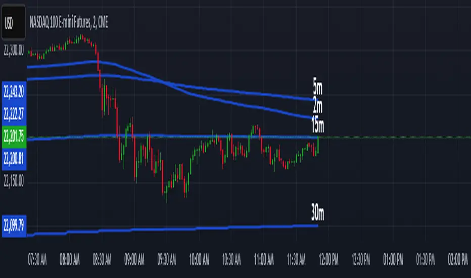
Multi-Timeframe 200 EMAMulti-Timeframe 200 EMA Indicator
Description:
This indicator plots the 200-period Exponential Moving Average (EMA) from multiple timeframes on a single chart. It allows traders to visualize key trend levels across different timeframes, helping with confluence, trend identification, and potential trade setups.
Key Features:
Multi-Timeframe EMAs: Displays the 200 EMA from the 2m, 5m, 15m, 30m, 1hr, and 4hr timeframes, regardless of the chart's current timeframe.
Dynamic Labeling: Each EMA is labeled with its respective timeframe (e.g., "2m", "1hr", "4hr") and the labels update in real-time, staying on the current EMA value.
Auto-Updating Labels: The labels move with the EMAs as new candles form, ensuring a clean and informative display. Old labels automatically disappear to prevent clutter.
Color-Coded EMAs: Each EMA has a unique color, making it easy to differentiate between timeframes.
How to Use This Indicator in Trading:
Trend Confirmation: If price stays above the higher timeframe 200 EMA (e.g., 1hr, 4hr), it suggests an uptrend; below it suggests a downtrend.
Support & Resistance Zones: The 200 EMA from larger timeframes often acts as strong dynamic support or resistance.
Multi-Timeframe Confluence: If multiple EMAs are aligned in the same direction, it strengthens the trend bias.
Reversal or Breakout Signals: When price crosses above or below a higher timeframe EMA, it could indicate a potential trend change or breakout opportunity.
Best Used For:
🔹 Scalpers & Day Traders: Helps identify intraday trends and key levels across multiple timeframes.
🔹 Swing Traders: Useful for aligning trade setups with higher timeframe trends.
🔹 Trend Followers: Provides confirmation of long-term trends using the 200 EMA.
Multitimeframe
Toby's Key LevelsAn Indicator that helps determine Key Areas on the chart. You set the values you want the horizontal lines to update. They horizontal lines will be used for exits and entries of trade. My recommendation for these Key Areas are as follows ( These recommendations are mostly for day trading and swing trading ):
XAU: Value distance of 50 ex. XAUUSD.
NAS: Value distance of 250 ex. NAS100/USTEC.
ETH: Value distance of 100 ex. ETHUSD.
AUD pairs: Value distance of 0.0200 ex. GBPAUD, EURAUD.
CAD pairs: Value distance of 0.0100 ex. NZDCAD, EURCAD.
CHF pairs: Value distance of 0.0100 ex. CADCHF, GBPCHF.
GBP pairs: Value distance of 0.00350 ex. EURGBP.
JPY pairs: Value distance of 2.00 ex. EURJPY, GBPJPY.
NZD pairs: Value distance of 0.015 ex. GBPNZD, AUDNZD.
Note:
These are subject to change and you can alter the lines anyhow you want to suit your trading style. These are what I recommend. Remember, Market is King.
Safe Trading!

Sentival | QuantEdgeBIntroducing Sentival by QuantEdgeB.
An Adaptive Multi-Factor Indicator for Market Valuation & Trend Strength
____
Overview
The Sentival Valuation System is a medium-term, multi-factor valuation tool designed to assess market conditions using a combination of momentum, mean reversion, and risk-adjusted metrics. It provides traders and investors with a dynamic score reflecting market valuation, ranging from strongly oversold to strongly overbought conditions.
This system leverages a diverse range of technical indicators, including momentum oscillators, volatility measures, risk ratios, and mean-reversion metrics, providing a holistic view of market conditions.
____
1. Key Features
🛠 Multi-Factor Valuation Model
Sentival aggregates nine different indicators, normalizing and rescaling them into a standardized z-score-based valuation system. The final output represents an average of the selected indicators, allowing for flexible customization based on the user’s preference.
📊 Customizable Indicator Selection
Users can enable or disable any of the nine valuation factors, ensuring the system adapts to different market environments, trading styles, and assets.
🔄 Multi-Timeframe Adaptability
Sentival can be used across different time horizons, making it suitable for short-term mean reversion, medium-term traders, or long-term valuation analysis by simply adjusting the timeframe and indicator settings. This flexibility allows traders to adapt Sentival to various market conditions and trading objectives.
🎨 Intuitive Dashboard & Color Coding
- Dynamic Heatmap & Dashboard: Displays valuation strength across multiple factors.
- Gradient-Based Overbought/Oversold Signals: Clear color-coded signals for easy interpretation.
- Background Highlighting: Optional oversold/overbought background zones.
🏆 Statistical & Risk-Based Insights
- Standardized Rescaling & Z-Score Analysis to prevent bias from individual indicators.
- Risk-Adjusted Metrics such as Sharpe, Sortino, and Omega Ratios help assess the overall market risk appetite.
- Trend Following Mode (TF Display): Users can enable the "Trend Following" option to display the trend direction, helping to align valuation signals with the broader market trend.
____
2. How It Works
1️⃣ Normalization & Rescaling: Each selected indicator is transformed into a standardized scale to ensure fair weighting and prevent distortions from extreme values.
2️⃣ Multi-Indicator Aggregation: The system averages multiple valuation signals into a single z-score, providing a clear overbought/oversold reading rather than relying on a single metric.
3️⃣ Dynamic Trend Filtering: Users can enable Trend Following Mode (TF Display) to overlay directional trend confirmation, helping align valuation signals with momentum.
____
4. Sentival Valuation Score & Interpretation
🔹 Sentival Score Ranges
- 📉 Strongly Oversold (-2 and below) → Market is extremely undervalued; potential reversal.
- 📉 Moderately Oversold (-1.5 to -2) → Discounted market conditions, buying interest may emerge.
- 📉 Slightly Oversold (-0.5 to -1.5) → Possible accumulation phase.
- ⚖ Fair Value (-0.5 to +0.5) → Market trading at equilibrium.
- 📈 Slightly Overbought (+0.5 to +1.5) → Initial signs of market strength.
- 📈 Moderately Overbought (+1.5 to +2) → Market heating up, caution warranted, selling interest may emerge.
- 📈 Strongly Overbought (+2 and above) → Extreme valuation, increased risk of correction.
This classification helps traders gauge overall market sentiment and make better allocation decisions.
Note: Past valuations and buy/sell signals generated by Sentival do not guarantee future performance. Market conditions can change, and proper risk management should always be applied.
____
5. Use Cases & Applications
🔹 📊 Market Rotation & Asset Allocation
- Used as a valuation model to determine if a market or asset is undervalued or overvalued.
- Rotational strategies can benefit from the valuation score by switching exposure between assets.
🔹 📈 Medium-Term Trend Identification
- Detects overbought and oversold conditions while filtering out short-term noise.
- Can be combined with other trend-following indicators for confluence-based strategies.
🔹 🔄 Mean Reversion & Momentum Trading
- Provides statistical validation for momentum breakouts or mean reversion signals.
- Useful for long-short trading strategies, determining optimal entry & exit points.
____
Conclusion
Sentival is a powerful universal valuation system for traders and investors seeking a data-driven, multi-factor approach to market valuation. With its combination of momentum, trend, risk-adjusted, and mean-reversion indicators, it provides a robust, adaptable, and statistically sound framework for making informed market decisions.
🔹 Who Should Use Sentival?
✅ Swing Traders & Medium-Term Investors looking for structured valuation metrics.
✅ Quantitative & Systematic Traders incorporating multi-factor models.
✅ Portfolio Managers optimizing exposure to different market regimes.
🔹 Disclaimer: Past performance is not indicative of future results. No trading strategy can guarantee success in financial markets.
🔹 Strategic Advice: Always backtest, optimize, and align parameters with your trading objectives and risk tolerance before live trading.

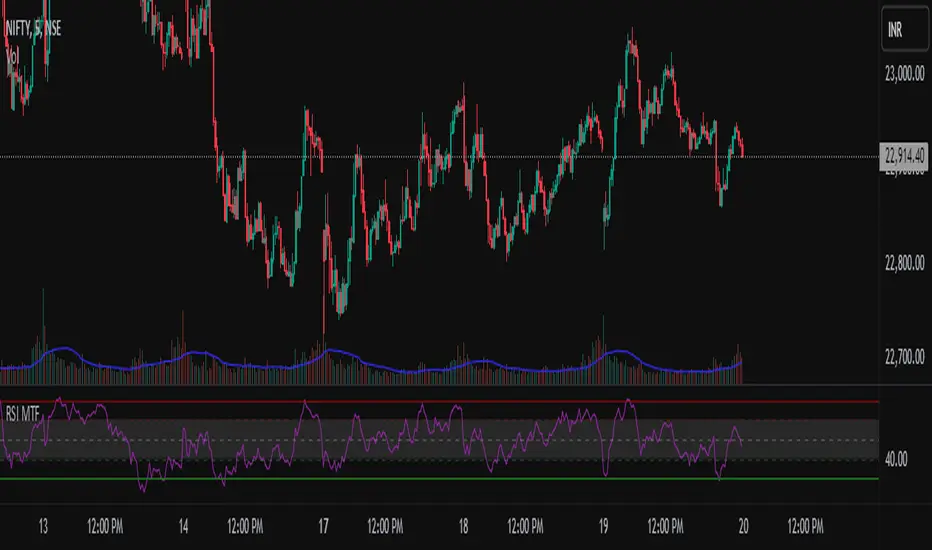
Multi timeframe RSIMulti-Timeframe RSI Indicator
This indicator displays the Relative Strength Index (RSI) from multiple timeframes—1 minute, 5 minutes, 15 minutes, and 30 minutes—on a single chart. Designed for intraday scalpers and short-term traders, it provides a comprehensive view of momentum across different timeframes, helping traders make more informed decisions.
✨ Why Use This Indicator?
✔ Enhanced Confirmation – Identify trends and momentum shifts with RSI signals from multiple timeframes.
✔ Perfect for Scalping & Intraday Trading – Quickly spot overbought/oversold conditions across different timeframes.
✔ Multi-Timeframe Confluence – Align entries and exits with stronger confirmation by analyzing RSI across short-term charts.
✔ Customizable & Easy to Use – Adjust RSI settings to suit your trading style.
This is a must-have tool for traders looking to refine their entries and exits with a multi-timeframe perspective! 🚀
Yearly Return % (Day-to-Day)How It Works:
It fetches the closing price from one year ago (using request.security with a daily lookback).
It calculates the percentage return relative to today’s closing price.
It plots the result in a separate pane.
Features:
Works on any timeframe but is more useful on daily or higher.
Automatically adjusts for different assets.
Zero Line for quick reference.
Clean, simple display without clutter.

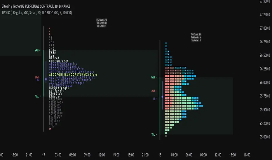
TPO IQ [TradingIQ]Hello Traders!
Introducing "TPO IQ"!
TPO IQ offers a Time Price Opportunity profile with several customization options that packs several related features to help traders navigate the generated profiles!
Features
TPO Profiles
Single Print identification
Initial Balance Identification
Can be anchored to timeframe change
Can be anchored to fixed time interval
Last profile detailed visuals
Customizable value area percentage
POC identification
Mid-point identification
TPO Profiles
A TPO profile is a market profile visualization that details how much time was spent at each price level throughout the time interval.
The image above further explains what a TPO Profile is!
Each letter corresponds to a candlestick. With this information, traders are able to visualize how much time was spent at each price area.
With customizable gradient colors, specifically in this example, blocks colored red are the earliest times in the profile, blocks colored green are in the beginning half of the time midpoint of the profile. Blue blocks represent the first half of the end of the time period, and purple blocks correspond to the end of the time period.
Please note that this form of TPO profile generation will only occur when the most recent profile uses less than 500 alphabet characters! If more than 500 characters are preset, TPO IQ will revert to using labels!
Initial Balance
TPO IQ also identifies the initial balance range and all alphabet characters that form within it!
The image above exemplifies this feature. The initial balance range is denoted by a a neon-blue line, with a blue circle showing the opening price. All characters within the initial balance range are highlighted blue, which is a feature that can be disabled with customizable colors.
POC
TPO IQ also identifies the point of control (POC) of the TPO Profile.
The point of control for the profile is labeled yellow by default, and shows where price spent the most time throughout the time period.
The image above shows the POC for the time period being identified by TPO IQ.
Value Area
TPO IQ also identifies the value area of the profile. A customizable percentage that is 70% by default, the value area of a TPO profile shows where price traded the majority of the time.
The image above further explains this feature. For this example, with the value area percentage being set to 70%, the value area high and value area low show the price zone that prices traded at 70% of the time throughout the profile.
TPO Midpoint
In addition to the POC, the TPO profile midpoint is also identified by TPO IQ.
The TPO midpoint simply corresponds to the middle price between the session's high and low!
Fixed Interval Mode
By default, TPO IQ recalculates every day, but this can also be changed to a customizable session time, such as 4 hours. If 4 hours is selected, then a new TPO profile will be generated every 4 hours.
However, in Fixed Interval mode, a TPO profile will be generated through a user-defined time range, such as 1300-1700.
In the image above, Fixed Interval mode is applied with a time range of 1300-1700 and, consequently, TPO IQ generates a new profile throughout every 1300-1700 time range!
This feature allows traders to specify time ranges of interest to generate TPO profiles for!
TPO Overview Label
The TPO overview label shows key statistics for the TPO profile generated throughout the trading session!
The "TPO Count" statistic shows how many alphabetical letters were generated for the profile, which is an adequate method to determine the session's volatility and price range.
The "Tick Levels" statistic shows how many tick levels were used to create the profile - another method to determine the volatility and price range of the session.
The "Top Letter" statistic shows which letter appears most throughout the profile. In this example, the top letter was "f", which means throughout creation of the profile, the letter "f" appeared the most!
And that's all for now!
If you have any feedback or new feature ideas for TPO IQ please feel free to share them with us!
Thank you traders!
Planetary Time IntervalsThe Planetary Time Intervals Indicator is a market time analysis tool that allows traders to analyze and forecast planetary degree time measurements on the chart. This indicator tracks consistent planetary degree intervals to the current bar and accurately project those intervals up to 500 bars on any timeframe.
It supports both geocentric and heliocentric planetary positions, including the Moon, making it applicable for long-term and intraday analysis.
How It Works:
Once the indicator is loaded, the user selects a significant high or low "datetime and price" as the starting point for calculations. There are three available methods for determining a planetary time interval, allowing for flexibility in market timing analysis:
1. Degree-Interval-Based Plotting (Default Method)
Input a fixed planetary interval (e.g., 30, 45, 9.78), and the indicator will:
Plot vertical background color changes at each elapse in planetary degrees of the selected planetary interval.
Project these intervals into the future with vertical lines and labels.
2. 360 Conversion Units (Alternative Time Measurement #1 – Bypasses Standard Degree-Based Plotting)
This method finds price-time equivalence through 360-base reduction, meaning it subtracts 360 increments from the price of a selected high or low until the result is under 360.
The final number serves as the working planetary degree measurement interval, and projections are plotted using this value.
The indicator will:
Plot vertical background color changes at each occurrence of this planetary interval.
Project these intervals into the future with vertical lines and labels.
Example Calculation:
If the selected high or low is already under 360:
Suppose the market high is 280 → The indicator uses 280 as the working planetary degree measurement interval.
Future projections are plotted using 280° increments.
If the selected high or low is above 360:
Suppose Bitcoin’s high at $64,899, and 360 Conversion Units are enabled. The script will:
Subtract multiples of 360 from 64,899:
64,899 - 360 = 64,539
64,539 - 360 = 64,179
Continue this process until the value is less than 360
The final result would be 99, meaning the working planetary degree measurement interval is 99°.
The indicator then plots these 99° intervals as planetary time projections as shown in the image below. This image also shows the math label option to show or hide as user info.
3. 100-Unit Time Measurement (Alternative Time Measurement #2
This method establishes a relationship between price and time by taking one-tenth (1/10) of a selected high or low and using that as the planetary measurement interval.
The indicator will:
Plot vertical background color changes at each occurrence of this planetary interval.
Project these intervals into the future with vertical lines and labels.
Example Calculation:
If the selected market high is 1,000, the resulting planetary interval would be 100.
The script plots projections at 100° intervals for future timing analysis.
Additional Features:
✔ Selectable Math Label Option – Users can enable an option to view the calculations behind both alternative methods to help determine if scaling is needed.
✔ Customizable Scaling for High or Low Prices – Adjustable scaling inputs allow the indicator to work with prices that are too high or too low, ensuring compatibility across different markets.
How to Use:
Load the indicator onto your chart anytime.
Select a significant high or low datetime & price as the base measurement.
Choose one of three measurement methods:
Standard Degree-Interval Plotting → Plots at fixed user input planetary intervals.
360 Conversion Units → Finds price-time equivalence through 360-based reductions.
100-Unit Time Measurement → Finds price-time equivalence by 1/10 units.
(Optional) Enable the math display option to see the calculation process.
(Optional) Adjust scaling to accommodate market prices that are significantly high or low.
Observe the projected planetary time intervals, which are plotted on the chart with background color changes, vertical lines, and labeled planetary time projections. Perfect for backtesting.
Inspired by the works of Michael Jenkins and George Bayer, and powered by AstroLib, developed by @BarefootJoey

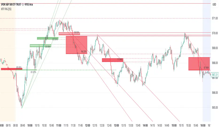
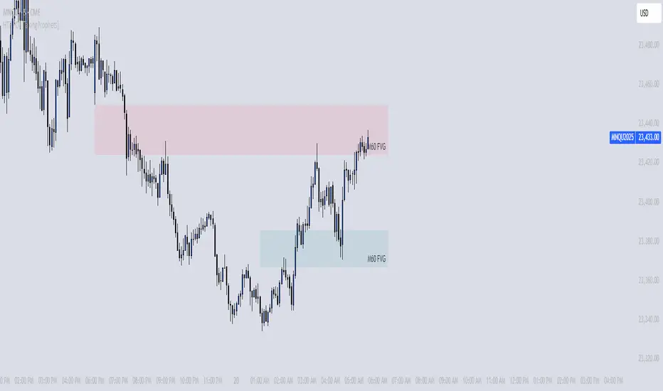
Higher Time Frame Fair Value Gap [ZeroHeroTrading]A fair value gap (FVG) highlights an imbalance area between market participants, and has become popular for technical analysis among price action traders.
A bullish (respectively bearish) fair value gap appears in a triple-candle pattern when there is a large candle whose previous candle’s high (respectively low) and subsequent candle’s low (respectively high) do not fully overlap the large candle. The space between these wicks is known as the fair value gap.
The following script aims at identifying higher timeframe FVG's within a lower timeframe chart. As such, it offers a unique perspective on the formation of FVG's by combining the multiple timeframe data points in the same context.
You can change the indicator settings as you see fit to achieve the best results for your use case.
Features
It draws higher timeframe bullish and bearish FVG's on the chart.
For bullish (respectively bearish) higher timeframe FVG's, it adds the buying (respectively selling) pressure as a percentage ratio of the up (respectively down) volume of the second higher timeframe bar out of the total up (respectively down) volume of the first two higher timeframe bars.
It adds a right extended trendline from the most recent lowest low (respectively highest high) to the top (respectively bottom) of the higher timeframe bullish (respectively bearish) FVG.
It detects and displays higher timeframe FVG's as early as one starts forming.
It detects and displays lower timeframe (i.e. chart's timeframe) FVG's upon confirmation.
It allows for skipping inside first bars when evaluating FVG's.
It allows for dismissing higher timeframe FVG's if there is no update for any period of the chart's timeframe. For instance, this can occur at lower timeframes during low trading activity periods such as extended hours.
Settings
Higher Time Frame FVG dropdown: Selects the higher timeframe to run the FVG detection on. Default is 15 minutes. It must be higher than, and a multiple of, the chart's timeframe.
Higher Time Frame FVG color select: Selects the color of the text to display for higher timeframe FVG's. Default is black.
Show Trend Line checkbox: Turns on/off trendline display. Default is on.
Show Lower Time Frame FVG checkbox: Turns on/off lower timeframe (i.e. chart's timeframe) FVG detection. Default is on.
Show Lower Time Frame FVG color select: Selects the color of the border for lower timeframe (i.e. chart's timeframe) FVG's. Default is white.
Include Inside Bars checkbox: Turns on/off the inclusion of inside first bars when evaluating FVG's. Default is on.
With Consistent Updates checkbox: Turns on/off consistent updates requirement. Default is on.
Flux Charts - S&D Screener💎 GENERAL OVERVIEW
Introducing Supply & Demand Zones (S&D) Screener! This screener can spot trading opportunities for Supply & Demand traders across 8 different tickers and timeframes simultaneously! This screener offers a wide range of configurable settings, explained within this write-up.
S&D Screener Features:
Supply & Demand Zones : This tool can detect Supply & Demand zones using one of the two detection methods.
Highly Configurable : Offers multiple parameters for fine-tuning detection settings.
Up to 8 Tickers : Allows traders to analyze multiple tickers & timeframes simultaneously for enhanced accuracy.
🚩 UNIQUENESS
The S&D Screener is the first ever tool on TradingView that allows traders to screen 8 different tickers on different timeframes for Supply & Demand Zones. Key factors that make it unique include:
✅ Comprehensive Dashboard – This screener provides a complete and customizable dashboard designed to enhance traders' decision-making by consolidating crucial Supply & Demand insights into one user-friendly interface.
✅ Multi-Ticker & Multi-Timeframe Analysis – With support for up to 8 tickers and timeframes, traders can effortlessly analyze the bigger market picture, identifying trends and opportunities across different assets and timeframes.
By combining multiple analytical elements in a single view, this screener empowers traders with the insights needed to navigate the market more effectively.
📌 HOW DOES IT WORK ?
The S&D Screener helps traders identify Supply & Demand Zones on multiple tickers & timeframes. It offers customizable settings to adapt to different trading styles. The screener includes two zone detection methods. The Momentum Method identifies zones based on strong bullish or bearish price movements, making it ideal for traders who seek quick market reactions. The Regression Method uses statistical regression to detect zones by analyzing price deviations from the trend, which is more suitable for long-term traders. You can customize your zone preferences and enable up to 8 tickers and their respective timeframes. You'll be able to see the status of the latest detected zones on that ticker/timeframe. You can also see the distance from current price of the ticker to the zone and how many times price has retested that zone.
Supply Zone
In trading, a supply zone is a specific area on a price chart where selling interest surpasses buying interest, leading to a potential decline in asset prices. This zone typically forms after a price rally, indicating that sellers find the asset overvalued and are prepared to sell, creating downward pressure. Identifying supply zones can help traders anticipate potential price reversals or pullbacks.
Trading Possibilities with Supply Zones
Entering Short Positions -> When the price approaches a recognized supply zone, traders may consider initiating short positions, anticipating that increased selling pressure will drive prices down.
Setting Profit Targets -> For traders holding long positions, supply zones can serve as strategic points to set profit targets, as these areas may signal potential resistance and a subsequent price drop.
Demand Zone
In trading, a demand zone is a specific area on a price chart where buying interest is strong enough to halt a downtrend and potentially reverse it upward. This zone indicates a price level where demand exceeds supply, leading to a rise in price. Identifying these zones can provide traders with strategic entry points for potential long positions.
Trading Possibilities with Demand Zones
Entering Long Positions -> When the price approaches a recognized demand zone, traders may consider initiating long positions, anticipating that increased buying pressure will drive prices up.
Setting Profit Targets -> For traders holding short positions, demand zones can serve as strategic points to set profit targets, as these areas may signal potential resistance and a subsequent price increase.
Momentum Detection Method
The Momentum Detection Method identifies supply and demand zones by analyzing the strength and direction of price movements over a specified period. It looks for a sequence of strong bullish or bearish candles to determine potential zones. The method is sensitive to the ‘Sensitivity’ setting, which adjusts the threshold for what constitutes a "strong" candle.
Using the momentum method is ideal for traders looking to capitalize on immediate price reactions and momentum shifts.
Regression Detection Method
The Regression Method uses statistical regression to identify supply and demand zones by analyzing price consolidation patterns. It fits a regression line to price data and identifies zones where price deviates significantly from the trend. This method is more mathematical and less reliant on individual candle patterns. It focuses on the overall price structure and identifies zones based on statistical deviations from the trend.
This method is particularly useful for traders who focus on longer-term price trends and prefer a more statistical approach to pinpoint zones.
Using the momentum method is ideal for traders looking to capitalize on immediate price reactions and momentum shifts.
Status ->
Far -> This status indicates that the current price is significantly distant from any identified supply or demand zones. In this scenario, traders might exercise patience, waiting for the price to approach these zones before considering entry or exit points.
Approaching ⬆️ -> The price is rising towards a supply zone, suggesting potential selling opportunities as the price nears an area where selling pressure previously dominated.
Approaching ⬇️ -> The price is falling towards a demand zone, indicating potential buying opportunities as the price approaches an area known for strong buying interest.
Inside -> The current price is within the boundaries of a supply or demand zone. This status often signals a critical decision point:
Inside a Supply Zone: The area where selling pressure may increase, potentially leading to a price decline. Traders might look for confirmation before initiating short positions.
Inside a Demand Zone: The area where buying interest could surge, possibly resulting in a price increase. Traders might seek validation before entering long positions.
Being "inside" a zone suggests heightened market activity and potential volatility, warranting close monitoring for trading signals.
Retests -> A retest occurs when the price revisits a supply or demand zone but fails to break through it. Specifically, during a retest, the wick of a candlestick enters the zone, but the candle closes below the supply zone or above the demand zone. This price action suggests that the zone remains a strong area of resistance or support, as the market couldn't sustain movement beyond it. Traders often view such retests as confirmations to enter positions in the direction opposite to the zone's boundary. For instance, if the price retests a supply zone and fails to close above it, it may signal a selling opportunity. Conversely, a failed retest of a demand zone could indicate a buying opportunity. Monitoring the number of retests can provide insights into the strength of these zones; multiple retests without a breakout may reinforce the zone's significance. Here you can see how many times the price retested the supply or demand zone.
⚠ Timeframe Restriction : The selected timeframes for analysis cannot be lower than the chart’s current timeframe to ensure proper data alignment.
⏰ ALERTS
This screener supports alerts, so you never miss a key market move. You can choose to receive alerts when a new demand or supply zone is created, helping you spot potential trading opportunities. Additionally, you can enable alerts for retests, which notify you when the price returns to test a previously identified zone. The alerts will work for each enabled ticker in the settings.
⚙️ SETTINGS
1. General Configuration
Detection Method : There are two detection methods you can choose from for identifying Supply & Demand Zones. Both methods aim to identify key areas where price is likely to react, but they do so using different approaches. Traders can choose the method that aligns with their trading style and time horizon.
Sensitivity : The Sensitivity setting allows traders to adjust how aggressively the script identifies supply and demand zones when using the Momentum Detection Method. This setting directly impacts the threshold for detecting zones when using the momentum detection method.
High Sensitivity -> Detects smaller price movements, resulting in more zones being identified. This is ideal for traders who want to capture even minor supply and demand imbalances and prefer a higher frequency of potential trading opportunities.
Medium Sensitivity -> Balances between detecting significant price movements and avoiding excessive noise. This setting is suitable for most traders who want a moderate number of zones without being overwhelmed.
Low Sensitivity -> Focuses on larger, more significant price movements, resulting in fewer zones being identified. This is ideal for traders who prioritize quality over quantity and prefer to focus on the most impactful supply and demand areas.
Lowest Sensitivity -> Detects only the strongest and most pronounced price movements, identifying the most significant zones. This setting is best for traders who want to focus on high-probability, high-impact zones and avoid minor fluctuations.
Zone Invalidation : The Zone Invalidation setting determines how supply and demand zones are invalidated.
Wick -> A zone is invalidated if a candle’s wick goes below a demand zone or above a supply zone.
Close -> A zone is invalidated if a candle closes below a demand zone or above a supply zone.
Zone Visibility Range : The Zone Visibility Range setting controls how far from the current price supply and demand zones are displayed on the chart. It helps traders focus on relevant zones while avoiding clutter from distant or less impactful areas.
Minimum Zone Width : The Minimum Zone Width setting defines the smallest size a supply or demand zone must have to be displayed on the chart. It uses the Average True Range (ATR) as a reference to ensure zones are proportionate to current market volatility.
Minimum Zone Length : The Minimum Zone Length setting determines the minimum number of bars a supply or demand zone must span to be displayed on the chart. This setting helps filter out short-lived or insignificant zones, ensuring only meaningful areas of supply or demand are highlighted.
2. Tickers
You can set, then enable or disable up to 8 tickers in this section to get informed about their latest supply or demand zone.

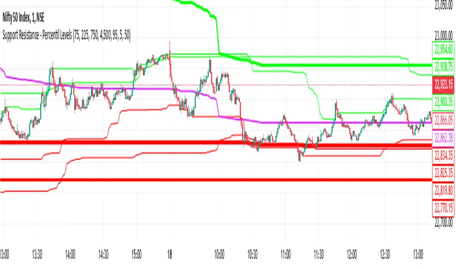
Support Resistance - Percentile LevelsKey Features:
1. Percentile Calculations:
The indicator calculates the 95th percentile (PercentilePlot100) and the 5th percentile (PercentilePlot5) of the high and low prices over specified lengths.
The lengths for these calculations are adjustable via input fields, allowing users to customize the periods used for percentile calculations.
2. Percentile Levels:
Resistance Levels (R1, R2, R3, R4): Plots resistance levels based on the 95th percentile of the high prices over different lengths (100, 200, 750, 4500).
Support Levels (S1, S2, S3, S4): Plots support levels based on the 5th percentile of the low prices over different lengths (100, 200, 750, 4500).
3. High-Timeframe Average:
Calculates and plots the average of the 750-period high and low percentiles (htfavg), which acts as a pivot point on the chart.
How to Use This Indicator:
1. Identify Key Support and Resistance Levels:
Use the plotted resistance (R1, R2, R3, R4) and support (S1, S2, S3, S4) levels to identify key areas where price may reverse or consolidate.
2. Pivot Point Analysis:
The plotted pivot point (htfavg) can be used to identify potential areas of trend change or consolidation. It represents the average price level based on higher timeframe percentiles.
3. Trend Analysis:
By observing how price interacts with these percentile levels, traders can gain insights into market trends and potential reversal points.
Customization:
The input fields allow you to customize the lengths of the percentiles and the percentile plot values according to your trading strategy and timeframe preference.
In summary, this indicator can help traders identify significant support and resistance levels, potential pivot points, and overall market trends based on percentile calculations of high and low prices over various periods. This can be valuable for making informed trading decisions and setting entry and exit points.
If you have any specific questions or need further customization, feel free to ask! 😊
Price-Aligned Trend Indicator - Saerthak AnandThis is a Pine Script (version 6) for TradingView that creates a "Price-Aligned Trend Indicator" with three different T3 moving averages (Fast, Medium, and Slow). The indicator colors the lines based on the trend (bullish, bearish, or neutral) and adds "BREAKOUT" or "BREAKDOWN" labels when the fast moving average crosses the medium moving average.
Explanation:
T3 Moving Average Calculation: The function calculates the T3 moving average by recursively applying the exponential moving average (EMA) multiple times.
Trend Conditions:
Bullish: Fast > Medium > Slow.
Bearish: Fast < Medium < Slow.
Neutral: Any other condition.
Plotting:
The three T3 moving averages are plotted with different levels of opacity based on the trend.
A colored cloud is filled between the fast and medium lines, indicating the current trend.
Breakout and Breakdown Labels:
A "BREAKOUT" label is displayed when the fast T3 crosses above the medium T3 and the overall trend is bullish.
A "BREAKDOWN" label is displayed when the fast T3 crosses below the medium T3 and the overall trend is bearish.
Suggestions for Improvement:
Performance Optimization: You may want to experiment with higher T3 lengths for smoother trend visualization.
Customization: Consider adding options for users to customize colors and label display.
Alert Conditions: You can add alertcondition for breakouts and breakdowns for real-time alerts in TradingView.
Signal Confirmation: Add further trend confirmation (e.g., volume analysis or RSI) to reduce false signals.
Multi-Timeframe Open LinesThe Multi-Timeframe Open Lines indicator is designed to help traders visualize key price levels at the open of specific time intervals. It draws horizontal lines at the open of 5-minute, 15-minute, 30-minute, and hourly candles, extending these lines to the start of the next respective interval. Traders can now control which timeframes are displayed and how many past opening lines are shown, ensuring a clean and organized chart.
Key Features:
Customizable Lines:
5-Minute Lines: Highlight the open of every 5-minute candle, ending at the start of the next 5-minute candle.
15-Minute Lines: Highlight the open of every 15-minute candle, ending at the start of the next 15-minute candle.
30-Minute Lines: Highlight the open of every 30-minute candle, ending at the start of the next 30-minute candle.
Hourly Lines: Highlight the open of every hourly candle, ending at the start of the next hourly candle.
Each timeframe's lines can be customized in terms of color, line style, and thickness.
Toggle Options:
Easily turn on or off the display of lines for each timeframe (5m, 15m, 30m, 1h) using checkboxes in the settings.
User-Defined Limits:
Control the number of past opening lines displayed for each timeframe (5m, 15m, 30m, 1h).
Prevents chart clutter by limiting the number of visible lines.
Multi-Timeframe Analysis:
Enables traders to analyze price action across multiple timeframes simultaneously, providing a clearer picture of market structure and key levels.
User-Friendly Inputs:
Easy-to-use settings for customizing line appearance and behavior, ensuring the indicator fits seamlessly into any trading strategy.
How to Use:
Apply the indicator to your chart to visualize the open price levels for 5-minute, 15-minute, 30-minute, and hourly candles.
Use the lines as dynamic support/resistance levels or to identify potential breakout/breakdown points.
Customize the colors, styles, and the number of visible lines to match your chart theme or trading preferences.
Toggle specific timeframes on or off to focus on the most relevant price levels.
Ideal For:
Traders who use multi-timeframe analysis.
Those who rely on key price levels for decision-making.
Anyone looking to enhance their chart with clear, customizable reference lines while avoiding clutter.
Multiple Timeframe LevelsThe multiple timeframe levels indicator plots the following lines on your chart:
Previous day's high, low, and midpoint
Previous week's high, low, and midpoint
Previous month's high, low, and midpoint
Overnight session high, low, and midpoint
This indicator makes it easy to plot the high timeframe levels on your chart so that you can focus on your preferred timeframe for trading. This can be used however you see fit. These levels are great for finding support and resistance, setting your stop losses and take profits, looking for reversals, etc.
You can customize this script my enabling/disabling the timeframe's high/low or midpoint as well as the color.
Dual HTF Candle Boxes with PDH/PDL/PWH/PWLThis Pine Script code for TradingView creates an indicator that displays dual higher timeframe (HTF) candle boxes along with Previous Day High (PDH), Previous Day Low (PDL), Previous Week High (PWH), and Previous Week Low (PWL) lines. Let's break down what this code does:
Core Functionality:
Dual HTF Candle Boxes: The script overlays two sets of candle boxes on the main chart, each representing a different higher timeframe. This allows traders to visualize price action on larger timeframes without switching charts. For example, you can see 15-minute and 1-hour candles overlaid on your current chart.
Customizable Timeframes: You can define the specific higher timeframes you want to see for each set of candles. The script provides input options to select these timeframes.
Color Customization: The colors of the candle bodies, wicks, and boxes are customizable. You can set different colors for bullish and bearish candles for each of the two higher timeframes.
Box and Body Display Options: You can choose to display both the box outlines and the candle bodies, or just the bodies, or just the boxes (high/low range). This allows you to customize the visual representation to your liking.
Midline: An optional midline can be displayed within each HTF candle box, representing the midpoint between the high and low.
Range in Pips/Percentage: The script can display the range of each HTF candle in pips or as a percentage of the total range.
PDH/PDL/PWH/PWL Lines: The script also plots horizontal lines representing the Previous Day High, Previous Day Low, Previous Week High, and Previous Week Low. These are common support and resistance levels.
PDH/PDL/PWH/PWL Customization: You can customize the colors and line styles (solid or dashed) of the PDH/PDL/PWH/PWL lines.
Code Breakdown:
indicator(): Defines the script as an indicator with a title and other properties.
input.*: Defines user input options for customizing the indicator. This is how you configure the timeframes, colors, and other settings.
timeframe.period: Gets the current chart's timeframe.
request.security(): Used to request data from higher timeframes. This is how the script gets the high, low, open, and close prices for the HTF candles.
box.new(): Creates the candle box objects on the chart.
line.new(): Creates the PDH/PDL/PWH/PWL lines.
label.new(): Creates the labels for the pip/percentage range and PDH/PDL/PWH/PWL.
array.new_box(), array.new_label(), array.new_line(): These arrays are used to store the created boxes, labels, and lines so they can be managed and deleted if the color settings are changed. This is a crucial improvement for performance and prevents the chart from becoming cluttered with old objects.
f_draw_htf_boxes(): This function handles the drawing of the HTF candle boxes. It takes the timeframe, colors, and other parameters as input.
ta.change(time(Interval)): Detects when a new HTF candle has formed.
Key Improvements in this Version:
Object Management: The use of arrays to store and manage the boxes, labels, and lines is a significant improvement. This prevents the accumulation of objects on the chart, which can slow down TradingView and make the chart unreadable. The script now properly deletes old objects when colors are changed.
Color Change Detection: The script now detects when the user changes the color inputs and clears the existing objects before drawing new ones with the new colors.
Clearer Code Structure: The code is organized into functions, making it easier to read and understand.
How to Use:
Open TradingView.
Open a chart for any symbol.
Open the Pine Editor.
Copy and paste this code into the editor.
Add the indicator to the chart.
Use the input options to customize the indicator to your preferences.
This script provides a powerful way to visualize higher timeframe price action and key support/resistance levels directly on your chart, enhancing your trading analysis. Remember that proper use and interpretation of these indicators are crucial for successful trading. This script is a tool, and like any tool, its effectiveness depends on the user's skill and understanding.

HTF POI [TakingProphets]HTF POI – Higher Timeframe Points of Interest Detection
The HTF POI Indicator by Taking Prophets is designed for traders following ICT (Inner Circle Trader) concepts and smart money principles. This tool automatically detects higher timeframe (HTF) points of interest (POIs) such as Fair Value Gaps (FVGs), Inverse Fair Value Gaps (IFVGs), and Consequent Encroachment (CE) levels, helping traders spot high-probability trading zones used by institutions.
🔹 Key Features:
✅ Automatic Detection of FVGs & IFVGs – Identifies key price inefficiencies across multiple timeframes.
✅ Multi-Timeframe Analysis – Detect POIs on the current timeframe and up to five higher timeframes (HTF1 to HTF5).
✅ Customizable Sensitivity – Adjust detection settings to High, Medium, or Low based on price gap size.
✅ Fair Value Gap (FVG) Encroachment Lines – Optional midpoint levels to track potential price rebalancing.
✅ Volume Display Option – View volume within detected FVGs for additional confluence.
✅ Inverse Fair Value Gaps (IFVGs) – Tracks invalidated gaps that turn into new liquidity pools.
✅ Works Across All Markets – Ideal for Forex, Futures, Stocks, and Crypto.
🔹 How It Works:
📌 Fair Value Gaps (FVGs) – Price inefficiencies caused by fast institutional moves that often get revisited.
📌 Bullish FVGs (BISI) – Formed when price gaps up, creating a demand zone where price may return.
📌 Bearish FVGs (SIBI) – Formed when price gaps down, acting as a supply zone for potential reversals.
📌 Inverse Fair Value Gaps (IFVGs) – Previously unfilled FVGs that get mitigated and act as liquidity pools.
📌 Consequent Encroachment (CE) – The 50% midpoint of an FVG, where price often reacts.
📌 Multi-Timeframe Integration – Tracks higher timeframe gaps for confluence with lower timeframe setups.
🔹 How to Use:
Identify FVG zones for potential entries or exits in alignment with smart money concepts.
Use Consequent Encroachment (CE) levels to confirm reactions at the 50% level of an FVG.
Watch for IFVGs as they provide new liquidity pools after FVGs are invalidated.
Combine with CHoCH/BOS market structure shifts and Order Blocks for higher-probability trades.
🚀 Refine your trade entries with precision using the HTF POI Indicator by Taking Prophets!
HTF Order Blocks [TakingProphets]HTF Order Blocks – Smart Money Order Block Detection
The HTF Order Blocks Indicator by Taking Prophets is designed for traders following ICT (Inner Circle Trader) concepts and smart money strategies. This indicator automatically detects higher timeframe (HTF) order blocks, allowing traders to track key institutional levels for potential reversals, continuations, and liquidity grabs.
🔹 Key Features:
✅ Automatic HTF Order Block Detection – Identifies bullish and bearish order blocks across multiple timeframes.
✅ Customizable Sensitivity – Adjust detection settings to High, Medium, or Low for filtering OB size based on ATR.
✅ Multi-Timeframe Analysis – Track up to five higher timeframes alongside the current timeframe.
✅ Breaker Block Detection – Optionally highlight breaker blocks when order blocks are invalidated.
✅ Visual Order Block Markings – Displays colored order block zones with labels for clarity.
✅ Works Across All Markets – Ideal for Forex, Futures, Stocks, and Crypto.
🔹 How It Works:
📌 Order Blocks (OBs) – Areas where price previously reversed due to institutional buying/selling.
📌 Bullish OBs – Formed after a down move when price breaks structure to the upside.
📌 Bearish OBs – Formed after an up move when price breaks structure to the downside.
📌 Breaker Blocks – Previously unmitigated OBs that get invalidated and turn into resistance/support.
📌 Multi-Timeframe Integration – Allows traders to track HTF OBs for confluence in their lower timeframe trades.
🔹 How to Use:
Look for order blocks at key liquidity zones to anticipate potential reversals.
Use multi-timeframe OBs to confirm bias and refine entries.
Identify breaker blocks when previous OBs fail, signaling trend shifts.
Combine with CHoCH/BOS structure shifts for high-probability trade setups.
🚀 Take your trading to the next level with the HTF Order Blocks Indicator by Taking Prophets!

HTF Market Structure [TakingProphets]HTF Market Structure
The Market Structure CHoCH/BOS (Fractal) Indicator is designed for traders using smart money concepts and ICT (Inner Circle Trader) methodology to track market structure shifts in real time. It automatically detects Change of Character (CHoCH) and Break of Structure (BOS) events based on fractal highs and lows, helping traders identify potential trend reversals and continuations with greater precision.
🔹 Key Features:
✅ Automatic CHoCH & BOS Detection – No need for manual plotting; the indicator highlights key structure shifts.
✅ Custom Lookback Period – Adjustable fractal settings to fine-tune market structure sensitivity.
✅ Multi-Timeframe Market Structure Table – Displays the most recent CHoCH state on multiple timeframes (Weekly, Daily, 4H, 1H, 15m, 5m).
✅ Candle Coloring – Optional feature to change candle colors after a CHoCH for better visual clarity.
✅ Works Across All Markets – Use it for Forex, Stocks, Crypto, and Futures.
🔹 How It Works:
📌 Break of Structure (BOS) – Indicates a continuation of the existing trend when price breaks a previous swing high or low.
📌 Change of Character (CHoCH) – Suggests a potential trend reversal when price structure shifts direction.
📌 Multi-Timeframe Confirmation – The built-in table tracks the latest CHoCH across different timeframes to help confirm bias.
🔹 How to Use:
Look for CHoCH signals at key liquidity zones (order blocks, fair value gaps).
Use BOS confirmations to follow trend continuations.
Combine with other smart money concepts like imbalance fills and liquidity grabs for stronger trade setups.
🚀 Enhance your market structure analysis with the CHoCH/BOS Indicator

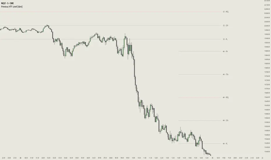
Previous HTF Highs, Lows & Equilibriums [dani]Previous HTF Highs, Lows & Equilibriums
Indicator Description
This powerful and user-friendly indicator is designed to help traders visualize key levels from multiple higher timeframes directly on their chart. It plots the previous session's high, low, and equilibrium (EQ) levels for up to 4 customizable timeframes, allowing you to analyze price action across different time horizons simultaneously.
Key Features
Multi-Timeframe Support:
Choose up to 4 higher timeframes (e.g., 1H, 4H, 1D, 1W) to plot levels on your chart.
Each timeframe's levels are displayed with clear, customizable lines.
Previous Session Levels:
Plots the previous session's high, low, and EQ (EQ = (high + low) / 2) for each selected timeframe.
Levels are dynamically updated at the start of each new session.
Customizable Line Styles:
Choose between solid, dashed, or dotted lines for each level.
Customize colors for high, low, and EQ levels to suit your preferences.
Dynamic Labels:
Each level is labeled with the corresponding timeframe (e.g., "1D - H" for daily high, "4H - L" for 4-hour low).
Labels are positioned dynamically to avoid clutter and ensure readability.
Toggle On/Off:
Easily toggle the visibility of all levels with a single button, making it simple to declutter your chart when needed.
Compatible with All Markets:
Works seamlessly across all instruments (stocks, forex, crypto, futures, etc.) and timeframes.
How to Use?
Add the indicator to your chart.
Select up to 4 higher timeframes to plot levels.
Customize line styles and colors to match your trading style.
Use the levels as reference points for support/resistance, breakout zones, or confluence areas.
Toggle levels on/off as needed to keep your chart clean and focused.
Disclaimer & Chat
This indicator is not a trading signal generator. It does not predict market direction or provide buy/sell signals. Instead, it is a tool to help you visualize key levels from higher timeframes, enabling you to make more informed trading decisions. Always combine this tool with your own analysis, risk management, and trading strategy.
Thank you for choosing this indicator! I hope it becomes a valuable part of your trading toolkit. Remember, trading is a journey, and having the right tools can make all the difference. Whether you're a seasoned trader or just starting out, this indicator is designed to help you stay organized and focused on what matters most—price action. Happy trading, and may your charts be ever in your favor! 😊
From, Dani.
50% Candle RetraceThis custom indicator draws a horizontal line at the 50% retracement level of each candlestick on the chart. It calculates the midpoint between the high and low of each candle, which is often used by traders to identify potential entry, exit and take-profit levels. Once price action returns to an untouched level, the line will be removed, leaving only the levels where price action is still missing.
Key Features:
Timeframe: Works on all timeframes.
Line Color: Customize the line color to suit your charting preferences.
Line Width: Adjust the thickness of the retracement line for better visibility.
Line Style: Choose between solid, dotted, or dashed lines.
Up/Down Candle Selection: Option to only display retracement lines for up (bullish) candles, down (bearish) candles, or both.
Full Customization: Control the transparency (opacity) of the line for enhanced visual clarity.
Simple Setup: No complicated settings – simply choose your preferred color, line style, and visibility options.
This indicator is perfect for traders who prefer to use price action and retracement levels to identify potential trade opportunities.
How It Works:
The indicator automatically calculates the 50% level (midpoint) for each candlestick, drawing a line at this level. It will only draw lines for candles that match your chosen criteria (up or down candles), ensuring the chart remains clean and relevant to your trading strategy. Lines are automatically removed as soon as price crosses them.

Pre-Market High & LowIndicator: Pre-Market High & Low
This indicator tracks the high and low price levels of a stock during the pre-market session (4:00 AM - 9:30 AM EST), before the official market open. It dynamically updates during pre-market hours, identifying the highest and lowest prices reached. Once the pre-market session ends, these levels are saved and plotted on the chart as reference points for the regular market session.
Key Features:
Dynamic Updates: Continuously tracks the high and low during pre-market hours.
Visual Indicators: Plots horizontal lines representing the pre-market high (green) and low (red).
Post-Market Reference: Once pre-market ends, these levels remain visible for the regular market session as reference points for potential breakout or breakdown levels.
How to Use:
Use this indicator to identify potential breakout or breakdown levels that may happen at the market open.
The green line represents the highest price reached during pre-market, while the red line indicates the lowest price.
The indicator will stop updating once the pre-market session closes (9:30 AM EST) and will remain visible as reference levels throughout the trading day.
Ideal for:
Day traders looking for pre-market support and resistance levels.
Traders analyzing the initial market reaction based on pre-market price action.

MTF- Standard Deviation ChannelWhat Is Standard Deviation?
Standard deviation is a statistical measurement that looks at how far individual points in a dataset are dispersed from the mean of that set. If data points are further from the mean, there is a higher deviation within the data set. It is calculated as the square root of the variance.
Key Takeaways:
Standard deviation measures the dispersion of a dataset relative to its mean.
It is calculated as the square root of the variance.
Standard deviation, in finance, is often used as a measure of the relative riskiness of an asset.
A volatile stock has a high standard deviation, while the deviation of a stable blue-chip stock is usually rather low.
Standard deviation is also used by businesses to assess risk, manage business operations, and plan cash flows based on seasonal changes and volatility.
Source: Investopedia
--------------- UPDATE ---------------
The deviation is calculated automatically. (via stdev function).
--
The targeted timeframe is available in the options (recalculation cycle).
--
If the selected security is a contract the number of days before expiration is automatically managed, otherwise it will use the 'default' options.
---------------------------------------

Long and Short Term Highs and LowsLong and Short Term Highs and Lows
Overview:
This indicator is designed to help traders identify significant price points by marking new highs and lows over two distinct timeframes—a long-term and a short-term period. It achieves this by drawing optional channel lines that outline the highest highs and lowest lows over the chosen time periods and by plotting visual markers (triangles) on the chart when a new high or low is detected.
Key Features:
Dual Timeframe Analysis:
Long Term: Uses a user-defined “Time Period” (default 52) and “Time Unit” (default: Weekly) to determine long-term high and low levels.
Short Term: Uses a separate “Time Period” (default 50) and “Time Unit” (default: Daily) to compute short-term high and low levels.
Optional Channel Display:
For both long and short term periods, you have the option to display a channel by plotting the highest and lowest values as lines. This visual channel helps to delineate the range within which the price has traded over the selected period.
New High/Low Markers:
The indicator identifies moments when the highest high or lowest low is updated relative to the previous bar.
When a new high is established, an up triangle is plotted above the bar.
Conversely, when a new low occurs, a down triangle is plotted below the bar.
Separate input toggles allow you to enable or disable these markers independently for the long-term and short-term setups.
Inputs and Settings:
Long Term High/Low Period Settings:
Show New High/Low? (STW): Toggle to enable or disable the plotting of new high/low markers for the long-term period.
Time Period: The number of bars used to calculate the highest high and lowest low (default is 52).
Time Unit: The timeframe on which the long-term calculation is based (default is Weekly).
Show Channel? (SCW): Toggle to display the channel lines that connect the long-term high and low levels.
Short Term High/Low Period Settings:
Show New High/Low?: Toggle to enable or disable the plotting of new high/low markers for the short-term period.
Time Period: The number of bars used for calculating the short-term extremes (default is 50).
Time Unit: The timeframe on which the short-term calculations are based (default is Daily).
Show Channel?: Toggle to display the channel lines for the short-term highs and lows.
Indicator Logic:
Channel Calculation:
The script uses the request.security function to pull data from the specified timeframes. For each timeframe:
It calculates the lowest low over the defined period using ta.lowest.
It calculates the highest high over the defined period using ta.highest.
These values can be optionally plotted as channel lines when the “Show Channel?” option is enabled.
New High/Low Detection:
For each timeframe, the indicator compares the current high (or low) with its immediate previous value:
New High: When the current high exceeds the previous bar’s high, an up triangle is drawn above the bar.
New Low: When the current low falls below the previous bar’s low, a down triangle is drawn below the bar.
Usage and Interpretation:
Trend Identification:
When new highs (or lows) occur, they can signal the start of a strong upward (or downward) movement. The indicator helps you visually track these critical turning points over both longer and shorter periods.
Channel Breakouts:
The optional channel display offers additional context. Price movement beyond these channels may indicate a breakout or a significant shift in trend.
Customizable Timeframes:
You can adjust both the time period and time unit to fit your trading style—whether you’re focusing on longer-term trends or short-term price action.
Conclusion:
This indicator provides a dual-layer analysis by combining long-term and short-term perspectives, making it a versatile tool for identifying key highs and lows. Whether you are looking to confirm trend strength or spot potential breakouts, the “Long and Short Term Highs and Lows” indicator adds a valuable visual element to your TradingView charts.
C&P MA/KT Compare & Predict Moving average / Current market price.
This is simple table indicator. Located at right-top of chart. Shows which way will MA's head go.
I made this indicator for automate candle countings & compare price. With this friend, you will be know trend more faster then waiting traditional MA golden / dead crossing.
In factory settings, current market price will be compared with closing price of the candle, corresponding to previous number 7, 25, 60, 99, 130, 240. If Current market price is lower then past, the box for the corresponding MA is highlighted in red and appears as Down. In opposite case, it will be highlighted in green and indicates Up.
MA와 시장가 차이로 MA의 머리 방향을 예측해주는 간단한 지표입니다.
수동으로 캔들 되돌려서 종가와 시장가 비교하는게 너무 번거로워서 자동화를 위해 제작되었습니다. 해당 지표를 이용하시면 MA의 골든/데드 크로스를 기다리는 것보다 더 빠른 예측이 가능합니다.
차트 우측 상단에 예측 값이 표시되며, 기본 설정에선 7, 25, 60, 99, 130, 240개 전 캔들의 종가와 시장가가 비교됩니다. 시장가가 비교 값보다 높을 때는 초록 배경에 Up 텍스트가 출력됩니다. 반대의 경우엔 빨간색 배경에 Down 표기가 나타납니다.
