[COW] Super Levels V0.1An indicator that shows key levels of the day. This includes, but is not limited to, the daily open close, previous day open and close, the high and low of the current and past day, and more.
Its currently in development, but feel free to check it out! It is useful to see key levels and where the price might stick, reverse, or bust through!
Levels

Custom LevelsThis indicator plots a customizable number of horizontal price levels above and below the current market price, using a user-defined rounding step. It assists traders in spotting potential support and resistance zones. Adjust the rounding step, number of levels, and line styles (color, width, style) through the settings menu. Updated dynamically with each new candle, it offers real-time insights for price level analysis. Perfect for traders focused on key price thresholds.

Momentum Robot - StructureThis free indicator is a companion to the Momentum Robot instrument grader.
Structure puts the fundamentals of momentum trading all in one indicator.
This indicator is intended to be used in momentum trading which makes realistic price targets clear for profit taking. Primarily to be used on the 1m and 10sec. It can actually be used on any timeframe for any style of trading. Below are the details of everything you are seeing in the indicator.
EMA’s:
The exponential moving averages included are the 9 ema, 20 ema and the 200 ema. These are the standard ema’s used in momentum trading. Once price has moved above each of these, it is in a good place to expect more upside.
VWAP:
Volume Weighted Average Price is also included (white) to show the average price based on volume. Once price is above this level, it is considered bullish.
Peak Lines and Breakout targets:
Shown with orange lines, these are the breakout targets where price has had a last rejection. The idea is, when price begins to make a move back to this line, there is a high probability that it will break through this level.
.50 cent lines:
In conjunction with the Peak Lines and Breakout Targets, the .50 cent lines (in gray) give a realistic expectation of where price will gravitate towards. So if the breakout line is .20 cents below a dollar level, there is a high probability that when price breaks the breakout line that it will move to the dollar level. A great spot for profit taking for long traders!
To be used in conjunction with the Volume and MACD indicators.
Enjoy this free indicator. This indicator is extracted from the full version of the Momentum Grader.

Fibonacci Pivot Points & Previous D,W&M Highs/LowsIndicator Overview
This indicator combines Fibonacci Pivot Points with previous high and low levels for different timeframes (day, week, month). It plots these levels on the chart to provide traders with key support and resistance areas, making it easier to identify potential trading opportunities.
Features
Fibonacci Pivot Points:
The indicator calculates pivot points based on the high, low, and close prices.
Fibonacci levels are used to determine support (S1, S2, S3, S4, S5) and resistance (R1, R2, R3, R4, R5) levels.
Users can customize the Fibonacci levels for both support and resistance.
Previous Highs and Lows:
The indicator plots previous day, week, and month high and low levels.
Each of these lines can be customized in terms of visibility, color, and width.
This helps traders to see key historical levels that might act as support or resistance in the future.
Inputs and Customization:
Fibonacci Time Frame:
Users can select the timeframe for calculating the pivot points (Daily, Weekly, Monthly).
Fibonacci Levels:
Customizable input fields for each Fibonacci level (R1, R2, R3, R4, R5, S1, S2, S3, S4, S5).
Previous High/Low Lines:
Day Lines:
Options to show or hide previous day's high/low lines.
Customizable color and width for these lines.
Week Lines:
Options to show or hide previous week's high/low lines.
Customizable color and width for these lines.
Month Lines:
Options to show or hide previous month's high/low lines.
Customizable color and width for these lines.
Technical Calculations:
Fibonacci Pivot Points:
Calculated as:
pp = (High + Low + Close) / 3
S1 = pp - ((High - Low) * Fibonacci Level)
R1 = pp + ((High - Low) * Fibonacci Level)
Previous High/Low Levels:
Uses request.security to fetch previous high and low values for the selected timeframe.
Plotted using line.new to draw lines across the chart.
Plotting:
The indicator plots Fibonacci Pivot Points and previous high/low lines on the chart, using distinct colors for each level.
Customizable transparency and linewidths make it easier to visually interpret the levels.
This indicator is particularly useful for traders who rely on technical analysis to identify key support and resistance levels, offering a blend of historical data and Fibonacci-based predictions.
Feel free to ask if you have any specific questions or need further adjustments!

CandelaCharts - Liquidity Key Zones (LKZ)📝 Overview
The Liquidity Key Zones indicator displays the previous high and low levels for daily, weekly, monthly, quarterly, and yearly timeframes. These levels serve as crucial price zones for trading any market or instrument. They are also high-probability reaction zones, ideal for trading using straightforward confirmation patterns.
Each of these levels plays a significant role in determining whether the market continues its momentum or reverses its bias. I like to think of these levels as dual magnets—they simultaneously attract and repel price. You might wonder how having opposing views can be useful. The key is to remain neutral about direction and establish your own rules to identify when these zones are likely to attract or repel price. I have my own set of rules, and you can develop yours.
📦 Features
MTF
Styling
⚙️ Settings
Day: Shows previous day levels
Week: Shows previous week levels
Month: Shows previous month levels
Quarter: Shows previous quarter levels
Year: Shows previous year levels
Show Average: Shows previous level average price
Show Open: Shows previous level open price
⚡️ Showcase
Daily
Weekly
Monthly
Quarterly
Yearly
Average
Open
📒 Usage
When the price breaks through a significant level, such as a daily, weekly, or monthly high or low, it often signals a potential reversal in market direction. This occurs because these levels represent key areas of support or resistance, where traders anticipate heightened activity, including profit-taking, stop-loss orders, or new positions being initiated.
Once the price breaches these levels, it may trigger a sharp reaction as market participants adjust their strategies, leading to a reversal. Monitoring price action and volume around these levels can provide valuable confirmation of such reversals.
Another effective approach to utilizing these pivot points is by incorporating them into a structured trading strategy, such as the X Model, which leverages multiple timeframes and technical tools to refine trade entries and exits.
X Model conditions:
(D1) Previous Day High (ERL)
(H1) Bullish FVG/IFVG/OB (IRL)
(m15) MSS / SMT
Only Short Above 00:00
By combining these elements, the X Model offers a comprehensive framework for leveraging pivot levels effectively, emphasizing confluence between liquidity zones, time-based rules, and multi-timeframe analysis to enhance trading accuracy and consistency.
🚨 Alerts
This script provides alert options for all signals.
Bearish Signal
A bearish signal is generated when the price breaks below the previous low level.
Bullish Signal
A bullish signal is generated when the price breaks above the previous low level.
⚠️ Disclaimer
Trading involves significant risk, and many participants may incur losses. The content on this site is not intended as financial advice and should not be interpreted as such. Decisions to buy, sell, hold, or trade securities, commodities, or other financial instruments carry inherent risks and are best made with guidance from qualified financial professionals. Past performance is not indicative of future results.

High Volume Points [BigBeluga]High Volume Points is a unique volume-based indicator designed to highlight key liquidity zones where significant market activity occurs. By visualizing high-volume pivots with dynamically sized markers and optional support/resistance levels, traders can easily identify areas of interest for potential breakouts, liquidity grabs, and trend reversals.
🔵 Key Features:
High Volume Points Visualization:
The indicator detects pivot highs and lows with exceptionally high trading volume.
Each high-volume point is displayed as a concentric circle, with its size dynamically increasing based on the volume magnitude.
The exact volume at the pivot is shown within the circle.
Dynamic Levels from Volume Pivots:
Horizontal levels are drawn from detected high-volume pivots to act as support or resistance.
Traders can use these levels to anticipate potential liquidity zones and market reactions.
Liquidity Grabs Detection:
If price crosses a high-volume level and grabs liquidity, the level automatically changes to a dashed line.
This feature helps traders track areas where institutional activity may have occurred.
Volume-Based Filtering:
Users can filter volume points by a customizable threshold from 0 to 6, allowing them to focus only on the most significant high-volume pivots.
Lower thresholds capture more volume points, while higher thresholds highlight only the most extreme liquidity events.
🔵 Usage:
Identify strong support/resistance zones based on high-volume pivots.
Track liquidity grabs when price crosses a high-volume level and converts it into a dashed line.
Filter volume points based on significance to remove noise and focus on key areas.
Use volume circles to gauge the intensity of market interest at specific price points.
High Volume Points is an essential tool for traders looking to track institutional activity, analyze liquidity zones, and refine their entries based on volume-driven market structure.

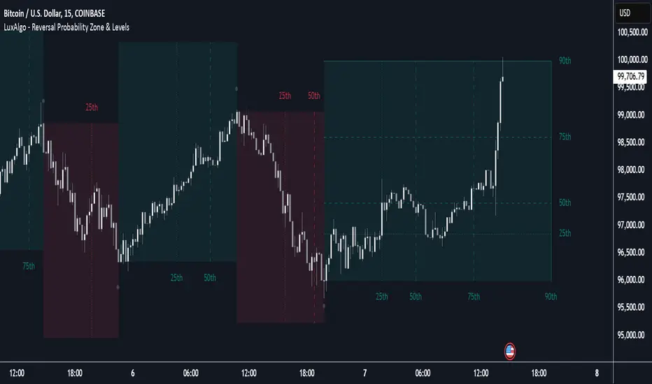
Reversal Probability Zone & Levels [LuxAlgo]The Reversal Probability Zone & Levels tool allows traders to identify a zone starting from the last detected reversal to highlight the probability of where the next reversal would be from a price and time perspective.
Price and time levels within the zone are displayed for up to 4 percentiles defined by the user.
🔶 USAGE
By default, the tool displays a zone with the 25th, 50th, 75th and 90th percentiles on both the price and time axis, indicating where, when and how many of the past reversals have occurred.
Traders can select the length for swing detection and the maximum number of reversals for probability calculations. The tool considers both bullish and bearish reversals separately, which means that if the last reversal was a swing high, the zone would show the probabilities for the last defined Maximum reversals
The Maximum reversals value has a direct impact on the probabilities, the more data traders use the more significant the result, probabilities over 10 occurrences are far weak compared to probabilities over 1000 occurrences.
🔹 Percentiles
Traders can fine-tune the percentile parameters in the settings panel.
A given percentile means that the number of occurrences in the data set is less than or equal to the percentile.
In English, this means
Percentile 20th: 20% of the occurrences are less than or equal to this value, so 80% of the occurrences are greater than this value.
Percentile 50th: 50% of the occurrences are below and 50% are above this value.
Percentile 80th: 80% of occurrences are lower than or equal to this value, so 20% of occurrences are greater than this value.
🔹 Normalize data
The Normalize Data feature allows traders to make an apples to apples comparison when we have a lot of historical data on high timeframe charts, using returns between swings instead of raw price.
🔹 Display Style
By default, the tool has the No overlapping feature enabled to display a clean chart, traders can turn it off, but this can fill the chart with too much information and barely see the price.
Traders can enable/disable settings to show only the last zone and the swing markers on the chart.
🔶 SETTINGS
Swing Length: The maximum length in bars used to identify a swing
Maximum Reversals: Maximum number of reversals included in calculations
Normalize Data: Use returns between swings instead of raw price
Percentiles: Enable/disable each of the four percentiles and select the percentile number, line style, colors, and size
🔹 Style
No Overlapping Zones: Enable or disable the No overlap between zones feature
Show Only Last Zone: Enable/disable display of last zone only
Show Marks: Enable/disable reversal markers
Price Level Multi Timeframe [Snowdex]Price Level Multi-Timeframe Indicator
This indicator visualizes important price levels from multiple timeframes (e.g., daily, weekly, monthly) directly on the chart. It helps traders identify significant support and resistance levels for better decision-making.
Features:
Displays price levels for multiple timeframes: daily (1D), weekly (1W), monthly (1M), quarterly (3M), semi-annual (6M), and yearly (12M).
Customizable options to show or hide levels and adjust their colors.
Highlights high, low, and close levels of each timeframe with labels and dotted lines.
Includes options to extend levels visually for better clarity.
Benefits:
Easily compare price levels across timeframes.
Enhance technical analysis with multi-timeframe insights.
Identify key areas of support and resistance dynamically.

Unmitigated 50% of the RangeThis indicator is designed to display unmitigated 50% zones of price ranges within two swing (High and Low) points. The 50% level serves as a probable target for retracements before the price resumes its movement in the direction of the most recent swing. The underlying theory is that Price Action tends to correct unbalanced price zones by returning to 50% of the range.
The indicator identifies highs and lows utilizing the “Left Swing Sensitivity” setting, which detects the high/low points within the specified number of bars. It then ensures that the zone meets a minimum size requirement, configured via the “Minimum Leg Size” setting, to filter out smaller legs/zones that would not provide sufficient profit and loss opportunities for entries at 50% and take profit at the most recent swing point.
To prevent duplication of zones when the price is gradually moving up, an "Auto Adjust Levels" setting is available. Enabled by default, this feature automatically cleans up smaller zones, retaining only the primary zone between the most recent swing point and the outer swing.
Additionally, the indicator automatically removes mitigated zones where the price has returned to the 50% level, thus maintaining clean charts.
There are several visualization settings available, offering comprehensive control over what is displayed on the charts:
Control the color and style of the lines representing the 1, 0, and 50% levels.
Choose whether to display labels and if they should show the price at the rendered levels.
Optionally extend the lines/labels to the right for each level.

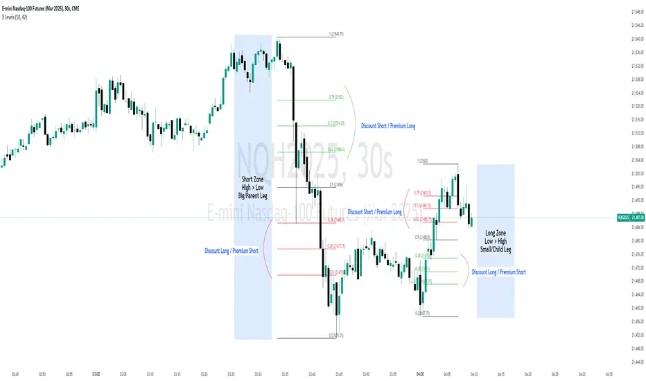
Discount/Premium OTE LevelsThis indicator is created to identify discount/premium areas to provide additional confluence to trades taken. The underlying theory is that the trades taken in discounted areas are likely to have less risk due to a smaller stop loss and a higher reward/risk ratio.
The indicator operates by first identifying a zone between the last major swing high and low. These highs and lows are determined as price points that at the extremes within the number of bars to the left, as defined by the "Swing Sensitivity" setting.
Once a price zone is established, the indicator verifies that the zone meets the minimum size in points as configured via the "Minimum size" setting to be considered tradable. Zones that are too small may not provide a sufficient range even for scalping. The default value is 42 points based on Nasdaq, which means that the distance between inner most OTE levels (0.382 and 0.618) is at least 10 points.
When a valid zone is identified, it is then subdivided into areas of interest based on OTE levels, which can be configured/adjusted via the "Levels to Draw" setting. These levels represent the midpoint (50%), which distinguishes between premium and discount, and the three OTE levels 0.79, 0.705, 0.618, above the 50% for discount and below the 50% for premium.
For example, if a zone is formed initially by a swing low followed by a swing high with the assumption that the draw is higher, the indicator can be used to formulate long positions from below the 50% level starting at 0.38 OTE level, or ideally at 0.295 OTE level using 0 as a stop loss. Alternatively, if the 50% level is not yet tapped, short scalp positions can be made from 0.79-0.618 OTE levels with 50% as a partial or TP target.
See for long/short example
Typically, the indicator will show only a single zone. However, there may be cases with two zones: one larger parent zone containing a smaller, valid price zone within itself.
The indicator will automatically invalidate and remove the zone once the high/low of the zone is invalidated.
Configuration:
The indicator provides several visualization options for customization, including:
Color settings for OTE levels, with separate settings for edge/50% color, premium, and discount levels.
Settings for line style for OTE levels.
Settings to determine whether to show prices on level labels.
Settings to decide if lines should be extended to the right.
[COG]MTF RZP Heatmap MTF RZP Heatmap (Range Zone Pulse)
What It Does
This indicator creates three visual heatmaps that show how current price movement compares to the average range of different timeframes. It helps traders:
Identify when price moves are overextended
Compare momentum across different timeframes
Spot potential reversal points
Understand the relative strength of price movements
How It Works
Range Calculation:
For each selected timeframe, it calculates an average range based on the specified number of periods
The range is measured from high to low for each period
A moving average of these ranges creates a dynamic "normal" range for that timeframe
Position Calculation:
Measures how far price has moved from the period's opening price
Compares this movement to the average range
Converts the movement into a percentage (-100% to +100%)
Visual Display:
Shows three vertical heatmaps, one for each timeframe
Colors graduate from bearish (typically red) to bullish (typically green)
A dot indicator shows the current position within each range
Percentage labels show exact movement relative to average range
Trading Applications
Trend Trading:
Multiple timeframes aligned in the same color suggest strong trend
Use larger timeframes (Daily/Weekly) for trend direction
Use smaller timeframes (4H/1H) for entry timing
Mean Reversion:
Extreme readings (near +100% or -100%) suggest overextended moves
Look for divergences between timeframes
Use when shorter timeframes show extremes but larger timeframes don't
Volatility Trading:
Compare current moves to average ranges
Identify when markets are more volatile than usual
Adjust position sizes based on range expansion/contraction
Multi-Timeframe Analysis:
Compare price action across different time horizons
Identify conflicting signals between timeframes
Use for timeframe alignment in trading decisions
Best Practices for Usage
Timeframe Selection:
Set the first timeframe to your trading timeframe
Set the second timeframe to your trend timeframe
Set the third timeframe to your entry timeframe
Range Period Settings:
Default is 5 periods
Increase for more stable readings
Decrease for more responsive readings
Color Interpretation:
Darker colors indicate stronger moves
Look for alignment across timeframes
Watch for extremes in any timeframe
Trading Setups:
Wait for alignment in multiple timeframes
Use extreme readings for counter-trend trades
Combine with other indicators for confirmation

ZenAlgo - SessionsZenAlgo - Sessions is a robust TradingView indicator designed to analyze and visualize global trading sessions (Asian, European, and US). By combining session-specific price levels, volume and delta tracking, and historical performance metrics, it delivers actionable insights for session-based trading strategies, simplifying decision-making in dynamic markets.
Features
Session Highlighting: Distinguishes trading sessions with customizable colors for easy identification.
Session Levels: Dynamically calculates and projects five key levels (0%, 25%, 50%, 75%, 100%) to identify support and resistance zones.
Volume and Delta Tracking: Tracks session-specific total volume, inflows, outflows, and delta to assess market sentiment.
Interactive Performance Table: Summarizes recent session metrics, including win/loss percentages, volume, and delta, enabling trend analysis.
Historical Analysis: Retains session performance data for up to 100 sessions, providing insights into long-term trends.
Dynamic Range Projection: Extends session levels into subsequent sessions, maintaining market context.
Customizable Time Zones: Adapts session tracking to any trading environment.
Added Value: Why Is This Indicator Original/Why Shall You Pay for This Indicator?
1. Synergy Between Indicators
Session Levels: Highlight key market zones that guide entry/exit points.
Volume and Delta Metrics: Clarify price action at these levels by identifying buyer/seller dominance.
Performance Metrics: Aggregate historical session data, helping traders identify recurring patterns, sentiment shifts, and session-specific tendencies.
Together, these features amplify one another, creating actionable insights that exceed the value of standalone tools.
2. Comparison to Freely Available Indicators
Traditional indicators like Bollinger Bands, RSI, or Moving Averages operate on broad price action trends. ZenAlgo - Sessions focuses on session-specific patterns, volume dynamics, and real-time updates, delivering more context-specific insights.
By consolidating multiple functionalities into one tool, it eliminates the need for multiple separate indicators, streamlining analysis.
3. Why Pay for This Indicator?
Comprehensive Insights: Delivers session-specific metrics unavailable in standalone tools.
Real-Time Updates: Ensures metrics and levels reflect the latest market movements.
Seamless Integration: Combines price action, volume, and historical performance into a single, intuitive interface.
How It Works
1. Session Detection
Defines sessions for Asia, Europe, and the US based on fixed opening and closing times. Time zones ensure compatibility with global markets, excluding weekends and holidays for relevance.
2. Price Levels
Calculates five levels (0%, 25%, 50%, 75%, 100%) based on session high and low, projecting these into subsequent sessions for continued analysis.
3. Volume and Delta Metrics
Tracks session volume, separating inflows and outflows based on price movements.
Calculates delta to gauge net buying/selling activity.
4. Performance Metrics
Tracks win/loss rates and percentage changes across sessions.
Stores session metrics (volume, delta, win/loss) for up to 100 sessions.
5. Dynamic Visualization
Continuously updates session levels and metrics in real time for actionable insights.
Usage Examples
Support/Resistance Levels: Use session levels, especially the 50% midline, as potential pivot points for trades.
Breakout Analysis: Monitor price action beyond session highs or lows to confirm breakouts.
Volume Trends: Compare session volumes to identify high-activity periods.
Delta Shifts: Assess delta changes to determine market sentiment at key levels.
Session Comparison: Identify which session drives significant activity using the performance table.
Multi-Session Strategies: Plan trades based on extended session levels to anticipate reactions at previously tested zones.
Settings
Asia Session Color: Adjust the highlight color for the Asian session.
Europe Session Color: Customize the color for the European session.
US Session Color: Define the color for the US session.
Time Zone: Set the time zone for session tracking.
Line Transparency: Adjust session line opacity.
Number of Sessions for Total Count: Define how many sessions to analyze in the performance table.
Important Notes
This indicator is a technical analysis tool and does not guarantee trading success. Use it alongside other indicators and fundamental analysis for a comprehensive trading strategy.
Combine with Other Tools: Use complementary indicators such as RSI, Bollinger Bands, or ATR to filter out unreliable signals and improve accuracy.
Known Weaknesses and Mitigation Strategies
1. Extreme Volatility
Issue: During sudden, significant price movements (e.g., news-driven events), session levels and delta metrics may become less reliable as the market temporarily disregards historical patterns.
Mitigation: Combine ZenAlgo - Sessions with volatility indicators like ATR (Average True Range) or a news alert system to adjust expectations during these periods.
2. Low Liquidity Periods
Issue: During holidays or outside peak trading hours, session metrics may misrepresent actual market activity due to reduced participant involvement.
Mitigation: Focus on sessions with higher activity (e.g., overlapping US and European sessions) to ensure more accurate insights.
3. Non-Standard Trading Hours
Issue: Market-specific differences, such as extended hours or daylight saving adjustments, can misalign session boundaries.
Mitigation: Verify session times align with your market and adjust settings accordingly.
4. Historical Data Dependencies
Issue: Historical metrics rely on consistent session patterns; deviations (e.g., extended or shortened sessions) can impact trend accuracy.
Mitigation: Regularly review and interpret historical data alongside real-time metrics to ensure alignment.

JaT - Max/Min Labels ProDescription:
The JaT - Max/Min Labels Pro is a powerful and customizable tool designed for traders who want clear, precise, and visually appealing identification of local price extremes. This indicator dynamically detects local maxima and minima based on user-defined sensitivity and displays their values as labels directly on the chart.
Key Features:
Dynamic Extremes Detection: Automatically identifies local highs and lows using a user-configurable lookback period and sensitivity setting.
Customizable Label Offset: Allows you to position labels further away from the bars for enhanced visibility.
Clear Visualization: Labels are color-coded for clarity:
Green for Highs: Transparent green text (50% opacity) displayed above the bar.
Red for Lows: Transparent red text (50% opacity) displayed below the bar.
Efficient Performance: Utilizes optimized Pine Script arrays to manage labels dynamically and avoid clutter.
User-Friendly: Simple configuration with adjustable parameters for lookback period, sensitivity, and label offset.
Parameters:
Lookback Period: Defines the range of bars to analyze for extremes.
Sensitivity: Adjusts the smoothing level for extreme detection using a moving average.
Label Offset: Controls the vertical distance of labels from the bar, ensuring they are easy to read without overlapping.
Who is it for?
This indicator is ideal for traders who rely on technical analysis to spot potential reversal points, breakout levels, or key support/resistance zones. Whether you're a day trader, swing trader, or long-term investor, the JaT - Max/Min Labels Pro provides an elegant and practical solution for enhancing your charting workflow.
How to Use:
Add the indicator to your chart.
Configure the settings to suit your trading style:
Adjust the Lookback Period to define how far back the indicator analyzes.
Set the Sensitivity to control how frequently highs and lows are detected.
Use the Label Offset to adjust label placement for better visibility.
Observe the dynamically generated labels highlighting price extremes.
Feel free to tweak or expand this description if you'd like to emphasize other features or include additional instructions. Let me know if there's anything else you'd like to add or adjust! 😊
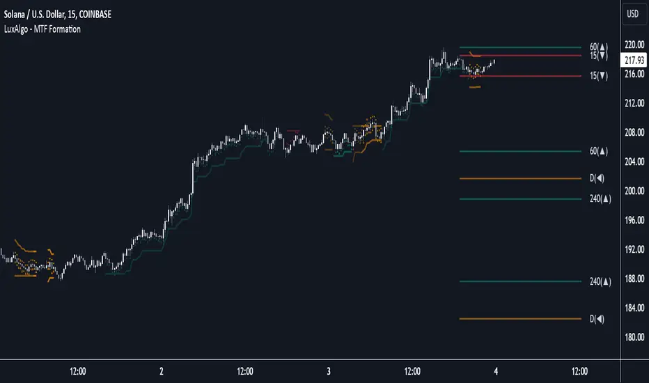
Multi Timeframe Market Formation [LuxAlgo]The Multi Timeframe Market Formation tool allows traders to analyze up to 6 different timeframes simultaneously to discover their current formation, S/R levels and their degree of synchronization with the current chart timeframe. Multi timeframe analysis made easy.
🔶 USAGE
By default, the tool displays the chart's timeframe formation plus up to 5 other formations on timeframes higher than the one in the chart.
When the chart formation is synchronized with any enabled timeframe formation, the tool displays labels and a trailing channel, it uses a gradient by default, so the more timeframes are synchronized, the more visible the labels and the trailing channel are.
All timeframes enabled in the settings panel must be higher than the chart timeframe, otherwise the tool will display an error message.
🔹 Formations
A formation is a market structure defined by a lower and an upper boundary (also known as support & resistance).
Each formation has a different symbol and color to identify it at a glance.
It helps traders to know the current market behavior and the tool displays up to 5 of them.
BULLISH (green ▲): higher high and higher low
BEARISH (red ▼): lower high and lower low
CONTRACTION (orange ◀): lower high and higher low
EXPANSION (blue ▶): higher high and lower low
SIDEWAYS (yellow ◀): Any that does not fit with the others
🔹 Multi Timeframe Formations
The tool displays up to 6 different timeframe formations, the chart timeframe plus 5 more configurable from the settings panel.
Each of them has an upper and lower limit, a timeframe, a color and an icon.
If a bound level is shared by more than one formation, the timeframes and symbols are displayed on the same line.
These are significant levels shared by different timeframes and traders need to be aware of them.
🔹 Sync With Chart Timeframe
If the current formation on the chart timeframe is in sync with any of the timeframes enabled in the settings panel, the tool will display this on the chart.
The more timeframes are in sync, the more they are visible, providing a clear visual representation of the common market behavior on multiple timeframes at the same time.
🔶 SETTINGS
Formation size: Size of market formations on the chart timeframe
🔹 Timeframes
TF1 to TF5: Activate/deactivate timeframe, set size of market formation and activate/deactivate high and low levels
🔹 Style
Show Labels: Enable/Disable Timeframe Sync Labels
Transparency Gradient: Enable/Disable Transparency Gradient
Show Trailing Channel | Multiplier: Enable/Disable Trailing Channel and set multiplier
Color for each formation
JJ Psychological Levels (125 Increments)Psychological Levels Indicator
Description:
The Psychological Levels Indicator is a versatile tool designed for traders to identify key price levels that often act as support or resistance zones in the market. These levels are plotted at regular intervals, customizable by the user, starting from a base price level. This is particularly useful for spotting psychological price points that traders and investors frequently monitor.
Key Features:
1.Dynamic Psychological Levels:
- The script calculates and displays horizontal lines at price levels separated by customizable increments (default: 125 points).
- These levels are dynamically adjusted to the visible range of the chart.
2. Customizable Inputs:
- Starting Level: Set the base level from which increments are calculated (e.g., 0 or 1000).
- Step Size: Define the interval between levels (e.g., 125 for indices like Bank NIFTY).
3. Visual Representation:
- Horizontal lines are drawn at each psychological level, helping traders quickly identify key zones.
- Labels are placed next to each level, displaying the corresponding price for easy reference.
4. Application Across Instruments:
- This indicator works seamlessly with various asset classes, including stocks, indices, forex, and cryptocurrencies.
How to Use:
1.Identify Key Price Zones:
- Use the plotted psychological levels to spot areas where price action is likely to react.
- Levels such as 1125, 1250, and 1375 (for a step size of 125) are visually highlighted.
2. Plan Trades Around Key Levels:
- These levels can act as support/resistance or breakout points, providing opportunities for entry, exit, and stop-loss placement.
3. Customizable Settings:
- Adjust the starting level and step size to tailor the indicator to your trading instrument or strategy.
Why Psychological Levels Matter:
Psychological levels are widely followed by traders and often coincide with key market turning points due to their significance in human behavior and market psychology. They are frequently used by institutional traders, making them valuable reference points for intraday and swing trading.
Custom Settings:
- **Starting Level:** Default: `0`
- **Step Size:** Default: `125`
Disclaimer:
This indicator is a technical analysis tool and is not intended to provide financial advice. Always combine it with other indicators and perform your due diligence before making trading decisions.

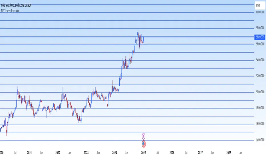
NPT Levels GeneratorNPT Levels Generator
Description:
The NPT Levels Generator is a custom indicator designed to draw horizontal lines at specific price levels on the chart. It helps traders identify key levels of interest, making it easier to analyze price action and plan trades.
The indicator takes a manually defined Base Price as the central reference point and then generates a series of horizontal lines above and below it at equal intervals. The number of lines and the distance between them are fully customizable through the settings panel.
This tool is particularly useful for identifying support and resistance levels, pivot zones, or any other significant price levels for technical analysis.
Features:
-Customizable Base Price: Define the central level manually.
- Adjustable Line Distance: Set the spacing between each horizontal line.
- Flexible Number of Lines: Choose how many lines to display above and below the base price.
- Custom Line Appearance: Configure the color and thickness of the lines.
This indicator is ideal for traders using price levels as a core part of their strategy, offering flexibility and clarity in visualizing key areas of interest.
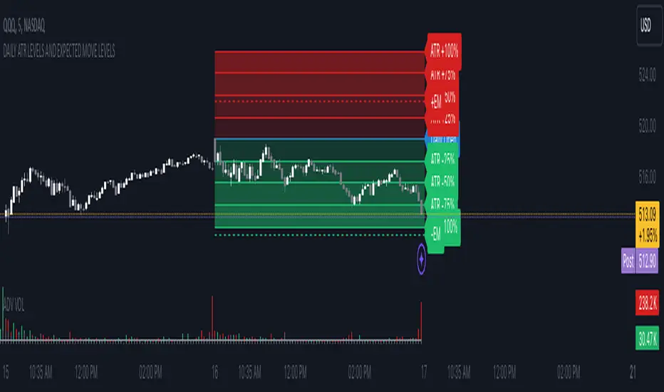
DAILY ATR LEVELS AND EXPECTED MOVE LEVELSThis Pine Script code is designed to visualize ATR (Average True Range) levels and expected move levels on a chart. It provides useful inputs for customizing how these levels are displayed, such as line width, style, and color. The script is divided into several sections, each focused on a different feature:
1. User Inputs for Customization:
- Line Width and Style: Users can customize the line width, style (solid, dotted, or dashed), and color for various levels.
- Offset for Line Placement: The rightOffset input controls how far in the future the lines extend (measured in minutes).
- Show Labels: Labels can be toggled on/off for ATR levels and expected move lines, with customizable text colors.
2. ATR Levels and ATR Settings:
- The ATR length (atrLength) and the multiplier (atrMultiplier) control the calculation of ATR levels.
- The script plots ATR levels based on the daily open price, including key levels like ATR +25%, ATR +50%, etc., for both positive and negative movements.
- Line Drawing: The script dynamically creates lines for each ATR level, and the lines are customized according to the user's inputs. For each level, the line.new function is used to plot a line from the start of the day (daily open) to a point offset in the future.
- Labels: Labels are added near each ATR level to make them more identifiable, such as "ATR +25%" or "Daily Open."
3. Expected Move Calculation and Logic:
- The script calculates the expected move for the next trading session based on the previous close price and the volatility derived from the VIX (Volatility Index).
- The expected move is calculated as a percentage of the previous close and is added and subtracted from the previous close price to generate upper and lower levels.
- Volatility Adjustment: The VIX value is adjusted by the square root of 252 (the number of average trading days in a year) to calculate the daily volatility.
- Upper and Lower Lines: Lines are drawn for the expected move's upper and lower bounds, showing the potential price movement based on volatility.
4. Customizable Expected Move Lines:
- Line Style and Color: The upper and lower expected move lines can be customized in terms of width, style, and color, as specified by the user.
- Labels for Expected Move Levels: Labels are added for the upper and lower expected move lines, such as "Expected Move Upper" and "Expected Move Lower."
5. Logic for Drawing Lines:
- The script continuously evaluates whether the levels should be displayed based on the user's preferences.
- If showATRLevels or showLineEM is enabled, the script will draw the respective lines and labels on the chart.
- It uses line.new to draw the lines and label.new to position the labels at the correct levels on the chart.
6. Handling Time and Line Deletion:
- The script handles the dynamic nature of the chart by deleting previous lines (using line.delete) to avoid cluttering the chart with outdated lines.
- The time for the lines is set dynamically using the startTime and endTime variables, ensuring that lines are drawn within the correct timeframe.
Summary of Key Features:
- ATR Levels: Plots key levels of ATR, such as daily open, ATR +25%, ATR -25%, etc., with customizable colors and line styles.
- Expected Move Levels: Calculates and plots the upper and lower bounds of the expected move based on the VIX and previous close price.
- Customization Options: Users can control the appearance (line width, style, color) and whether to show labels for the ATR and expected move levels.
- Dynamic Updates: The lines and labels update dynamically throughout the trading day, adjusting based on market conditions.
Overall, this script is designed to help traders visualize volatility and potential price movement on a daily chart by providing ATR-based levels and expected move projections. It offers a high degree of customization to suit different charting preferences.
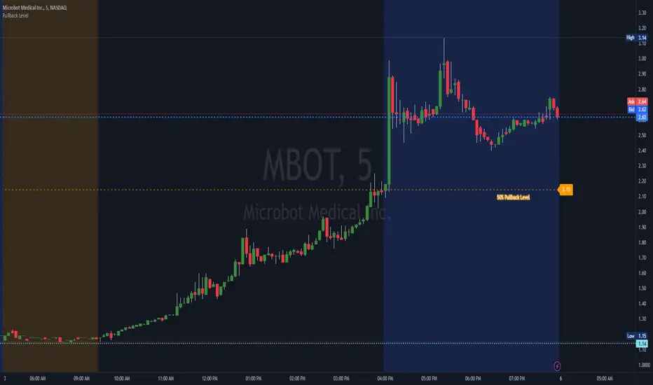
Custom Percent Pullback LevelThis script takes a stock's current day low and current day high and lets you set a custom pullback level (line and label on the chart) that you can then set an alert for or use as an indicator if the stock is still bullish or bearish.
Pullbacks can be useful for momentum runners to identify potential continuation. As a rule of thumb many people want to see that stock hold onto at least 33% of it's daily gain to continue a bullish look. Some people may want it to hold 50%, and others may want to see a certain amount of gains held through new highs.
This tool allows you to set a custom pullback level for that day so you can easily spot on the chart if the stock is nearing or falling below those levels. You can also set an alert for that level in order to get your attention.
Liquitive Buy/Sell Dollar AveragerLiquitive Buy/Sell Dollar Averager Indicator
The "Liquitive Buy/Sell Dollar Averager" is a versatile trading tool designed for intraday and multi-timeframe analysis, combining advanced range-bound calculations, RSI normalization, volume spikes, and candle pattern recognition to identify optimal buy and sell conditions. This indicator is particularly suitable for traders employing strategies that focus on dollar-cost averaging, position scaling, and systematic buy/sell decision-making.
Key Features:
Adaptive RSI-Based Levels:
Dynamically calculates inner bounds (IB) and outer bounds (OB) using RSI and price ranges, helping to identify overbought and oversold conditions relative to the price action.
Normalizes RSI values to the price range for seamless visualization overlaid on the chart.
Volume and Candle Analysis:
Detects significant volume spikes relative to a moving average, signaling increased market activity.
Identifies spiking green/red candles to capture momentum-driven price movements.
Dynamic Support and Resistance:
Calculates and plots support and resistance levels based on recent swing highs and lows.
Median and boundary lines help visualize key price levels for decision-making.
Profitability Check:
Buy and Sell Signals:
Checks profitability thresholds based on percentage gains/losses.
Incorporates logic for "time to buy" and "time to sell" using target profit margins.
Implements average move percentage to define realistic thresholds for buy/sell actions.
Time-Based Trading Restrictions:
Configures trading logic to disallow trades after a specific time (e.g., 3:40 PM for intraday sessions).
Ensures logical entry and exit decisions are only made within active trading hours.
Color-Coded Visualization:
Background colors dynamically shift between green (bullish), red (bearish), and neutral, depending on RSI and price position relative to the inner bounds.
Opacity of the background adjusts based on normalized RSI differences to provide a visual cue of market strength.
Customizable Parameters:
Allows user input for key settings like lookback periods, RSI length, percent ranges, volume thresholds, and transparency levels, enabling flexible configuration tailored to individual strategies.
Actionable Alerts and Signals:
Plots "Open Position", "Add to Position", and "Close Position" markers directly on the chart, making it easy to follow systematic trading rules.
How It Works:
Buy Signals:
Triggered when price conditions, volume spikes, and RSI-based thresholds align with profitability metrics.
Designed for dollar-cost averaging, identifying opportunities to add to long positions or open new positions.
Sell Signals:
Evaluates profitability conditions to identify when to close or scale out of positions.
Incorporates real-time evaluation of market momentum and profitability.

Premarket and Opening Range (First 30 minutes) LevelsThis indicator is for people who like to utilize the pre-market highs and pre-market Low's as well as the first 30 minutes high and low, or some people like to call the opening range. I hope you find value in this. Note, the levels will only appear after tracking. Premarket levels will happen after pre-market closes. Opening Range levels will show right after the first 30 minutes.

Multi-Timeframe Liquidity LevelsMulti-Timeframe Liquidity Levels – Overview
The Multi-Timeframe Liquidity Levels indicator automatically displays significant highs and lows from various timeframes (Daily, Weekly, Monthly, and Quarterly) on your current chart. This allows traders to quickly identify potential support and resistance zones without frequently switching between different timeframe charts. Additionally, the script offers extra lines for special reference points (e.g., the “Midnight” midpoint of the current day and the previous day’s open/close) to highlight potential liquidity zones even more clearly.
1. Core Idea and Benefits
Time-Saving: Instead of manually reviewing charts in different timeframes, the indicator fetches relevant high/low levels automatically and shows them on your active timeframe.
Clear Layout: Traders instantly see where the Daily, Weekly, Monthly, and Quarterly highs and lows lie—areas often associated with institutional orders or liquidity hunts.
Customizable: You can tailor the color scheme, line style (Solid, Dashed, Dotted), and line width, ensuring the displayed levels fit your personal charting style.
2. How It Works
Multi-Timeframe High/Low
For each timeframe (Day, Week, Month, Quarter), the indicator references the previous candle’s high and low (high , low ).
Using request.security(...), these values are plotted on the chart you’re currently viewing.
Flexible Display
You can individually enable or disable the Daily, Weekly, Monthly, and Quarterly lines, depending on which levels are most relevant to your trading.
With Line Style (Solid, Dashed, Dotted) and Line Width, you can easily emphasize certain lines you consider more important.
Additional Lines
“Midnight” Line: A theoretical midpoint between today’s high and low, which can be useful for gauging daily pivot areas.
Previous Day’s Open/Close: Many traders track these reference points to anticipate market reactions. You can show or hide these lines as desired.
Automatic Line Removal & Creation
When a particular timeframe (e.g., “Show Monthly Levels”) is disabled, the script automatically removes the existing monthly lines.
Enabling it again recreates those lines without hassle.
3. Usage and Interpretation
Identifying Support and Resistance
Highs and lows from higher timeframes are often key zones for entries, exits, or major market reactions.
A Daily level may be crucial for short-term traders, whereas Monthly or Quarterly levels can indicate long-term liquidity areas.
Spotting Market Shifts
If price decisively moves above a Higher-Timeframe line, it could signal strong momentum.
Conversely, a failed breakout (where price quickly returns under or above a level) might warn of a potential reversal.
Extra Lines as Filters
The “Midnight” Line helps visualize a rough central price for the current day, aiding in intraday directional bias.
Previous Day’s Open/Close: Common reference points for day traders, where swift approaches and rejections can indicate potential entries or partial take-profit zones.
4. Practical Tips
Use Color-Coding Wisely: Assign distinct colors (e.g., Blue for Daily, Green for Weekly, Orange for Monthly, Purple for Quarterly) so you can easily discern which timeframe you’re looking at.
Toggle On/Off As Needed: Day traders might focus on Daily and Weekly, while long-term traders may pay closer attention to Monthly and Quarterly.
Combine with Price Action: Lines alone don’t constitute a trading strategy. Use them alongside candlestick patterns, volume analysis, or other indicators for a more complete market perspective.
5. Important Notes & Recommendations
Not Financial Advice: This indicator simply reflects historical high/low data across multiple timeframes and does not constitute a buy or sell recommendation.
Trader Responsibility: Observe how the market actually behaves around these lines and adapt your risk management accordingly.
Levels Strength Index [BigBeluga]Levels Strength Index provides a unique perspective on market strength by comparing price positions relative to predefined levels, delivering a dynamic probability-based outlook for potential up and down moves.
🔵 Idea:
The Levels Strength Index analyzes the price position against a series of calculated levels, assigning probabilities for upward and downward movements. These probabilities are displayed in percentage form, providing actionable insights into market momentum and strength. The color-coded display visually reinforces whether the price is predominantly above or below key levels, simplifying trend analysis.
🔵 Key Features:
Dynamic Probability Calculation: The indicator compares the current price position relative to 10 predefined levels, assigning an "Up" and "Down" percentage. For example, if the price is above 8 levels, it will display 80% upward and 20% downward probabilities.
Color-Coded Trend Visualization: When the price is above the majority of levels, the display turns green, signaling strength. Conversely, when below, it shifts to orange, reflecting bearish momentum.
Clear Up/Down Probability Labels: Probabilities are displayed with directional arrows next to the price, instantly showing the likelihood of upward or downward moves.
Probability-Based Price Line: The price line is color-coded based on the probability percentages, allowing a quick glance at the prevailing trend and market strength. This can be toggled in the settings.
Customizable Transparency: Adjust the transparency of the levels to seamlessly integrate the indicator with your preferred chart setup.
Fully Configurable: Control key parameters such as the length of levels and price color mode (trend, neutral, or none) through intuitive settings.
🔵 When to Use:
The Levels Strength Index is ideal for traders looking to:
Identify strong upward or downward market momentum using quantified probabilities.
Visualize price strength relative to key levels with intuitive color coding.
Supplement existing level-based strategies by combining probabilities and market positioning.
Gain instant clarity on potential market moves with percentage-based insights.
Whether you're trading trends or ranges, this tool enhances decision-making by combining level-based analysis with a dynamic probability system, offering a clear, actionable perspective on market behavior.

Support and Resistance Non-Repainting [AlgoAlpha]Elevate your technical analysis with the Non-Repainting Support and Resistance indicator from AlgoAlpha. Designed for traders who value precision, this tool highlights key support and resistance zones without repainting, ensuring reliable signals for better market decisions.
Key Features
🔍 Concise Zones: Identifies critical levels in real-time without repainting.
🖍 Customizable Appearance: Choose your preferred colors for bullish and bearish zones.
📏 Pivot Sensitivity Settings: Adjust the lookback period to fit different market conditions.
🔔 Visual Alerts: Highlights zones on your chart with clear, dynamic boxes and lines.
How to Use
Add the Indicator : Add it to your favorites chart by clicking the star icon. Adjust the lookback period, max zone duration, and colors to match your strategy.
Analyze the Chart : Look for zones where prices frequently react, indicating strong support or resistance.
Set Alerts : Enable notifications for new zone formations and zone invalidations, ensuring you never miss critical market moves.
How It Works
The indicator detects pivot highs and lows using a specified lookback period. When a pivot is confirmed, it draws corresponding support or resistance zones using TradingView’s built-in drawing tools. These zones extend until price breaks through them or they expire based on a maximum allowed duration. The indicator continuously checks if price interacts with any active zones and adjusts accordingly, ensuring accurate and real-time visualization.
