How to configure your Supercharts
Chart settings help you fine-tune your charts to match your trading style. With settings, you can adjust the look, type, visual elements, price scale, and more to create the perfect setup.
This guide will help you better understand each of the chart settings.
- How to access Supercharts' settings
- Symbol
- Status line
- Scales and lines
- Canvas
- Trading
- Alerts
- Events
- More price scale settings
- Template
Additionally, we'll look at four price scale types and their differences.
How to access Supercharts' settings
To access chart settings, find the gear button on the upper toolbar or at the bottom of the chart. You can also double-click on the price line or bars to access the setting window.

Let's take a look at what you can customize here.
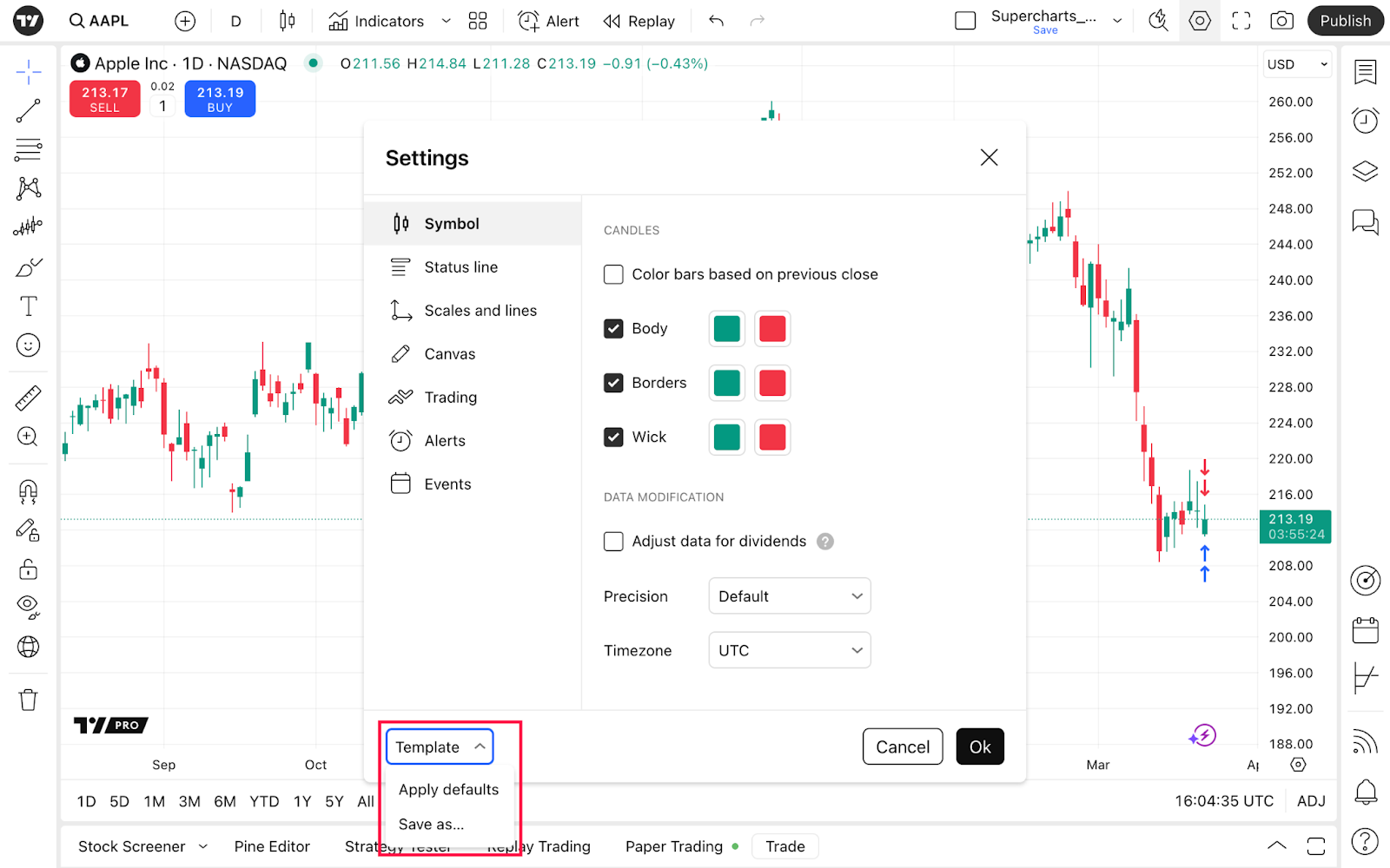
Symbol
This menu automatically adjusts to the chart type you're using and lists settings specific to each type. Generally, here you can choose your chart's look — adjust colors, opacity, width, and other parameters.
Then there's the Data modification section where you can manage the data you see.
- For stocks and funds, select a session (pick regular or extended hours)
- For futures, adjust data for contract changes (allows back-adjustment in continuous futures to remove the price gap)
- For dividends, adjust data if you want more precise charts that account for a company's dividends distribution as it can greatly impact the chart's outlook.
- For precision, choose the price format to display on the price scale and in values near the symbol's status line.
- For timezone, adjust and pick the time you want. You can set a particular timezone or choose "Exchange" so that the chart will automatically switch to this exchange's time.

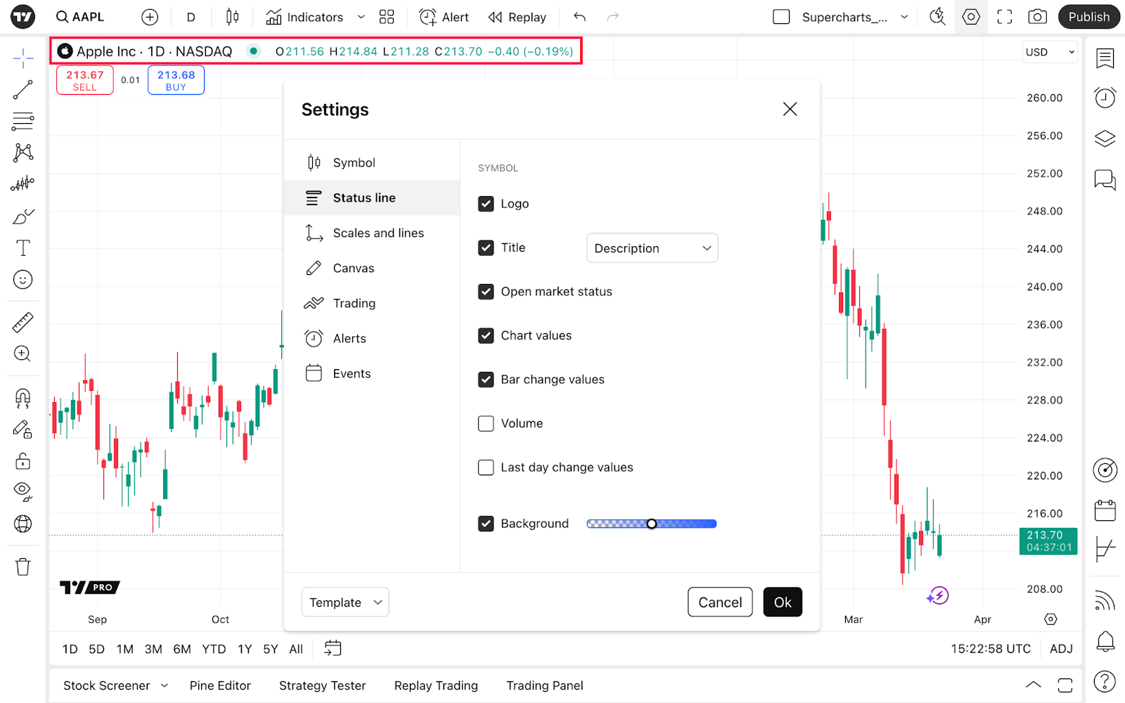
Status line
Here, you can set the info to display next to the symbol's ticker — logo, title, chart values, and more. Try turning on/off each of them to see the results.
Scales and lines
Here, you can choose what labels and values will be displayed on the price and time scales. There are three main sections.
- Price scale. Set the currency and unit visibility, scales mode, price to bar ratio lock, and scales position.
- Price labels and lines. Configure labels overlapping, price button to create alerts, countdown to bar close, as well as symbol values, high/low, and other values format, visibility, and colors.
- Time scale. This section allows you to display weekdays, choose date and hours format, and also pin chart to the left when changing intervals.

Canvas
In this tab, you can add some style to your chart. To make it easier for you to use, it's separated into four sections.
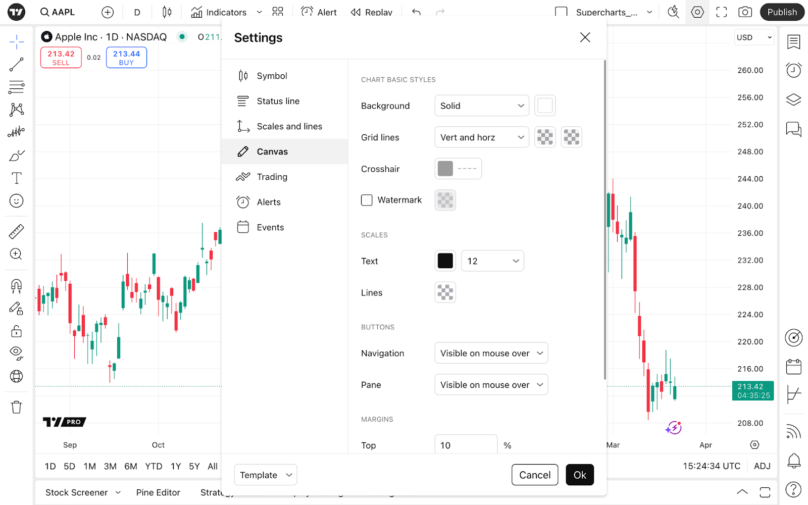
Chart basic styles
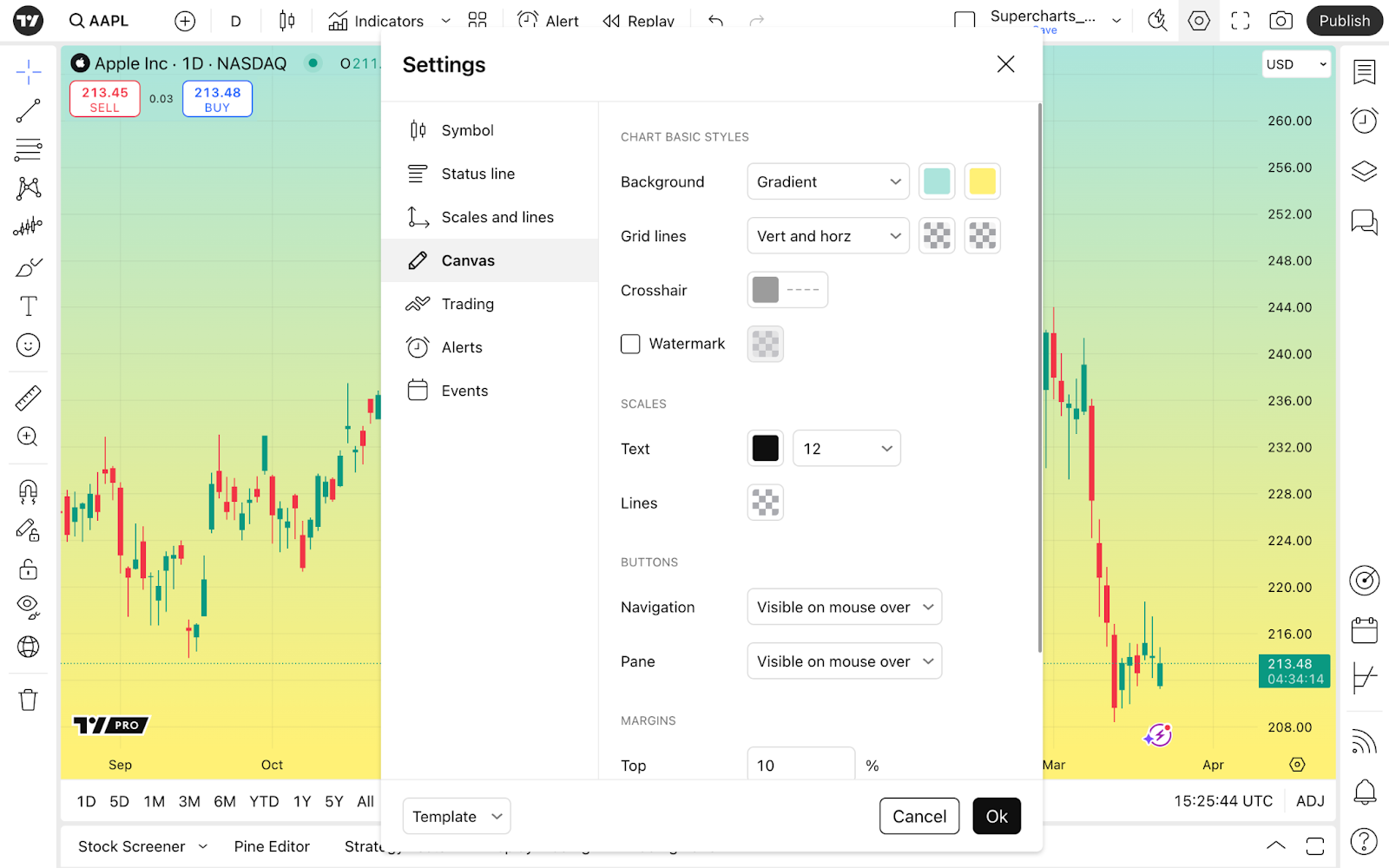
Here, choose the background color and set it for solid or gradient.
You can also choose which grid lines you want to see: vertical only, horizontal only, vertical and horizontal together, or none. Choose their colors and opacity for more customization.
If you choose an indicator, the Pane separator setting will appear. Pane separator — it is the line between the price part of the chart and indicators. You can set this line's colors and opacity as well.
For Crosshair, that follows your cursor, you can set its color and opacity as well as your preferred thickness and style.
Watermark displays the chosen symbol and time interval. Here, available settings are colors and opacity as well.

Scales
Scales are located to the right and at the bottom of the chart. Choose a scale for the text size that works for you. For better visibility, try changing colors for both text and lines.
Buttons
Here you can set the visibility of navigation and panel buttons.
Navigation buttons are located at the bottom of the chart. They help you zoom in or out, scroll to the left or to the right, or reset the chart view.
Pane buttons allow you to manage chart panes — move them up and down, collapse, maximize, and remove them.

Margins
This section allows you to choose the distance between the price line and the upper, bottom, or right edges of the chart.
Trading
In this tab, you can prepare your chart for placing orders and retrieving information from them. It is separated into two sections — General and Appearance. In General, you can select the display of buttons and notification sounds. Various chart customizations in Appearance will help you get more information about your trades from labels on the price scale and next to it.

General
Here, you can choose to display buy and sell buttons, which allow you to easily place orders by the market price.
Then you can select Instant order placement for the quantity window to emerge between the buy and sell buttons. From there, you will be able to choose the amount of the asset you want to trade.
! Note: The instant order placement window will appear only if your broker is connected.

In Play sound for executions, you can choose the sound you'd like to play when your order is executed.
In Notifications, you can go for the events that you want to be notified about. If you choose "Rejection only," you will not get any notification besides for the rejected orders. Choose "All events" and you will get notifications for all of them, like for the filled ones, placed, and other.
Appearance
Tick Positions, then choose Profit & loss, if you want to see your position price changes right on the chart. Choose the value for the position change in money, ticks, or percents.
! Note: choosing percent will display the percent changes in price rather than the actual percent gains or loss for the position. For example, placing the order with x2 leverage means that with 1% price change you get 2% profits or loss. However, the value here will still be displayed as 1%.
Then goes the Reverse button on hover, which appears when you hover your cursor over the price change values. This allows you to instantly reverse your position. This function can be used for high volatility markets and scalping trading strategies, when you don't have time to fill in the order's details and need them executed instantly.

Enable Orders if you want to see your open order's values for this particular symbol.
With Brackets profit & loss you can choose the values for your orders to be displayed in money, ticks, or percents.
Executions are displayed as red arrows for executed sell orders and as blue arrows for executed buys.
Execution labels are price values of such orders appearing near the price scale.
Extended price line for positions and orders can help you with identifying price levels.
With Orders and position alignment you will choose the placement for the labels for right, left, or center.
Enable Orders, Executions, and Positions on screenshots if you want these values to be seen on your screenshots.
Alerts
Here you can manage how alerts are displayed on the chart. These are the settings only for the alerts' appearance. Explore our knowledge base to learn more about TradingView alerts and how they function.
Back to the chart's settings, choose the color for the Alert lines and turn on Only active alerts, if you don't need the expired ones or those that are not active to disturb you from the analysis.
Toggle the Alert volume to change the alerts' volume level.
Enable Automatically hide toasts, so the pop-up alert notifications will hide automatically after 20 seconds.

Events
This section gives you an overview of the community ideas and upcoming corporate events, such as dividends, stock splits, and earnings and revenue reports.
Ideas are displayed near the price line and colored in green, red, and orange colors according to the bullish, bearish, or neutral sentiment of the idea. Make sure to read our House rules to stay informed about the TradingView policy on publications.
Dividends display the company's payments to its shareholders for each stock investors hold. This can vary significantly from cents to dollars, or there could be none.
During stock splits the company issues and distributes new shares and reduces the price of the current shares according to the split ratio.
Example: There're a million stocks of the XYZ company at $1,000 per stock. The total stock value of XYZ is one billion dollars. XYZ decides on a 10:1 stock split. After such a split, the total amount of XYZ shares will increase 10 times to 10 million, while a single share price will be reduced 10 times — to $100. The total stock value remains at one billion dollars.
As stocks are purchased through the authorized brokers, additional stocks are automatically added to the investors portfolio. After a 10:1 split, for every share held, investors get 9 additional shares.
With earnings, you will get access to report dates, estimated and reported revenue, and more. Click the More financials button to head to the financials on that symbol.
Turning on the Earnings break will plot the line from the events labels on the date scale up for enhanced visibility.
The latest news has a purple-colored lightning-like appearance. There, read the fact of the day for that symbol and easily access News flow.

Turn on News notifications to be timely informed in trading's fast-paced environment.
More price scale settings
As we mentioned, another way to access settings is the gear button at the bottom of the price scale — click "More settings…" to open the window we've just described.
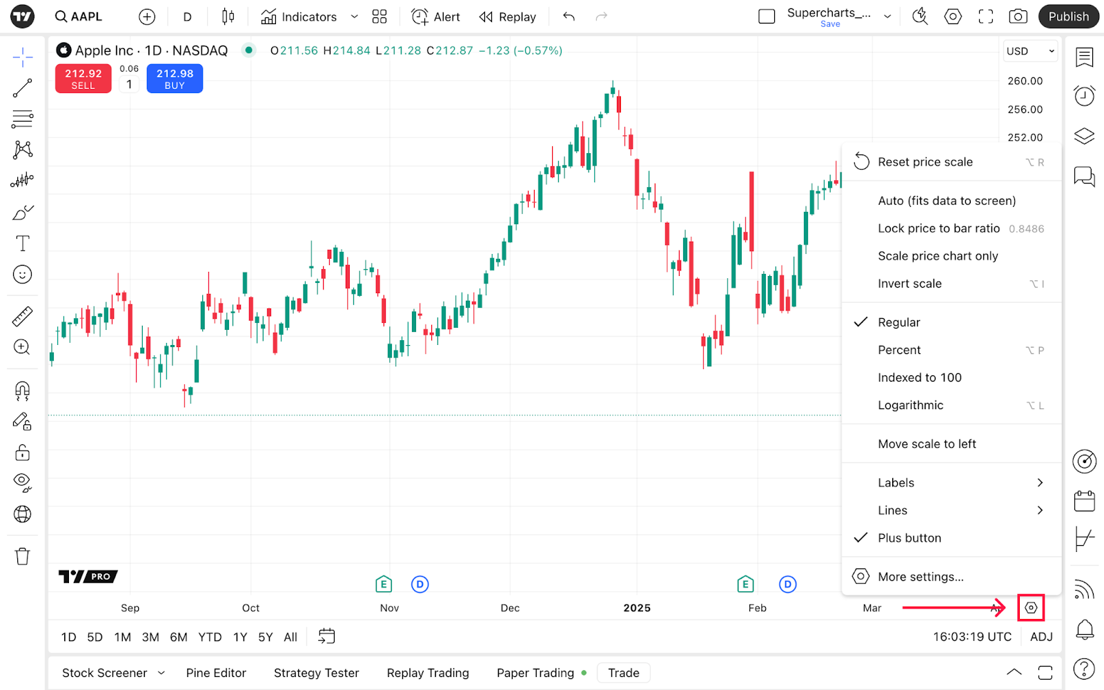
What's new here is different scale settings, each used for completely different purposes.
- Reset price scale automatically adjusts the price line to the screen size, and turns on the Auto mode, which fits data to your screen.
- Scale price chart only will disable scaling of indicators or other chart elements.
- By inverting the scale, you change the relation of assets.
Example: AAPL is the symbol for the proportion of Apple stocks to the US dollar. Inverting the scale for AAPL would mean that now you see the proportion of the US dollar to Apple stocks.
Then follow four types of price scales. Each of them uses different methods of measuring the distance between price levels on the Y-axis.
- Regular. A linear scale that uses absolute values in price changes to plot the price line. The distance between $40 and $80 on such a scale would be the same as between $400 and $440. However, these are completely different opportunities for investors.
- Percent. A linear scale that uses percentage values in price changes to plot the price line. Each price change here is represented by a fixed distance from the chart's starting point.
- Indexed to 100. This scale is perfect for comparing completely different values that might seem incomparable. The first value here on the chart is set to 100. To calculate the following values, we add the percentage change of each symbol relative to the first value to 100.
- Logarithmic. It is an exponential scale that uses percentage changes in price to plot the price line. Here, spacing between $40 and $80 would be ten times larger than between $400 and $440, because it would represent 100% and 10% increases respectively.
Beware: turning off logarithmic scale returns the chart to the regular price scale even if the previously chosen was Percent or Indexed to 100.
Then in settings, you can choose either the left or right side for the scale on the chart.
In Labels and Lines, choose the information you want to see on the chart.
Template
You can always save your chart settings and change them promptly through this menu.
Note: chart settings can differ when it comes to the chart type and symbol. Symbol section changes according to the chart type you choose, and corporate events like stock splits are impossible for Bitcoin.
After you learn how to configure your chart, also read other articles to master your analysis and trading.