Anchored VWAP - RTH + ON + Previous VWAPRegular trading hours Anchored VWAP, Overnight Anchored VWAP, and Prior Day VWAP as Price Level
Объем

Anchored VWAP - RTH + ON + Previous VWAPCash Session Anchored VWAP, Overnight Anchored VWAP, and Prior Day VWAP as a price level

📊 Wyckoff - Spring + UT + Khang cu//@version=5
indicator("📊 Wyckoff - Spring + UT + Khang cu", overlay=true)
// === Tham so nguoi dung ===
lookback = input.int(50, "Tim ho tro/khang cu trong X nen", minval=5)
rangePerc = input.float(0.005, "Nguong gan ho tro/khang cu (%)", step=0.001)
volMultiplier = input.float(1.5, "Nguong Volume cao", step=0.1)
wickRatio = input.float(2.0, "Ty le bong/than", step=0.1)
avgVolLength = input.int(20, "So nen tinh volume trung binh", minval=1)
showLabel = input.bool(true, "Hien thi nhan")
showResLine = input.bool(true, "Hien thi duong khang cu")
// === Tinh toan volume va vung gia ===
avgVol = ta.sma(volume, avgVolLength)
resistance = ta.highest(high, lookback)
support = ta.lowest(low, lookback)
candleBody = math.abs(close - open)
upperWick = high - math.max(open, close)
lowerWick = math.min(open, close) - low
// === Phat hien UpThrust (UT) ===
isNearRes = high >= resistance * (1 - rangePerc)
isUT = upperWick > wickRatio * candleBody and close < open and volume > avgVol * volMultiplier and isNearRes
// === Phat hien Spring ===
isNearSup = low <= support * (1 + rangePerc)
isSpring = lowerWick > wickRatio * candleBody and close > open and volume > avgVol * volMultiplier and isNearSup
// === Hien thi nhan tren bieu do ===
plotshape(isUT and showLabel, title="UT", location=location.abovebar, color=color.red, style=shape.labeldown, text="UT", textcolor=color.white)
plotshape(isSpring and showLabel, title="Spring", location=location.belowbar, color=color.green, style=shape.labelup, text="Spring", textcolor=color.white)
// === To mau nen: do cho UT + Spring, xam cho nen khac ===
barcolor(isUT or isSpring ? color.rgb(255, 0, 0) : color.new(color.gray, 60))
// === Ve duong khang cu ===
var line resLine = na
if (showResLine)
if na(resLine)
resLine := line.new(x1=bar_index, y1=resistance, x2=bar_index + 1, y2=resistance, extend=extend.right, color=color.orange, style=line.style_dashed)
else
line.set_xy1(resLine, bar_index, resistance)
line.set_xy2(resLine, bar_index + 1, resistance)

订单流轨迹自动交易脚本《订单流交易》一书系统性地介绍了订单流(Order Flow)这一市场分析方法,强调通过分析市场中每一价位的主动买卖单量,捕捉供需力量的变化,从而预判价格趋势的延续或反转。以下是核心内容提炼:
1. 订单流的核心概念
订单流定义:通过实时追踪每个价位的主动买单和卖单成交量,揭示市场供需力量的动态平衡。与传统K线图(仅显示开盘、收盘、最高、最低价)不同,订单流深入价格内部,展示买卖双方的博弈细节。
关键指标:
Delta:单根K线内主动买单总量减去主动卖单总量的差值,反映多空力量强弱。
POC(成交量最大价位):K线内部成交量最大的价格点,揭示多空争夺的核心区域。
失衡现象:当某一价位的主动买单量显著高于卖单(需求失衡)或反之(供应失衡),阈值通常设为3:1。
堆积失衡:连续多个价位出现供需失衡,形成支撑/阻力带。
2. 订单流的优势
实时性:直接反映市场当下行为,而非滞后指标(如MACD、RSI)。
识别主力动向:通过大单、微单、被套交易者等信号,捕捉机构或主力资金的痕迹。
大单:顶部/底部成交量显著高于相邻价位,表明主力介入。
微单:顶部/底部成交量骤减,显示趋势末端力量衰竭。
被套交易者:趋势末端大量反向成交,导致价格反转(如顶部放量却无法突破)。
3. 订单流的分析方法
价格与成交量结合:
健康上涨:伴随主动买单递增,Delta为正且放大。
弱势反转:顶部出现需求失衡但价格回落,或底部供应失衡却未创新低。
关键价位的应用:
支撑/阻力:通过前日高低点、VWAP(成交量加权平均价)、月线级别高低点等判断。
突破与回踩:价格突破关键位后回踩确认,结合订单流验证有效性。
4. 交易策略与实战应用
高胜率信号:
顶部/底部微单:趋势末端成交量萎缩,预示反转(如顶部主动买单骤减)。
失衡堆积:连续失衡形成支撑/阻力带,回踩时入场。
吸收与主动出击:价格在区间内震荡(吸收)后突破,伴随成交量放大。
资金管理与心理:
止损设置:基于失衡区间或关键价位,控制单笔亏损(如1-2跳)。
空仓纪律:无明确信号时保持观望,避免过度交易。
5. 与传统技术的对比
K线图的局限:无法展示价格内部成交细节,仅依赖形态(如十字星、吞噬)易被误导。
订单流的独特性:通过微观成交数据,识别市场情绪(如恐慌性抛售或贪婪追涨),避免“看图说话”的滞后性。
6. 适用场景与市场
高流动性市场:期货、股指、外汇等,需足够成交量支撑订单流分析。
日内与波段交易:短周期(如15分钟)捕捉供需突变,长周期验证趋势强度。
总结
订单流的核心在于通过实时成交数据,理解市场参与者的行为逻辑,从而在趋势启动初期或反转前捕捉机会。它并非预测工具,而是通过供需力量对比,为交易决策提供客观依据。结合严格的资金管理和心理纪律,订单流能显著提升交易的胜率与盈亏比。
**"Order Flow Trading"** systematically introduces the market analysis method of **Order Flow**, emphasizing the capture of supply-demand dynamics by analyzing active buy/sell volumes at each price level to anticipate trend continuations or reversals. Below is a distilled summary of the core concepts:
---
### **1. Core Concepts of Order Flow**
- **Definition**:
Order Flow tracks real-time active buy/sell volumes at each price level, revealing the dynamic balance between supply and demand. Unlike traditional candlestick charts (which only show open, close, high, and low prices), Order Flow dives into price internals, exposing the battle between buyers and sellers.
- **Key Metrics**:
- **Delta**: The difference between total active buy volume and sell volume within a single candlestick, reflecting bullish/bearish strength.
- **POC (Point of Control)**: The price level with the highest volume in a candlestick, indicating the focal point of buyer-seller conflict.
- **Imbalance**: Occurs when buy volume significantly exceeds sell volume (**demand imbalance**, threshold ~3:1) or vice versa (**supply imbalance**).
- **Cumulative Imbalance**: Consecutive price levels with imbalances, forming support/resistance zones.
---
### **2. Advantages of Order Flow**
- **Real-Time Insight**: Reflects immediate market behavior, unlike lagging indicators (e.g., MACD, RSI).
- **Identifying Institutional Activity**: Detects "smart money" footprints through signals like:
- **Large Orders**: Unusually high volume at tops/bottoms, signaling institutional participation.
- **Micro Orders**: Abrupt volume drops at trend extremes, indicating exhaustion.
- **Trapped Traders**: Reversals triggered by countertrend volume surges (e.g., failed breakouts with high sell volume).
---
### **3. Analytical Techniques**
- **Price-Volume Integration**:
- **Healthy Rally**: Rising buy volume with expanding positive Delta.
- **Weak Reversal**: Demand imbalance at tops with price rejection, or supply imbalance at bottoms without new lows.
- **Key Price Levels**:
- **Support/Resistance**: Identified via prior highs/lows, VWAP (Volume-Weighted Average Price), or monthly levels.
- **Breakout & Retest**: Validate breakouts using Order Flow after price retests key levels.
---
### **4. Trading Strategies & Execution**
- **High-Probability Signals**:
- **Micro Orders at Extremes**: Volume drying up at tops/bottoms signals reversals.
- **Cumulative Imbalance Zones**: Enter on pullbacks to stacked imbalance areas.
- **Absorption & Breakouts**: Post-consolidation breakouts with volume expansion.
- **Risk & Psychology**:
- **Stop Loss**: Set 1-2 ticks outside imbalance zones or key levels.
- **Flat Discipline**: Avoid overtrading; act only on clear signals.
---
### **5. Order Flow vs. Traditional Analysis**
- **Candlestick Limitations**: Reliance on patterns (e.g., doji, engulfing) often leads to false signals due to missing internal price data.
- **Order Flow Edge**: Leverages granular trade data to detect market sentiment (e.g., panic selling or FOMO buying), avoiding lagging "chart storytelling."
---
### **6. Applicable Markets & Timeframes**
- **High-Liquidity Markets**: Futures, indices, forex (sufficient volume for Order Flow analysis).
- **Timeframes**:
- **Intraday/Swing**: Short-term (e.g., 15min) for sudden supply-demand shifts.
- **Long-Term**: Validate trend strength on higher timeframes (e.g., daily).
---
### **Summary**
Order Flow focuses on interpreting real-time transactional data to decode market participant behavior, capturing opportunities at trend inception or reversal points. It is not a predictive tool but a framework for objective decision-making through supply-demand analysis. Combined with strict risk management and psychological discipline, Order Flow enhances trade accuracy and profit potential.

🔍 Phat hien Spring Wyckoff (hien thi sau 1 nen)//@version=5
indicator("🔍 Phat hien Spring Wyckoff (hien thi sau 1 nen)", overlay=true)
// === Tham so nguoi dung ===
lookbackSupport = input.int(50, "Tim ho tro trong X nen", minval=5)
volumeLookback = input.int(20, "So nen tinh volume trung binh", minval=1)
volMultiplier = input.float(1.5, "Nguong volume cao bat thuong", step=0.1)
showSupportLine = input.bool(true, "Hien thi duong ho tro")
// === Tim day gan nhat lam ho tro ===
lowestLow = ta.lowest(low, lookbackSupport)
// === Tinh volume trung binh ===
avgVol = ta.sma(volume, volumeLookback)
// === Dieu kien Spring (o cay nen hien tai) ===
isSpringNow = low < lowestLow and close > lowestLow and volume > avgVol * volMultiplier
// === Tri hoan tin hieu 1 nen de hien thi chu o cay ke tiep ===
isSpringPrev = isSpringNow
// === Hien thi chu "Spring" o cay nen ke tiep ===
plotshape(isSpringPrev, style=shape.labelup, location=location.belowbar, color=color.green, size=size.small, text="Spring", textcolor=color.white)
// === Ve duong ho tro mau tim, dam ===
plot(showSupportLine ? lowestLow : na, title="Ho tro", color=color.purple, linewidth=2, style=plot.style_line)

Session Aware VWAPEver Wonder Why Sessions Feel So Different?
London’s caffeine rush kicks in at 07:00 UTC, New York brings its own energy at 13:00 UTC, and Asia’s quiet mornings can suddenly roar. Each session has its own heartbeat, and this indicator traces it with precision, painting VWAP and its bands only when a session’s live. It’s like tuning into different radio stations, just with price action.
Spotlight on the Main Features
Deviation Multiplier & ATR Length
Tweak a 1.5× ATR band, tighten it for calm markets, loosen up when volatility spikes.
Volume Spike Filter
Flags those “wait, did you see that?” moments when volume suddenly jumps.
Trend EMA + Buffer
A 50‑period EMA with half an ATR buffer—filters noise but still catches real momentum.
Session Boxes & Debug Mode
Shaded session boundaries keep you oriented; debug mode if you love a bit of chart clutter.
Here’s the Thing: How It Works
Reset VWAP at each session start (fresh sum of price×volume & volume).
Calculate upper and lower bands using ATR×deviation multiplier.
Plot only during its session—London lines vanish when New York takes over, and so on.
Putting It to Work: Real‑World Tips
Quick Scalps: When price snaps above the lower band on a volume spike during London overlap, you might grab a quick tick or two.
Trend Confirmation: If price stays above the EMA buffer across sessions, lean into longs. If it dips below, maybe pause and grab coffee.
Dodge False Breakouts: Built‑in 5‑bar cooldown helps you ignore that one‑off fake‑out.
Ready to Give It a Spin?
Try it on EUR/USD or GBP/JPY, then drop your setups below let’s learn out loud.

30 Normalized Price with LimitsThis indicator shows the normalized price of the top 30 NASDAQ companies.
The main purpose of the indicator is to identify which company is primarily driving the NASDAQ and to anticipate the market using the information we have.
This indicator is designed to be used in combination with other similar ones I’ve published, which monitor the RSI, CCI, MACD, etc., of the top 30 NASDAQ companies.

30 Prezzi Normalizzati (Daily Reset)This indicator shows the normalized price of the top 30 NASDAQ companies. Like the previous one, its main use is to identifying which company is primarily driving the NASDAQ and in anticipating the market using the information at our disposal. The difference between this indicator and others is that the price is anchored to a common starting point for all companies, offering a clearer view of the market's opening dynamics.
This indicator is designed to be used in combination with other similar tools I’ve published, which track the RSI, CCI, MACD, etc.., of the top 30 NASDAQ companies

Pelosi Kenobi LevelsThe Pelosi Kenobi Levels Indicator is a sophisticated PineScript v6 tool designed for TradingView to assist traders in identifying key price levels and market dynamics across multiple timeframes. It integrates several technical analysis components, including:
High, Low, and 50% Retracement Levels: Displays current and previous day, week, and month high, low, and 50% retracement levels, with customizable display options for standard, non-standard, and rolling calculations.
Liquidity Clusters: Visualizes bullish and bearish liquidity zones using three-tiered boxes (b1, b2, b3) based on volume and price proximity to significant retracement levels, helping traders spot areas of potential support or resistance.
Cumulative Delta Heatmap: Shows cumulative volume delta as a heatmap, indicating buying or selling pressure, with customizable reset periods (e.g., daily, weekly, custom).
Anchored VWAP (AVWAP): Plots a multi-timeframe anchored Volume Weighted Average Price, reset on new timeframe bars, to highlight price areas where significant trading volume has occurred.
YaGA Retracement Index: Provides a table scoring bullish and bearish strength based on the proximity of price to key levels, aiding in trend assessment.
Opening Range Fib50 (OR31FIB50 and ORCUSTOMFIB50): Plots high, low, and 50% retracement levels for 31-minute or custom-minute opening ranges, useful for intraday trading strategies.
Custom Levels: Allows traders to define their own price levels for additional reference points.
How It Helps Traders:
Market Structure Insight: Identifies critical support/resistance zones through highs, lows, and retracements, enabling traders to anticipate price reactions.
Liquidity Detection: Liquidity clusters highlight areas where large orders may be placed, useful for entry/exit timing or stop placement.
Trend and Momentum Analysis: The delta heatmap and YaGA index provide real-time insights into buying/selling pressure and trend strength, aiding in directional bias.
Intraday Precision: Opening range levels help scalpers and day traders target breakouts or reversals during high-volatility periods.
Customization: Extensive input options allow traders to tailor the indicator to their preferred timeframes, visual styles, and trading strategies, enhancing adaptability across markets (e.g., stocks, forex, crypto).
This indicator is particularly valuable for technical traders seeking a comprehensive, visually intuitive tool to combine price action, volume analysis, and market sentiment for informed decision-making.

Volume Range Profile with Fair Value (Zeiierman)█ Overview
The Volume Range Profile with Fair Value (Zeiierman) is a precision-built volume-mapping tool designed to help traders visualize where institutional-level activity is occurring within the price range — and how that volume behavior shifts over time.
Unlike traditional volume profiles that rely on fixed session boundaries or static anchors, this tool dynamically calculates and displays volume zones across both the upper and lower ends of a price range, revealing point-of-control (POC) levels, directional volume flow, and a fair value drift line that updates live with each candle.
You’re not just looking at volume anymore. You’re dissecting who’s in control — and at what price.
⚪ In simple terms:
Upper Zone = The upper portion of the price range, showing concentrated volume activity — typically where selling or distribution may occur
Lower Zone = The lower portion of the price range, highlighting areas of high volume — often associated with buying or accumulation
POC Bin = The bin (price level) with the highest traded volume in the zone — considered the most accepted price by the market
Fair Value Trend = A dynamic trend line tracking the average POC price over time — visualizing the evolving fair value
Zone Labels = Display real-time breakdown of buy/sell volume within each zone and inside the POC — revealing who’s in control
█ How It Works
⚪ Volume Zones
Upper Zone: Anchored at the highest high in the lookback period
Lower Zone: Anchored at the lowest low in the lookback period
Width is user-defined via % of range
Each zone is divided into a series of volume bins
⚪ Volume Bins (Histograms)
Each zone is split into N bins that show how much volume occurred at each level:
Taller = More volume
The POC bin (Point of Control) is highlighted
Labels show % of volume in the POC relative to the whole zone
⚪ Buy vs Sell Breakdown
Each volume bin is split by:
Buy Volume = Close ≥ Open
Sell Volume = Close < Open
The script accumulates these and displays total Buy/Sell volume per zone.
⚪ Fair Value Drift Line
A POC trend is plotted over time:
Represents where volume was most active across each range
Color changes dynamically — green for rising, red for falling
Serves as a real-time fair value anchor across changing market structure
█ How to Use
⚪ Identify Key Control Zones
Use Upper/Lower Zone structures to understand where supply and demand is building.
Zones automatically adapt to recent highs/lows and re-center volume accordingly.
⚪ Follow Institutional Activity
Watch for POC clustering near price tops or bottoms.
Large volumes near extremes may indicate accumulation or distribution.
⚪ Spot Fair Value Drift
The fair value trend line (average POC price) gives insight into market equilibrium.
One strategy can be to trade a re-test of the fair value trend, trades are taken in the direction of the current trend.
█ Understanding Buy & Sell Volume Labels (Zone Totals)
These labels show the total buy and sell volume accumulated within each zone over the selected lookback period:
Buy Vol (green label) → Total volume where candles closed bullish
Sell Vol (red label) → Total volume where candles closed bearish
Together, they tell you which side dominated:
Higher Buy Vol → Bullish accumulation zone
Higher Sell Vol → Bearish distribution zone
This gives a quick visual insight into who controlled the zone, helping you spot areas of demand or supply imbalance.
█ Understanding POC Volume Labels
The POC (Point of Control) represents the price level where the most volume occurred within the zone. These labels break down that volume into:
Buy % – How much of the volume was buying (price closed up)
Sell % – How much was selling (price closed down)
Total % – How much of the entire zone’s volume happened at the POC
Use it to spot strong demand or supply zones:
High Buy % + High Total % → Strong buying interest = likely support
High Sell % + High Total % → Strong selling pressure = likely resistance
It gives a deeper look into who was in control at the most important price level.
█ Why It’s Useful
Track where fair value is truly forming
Detect aggressive volume accumulation or dumping
Visually split buyer/seller control at the most relevant price levels
Adapt volume structures to current trend direction
█ Settings Explained
Lookback Period: Number of bars to scan for highs/lows. Higher = smoother zones, Lower = reactive.
Zone Width (% of Range): Controls how much of the range is used to define each zone. Higher = broader zones.
Bins per Zone: Number of volume slices per zone. Higher = more detail, but heavier on resources.
-----------------
Disclaimer
The content provided in my scripts, indicators, ideas, algorithms, and systems is for educational and informational purposes only. It does not constitute financial advice, investment recommendations, or a solicitation to buy or sell any financial instruments. I will not accept liability for any loss or damage, including without limitation any loss of profit, which may arise directly or indirectly from the use of or reliance on such information.
All investments involve risk, and the past performance of a security, industry, sector, market, financial product, trading strategy, backtest, or individual's trading does not guarantee future results or returns. Investors are fully responsible for any investment decisions they make. Such decisions should be based solely on an evaluation of their financial circumstances, investment objectives, risk tolerance, and liquidity needs.

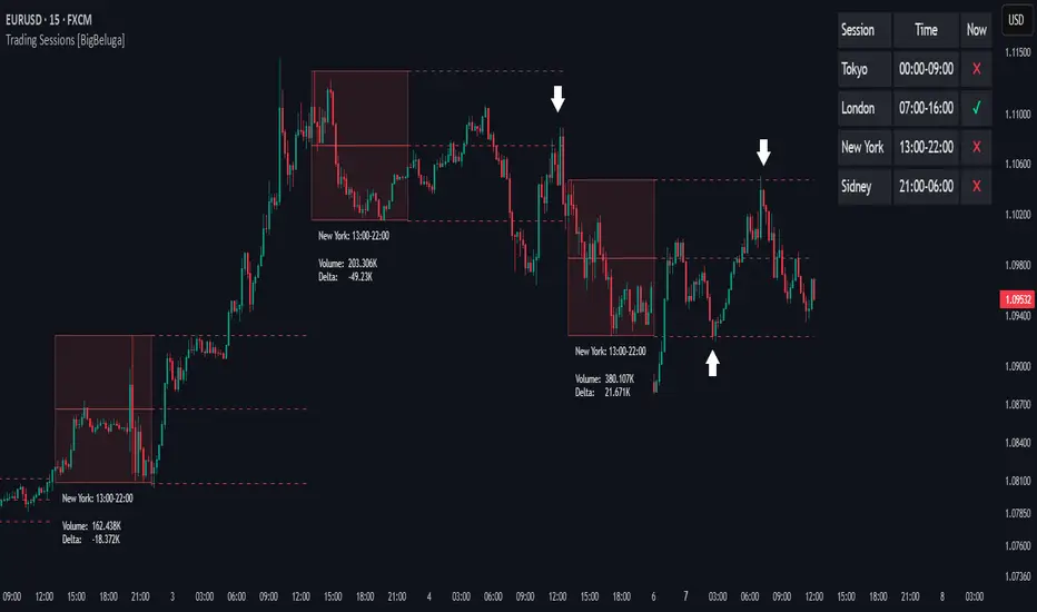
Trading Sessions [BigBeluga]
This indicator brings Smart Money Concept (ICT) session logic to life by plotting key global trading sessions with volume and delta analytics. It not only highlights session ranges but also tracks their midpoints — which often act as intraday support/resistance levels.
🔵 KEY FEATURES
Visual session boxes: Plots boxes for Tokyo, London, New York, and Sydney sessions based on user-defined UTC+0 time ranges.
Volume & delta metrics: Displays total volume and delta volume (buy–sell difference) within each session.
Mid, High & Low Range Extension: Once a session ends, the high, low, and midpoint levels automatically extend — ideal for detecting SR zones.
Session labels: Each box includes a label with session name, time, volume, and delta for quick reference.
Custom session control: Enable or disable sessions individually and configure start/end times.
Clean aesthetics: Transparent shaded boxes with subtle borders make it easy to overlay without clutter.
Sessions Dashboard: Shows the time range of each session and tells you whether the session is currently active.
🔵 USAGE
Enable the sessions you want to monitor (e.g., New York or Tokyo) from the settings.
Use session volume and delta values to gauge the strength and direction of institutional activity.
Watch for price interaction with the extended range — it often acts as dynamic support/resistance after the session ends.
Overlay it with liquidity tools or breaker blocks for intraday strategy alignment.
🔵 EXAMPLES
Extended Future Range acted as resistance/support.
Delta value helped confirm bullish pressure during New York open.
Multiple sessions helped identify kill zone overlaps and high-volume turns.
Trading Sessions is more than just a visual scheduler — it's a precision tool for traders who align with session-based volume dynamics and ICT methodology. Use it to define high-probability zones, confirm volume shifts, and read deeper into the true intent behind market structure.
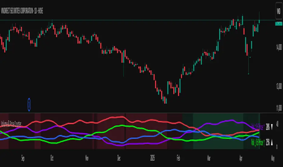
Volume & Price Counter**User Guide for Volume & Price Counter (Candle Structure)**
### 1. Introduction to Volume & Price Counter
The **Volume & Price Counter** (Candle Structure) is a momentum analysis indicator that helps identify which side—buyers or sellers—is dominating the market by counting candles based on the combination of volume and price movement.
The indicator classifies candles into 4 groups:
- **Volume Up, Price Up (Vol ↑ & Price ↑)** – Indicates strong buying pressure.
- **Volume Down, Price Up (Vol ↓ & Price ↑)** – Price is rising but buying momentum is weakening.
- **Volume Up, Price Down (Vol ↑ & Price ↓)** – Indicates strong selling pressure.
- **Volume Down, Price Down (Vol ↓ & Price ↓)** – Price is falling but selling momentum is weakening.
---
### 2. How the Indicator Works
The Volume & Price Counter calculates the number of each candle type over a specific time period to determine which side is currently in control:
- **Green Background**: When the total of (Vol ↑ & Price ↑) + (Vol ↓ & Price ↑) is greater than the total of (Vol ↑ & Price ↓) + (Vol ↓ & Price ↓) → Buyers are in control.
- **Red Background**: When the total of (Vol ↑ & Price ↓) + (Vol ↓ & Price ↓) is greater than the total of (Vol ↑ & Price ↑) + (Vol ↓ & Price ↑) → Sellers are in control.
---
### 3. How to Use the Indicator in Trading
**a) When the background is green**:
- The market is in an uptrend; consider buying during pullbacks to support zones.
- If the green background continues and the number of (Vol ↑ & Price ↑) candles dominates, the price may continue to rise.
- If the green background is present but there are many (Vol ↓ & Price ↑) candles, be cautious as buying strength may be fading.
**b) When the background is red**:
- The downtrend is prevailing; it's better to stay out or look for selling opportunities during pullbacks.
- If the red background continues with a high number of (Vol ↑ & Price ↓) candles, the price may continue to fall.
- If there are many (Vol ↓ & Price ↓) candles during a red background, selling pressure may be weakening—watch for reversal signals.
**c) When the background shifts from red to green**:
- This is a positive signal, indicating buyers are returning to the market.
- Additional volume confirmation is needed to validate a true uptrend.
**d) When the background shifts from green to red**:
- This warns of a potential trend reversal to the downside.
- If volume spikes during the red shift, consider closing long positions.
---
### 4. Combining Volume & Price Counter with Other Indicators
**Combine with support/resistance levels**:
If a green background appears at a strong support zone, it may signal a potential buying opportunity.
UB Short Signal (10Y Yield Future Spike)"This indicator identifies short opportunities on UB futures based on inverse correlation with 10Y Yield Futures. A macro trading tool to be used with additional confirmations."
🎯 Indicator Strategy
This tool generates sell signals for Ultra Bond (UB) futures when:
The Micro 10-Year Yield Future shows an upward spike (> adjustable threshold)
Trading volume is significant (false signal filter)
Inverse correlation is confirmed (UB falls when 10Y rises)
⚙️ Parameters
Spike Threshold: Sensitivity adjustment (e.g., 0.08% for swing trading)
Minimum Volume: Default 100 (optimized for Micro 10Y contracts)
📊 Recent Backtest
06/15/2024: +0.10% spike → UB dropped -0.3% within 15 minutes
06/18/2024: Valid signal post-CPI release
⚠️ Disclaimer
Analytical tool only – not financial advice
Must be combined with proper risk management

Grok CCI with DMF and 20 DMA FilterCCI Indicator that generates Buy and Sell signals, filtered with Dynamic money flow and a 14 Day moving average.
Shout out to RezzaHmt www.tradingview.com
for his Dynamic money flow Indicator.
This is still a work in progress.
Add it twice to your chart: One the main chart ( Uncheck all check boxes except the DMA and the Buy and Sell under style.)
One below the chart (Uncheck the Buy and Sell boxes and the Blue CCI box)

Money Flow Pulse💸 In markets where volatility is cheap and structure is noisy, what matters most isn’t just the move — it’s the effort behind it. Money Flow Pulse (MFP) offers a compact, color-coded readout of real-time conviction by scoring volume-weighted price action on a five-tier scale. It doesn’t try to predict reversals or validate trends. Instead, it reveals the quality of the move in progress: is it fading , driving , exhausting , or hollow ?
🎨 MFP draws from the traditional Money Flow Index (MFI), a volume-enhanced momentum oscillator, but transforms it into a modular “pressure readout” that fits seamlessly into any structural overlay. Rather than oscillating between extremes with little interpretive guidance, MFP discretizes the flow into clean, color-coded regimes ranging from strong inflow (+2) to strong outflow (–2). The result is a responsive diagnostic layer that complements, rather than competes with, tools like ATR and/or On-Balance Volume.
5️⃣ MFP uses a normalized MFI value smoothed over 13 periods and classified into a 5-tier readout of Volume-Driven Conviction :
🍆 Exhaustion Inflow — usually a top or blowoff; not strength, but overdrive (+2)
🥝 Active Inflow — supportive of trend continuation (+1)
🍋 Neutral — chop, coil, or fakeouts (0)
🍑 Selling Intent — weakening structure, possible fade setups (-1)
🍆 Exhaustion Outflow — often signals forced selling or accumulation traps (-2)
🎭 These tiers are not arbitrary. Each one is tuned to reflect real capital behavior across timeframes. For instance, while +1 may support continuation, +2 often precedes exhaustion — especially on the lower timeframes. Similarly, a –1 reading during a pullback suggests sell-side pressure is building, but a shift to –2 may mean capitulation is already underway. The difference between the two can define whether a move is tradable continuation or strategic exhaustion .
🌊 The MFI ROC (Rate of Change) feature can be toggled to become a volatility-aware pulse monitor beneath the derived MFI tier. Instead of scoring direction or structure, ROC reveals how fast conviction is changing — not just where it’s headed, but how hard it's accelerating or decaying. It measures the raw Δ between the current and previous MFI values, exposing bursts of energy, fading pressure, or transitional churn .
🎢 Visually, ROC appears as a low-opacity area fill, anchored to a shared lemon-yellow zero line. When the green swell rises, buying pressure is accelerating; when the red drops, flow is actively deteriorating. A subtle bump may signal early interest — while a steep wave hints at an emotional overreaction. The ROC value itself provides numeric insight alongside the raw MFI score. A reading of +3.50 implies strong upside momentum in the flow — often supporting trend ignition. A score of –6.00 suggests rapid deceleration or full exhaustion — often preceding reversals or failed breakouts.
・ MFI shows you where the flow is
・ ROC tells you how it’s behaving
😎 This blend reveals not just structure or intent — but also urgency . And in flow-based trading, urgency often precedes outcome.
🧩 Divergence isn’t delay — it’s disagreement . One of the most revealing features of MFP is how it exposes momentum dissonance — situations where price and flow part ways. These divergences often front-run pivots , traps , or velocity stalls . Unlike RSI-style divergence, which whispers of exhaustion, MFI divergence signals a breakdown in conviction. The structure may extend — but the effort isn’t there.
・ Price ▲ MFI ▼ → Effortless Markup : Often signals distribution or a grind into liquidity. Without rising MFI, the rally lacks true flow participation — a warning of fragility.
・ Price ▼ MFI ▲ → Absorption or Early Accumulation : Price breaks down, but money keeps flowing in — a hidden bid. Watch for MFI tier shifts or ROC bursts to confirm a reversal.
🏄♂️ These moments don’t require signal overlays or setup hunting. MFP narrates the imbalance. When price breaks structure but flow does not — or vice versa — you’re not seeing trend, you’re seeing disagreement, and that's where edge begins.
💤 MFP is especially effective on intraday charts where volume dislocations matter most. On the 1H or 15m chart, it helps distinguish between breakouts with conviction versus those lacking flow. On higher timeframes, its resolution softens — it becomes more of a drift indicator than a trigger device. That’s by design: MFP prioritizes pulse, not position. It’s not the fire, it’s the heat.
📎 Use MFP in confluence with structural overlays to validate price behavior. A ribbon expansion with rising MFP is real. A compression breakout without +1 flow is "fishy". Watch how MFP behaves near key zones like anchored VWAP, MAs or accumulation pivots. When MFP rises into a +2 and fails to sustain, the reversal isn’t just technical — it’s flow-based.
🪟 MFP doesn’t speak loudly, but it never whispers without reason. It’s the pulse check before action — the breath of the move before the breakout. While it stays visually minimal on the chart, the true power is in the often overlooked Data Window, where traders can read and interpret the score in real time. Once internalized, these values give structure-aware traders a framework for conviction, continuation, or caution.
🛜 MFP doesn’t chase momentum — it confirms conviction. And in markets defined by noise, that signal isn’t just helpful — it’s foundational.

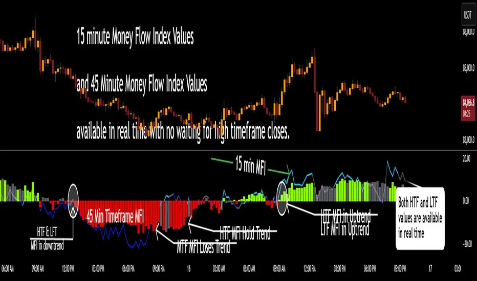
Multi Timeframe Altered Money Flow Index by CoffeeShopCryptoMoney Flow Index is a long used tool in trading markets, understanding to where money is moving and most importantly when its going there.
One of the biggest challenges was the when part. Because seeing it on your current trading chart timeframe is easy but it gets difficult if youre attempting a top-down-analysis of market structure vs price performance.
The new formula presented by @CoffeeshopCrypto is a key solution to this timeframe analysis issue. Seems like I may have solved the "glitch-In-The-Matrix".
The issue was always setting a secondary MFI on your chart and telling the system you wanted to watch the 1 hour MFI from a 5 minute chart.
To do this you need to wait for 12 candles to close on your 5 minute chart before you can get a 1hour MFI value. The move may have already happend and you may be too late. If there was only a better faster way to see the changing values of the High Timeframe Money Flow Index in real time without changing chart times and losing place......oh wait.....there is one now!
This tool allows you to tell it what timeframe you are looking at,
and what you want to compare it to.
It runs the calculation in the background automatically to give you the real time values of your High Timeframe chart setting on the chart you are looking at.
How to trade Long
When both the LFT and HTF Money flow cross above ZERO, they are both in uptrend
How to trade Short
When both the LFT and HTF Money flow cross below ZERO, they are both in downtrend
What happens when Low timeframe is inside the high timeframe:
If High timeframe MFI is below zero but the LFT MFI is above it and still below zero, you have lost your short term downtrend. The opposite is true when the high timeframe MFI is above zero.
A strong constant comparative trend is when your low timeframe MFI is leading your High timeframe MFI.
Personal Settings:
In my usage, i find it best to multiply my trading chart timeframe by 3 and use that number as my high timeframe MFI setting
This works on ANY chart time you want. For example you are not locked to the standard built TradingView chart times.
If you trade on a 7 minute timeframe, you can set your HTF to 21.
7 * 3 = 21
VolumePrice Intensity AnalyzerVolumePrice Intensity Analyzer
The VolumePrice Intensity Analyzer is a Pine Script v6 indicator designed to measure market activity intensity through the trading value (Price * Volume, scaled to millions). It helps traders identify significant volume-price interactions, track trends, and gauge momentum by combining volume analysis with trend-following tools.
Features:
Volume-Based Analysis: Calculates Price * Volume in millions to highlight market activity levels.
Trend Identification: Plots 20-day and 50-day SMAs of the trading value to smooth fluctuations and reveal sustained trends.
Relative Strength: Displays the ratio of daily Price * Volume to the long-term SMA in a separate pane, helping traders assess activity intensity relative to historical averages.
Real-Time Metrics: A table shows the current Price * Volume and its ratio to the long SMA, updated continuously with bold text formatting (v6 feature).
Alerts: Triggers notifications for high trading values (when Price * Volume exceeds 1.5x the long SMA) and SMA crossovers (short SMA crossing above long SMA).
Visual Cues: Uses dynamic bar colors (teal for bullish, gray for bearish) and background highlights to mark significant market activity.
Customizable Inputs: Adjust SMA periods, scaling factor, and alert threshold via the settings panel, with tooltips for clarity (v6 feature).
Originality:
Unlike basic volume indicators, this tool combines Price * Volume with trend analysis (SMAs), relative strength (ratio plot), and actionable alerts. The real-time table and visual highlights provide a unique, at-a-glance view of market intensity, making it a valuable addition for volume and trend-focused traders.
Calculations:
Trading Value (P*V): (Close * Volume) * Scale Factor (default scale factor of 1e-6 converts to millions).
SMAs: 20-day and 50-day Simple Moving Averages of the trading value to identify short- and long-term trends.
Ratio: Daily Price * Volume divided by the 50-day SMA, plotted in a separate pane to show relative activity strength.
Bar Colors: Teal (RGB: 0, 132, 141) for bullish bars (close > open or close > previous close), gray for bearish or neutral bars.
Background Highlight: Light yellow (hex: #ffcb3b, 81% transparency) when Price * Volume exceeds the long SMA by the alert threshold.
Plotted Elements:
Short SMA P*V (M): Red line, 20-day SMA of Price*Volume in millions.
Long SMA P*V (M): Blue line, 50-day SMA of Price*Volume in millions.
Today P*V (M): Columns, daily Price*Volume in millions (teal/gray based on price action).
Daily V*P/Longer Term Average: Purple line in a separate pane, ratio of daily Price * Volume to the 50-day SMA.
Usage:
Spot High Activity: Look for Price * Volume columns exceeding the SMAs or spikes in the ratio plot to identify significant market moves.
Confirm Trends: Use SMA crossovers (e.g., short SMA crossing above long SMA) as bullish trend signals, or vice versa for bearish trends.
Monitor Intensity: The table provides real-time Price * Volume and ratio values, while background highlights signal high activity periods.
Versatility: Suitable for stocks, forex, crypto, or any market with volume data, across various timeframes.
How to Use:
Add the indicator to your chart.
Adjust inputs (SMA periods, scale factor, alert threshold) via the settings panel to match your trading style.
Watch for alerts, check the table for real-time metrics, and observe the ratio plot for relative strength signals.
Use the background highlights and bar colors to quickly spot significant market activity and price action.
This indicator leverages Pine Script v6 features like lazy evaluation for performance and advanced text formatting for better visuals, making it a powerful tool for traders focusing on volume, trends, and momentum.

VWAP Separation w/ StDev (LEX)---
## VWAP Separation with Standard Deviation Bands
**Overview**
This indicator measures and visualizes the raw distance (separation) between a chosen price source (like `hlc3` or `close`) and its corresponding Volume Weighted Average Price (VWAP) for a selected anchor period. It helps traders gauge how far the current price has deviated from its volume-weighted average.
To provide context on the magnitude of this separation, the indicator also calculates and plots dynamic bands representing +/- 1 standard deviation of the separation value itself, calculated over a user-defined lookback period.
**How it Works**
1. **VWAP Calculation:** The indicator first calculates the VWAP based on the user-selected `Anchor Period` (e.g., Session, Week, Month) and `Source` price. The VWAP calculation resets at the beginning of each new anchor period.
2. **Separation Calculation:** It then subtracts the calculated VWAP from the source price for each bar (`Separation = Source - VWAP`).
3. **Plotting Separation:** This raw separation value is plotted as a line in a separate indicator pane.
* Positive values indicate the source price is above the VWAP.
* Negative values indicate the source price is below the VWAP.
4. **Zero Line & Crossings:** A horizontal line at zero is plotted for easy reference. Small circles are plotted on the zero line whenever the separation value crosses it (using `ta.cross`), highlighting moments when the price crosses its VWAP.
5. **Standard Deviation Bands:**
* The indicator calculates the rolling Simple Moving Average (SMA) of the `Separation` value over a specified `StDev Length` using `ta.sma`.
* It then calculates the rolling standard deviation of the `Separation` value over the same length using `ta.stdev`.
* Finally, it plots two dynamic lines: `SMA + 1 StDev` and `SMA - 1 StDev`. These bands represent the typical range of the separation's volatility based on the lookback period.
**How to Use / Interpretation**
* **Magnitude of Separation:** The primary line directly shows how far, in price terms, the market is currently trading away from its VWAP for the chosen anchor period. Large absolute values suggest a significant deviation.
* **Zero Line:** Crossing the zero line indicates the price is moving from one side of the VWAP to the other. The indicator staying consistently above/below zero shows price trending relative to its VWAP.
* **Standard Deviation Bands:** These bands help contextualize the separation.
* When the separation line touches or exceeds the upper band, it suggests the price is unusually far *above* the VWAP compared to its recent behavior.
* When the separation line touches or exceeds the lower band, it suggests the price is unusually far *below* the VWAP compared to its recent behavior.
* These "unusual" deviations *might* indicate over-extended conditions potentially leading to mean reversion back towards the VWAP, *or* they could signal the start of a strong move away from the VWAP. Always use in conjunction with other analysis methods.
* The width of the bands indicates the recent volatility *of the separation value itself*. Wider bands mean the separation has been more volatile; narrower bands mean it's been more stable.
**Key Features**
* Flexible VWAP calculation based on various anchor periods (Session, Week, Month, Earnings, etc.).
* Plots the raw price separation from VWAP.
* Clear zero line reference.
* Visual markers for zero-line crossings.
* Dynamic +/- 1 Standard Deviation bands based on the separation's volatility.
* User-configurable inputs for anchor period, price source, and standard deviation length.
**Settings**
* **Anchor Period:** Determines the calculation period for VWAP (Session, Week, Month, Quarter, Year, Decade, Century, Earnings, Dividends, Splits). Default: `Session`.
* **Source:** The price data used for calculating VWAP and separation (e.g., hlc3, close, open). Default: `hlc3`.
* **StDev Length:** The lookback period (number of bars) used to calculate the moving average and standard deviation of the separation value. Default: `20`.
**Disclaimer**
This indicator is provided for educational and informational purposes only. It does not constitute financial advice or a recommendation to trade. Trading financial markets involves significant risk. Always perform your own due diligence and test any indicator thoroughly before using it in live trading. Past performance is not indicative of future results.
---

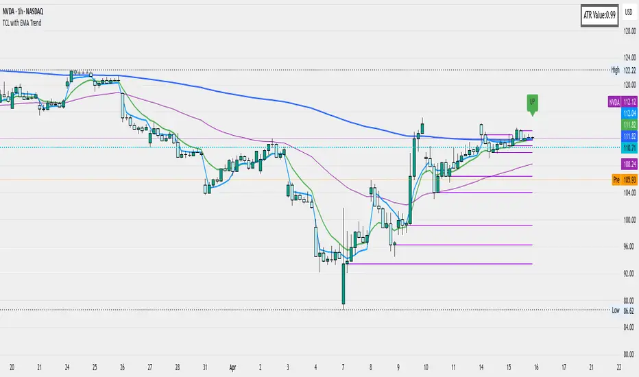
Pivot Levels with EMA Trend📌 Trend Change Levels with EMA Trend
✨ Description:
This TradingView script identifies clean trend change levels based on 1-hour structure shifts and filters them to keep only those not invalidated. It follows the "Jake Ricci" method, each level is printed at the beginning of the candle that changes the trend, on a 1 hour chart. For precision, make sure to exclude after/pre market and only use the levels on regular hours charts.
It includes dynamic EMAs (9, 50, 200), intraday VWAP, the daily open level printed, and a visual trend label based on EMA(9) slope.
Designed for intermediate traders, it helps build bias, manage entries, and avoid false setups by focusing on clean, reactive levels that the market respects.
🔧 Core Logic:
On the 1H chart, the script compares current and previous closes to detect trend direction. If the trend flips (e.g., up to down), the open of the candle that caused the flip becomes a candidate level.
Only levels that remain untouched by future candle closes are plotted — this filters out “weak” levels that price already violated (which means, a candle closes after passing through the level).
These levels become key S/R zones and often act as reaction points during pullbacks, traps, and liquidity sweeps.
The idea is to check how the price reacts to those levels. Usually there's a clean retest of the level. After that, if the price continues in that direction, it tends to reach the following level.
🔹 Included Tools:
🟣 Trend Change Levels (1H):
Fixed horizontal lines based on confirmed shifts in trend, shown only when not broken.
📉 EMAs (9 / 50 / 200):
Visibility can be set per timeframe. Use for trend context.
📍 EMA Trend Label:
Shows \"UP\", \"DOWN\", or \"RANGE\" based on EMA(9) slope.
🔵 VWAP (Intraday Reset):
Real-time volume-weighted average price that resets daily. Useful for fair value zones and reversion plays.
🟠 Daily Open Line:
Plot of the current day’s open. Used for intraday directional bias. Usually: DO NOT take longs below the Open Print, DO NOT take shorts above it.
📊 ATR Table:
Displays current ATR multiplier on the chart. It's useful to understand if the market is expanding or not.
📈 How to Use It (Strategy):
1. Start on the 1H chart to generate levels.
Only the open of candles that reversed trend are considered — and only if future candles didn’t close through them. I suggest manually adding horizontal lines to mark again the levels, so that they stick to all the timeframes.
2. Use the trend label to decide your bias — \"UP\" for long setups, \"DOWN\" for shorts. Avoid trading against the slope.
3. Switch to the 5m chart and wait for price to approach a plotted level. These are often used for manipulation, retests, or clean reversals.
4. Look for confirmation: rejection candles, break-and-retest, strong engulfing candles, or traps above/below the level. ALWAYS check the price action around the level, along with the volume.
5. Check if VWAP or an EMA is near the level. If yes, the confluence strengthens the trade idea.
6. Use the ATR value to understand if the market is expanding (candles are bigger than the ATR). You don't want to stay in a slow and ranging trade.
✅ Example Entry Flow:
1. On the 1H chart, note a trend change level printed recently.
2. Check the current trend label — if it says \"UP,\" prefer longs.
3. Wait for price to retrace toward the level.
4. On the 5m, look for a bullish engulfing candle or trap setup at the level.
5. Check if VWAP and EMA(50) are near. If yes, execute the trade.
6. Set stop just under the low of the candle prior to your entry. Ideally, a retracing candle.
To be clear: imaging to be LONG, you wait for a retracement that should touch your level. You wait for a candle that resumes the LONG trend, enter when it breaks the high of the previous candle (sill in retracement), you place your stop under the candle prior to your entry.
Notes:
No repainting — levels only show up after confirmed shifts.
Removes broken levels for chart clarity and reliability.
Helps spot high-probability pullback zones and fakeouts.
Perfect confluence tool to support price action, SMC, or EMA strategies.
Works across multiple timeframes with customizable inputs.
👤 Ideal For:
Intraday traders looking for reactive entry points and direction confirmation.
Swing traders wanting to pinpoint continuation zones or reversal pivots.
🚨 Final Note: This indicator doesn’t generate buy/sell signals. It improves your trade filtering by identifying areas the market already respected and reacting to them with price action. Combine it with your own system , test it in replay, and use screenshots to document setups.
📌 If used with discipline, this becomes a precision tool — not a signal generator.
VWAP + EMA Retracement Indicator SwiftEdgeVWAP + EMA Retracement Indicator
Overview
The VWAP + EMA Retracement Indicator is a powerful and visually engaging tool designed to help traders identify high-probability buy and sell opportunities in trending markets. By combining the Volume Weighted Average Price (VWAP) with two Exponential Moving Averages (EMAs) and a unique retracement-based signal logic, this indicator pinpoints moments when the price pulls back to a key zone before resuming its trend. Its modern, AI-inspired visuals and customizable features make it both intuitive and adaptable for traders of all levels.
What It Does
This indicator generates buy and sell signals based on a sophisticated yet straightforward strategy:
Buy Signals: Triggered when the price is above VWAP, has recently retraced to the zone between two EMAs (default 12 and 21 periods), and a strong bullish candle closes above both EMAs.
Sell Signals: Triggered when the price is below VWAP, has retraced to the EMA zone, and a strong bearish candle closes below both EMAs.
Signal Filtering: A customizable cooldown period ensures that only the first signal in a sequence is shown, reducing noise while preserving opportunities for new trends.
Confidence Scores: Each signal includes an AI-inspired confidence score (0-100%), calculated from candle strength and price distance to VWAP, helping traders gauge signal reliability.
The indicator’s visuals enhance decision-making with dynamic gradient lines, a highlighted retracement zone, and clear signal labels, all customizable to suit your preferences.
How It Works
The indicator integrates several components that work together to create a cohesive trading tool:
VWAP: Acts as a dynamic support/resistance level, reflecting the average price weighted by volume. It filters signals to ensure buys occur in uptrends (price above VWAP) and sells in downtrends (price below VWAP).
Dual EMAs: Two EMAs (default 12 and 21 periods) define a retracement zone where the price is likely to consolidate before continuing its trend. Signals are generated only after the price exits this zone with conviction.
Retracement Logic: The indicator looks for price pullbacks to the EMA zone within a user-defined lookback window (default 5 candles), ensuring signals align with trend continuation patterns.
Candle Strength: Signals require strong candles (bullish for buys, bearish for sells) with a minimum body size based on the Average True Range (ATR), filtering out weak or indecisive moves.
Cooldown Mechanism: A unique feature that prevents signal clutter by allowing only the first signal within a user-defined period (default 3 candles), balancing responsiveness with clarity.
Confidence Score: Combines candle body size and price distance to VWAP to assign a score, giving traders an at-a-glance measure of signal strength without needing external analysis.
These components are carefully combined to capture high-probability setups while minimizing false signals, making the indicator suitable for both short-term and swing trading.
How to Use It
Add to Chart: Apply the indicator to a 15-minute chart (recommended) or your preferred timeframe.
Customize Settings:
VWAP Source: Choose the price source (default: hlc3).
EMA Periods: Adjust the fast and slow EMA periods (default: 12 and 21).
Retracement Window: Set how many candles to look back for retracement (default: 5).
ATR Period & Body Size: Define candle strength requirements (default: 14 ATR period, 0.3 multiplier).
Cooldown Period: Control the minimum candles between signals (default: 3; set to 0 to disable).
Candle Requirements: Toggle whether signals require bullish/bearish candles or entire candle above/below EMAs.
Visuals: Enable/disable gradient colors, retracement zone, confidence scores, and choose a color scheme (Neon, Light, or Dark).
Interpret Signals:
Buy: A green "Buy" label with a confidence score appears below the candle when conditions are met.
Sell: A red "Sell" label with a confidence score appears above the candle.
Use the confidence score to prioritize higher-probability signals (e.g., above 80%).
Trade Management: Combine signals with your risk management strategy, such as setting stop-loss below the retracement zone and targeting a 1:2 risk-reward ratio.
Why It’s Unique
The VWAP + EMA Retracement Indicator stands out due to its thoughtful integration of classic indicators with modern enhancements:
Balanced Signal Filtering: The cooldown mechanism ensures clarity without missing key opportunities, unlike many indicators that overwhelm with frequent signals.
AI-Inspired Confidence: The confidence score simplifies decision-making by quantifying signal strength, mimicking advanced analytical tools in an accessible way.
Elegant Visuals: Dynamic gradients, a highlighted retracement zone, and customizable color schemes (Neon, Light, Dark) create a sleek, futuristic interface that’s both functional and visually appealing.
Flexibility: Extensive customization options let traders tailor the indicator to their style, from conservative swing trading to aggressive scalping.

Volume Pulse: Mobile-Optimized Candle Volume Viewer✨ Description ✨
Sleek. Simple. Sexy.
A modern, minimal volume tracker designed for mobile and desktop users who want clean data without clutter.
✅ Displays the volume of the last N candles with intuitive green/red background colors based on candle direction (bullish/bearish).
✅ Automatically converts numbers into K/M/B format for quick understanding.
✅ Comes with a text size setting, so it's fully readable whether you're on a phone or desktop.
Perfect for traders who want to:
Spot volume spikes at a glance
Quickly compare recent candle volumes
Stay mobile-friendly with a visual style that actually fits

3 VWAPs & extensionsSimple multiple VWAP indicator with extensions.
Standard settings give a daily, weekly and monthly anchored VWAP.
Toggle visibility of VWAP and/or extensions in settings.

Dskyz (DAFE) Aurora Divergence - Dskyz (DAFE) Aurora Divergence Indicator
Advanced Divergence Detection for Traders. Unleash the power of divergence trading with this cutting-edge indicator that combines price and volume analysis to spot high-probability reversal signals.
🧠 What Is It?
The Dskyz (DAFE) Aurora Divergence Indicator is designed to identify bullish and bearish divergences between the price trend and the On Balance Volume (OBV) trend. Divergence occurs when the price of an asset and a technical indicator (in this case, OBV) move in opposite directions, signaling a potential reversal. This indicator uses linear regression slopes to calculate the trends of both price and OBV over a specified lookback period, detecting when these two metrics are diverging. When a divergence is detected, it highlights potential reversal points with visually striking aurora bands, orbs, and labels, making it easy for traders to spot key signals.
⚙️ Inputs & How to Use Them
The indicator is highly customizable, with inputs grouped under "⚡ DAFE Aurora Settings" for clarity. Here’s how each input works:
Lookback Period: Determines how many bars are used to calculate the price and OBV slopes. Higher values detect longer-term trends (e.g., 20 for 1H charts), while lower values are more responsive to short-term movements.
Price Slope Threshold: Sets the minimum slope value for the price to be considered in an uptrend or downtrend. A value of 0 allows all slopes to be considered, while higher values filter for stronger trends.
OBV Slope Threshold: Similar to the price slope threshold but for OBV. Helps filter out weak volume trends.
Aurora Band Width: Adjusts the width of the visual bands that highlight divergence areas. Wider bands make the indicator more visible but may clutter the chart.
Divergence Sensitivity: Scales the strength of the divergence signals. Higher values make the indicator more sensitive to smaller divergences.
Minimum Strength: Filters out weak signals by only showing divergences above this strength level. A default of 0.3 is recommended for beginners.
Signal Cooldown (Bars): Prevents multiple signals from appearing too close together. Default is 5 bars, reducing chart clutter and helping traders focus on significant signals.
These inputs allow traders to fine-tune the indicator to match their trading style and timeframe.
🚀 What Makes It Unique?
This indicator stands out with its innovative features:
Price-Volume Divergence: Combines price trend (slope) and OBV trend for more reliable signals than price-only divergences.
Aurora Bands: Dynamic visual bands that highlight divergence zones, making it easier to spot potential reversals at a glance.
Interactive Dashboard: Displays real-time information on trend direction, volume flow, signal type, strength, and recommended actions (e.g., "Consider Buying" or "Consider Selling").
Signal Cooldown: Ensures only the most significant divergences are shown, reducing noise and improving usability.
Alerts: Built-in alerts for both bullish and bearish divergences, allowing traders to stay informed even when not actively monitoring the chart.
Beginner Guide: Explains the indicator’s visuals (e.g., aqua orbs for bullish signals, fuchsia orbs for bearish signals), making it accessible for new users.
🎯 Why It Works
The indicator’s effectiveness lies in its use of price-volume divergence, a well-established concept in technical analysis. When the price trend and OBV trend diverge, it often signals a potential reversal because the underlying volume support (or lack thereof) is not aligning with the price action. For example:
Bullish Divergence: Occurs when the price is making lower lows, but the OBV is making higher lows, indicating weakening selling pressure and potential upward reversal.
Bearish Divergence: Occurs when the price is making higher highs, but the OBV is making lower highs, suggesting weakening buying pressure and potential downward reversal.
The use of linear regression ensures smooth and accurate trend calculations over the specified lookback period. The divergence strength is then normalized and filtered based on user-defined thresholds, ensuring only high-quality signals are displayed. Additionally, the cooldown period prevents signal overload, allowing traders to focus on the most significant opportunities.
🧬 Indicator Recommendation
Best For: Traders looking to identify potential trend reversals in any market, especially those where volume data is reliable (e.g., stocks, futures, forex).
Timeframes: Suitable for all timeframes. Adjust the lookback period accordingly—smaller values for shorter timeframes (e.g., 1H), larger for longer ones (e.g., 4H or daily).
Pair With: Support and resistance levels, trend lines, other oscillators (e.g., RSI, MACD) for confirmation, and volume profile tools for deeper analysis.
Tips:
Look for divergences at key support/resistance levels for higher-probability setups.
Pay attention to signal strength; higher strength divergences are often more reliable.
Use the dashboard to quickly assess market conditions before entering a trade.
Set up alerts to catch divergences even when not actively watching the chart.
🧾 Credit & Acknowledgement
This indicator builds upon the classic concept of price-volume divergence, enhancing it with modern visualization techniques, advanced filtering, and user-friendly features. It is designed to provide traders with a powerful yet intuitive tool for spotting reversals.
📌 Final Thoughts
The Dskyz (DAFE) Aurora Divergence Indicator is more than just a divergence tool; it’s a comprehensive trading assistant that combines advanced calculations, intuitive visualizations, and actionable insights. Whether you’re a seasoned trader or just starting out, this indicator can help you spot high-probability reversal points with confidence.
Use it with discipline. Use it with clarity. Trade smarter.
**I will continue to release incredible strategies and indicators until I turn this into a brand or until someone offers me a contract.
-Dskyz
