DC - Volatility ZigZag Support/ResistanceThis indicator combines advanced Volatility ZigZag detection, SMA 200 trend analysis, and dynamic support/resistance zones based on volume and price pivots. It's designed to help traders visually identify trend reversals, key price levels, and potential breakouts or bounces with clarity and precision.
What It Does
Volatility ZigZag: Uses price volatility (standard deviation, ATR, true range) to plot ZigZag lines and identify significant trend changes. Labels provide reversal price, price/percentage change, and volume data between pivots.
SMA 200: Plots the 200-period Simple Moving Average to indicate the long-term trend direction.
Support/Resistance Zones: Automatically detects price levels based on pivot highs/lows confirmed by volume conditions. Boxes are color-coded and dynamically update based on breakout or retest behavior.
⚙️ Key Features
Fully customizable ZigZag settings: deviation %, pivot confirmation, std dev factor, and lookback length.
Configurable visuals: pivot markers (⦿), alert points (◯), and labeled statistics between pivots.
Volume-sensitive support/resistance zones that react to breakouts or bounces.
Alerts for new ZigZag pivots.
Data window feedback on trend status and deviation metrics.
✅ Ideal For
Swing traders tracking reversals or continuation patterns.
Trend followers using SMA 200 and pivot points for confirmation.
Volume-based traders looking for support/resistance backed by meaningful volume spikes or drops.
Точки разворота и уровни

OI GridTo draw a horizontal line that compares spot and future prices, users can select a symbol and an OI range for each asset.


Really Key LevelsAn indicator showing (only) the most important trading levels.
Works for equities. Probably doesn't work for futures, crypto, etc.
Shows RTH H/L (today and yesterday), RTH open, pre-market H/L (today and yesterday), RTH close (yesterday and 2 days ago), with nice labels. By default, only the most important of these are enabled.
Special features of this indicator that it works the same for RTH and ETH charts (even showing -pre-market H/L on an RTH chart), and the levels indicate the exact bar that the level relates to.
Colours, line styles and widths and the position of the label are configurable.
If you would like me to add other levels or features, feel free to ask me and, if I agree, when I do it can be influenced by buying me a coffee, snack or lunch (depending on the difficulty).

Adaptive ATR LimitsThis script plots adaptive ATR limits for intraday trading. It is intended for equities. It is not tested for other securities like futures, crypto, etc, though it may work for these too. It works for both regular trading hours and extended trading hours.
The limit lines (top and bottom) are always exactly 1 ATR/ADR apart. This is a key feature of the indicator.
The main mode is ATR, which includes overnight gaps and pre- and post-market movements. This also means the previous day close is considered to part of the current days range (which aligns with the definition of ATR). There is also an ADR mode, which uses the average range the price moves within regular hours only and is not affected by prices outside of these. Other than that, they work the same (including ATR/ADR length option and smoothing).
When in ADR mode, it treats premarket as a separate session from the regular/post-market and resets the session range at the regular market open. This is so it can plot the limits in the regular/post-market hours without being affected by the pre-market range. This is necessary since the daily ADR includes only regular market moves and due to the way the limits adapt.
It tries to plot the most sensible ATR limits based on the current daily ATR, in order to provide a visual target for how far a price could/should move intraday. In order to do this, it uses two methods to calculate limits, i) based on the mid-point of the current session range, and ii) based on the currently established range and current relative price position within that range.
The session starts using the first method. As more of the ATR is covered in the session, it transitions over of the second method. Once (if) the full ATR is covered within the session, it will have completely transitioned to the second method and will only use that for the rest of the session. In between these states, a weighted average of the two methods is used depending on the amount of the ATR the session has covered.
To explain the effect, as an example, imagine that the price is approaching the full ATR range on the high side. The indicator will have almost fully transitioned to the second (relative) method. The lower ATR limit will now be anchored to the daily low as the price hits the upper ATR limit. If the price goes beyond the upper ATR, the lower ATR limit will stay anchored to the daily low, and the upper limit will stay anchored to 1 ATR above the lower limit. This allows you to see how far the price is going beyond the upper ATR limit. If the price then returns and backs off the upper ATR limit, the lower ATR limit will un-anchor from the daily low (it will actually rise since the daily ATR range has been exceeded so the lower ATR limit needs to come up since the actual daily range can't fit into the ATR range anymore). The overall effect is to give you the best visual indication where the price is in relation to a possible upper ATR-based target. Reverse this example for when price low approaches the ATR range on the low side.
There is also a "basic mode" which simply plots 1 ATR/ADR above/below the session low/high. When using ADR, the session resets at the end of the pre-market.
The ATR length (averaging period) can be set (number of days), as well as a visual smoothing of the ATR limits using EMA.

TrendBoxThis indicator is called "TrendBox," designed to help traders analyze daily price ranges using several technical indicators. Below is a breakdown of its functionality, purpose, and key components:
Purpose
The script overlays indicators on a chart to assess whether the price is above or below key levels:
VWAP (Volume Weighted Average Price, based on the chart's timeframe).
Daily Market Open (fetched from the daily timeframe).
Daily 4-period VWMA (Volume Weighted Moving Average, fetched from the daily timeframe).
VIX-based expected range (high and low levels calculated using the VIX index).
It also displays a status box (optional) summarizing whether the price is above or below these levels, helping traders quickly evaluate market conditions.

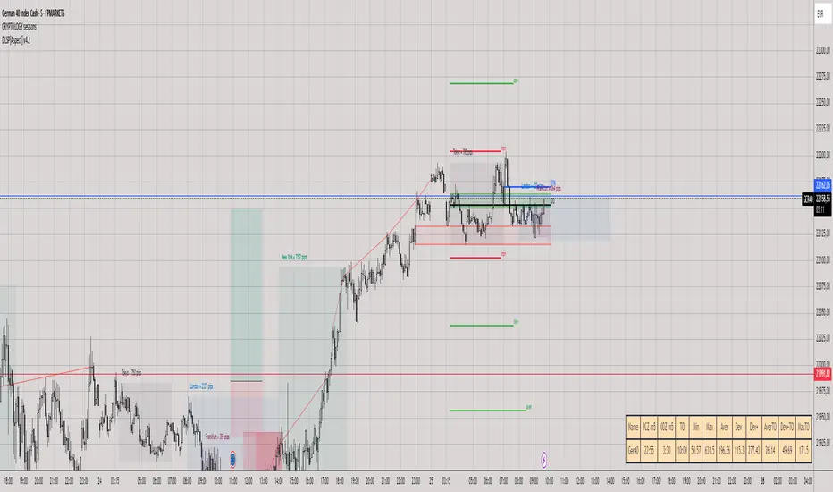
Daily Levels & Stats Pro - [Aspect] v4.0# Description of the "Daily Levels & Stats Pro - v4.0" Indicator
This indicator is a powerful tool for market analysis through the lens of key daily levels and statistical price movement indicators. It allows you to display important trading session opening levels, daily statistical movements, and high volatility zones on the price chart.
## Main Indicator Functions:
### Key Time Levels:
- **Daily Open (DO)** - daily trading session opening level at 02:00
- **NY Midnight (NYM)** - New York session opening level at 06:00
- **Trade Open (TO)** - active trading opening level at 10:00
### Analysis Zones:
- **Previous Close Zone (PCZ)** - previous day's closing zone (displayed on M5 timeframe)
- **Open Day Zone (ODZ)** - current day's opening zone (displayed on M5 timeframe)
### Statistical Price Movement Levels:
- **Min** - minimum statistical movement from DO
- **Max** - maximum statistical movement from DO
- **Aver** - average statistical movement from DO
- **Dev-** - lower deviation of movement from DO
- **Dev+** - upper deviation of movement from DO
### TO Impulse Movement Statistical Levels:
- **Aver TO** - average statistical movement from TO
- **Dev+ TO** - upper deviation of movement from TO
- **Max TO** - maximum statistical movement from TO
## Indicator Features:
- Complete customization of colors, styles, and line widths for all levels
- Ability to select time for each main level
- Adjustment of the number of bars for level display
- Automatic calculation of level values relative to DO and TO
- Visual display of TO-levels starts 3 bars before the actual TO point, providing better visual perception
- Ability to enable/disable individual levels and zones
- Automatic updates and resets when the day changes
- Adaptive text labels to mark levels
This indicator is excellent for traders who use statistical data and daily support/resistance levels in their trading strategy. It is particularly useful for DAX40 and other highly liquid instruments where daily trading statistics are important for making trading decisions.

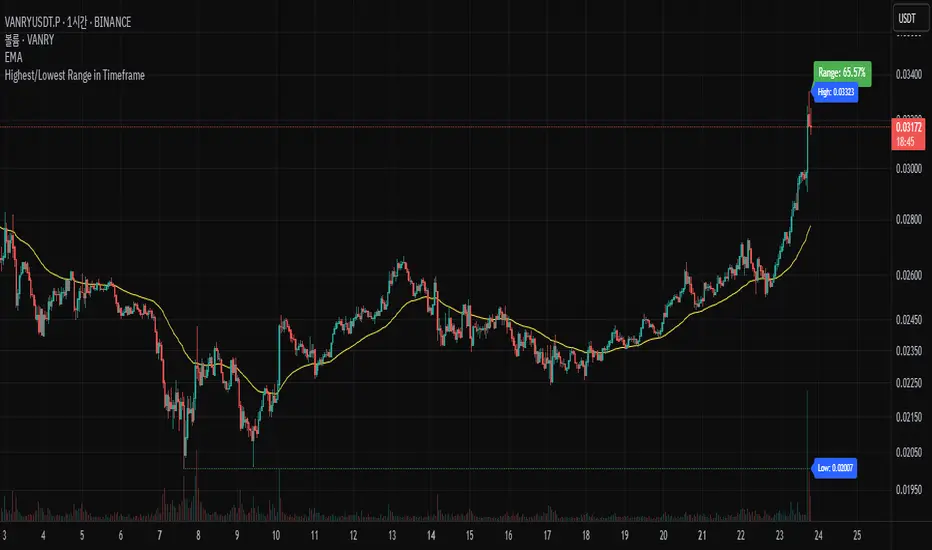
Highest/Lowest Range in TimeframeThis script helps traders visually identify the highest high and lowest low within a customizable range of recent bars.
🔍 Key Features
Scans the last 100 to 1000 bars (user-defined)
Automatically detects:
The highest wick (high) and lowest wick (low)
Draws dotted green horizontal lines at both levels
Shows a label indicating the percentage range between high and low
Displays real-time high and low price labels directly on the chart
⚙️ Use Cases
Quickly spot price extremes over your desired time window
Visually measure market range and volatility
Identify breakout potential or reversal zones
✅ How to Use
Add the script to your chart.
Set the “Bars to Scan” input to your desired lookback period (between 100–1000).
Use the displayed lines and labels to identify key high/low price levels and range metrics.
Horizontal Price TableOverview:
This script displays a dynamic price table on your chart, showing real-time prices and daily percentage changes for up to 7 user-defined tickers. You can customize both which tickers are shown and how many are visible, all through the settings panel.
How it works (Step-by-Step):
User-Defined Tickers:
The script provides input fields for up to 7 tickers using input.symbol(). You can track stocks, indexes, ETFs, crypto, or futures — anything supported by TradingView.
Choose How Many to Display:
An additional dropdown lets you choose how many of the 7 tickers to actually display (between 1 and 7). This gives you control over screen space and focus.
Market Data Fetching:
For each displayed ticker, the script fetches:
The current day’s closing price (close)
The previous day’s closing price (close )
This data is pulled using request.security() on the daily timeframe (1D).
% Change Calculation:
The script calculates the daily percentage change using:
(Current Price−Previous Close)/Previous Close×100(Current Price−Previous Close)/Previous Close×100
Cleaned Ticker Names:
Ticker symbols often include an exchange prefix like NASDAQ:AAPL. The script automatically removes anything before the colon (:), so only the clean symbol (e.g., AAPL) is shown in the table.
Table Display:
A visual table appears at the top-center of your chart, showing:
Row 1: Ticker symbol (cleaned)
Row 2: Current price (rounded to 2 decimals)
Row 3: Daily % change (green for gains, red for losses)
Customization:
You can choose the background color of the table.
Ticker names appear in white text with a gray background.
% change is color-coded: green for positive, red for negative.
Why Use This Script?
Track multiple tickers at once without leaving your chart.
Clean, customizable layout.
Useful for monitoring watchlists, portfolios, or related markets.
Tips:
Combine this with your favorite indicators for a personalized dashboard.
Works great on any chart or timeframe.
Ensure the tickers entered are valid on TradingView (e.g., SPY, BTCUSD, NQ1!, etc.).

Semaphore📌 Indicator Description: Semaphore
The Semaphore indicator plots three key moving averages on the current asset's price, allowing users to select between SMA (Simple Moving Average) or EMA (Exponential Moving Average), and to choose whether the calculation should be based on the daily timeframe or the current chart timeframe.
🔧 Customizable Parameters:
Moving average type: SMA or EMA.
Data source: Daily timeframe or current chart timeframe.
Fixed lengths: 10 (short-term), 21 (medium-term), and 50 (long-term).
🎯 What does it do?
Calculates and plots the three selected moving averages.
Automatically adapts to the chosen timeframe (e.g., display daily averages on a 1h chart).
Color-coded lines for easy visual distinction:
🔵 Blue for the 10-period MA
🟡 Yellow for the 21-period MA
🔴 Red for the 50-period MA
🌟 Benefits and Advantages:
Timeframe flexibility: Follow higher timeframe trends (daily) while trading on lower timeframes.
Clean and quick visual reference: With just three colored lines, you get a clear view of short, medium, and long-term trends.
Perfect for “traffic light” strategies: For example, all MAs aligned in one direction can indicate strong trend confirmation.
Universal use: Works seamlessly with any asset — stocks, crypto, forex, indices, and more.

donchain channel with EMAsDonchain channel with labels of price tops and bottom changes.
based on wyckoff method, price start changing its directions with slower and slower speed of increasing price. with closer tops started to appears. same for bottoms.
by using donchain and labels of different price change of top and bottom. we can track and notice where price started to slowing down before the direction changed.

Gold Supply & Demand Zones [HTF] + VWAPGold Supply & Demand Zones + VWAP indicator to effectively, trade XAUUSD (Gold).
🧠 What This Indicator Does
It combines two powerful concepts:
Supply & Demand Zones from a Higher Timeframe (HTF).
VWAP (Volume Weighted Average Price) to understand the price’s relation to fair value.
Supply Zone = Area of potential selling pressure (resistance).
Demand Zone = Area of potential buying pressure (support).
✅ How it's calculated:
You select a Higher Timeframe (default = 1 hour).
Highest high = Supply Zone Top
Lowest low = Demand Zone Bottom
It creates a zone width using a pip size you define (default = 10 pips).
✅ When are zones visible?
Zones only appear if the current price is near them — this avoids clutter and keeps things relevant.
📊 How to Use the Indicator (Strategy Idea)
🟢 Bullish Setup (Buy):
Price enters the demand zone (green lines visible).
VWAP turns green (price above VWAP).
Look for a bullish candle or reversal pattern.
Enter long — target could be mid-range or supply zone.
🔴 Bearish Setup (Sell):
Price enters the supply zone (red lines visible).
VWAP turns red (price below VWAP).
Look for a bearish candle or breakdown.
Enter short — target could be mid-range or demand zone.
Imagine you're on a 15-minute chart with HTF set to 1H:
Gold drops into a green demand zone, VWAP is now green — this is a high-probability long setup.
Gold rallies into a red supply zone, VWAP turns red — this is a potential short.
Like this indicator? Boost it ❣️

Session OHLC LevelsMarks:
- NY open, AM high, AM low, PM high, PM low and close
- Asia open, high, low and close
- London open, high, low and close

GIGANEVA V6.61 PublicThis enhanced Fibonacci script for TradingView is a powerful, all-in-one tool that calculates Fibonacci Levels, Fans, Time Pivots, and Golden Pivots on both logarithmic and linear scales. Its ability to compute time pivots via fan intersections and Range interactions, combined with user-friendly features like Bool Fib Right, sets it apart. The script maximizes TradingView’s plotting capabilities, making it a unique and versatile tool for technical analysis across various markets.
1. Overview of the Script
The script appears to be a custom technical analysis tool built for TradingView, improving upon an existing script from TradingView’s Community Scripts. It calculates and plots:
Fibonacci Levels: Standard retracement levels (e.g., 0.236, 0.382, 0.5, 0.618, etc.) based on a user-defined price range.
Fibonacci Fans: Trendlines drawn from a high or low point, radiating at Fibonacci ratios to project potential support/resistance zones.
Time Pivots: Points in time where significant price action is expected, determined by the intersection of Fibonacci Fans or their interaction with key price levels.
Golden Pivots: Specific time pivots calculated when the 0.5 Fibonacci Fan (on a logarithmic or linear scale) intersects with its counterpart.
The script supports both logarithmic and linear price scales, ensuring versatility across different charting preferences. It also includes a feature to extend Fibonacci Fans to the right, regardless of whether the user selects the top or bottom of the range first.
2. Key Components Explained
a) Fibonacci Levels and Fans from Top and Bottom of the "Range"
Fibonacci Levels: These are horizontal lines plotted at standard Fibonacci retracement ratios (e.g., 0.236, 0.382, 0.5, 0.618, etc.) based on a user-defined price range (the "Range"). The Range is typically the distance between a significant high (top) and low (bottom) on the chart.
Example: If the high is $100 and the low is $50, the 0.618 retracement level would be at $80.90 ($50 + 0.618 × $50).
Fibonacci Fans: These are diagonal lines drawn from either the top or bottom of the Range, radiating at Fibonacci ratios (e.g., 0.382, 0.5, 0.618). They project potential dynamic support or resistance zones as price evolves over time.
From Top: Fans drawn downward from the high of the Range.
From Bottom: Fans drawn upward from the low of the Range.
Log and Linear Scale:
Logarithmic Scale: Adjusts price intervals to account for percentage changes, which is useful for assets with large price ranges (e.g., cryptocurrencies or stocks with exponential growth). Fibonacci calculations on a log scale ensure ratios are proportional to percentage moves.
Linear Scale: Uses absolute price differences, suitable for assets with smaller, more stable price ranges.
The script’s ability to plot on both scales makes it adaptable to different markets and user preferences.
b) Time Pivots
Time pivots are points in time where significant price action (e.g., reversals, breakouts) is anticipated. The script calculates these in two ways:
Fans Crossing Each Other:
When two Fibonacci Fans (e.g., one from the top and one from the bottom) intersect, their crossing point represents a potential time pivot. This is because the intersection indicates a convergence of dynamic support/resistance zones, increasing the likelihood of a price reaction.
Example: A 0.618 fan from the top crosses a 0.382 fan from the bottom at a specific bar on the chart, marking that bar as a time pivot.
Fans Crossing Top and Bottom of the Range:
A fan line (e.g., 0.5 fan from the bottom) may intersect the top or bottom price level of the Range at a specific time. This intersection highlights a moment where the fan’s projected support/resistance aligns with a key price level, signaling a potential pivot.
Example: The 0.618 fan from the bottom reaches the top of the Range ($100) at bar 50, marking bar 50 as a time pivot.
c) Golden Pivots
Definition: Golden pivots are a special type of time pivot calculated when the 0.5 Fibonacci Fan on one scale (logarithmic or linear) intersects with the 0.5 fan on the opposite scale (or vice versa).
Significance: The 0.5 level is the midpoint of the Fibonacci sequence and often acts as a critical balance point in price action. When fans at this level cross, it suggests a high-probability moment for a price reversal or significant move.
Example: If the 0.5 fan on a logarithmic scale (drawn from the bottom) crosses the 0.5 fan on a linear scale (drawn from the top) at bar 100, this intersection is labeled a "Golden Pivot" due to its confluence of key Fibonacci levels.
d) Bool Fib Right
This is a user-configurable setting (a boolean input in the script) that extends Fibonacci Fans to the right side of the chart.
Functionality: When enabled, the fans project forward in time, regardless of whether the user selected the top or bottom of the Range first. This ensures consistency in visualization, as the direction of the Range selection (top-to-bottom or bottom-to-top) does not affect the fan’s extension.
Use Case: Traders can use this to project future support/resistance zones without worrying about how they defined the Range, improving usability.
3. Why Is This Code Unique?
Original calculation of Log levels were taken from zekicanozkanli code. Thank you for giving me great Foundation, later modified and applied to Fib fans. The script’s uniqueness stems from its comprehensive integration of Fibonacci-based tools and its optimization for TradingView’s plotting capabilities. Here’s a detailed breakdown:
All-in-One Fibonacci Tool:
Most Fibonacci scripts on TradingView focus on either retracement levels, extensions, or fans.
This script combines:
Fibonacci Levels: Static horizontal lines for retracement and extension.
Fibonacci Fans: Dynamic trendlines for projecting support/resistance.
Time Pivots: Temporal analysis based on fan intersections and Range interactions.
Golden Pivots: Specialized pivots based on 0.5 fan confluences.
By integrating these functions, the script provides a holistic Fibonacci analysis tool, reducing the need for multiple scripts.
Log and Linear Scale Support:
Many Fibonacci tools are designed for linear scales only, which can distort projections for assets with exponential price movements. By supporting both logarithmic and linear scales, the script caters to a wider range of markets (e.g., stocks, forex, crypto) and user preferences.
Time Pivot Calculations:
Calculating time pivots based on fan intersections and Range interactions is a novel feature. Most TradingView scripts focus on price-based Fibonacci levels, not temporal analysis. This adds a predictive element, helping traders anticipate when significant price action might occur.
Golden Pivot Innovation:
The concept of "Golden Pivots" (0.5 fan intersections across scales) is a unique addition. It leverages the symmetry of the 0.5 level and the differences between log and linear scales to identify high-probability pivot points.
Maximized Plot Capabilities:
TradingView imposes limits on the number of plots (lines, labels, etc.) a script can render. This script is coded to fully utilize these limits, ensuring that all Fibonacci levels, fans, pivots, and labels are plotted without exceeding TradingView’s constraints.
This optimization likely involves efficient use of arrays, loops, and conditional plotting to manage resources while delivering a rich visual output.
User-Friendly Features:
The Bool Fib Right option simplifies fan projection, making the tool intuitive even for users who may not consistently select the Range in the same order.
The script’s flexibility in handling top/bottom Range selection enhances usability.
4. Potential Use Cases
Trend Analysis: Traders can use Fibonacci Fans to identify dynamic support/resistance zones in trending markets.
Reversal Trading: Time pivots and Golden Pivots help pinpoint moments for potential price reversals.
Range Trading: Fibonacci Levels provide key price zones for trading within a defined range.
Cross-Market Application: Log/linear scale support makes the script suitable for stocks, forex, commodities, and cryptocurrencies.
The original code was from zekicanozkanli . Thank you for giving me great Foundation.

Break of Structure & Change of CharacterThis Break of Structure & Change of Character indicator is a fully customizable Pine Script v6 tool designed to help you spot key market structure shifts on any timeframe (optimized by default for 5‑minute charts). Here’s what it does and how to tailor it:
What It Detects
Swing Pivots
Finds local swing highs and lows over a configurable lookback (Pivot Lookback).
Break of Structure (BOS)
Marks when price closes beyond the last swing high (bullish BOS) or below the last swing low (bearish BOS), using an ATR‑based buffer to filter out minor moves.
Change of Character (CHoCH)
After a BOS, watches for price to reverse back through that level (e.g. a drop below the higher‑low after a bullish BOS), signaling a potential shift in momentum.
Key Inputs & Features
Pivot Lookback (pivotLen): How many bars to look back for pivots (default 8 for a 5‑min chart).
Fast Mode: When enabled, halves both the pivot lookback and ATR threshold for quicker—but noisier—signals.
ATR Threshold (atrLen & atrMult): Uses ATR(atrLen) × atrMult to require a minimum follow‑through beyond the pivot for a valid BOS/CHoCH.
Show Labels / Show Pivot Labels: Toggle on/off all structure labels or just pivot “x” markers.
Appearance Customization
Colors: Choose separate colors for pivot highs/lows, BOS labels, CHoCH labels, and structure lines.
Line Style: Select “Solid”, “Dotted”, or “Dashed” for your swing‑level lines.
Label Size & Style: Pick “Tiny”, “Small”, or “Normal” text size and choose label orientation (Up/Down/Left/Right) independently for pivots, BOS, and CHoCH.
Pivot Label Text: Change the pivot marker from the default “x” to any character you prefer.
How to Use
Add to Chart: Apply it on a 5‑minute chart (you’ll get a one‑time notice if you’re on another timeframe).
Tweak Inputs: Adjust pivot lookback, ATR multiplier, and toggle Fast Mode to suit your style.
Interpret Signals:
Green “BOS↑” or red “BOS↓” labels mark structure breaks.
Orange “CHoCH↓” or “CHoCH↑” labels flag the reversal through that level.
Dotted (or styled) lines trace the last swing high/low for visual reference.

StochDL 355This is a Stochastic indicator marking Regular and Hidden Divergence which I liked from the script of Dev Lucem who called his indicator "Plain Stochastic Divergence". I call this indicator StochDL to give Dev Lucem credit for his original contribution. I noticed in his original script that the %K and %D calculation could be improved which I changed to be: period K and period D should be calculated to be %K. Then smooth K and %K should be smoothed to get %D.
His script nicely identifies regular and hidden divergence for %K. However, I then added script to also identify regular and hidden divergence for %D. The "top Spot" and "Bottom Spot" mark when the divergence is complete. It is not my intention to claim that I solely generated this indicator, however, I have altered and added content to make this indicator unique from the original.
I use these arrows for to alert me that there is divergence. I then use other indicators to confirm a change of trend has taken place.

Session Highs/Lows for Full Day + Open/Close Labelsthis indicator shows the start and stop of each trading session and plots the high and low of each session

Time Cycles# New York Time Cycles Indicator
## Overview
The Time Cycles indicator is a specialized technical analysis tool designed to divide the trading day into distinct time blocks based on New York trading hours. Developed for TradingView, this indicator helps traders identify and analyze market behavior during specific time periods throughout the trading session. The indicator displays six consecutive time blocks, each representing 90-minute segments of the trading day, while tracking price ranges within each block.
## Core Concept
The Time Cycles indicator is built on the premise that different periods during the trading day often exhibit unique market characteristics and behaviors. By segmenting the trading day into standardized 90-minute blocks, traders can:
1. Identify recurring patterns at specific times of day
2. Compare price action across different time blocks
3. Recognize potential support and resistance levels based on the high and low of previous time blocks
4. Develop time-based trading strategies specific to certain market hours
## Time Block Structure
The indicator divides the trading day into six sequential 90-minute blocks based on New York time:
1. **Box 1**: 07:00 - 08:30 ET
2. **Box 2**: 08:30 - 10:00 ET
3. **Box 3**: 10:00 - 11:30 ET
4. **Box 4**: 11:30 - 13:00 ET
5. **Box 5**: 13:00 - 14:30 ET
6. **Box 6**: 14:30 - 16:00 ET
These time blocks cover the core US trading session from pre-market into regular market hours.
## Visual Representation
Each time block is represented on the chart as a visual box that:
- Spans the exact time period of the block (horizontally)
- Extends from the highest high to the lowest low recorded during that time period (vertically)
- Is displayed with customizable colors and transparency levels
- Automatically builds in real-time as price action develops
Additionally, the indicator draws dashed projection lines that:
- Display the high and low of the most recently completed time block
- Extend forward in time (for up to 24 hours)
- Help traders identify potential support and resistance levels
## Technical Implementation
The indicator employs several key technical features:
1. **Time Detection**: Accurately identifies the current New York time to place each box in the correct time period
2. **Dynamic Box Creation**: Initializes and updates boxes in real-time as price action develops
3. **Range Tracking**: Continuously monitors and adjusts the high and low of each active time block
4. **Projection Lines**: Creates horizontal dashed lines projecting the high and low of the most recently completed time block
5. **Daily Reset**: Automatically resets all boxes and lines at the start of each new trading day
6. **Customization**: Allows users to set custom colors and transparency levels for each time block
This Time Cycles indicator provides traders with a structured framework for analyzing intraday market movements based on specific time periods. By understanding how the market typically behaves during each 90-minute block, traders can develop more targeted strategies and potentially identify higher-probability trading opportunities throughout the trading day.

FVG# Fair Value Gap (FVG) Indicator
## Overview
The Fair Value Gap (FVG) indicator is a technical analysis tool designed to identify potential areas of price imbalance in the market. These imbalances, known as "fair value gaps," represent discontinuities in price movement where supply and demand were significantly imbalanced, potentially creating zones that price may return to in the future. This indicator was developed by Michele Amori for TradingView and operates as an overlay on price charts.
## Core Concept
Fair Value Gaps occur when price makes a significant move in one direction, leaving behind an area where no trading occurred. Specifically:
- **Bullish FVG**: Forms when the low of the current candle is higher than the high of the candle two positions back, creating an upward gap in price movement.
- **Bearish FVG**: Forms when the high of the current candle is lower than the low of the candle two positions back, creating a downward gap in price movement.
These gaps represent potential "fair value" areas that price may revisit to establish equilibrium between buyers and sellers.
## Visual Representation
The indicator displays FVGs in the following manner:
1. **Bullish FVGs**:
- Represented by semi-transparent green boxes
- Extend from the high of the candle two positions back to the low of the current candle
- Include a dashed green center line representing the middle point of the gap
2. **Bearish FVGs**:
- Represented by semi-transparent red boxes
- Extend from the low of the candle two positions back to the high of the current candle
- Include a dashed red center line representing the middle point of the gap
All FVG boxes and their center lines are extended to the right of the chart, making them visible until they are filled or invalidated.
## Invalidation Logic
The indicator automatically removes FVGs when they are considered filled or invalidated:
- **Bullish FVGs**: Removed when the closing price falls below the bottom of the FVG box, indicating that the upward gap has been filled.
- **Bearish FVGs**: Removed when the closing price rises above the top of the FVG box, indicating that the downward gap has been filled.
This removal only occurs after a candle is confirmed (fully formed), ensuring that premature invalidation doesn't occur during candle formation.
## Technical Implementation
The indicator uses arrays to store and manage the FVG boxes and their center lines. Key features of the implementation include:
- Creation of new FVGs only after candle confirmation
- Dynamic addition and removal of visual elements
- Transparent coloring (80% transparency) for better chart visibility
- Dashed center lines with less transparency (25%) to highlight the middle point of gaps

Pelosi Kenobi LevelsThe Pelosi Kenobi Levels Indicator is a sophisticated PineScript v6 tool designed for TradingView to assist traders in identifying key price levels and market dynamics across multiple timeframes. It integrates several technical analysis components, including:
High, Low, and 50% Retracement Levels: Displays current and previous day, week, and month high, low, and 50% retracement levels, with customizable display options for standard, non-standard, and rolling calculations.
Liquidity Clusters: Visualizes bullish and bearish liquidity zones using three-tiered boxes (b1, b2, b3) based on volume and price proximity to significant retracement levels, helping traders spot areas of potential support or resistance.
Cumulative Delta Heatmap: Shows cumulative volume delta as a heatmap, indicating buying or selling pressure, with customizable reset periods (e.g., daily, weekly, custom).
Anchored VWAP (AVWAP): Plots a multi-timeframe anchored Volume Weighted Average Price, reset on new timeframe bars, to highlight price areas where significant trading volume has occurred.
YaGA Retracement Index: Provides a table scoring bullish and bearish strength based on the proximity of price to key levels, aiding in trend assessment.
Opening Range Fib50 (OR31FIB50 and ORCUSTOMFIB50): Plots high, low, and 50% retracement levels for 31-minute or custom-minute opening ranges, useful for intraday trading strategies.
Custom Levels: Allows traders to define their own price levels for additional reference points.
How It Helps Traders:
Market Structure Insight: Identifies critical support/resistance zones through highs, lows, and retracements, enabling traders to anticipate price reactions.
Liquidity Detection: Liquidity clusters highlight areas where large orders may be placed, useful for entry/exit timing or stop placement.
Trend and Momentum Analysis: The delta heatmap and YaGA index provide real-time insights into buying/selling pressure and trend strength, aiding in directional bias.
Intraday Precision: Opening range levels help scalpers and day traders target breakouts or reversals during high-volatility periods.
Customization: Extensive input options allow traders to tailor the indicator to their preferred timeframes, visual styles, and trading strategies, enhancing adaptability across markets (e.g., stocks, forex, crypto).
This indicator is particularly valuable for technical traders seeking a comprehensive, visually intuitive tool to combine price action, volume analysis, and market sentiment for informed decision-making.

Zig Zag + Fibonacci PROPlots ZigZag structure with optional Fibonacci retracement levels.
Helps identify recent highs/lows and possible support/resistance zones.
Customizable levels and alert on price cross.

Pivot detector🧠 Pivot Detector – Multi-condition Reversal Signal with Trend & Time Filters
This indicator is specifically optimized for Bitcoin trading, combining classic reversal patterns with volume, trend, and session filters.
🟢 Long signals:
- RSI crossing up from oversold (RSI < 30)
- MACD histogram crossing above zero
- Price touching the lower Bollinger Band with OBV reversal
- Bullish engulfing pattern + volume spike
🔴 Short signals:
- RSI crossing down from overbought (RSI > 70)
- MACD histogram crossing below zero
- Price touching upper Bollinger Band + OBV failure
- Bearish engulfing pattern + volume spike
⚙️ Additional filters:
- ❌ Signals are blocked during low-volatility range zones (ADX < 20 or narrow standard deviation)
- ✅ Longs only allowed during active hours: 00–02, 07–09, 13–15 UTC
- ✅ Shorts only triggered outside strong uptrend (ADX > 25 with DI+ dominance)
📊 Best used on:
- ✅ Bitcoin / BTCUSDT
- ✅ 15m, 30m, 1H, 4H charts
🎯 Strategy focus:
- Captures short-term reversals in volatile but trendable markets
- Filters out traps and low-quality signals during sideways conditions
- Best used with manual confirmation or as part of a composite system
Alerts are built-in for both long and short triggers.
⚠️ This tool is still in its experimental phase and may require further adjustments as it's tested and improved.
