Estrategia 15 MINThe 50-EMA and 200-EMA are exponential moving averages (EMA) used in technical analysis to identify trends. The 50-EMA is used to analyze short- and medium-term trends, while the 200-EMA is used to analyze long-term trends.
50-EMA
Averaged over 50 periods
Allows for faster reaction to price changes
Used to analyze short- and medium-term trends
200-EMA
Averaged over 200 periods
Indicates an overall trend
Used to analyze long-term trends
Индикаторы и стратегии

Volume Flow Scalper PRO+ (RSI & EMA Filters)
### 📊 Volume Flow Scalper PRO+ Strategy (with RSI & EMA Filters)
**Overview:**
The *Volume Flow Scalper PRO+* is a dynamic momentum-based strategy that leverages volume flow direction, enhanced with RSI and EMA trend filters, to generate precise scalping signals. This tool is designed for intraday and short-term traders who want to capitalize on high-probability buy and sell zones driven by real-time market sentiment.
---
**Core Components:**
✅ **Volume Flow Analysis**
Measures the net bullish vs. bearish volume based on price movement (up or down candle) and smooths it using your chosen Moving Average type (EMA, SMA, WMA, or VWMA). This forms the core of signal generation.
✅ **RSI Bias Filter (Optional)**
Filters trades based on RSI momentum. Buy signals require RSI to be above a user-defined level (default: 50), while sell signals require it to be below.
✅ **EMA Trend Filter (Optional)**
Ensures entries align with the trend. Buy signals require price to be above the EMA; sell signals require it to be below.
✅ **VWAP Filter (Optional)**
For traders who favor institutional price levels, this option restricts signals to when price is above (buy) or below (sell) the Volume Weighted Average Price.
---
**Signals:**
- 🔼 **Buy Signal**: Triggered when the Volume Flow MA crosses **above** a threshold, with filters confirming bullish conditions.
- 🔽 **Sell Signal**: Triggered when the Volume Flow MA crosses **below** a negative threshold, with filters confirming bearish conditions.
---
**Strategy Features:**
- 📈 **Customizable Take Profit / Stop Loss** levels based on percentage distance from entry.
- 🔍 **Fully Adjustable Settings** including MA types, thresholds, filter usage, and indicator lengths.
- ⚙️ Works on any timeframe and any market (crypto, forex, stocks, etc.).
---
**Best Use Cases:**
- Scalping on lower timeframes (1m, 5m, 15m)
- Filtering high-quality entries with trend confirmation
- Combining with price action or support/resistance zones

Turnover in CroreA simple indicator for turnover in crores.
You can set a threshold volume of your choice, and the indicator will display volumes below this threshold in red and volumes above it in green.
Vertical Line at Specified HoursThis script helps you easily separate time.
This indicator can be used for many different purposes. For example, I use it to separate different days and sessions.
Features :
1- Ability to use 10 vertical lines simultaneously
2- The Possibility to change the color of lines
3- The Possibility to change the line type
Tip : The times you enter in the input section must be in the New York time zone.

Pivot Points)Pivot Point Display:
Calculate and draw the Pivot Point line (center point).
Calculate and display Support and Resistance levels.
Types of Pivot Calculation Methods:
Classic (default)
Ability to select other methods such as Fibonacci, Camarilla, Woodie's (but not yet implemented in the code).
Support and Resistance Lines:
Four resistance levels (R1, R2, R3, R4) in red.
Four support levels (S1, S2, S3, S4) in bright green.
Ability to adjust line thickness:
The user can change the thickness of the lines.
Value Labeling:
Display a numerical value for Pivot, resistance and support next to each level.
Automatic Update:
Delete previous lines and labels and draw new lines on the last candle.
Works on all timeframes:
This indicator works on different timeframes such as 1 minute, 5 minutes, 1 hour, 4 hours, daily, weekly and monthly.

Triple EMA + Volume/Price SignalsOverview
This script merges three exponential moving averages (EMA) with adaptive volume thresholds to identify high-confidence trends. Unlike basic volume indicators, it triggers signals only when volume exceeds both a user-defined absolute value (e.g., 500k) and a percentage increase (e.g., 5%) – reducing noise in volatile markets.
Key Features
Triple EMA System:
Short (9), Medium (21), and Long (50) EMAs for trend direction.
Bullish Signal: Short EMA > Medium EMA > Long EMA.
Bearish Signal: Short EMA < Medium EMA < Long EMA.
Dual-Threshold Volume Confirmation:
Absolute Volume: Highlight bars where volume exceeds X (e.g., 500,000).
Percentage Increase: Highlight bars where volume rises by Y% (e.g., 5%) vs. prior bar.
Users can enable/disable either threshold.
Customizable Alerts:
Trigger alerts only when both EMA alignment and volume conditions are met.
How It Works
Trend + Volume Synergy:
A bullish EMA crossover alone might be a false breakout. This script requires additional volume confirmation (e.g., 500k volume + 5% spike) to validate the move.
Flexibility: Adjust thresholds for different assets:
Stocks: Higher absolute volume (e.g., 1M shares).
Crypto: Smaller absolute volume but larger % spikes (e.g., 10%).
Usage Examples
Swing Trading:
Set EMA lengths to 20/50/200 and volume thresholds to 500k + 5% on daily charts.
Scalping:
Use 5/13/21 EMAs with 100k volume + 3% spikes on 5-minute charts.

EMA Cross Strategy with EMA Turning ExitEMA Cross Strategy with EMA Turning Exit,EMA Cross Strategy with EMA Turning Exit,
EMA Cross Strategy with EMA Turning Exit,
EMA Cross Strategy with EMA Turning Exit,

Cz ASR indicatorAverage session range indicator built by me. Great tool to gauge volatility and intraday reversal zones. Great for FX as there is an included table that shows range in pips; however, this can be applied across all assets as a volatility measure.
How it works:
The script measures the range of sessions, including Asia, London, and New York. The lookback period could be adjusted so you can find what length works best and is most accurate. This is then averaged out to provide the ASR. This provides us with an upper and lower bound of which the price could potentially fluctuate in based on the past session ranges. I have also added the 50% ASR, which is also a super useful metric for reversals or continuations.
There is also a configurable UTC so that you can adjust the indicator so it can accurately measure the range within certain sessions.
Note - different session start and stop times vary from market to market. I have set the code to the standard forex market opens however, if you wish to change the time ,you are able to do so by editing the variables in the script
Enjoy :)

NakInvest - 123 (Bullish & Bearish U-Pattern)📘 Description: U-Shape 123 (Bullish & Bearish Identifier)
This indicator helps you identify the 123 reversal pattern, a powerful yet simple price action setup taught by renowned Brazilian trader Stormer.
I learned this pattern from Lucas Nakata, founder of NakInvest, who was a student of Stormer. Stormer has popularized and refined this setup in the Brazilian trading community, especially for identifying U-shaped reversals that precede strong directional moves.
⸻
🔎 What is the 123 Pattern?
The 123 pattern is a 3-candle formation used to spot bullish or bearish reversals. It forms a “U” or inverted “U” shape and is based purely on candlestick structure — no indicators or lagging signals.
There are two versions:
✅ Bullish 123 (“U” pattern)
• Candle 1: Red candle with a large body (selling pressure).
• Candle 2: Small candle of any color (pause or indecision).
• Candle 3: Green candle with a body at least 70% the size of candle 1 (strong bullish push).
This indicates a potential bullish reversal from a prior downtrend.
❌ Bearish 123 (inverted “U” pattern)
• Candle 1: Green candle with a large body (buying pressure).
• Candle 2: Small candle of any color (pause or indecision).
• Candle 3: Red candle with a body at least 70% the size of candle 1 (strong bearish push).
This indicates a potential bearish reversal from a prior uptrend.

MULTI-SESSION GLM🎯 "MULTI-SESSION GLM" Indicator
Highlight 3 customizable trading sessions directly on your chart, each with unique colors—ideal for spotting market overlaps or key trading hours.
✨ Features:
✅ 3 independent sessions (adjust time ranges & colors).
✅ Transparent overlay (non-intrusive to price action).
✅ Perfect for Forex, Futures, and Stock traders.
✅ Easy setup (configure in seconds).
⚙️ How to Use:
Open the indicator settings.
Set your sessions (e.g., "0800-1200").
Pick colors for each zone.

Multi-Timeframe EMAs with PivotThis is a well-designed multi-timeframe EMA indicator with pivot points for TradingView. Here's a detailed analysis:
Core Components
Multi-Timeframe EMAs
Tracks 5, 20, and 48-period EMAs across 4 timeframes (1m, 5m, 15m, 1h)
Uses request.security() to fetch higher timeframe data accurately
Each EMA is toggleable via input settings
Pivot Point System
Calculates classic pivot point: (Prev High + Prev Low + Prev Close)/3
Flexible timeframe selection (default: Daily)
Displays as a yellow line with labeled value
Visual Design
Color-coded EMAs for easy identification
Clean plotting with na values for disabled EMAs
Dynamic pivot line that auto-centers on last bar

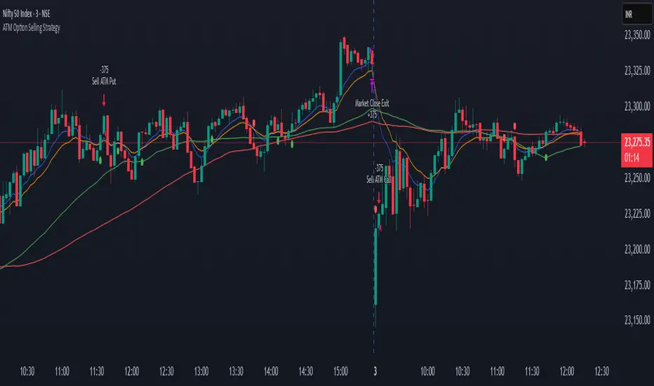
ATM Option Selling StrategyATM Option Selling Strategy – Explained
This strategy is designed for intraday option selling based on the 9/15 EMA crossover, 50/80 MA trend filter, and RSI 50 level. It ensures that all trades are exited before market close (3:24 PM IST).
. Indicators Used:
9 EMA & 15 EMA → For short-term trend identification.
50 MA & 80 MA → To determine the overall trend.
RSI (14) → To confirm momentum (above or below 50 level).
2. Entry Conditions:
🔴 Sell ATM Call (CE) when:
Price is below 50 & 80 MA (Bearish trend).
9 EMA crosses below 15 EMA (Short-term trend turns bearish).
RSI is below 50 (Momentum confirms weakness).
🟢 Sell ATM Put (PE) when:
Price is above 50 & 80 MA (Bullish trend).
9 EMA crosses above 15 EMA (Short-term trend turns bullish).
RSI is above 50 (Momentum confirms strength).
3. Position Sizing & Risk Management:
Sell 375 quantity per trade (Lot size).
50-Point Stop Loss → If option premium moves against us by 50 points, exit.
50-Point Take Profit → If option premium moves in our favor by 50 points, book profit.
Exit all trades at 3:24 PM IST → No overnight positions.
4. Exit Conditions:
✅ Stop Loss or Take Profit Hits → Automatically exits based on a 50-point move.
✅ Time-Based Exit at 3:24 PM → Ensures no open positions at market close.
Why This Works?
✔ Trend Confirmation → 50/80 MA ensures we only sell options in the direction of the market trend.
✔ Momentum Confirmation → RSI prevents entering weak trades.
✔ Controlled Risk → SL and TP protect against large losses.
✔ No Overnight Risk → All trades close before market close.
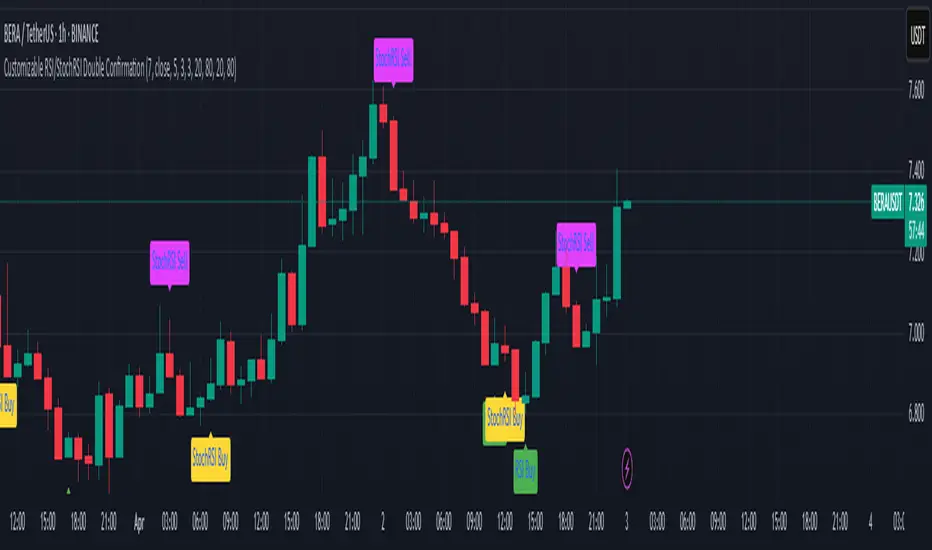
Customizable RSI/StochRSI Double ConfirmationBelow are the key adjustable parameters in the script and their usage:
RSI Parameters
RSI Length: The number of periods used to calculate the RSI, with a default value of 7. Adjusting this parameter changes the sensitivity of the RSI—shorter periods make it more sensitive, while longer periods make it smoother.
RSI Source: The price source used for RSI calculation, defaulting to the closing price (close). This can be changed to the opening price or other price types as needed.
StochRSI Parameters
StochRSI Length: The number of periods used to calculate the StochRSI, with a default value of 5. This affects how quickly the StochRSI reacts to changes in the RSI.
StochRSI Smooth K: The smoothing period for the StochRSI %K line, with a default value of 3. This is used to reduce noise.
StochRSI Smooth D: The smoothing period for the StochRSI %D line, with a default value of 3. It works in conjunction with %K to provide more stable signals.
Signal Thresholds
RSI Buy Threshold: A buy signal is triggered when the RSI crosses above this value (default 20).
RSI Sell Threshold: A sell signal is triggered when the RSI crosses below this value (default 80).
StochRSI Buy Threshold: A buy signal is triggered when the StochRSI %K crosses above this value (default 20).
StochRSI Sell Threshold: A sell signal is triggered when the StochRSI %K crosses below this value (default 80).
Signals
RSI Buy/Sell Signals: When the RSI crosses the buy/sell threshold, a green "RSI Buy" or red "RSI Sell" is displayed on the chart.
StochRSI Buy/Sell Signals: When the StochRSI %K crosses the buy/sell threshold, a yellow "StochRSI Buy" or purple "StochRSI Sell" is displayed.
Double Buy/Sell Signals: When both RSI and StochRSI simultaneously trigger buy/sell signals, a green "Double Buy" or red "Double Sell" is displayed, indicating a stronger trading opportunity.
The volatility of different cryptocurrencies varies, and different parameters may be suitable for each. Users need to experiment and select the most appropriate parameters themselves.
Disclaimer: This script is for informational purposes only and should not be considered financial advice; use it at your own risk.
Responsive VWAP Bands [PQ_MOD]This indicator calculates dynamic VWAP bands that adapt in real time to market conditions. It continuously aggregates volume‐weighted price data from a user-defined start point (either the very first bar or after a specified time) to compute a progressive VWAP (pvwap) and its associated volatility, derived from a volume-weighted variance of the price. The resulting standard deviation is scaled by a user-defined multiplier to generate upper and lower bands around the pvwap. Notably, the indicator features a customizable event-triggered reset mechanism—where the cumulative sums are reinitialized when a chosen condition (such as a periodic interval, a new higher high or lower low, a trend change indicated by a stochastic oscillator divergence, or an external event) is met—thereby enhancing its responsiveness to shifts in market structure. The VWAP, along with its bands, is then plotted on the chart using circle markers, offering a clear visual reference for potential support and resistance levels.

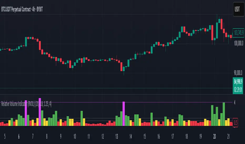
Relative Volume Indicator (RVOL)Relative Volume Indicator (RVOL)
The Relative Volume Indicator (RVOL) helps traders identify unusual volume activity by comparing the current volume to the average historical volume. This makes it easier to spot potential breakouts, reversals, or significant market events that are accompanied by volume confirmation.
What This Indicator Shows
This indicator displays volume as a multiple of average volume, where:
- 1.0x means 100% of average volume
- 2.0x means 200% of average volume (twice the average)
- 0.5x means 50% of average volume (half the average)
Color Coding
The volume bars are color-coded based on configurable thresholds:
- Red: Below average volume (< Average Volume Threshold)
- Yellow: Average volume (between Average Volume and Above Average thresholds)
- Green: Above average volume (between Above Average and Extreme thresholds)
- Magenta: Extreme volume (> Extreme Volume Threshold)
Horizontal Reference Lines
Three dotted horizontal reference lines help you visualize the thresholds:
- Lower gray line: Average Volume Threshold (default: 0.8x)
- Upper gray line: Above Average Threshold (default: 1.25x)
- Magenta line: Extreme Volume Threshold (default: 4.0x)
How To Use This Indicator
1. Volume Confirmation: Use green bars to confirm breakouts or trend changes - stronger moves often come with above-average volume.
2. Low Volume Warning: Red bars during price movements may indicate weak conviction and potential reversals.
3. Extreme Volume Events: Magenta bars (extreme volume) often signal major market events or potential exhaustion points that could lead to reversals.
4. Volume Divergence: Look for divergences between price and volume - for example, if price makes new highs but volume is decreasing (more yellow/red bars), the move may be losing strength.
Settings Configuration
- Average Volume Lookback Period: Number of bars used to calculate the average volume (default: 20)
- Average Volume Threshold: Volume below this level is considered below average (default: 0.8x)
- Above Average Threshold: Volume above this level is considered above average (default: 1.25x)
- Extreme Volume Threshold: Volume above this level is considered extreme (default: 4.0x)
- Colors: Customize colors for each volume category
Important Note: Adjust threshold values only through the indicator settings (not in the Style tab). Changing values in the Style tab will not adjust the coloring of the volume bars.
Adjust these settings based on the specific asset being analyzed and your trading timeframe. More volatile assets may require higher thresholds, while less volatile ones might need lower thresholds.
EMA Price Range by tuanduongEMA Price Range Indicator – Dynamic Range Analysis with Custom EMA (tuanduong2511)
Overview
The EMA Price Range Indicator is designed to help traders visualize the distance between price action and a key Exponential Moving Average (EMA). This indicator dynamically calculates the range from each candle to a user-defined EMA and displays it in a real-time table. By understanding the relationship between price and the EMA, traders can better gauge potential support, resistance, and overextension in the market.
Key Features
✅ Customizable EMA – Allows users to choose the EMA period that best suits their strategy (default: 144).
✅ Real-Time Range Calculation – Computes the absolute difference between the EMA and the price (using the high or low, depending on whether the candle is above or below the EMA).
✅ Minimalist UI – The EMA is plotted directly on the chart, while a small table in the bottom-right corner provides numerical insights, reducing chart clutter.
✅ Versatile Use Cases – Suitable for trend-following traders (identifying pullbacks to EMA) and mean-reversion traders (spotting extended price movements).
How It Works
User-Defined EMA:
The script calculates an Exponential Moving Average (EMA) based on the selected period.
EMA adapts dynamically, giving more weight to recent price movements.
Range Calculation:
If the price is above the EMA, the range is measured from the high point of the candle to the EMA.
If the price is below the EMA, the range is measured from the low point of the candle to the EMA.
This approach ensures that we’re measuring the most relevant distance for price interaction.
Live Table Display:
The current EMA value and the distance (range) from the price are displayed in a small table in the bottom-right corner of the chart.
How to Use It
📌 Trend Traders: Use the indicator to track pullbacks to key EMAs (e.g., EMA 50, 144, or 200). When the price is far from the EMA, it may indicate an overextended trend or potential retracement zone.
📌 Mean Reversion Traders: Look for extreme deviations between price and the EMA. Large distances can signal potential price snapbacks to the mean.
📌 Scalping & Day Trading: Short-term traders can use it with fast EMAs (e.g., EMA 21 or 34) to measure quick price movements relative to short-term momentum.
Why This Indicator?
Unlike traditional EMA indicators, which only plot a moving average, this script provides quantifiable price distance to the EMA, helping traders make data-driven decisions. It allows traders to answer:
✅ Is the price stretched too far from the EMA?
✅ Should I wait for a pullback before entering?
✅ Is the trend strong, or is the price losing momentum?
By integrating EMA-based range analysis, traders gain a clearer understanding of market conditions and can improve their entry, exit, and risk management strategies.

FunkyQuokka's $ Volume💡 Why $ Volume Matters
Share volume alone is a half-truth — 1M shares traded at $5 isn’t the same as 1M shares at $500. That’s where dollar volume steps in, offering a far more accurate view of institutional interest, breakout validity, liquidity zones and overall trader conviction.
📈 Features:
Clean histogram of dollar volume (close × volume)
Orange line showing customizable average $ volume
K/M/B formatting for axis scale (no huge ugly numbers)
Minimal design to blend into a multi-pane layout
⚙️ Inputs:
Tweakable average length – defaults to 20
By FunkyQuokka 🦘
Dynamic Support and Resistance"Dynamic Support & Resistance" Indicator: Find Key Price Levels Easily
This indicator helps you quickly spot potential support and resistance levels on your chart. Think of these levels as price "floors" (support) and "ceilings" (resistance) where the price might bounce or change direction.
How to Use It:
Add it to your chart: Search for "Support and Resistance Zones" in TradingView's indicator library and add it to your chart.
See the lines: You'll see green dashed lines for support and red dashed lines for resistance.
Understand the levels:
Green lines (Support): These show price levels where buyers might step in and push the price back up.
Red lines (Resistance): These show price levels where sellers might step in and push the price back down.
Adjust the settings (optional):
You can change how sensitive the indicator is by adjusting the "Support Window" and "Resistance Window" settings. A smaller number finds more levels, a larger number finds fewer, but potentially stronger levels.
Use it for your trading:
Look for price bounces at support levels to consider buying.
Look for price reversals at resistance levels to consider selling.
These levels can also help you decide where to place stop-loss orders.
Why it's useful:
Saves time: It automatically finds these important price levels, so you don't have to draw them manually.
Easy to see: The colored lines make the levels clear and easy to understand.
Helps with decisions: It gives you potential entry and exit points for your trades.
In simple terms, this indicator makes it easier to see where the price might change direction, helping you make smarter trading choices.

Davut Dayı Full EMA Stack StrategyEma stacking strategy for the honor of Davut Bilgili for his wisdom.
EMA's are generally stack to gether beware when the cross you should take action.

EMA CloudIt's provide the area of value between 2 EMA. Additional 1 EMA long term for determine the market status.

Enhanced Range Filter Strategy with ATR TP/SLBuilt by Omotola
## **Enhanced Range Filter Strategy: A Comprehensive Overview**
### **1. Introduction**
The **Enhanced Range Filter Strategy** is a powerful technical trading system designed to identify high-probability trading opportunities while filtering out market noise. It utilizes **range-based trend filtering**, **momentum confirmation**, and **volatility-based risk management** to generate precise entry and exit signals. This strategy is particularly useful for traders who aim to capitalize on trend-following setups while avoiding choppy, ranging market conditions.
---
### **2. Key Components of the Strategy**
#### **A. Range Filter (Trend Determination)**
- The **Range Filter** smooths price fluctuations and helps identify clear trends.
- It calculates an **adjusted price range** based on a **sampling period** and a **multiplier**, ensuring a dynamic trend-following approach.
- **Uptrends:** When the current price is above the range filter and the trend is strengthening.
- **Downtrends:** When the price falls below the range filter and momentum confirms the move.
#### **B. RSI (Relative Strength Index) as Momentum Confirmation**
- RSI is used to **filter out weak trades** and prevent entries during overbought/oversold conditions.
- **Buy Signals:** RSI is above a certain threshold (e.g., 50) in an uptrend.
- **Sell Signals:** RSI is below a certain threshold (e.g., 50) in a downtrend.
#### **C. ADX (Average Directional Index) for Trend Strength Confirmation**
- ADX ensures that trades are only taken when the trend has **sufficient strength**.
- Avoids trading in low-volatility, ranging markets.
- **Threshold (e.g., 25):** Only trade when ADX is above this value, indicating a strong trend.
#### **D. ATR (Average True Range) for Risk Management**
- **Stop Loss (SL):** Placed **one ATR below** (for long trades) or **one ATR above** (for short trades).
- **Take Profit (TP):** Set at a **3:1 reward-to-risk ratio**, using ATR to determine realistic price targets.
- Ensures volatility-adjusted risk management.
---
### **3. Entry and Exit Conditions**
#### **📈 Buy (Long) Entry Conditions:**
1. **Price is above the Range Filter** → Indicates an uptrend.
2. **Upward trend strength is positive** (confirmed via trend counter).
3. **RSI is above the buy threshold** (e.g., 50, to confirm momentum).
4. **ADX confirms trend strength** (e.g., above 25).
5. **Volatility is supportive** (using ATR analysis).
#### **📉 Sell (Short) Entry Conditions:**
1. **Price is below the Range Filter** → Indicates a downtrend.
2. **Downward trend strength is positive** (confirmed via trend counter).
3. **RSI is below the sell threshold** (e.g., 50, to confirm momentum).
4. **ADX confirms trend strength** (e.g., above 25).
5. **Volatility is supportive** (using ATR analysis).
#### **🚪 Exit Conditions:**
- **Stop Loss (SL):**
- **Long Trades:** 1 ATR below entry price.
- **Short Trades:** 1 ATR above entry price.
- **Take Profit (TP):**
- Set at **3x the risk distance** to achieve a favorable risk-reward ratio.
- **Ranging Market Exit:**
- If ADX falls below the threshold, indicating a weakening trend.
---
### **4. Visualization & Alerts**
- **Colored range filter line** changes based on trend direction.
- **Buy and Sell signals** appear as labels on the chart.
- **Stop Loss and Take Profit levels** are plotted as dashed lines.
- **Gray background highlights ranging markets** where trading is avoided.
- **Alerts trigger on Buy, Sell, and Ranging Market conditions** for automation.
---
### **5. Advantages of the Enhanced Range Filter Strategy**
✅ **Trend-Following with Noise Reduction** → Helps avoid false signals by filtering out weak trends.
✅ **Momentum Confirmation with RSI & ADX** → Ensures that only strong, valid trades are executed.
✅ **Volatility-Based Risk Management** → ATR ensures adaptive stop loss and take profit placements.
✅ **Works on Multiple Timeframes** → Effective for day trading, swing trading, and scalping.
✅ **Visually Intuitive** → Clearly displays trade signals, SL/TP levels, and trend conditions.
---
### **6. Who Should Use This Strategy?**
✔ **Trend Traders** who want to enter trades with momentum confirmation.
✔ **Swing Traders** looking for medium-term opportunities with a solid risk-reward ratio.
✔ **Scalpers** who need precise entries and exits to minimize false signals.
✔ **Algorithmic Traders** using alerts for automated execution.
---
### **7. Conclusion**
The **Enhanced Range Filter Strategy** is a powerful trading tool that combines **trend-following techniques, momentum indicators, and risk management** into a structured, rule-based system. By leveraging **Range Filters, RSI, ADX, and ATR**, traders can improve trade accuracy, manage risk effectively, and filter out unfavorable market conditions.
This strategy is **ideal for traders looking for a systematic, disciplined approach** to capturing trends while **avoiding market noise and false breakouts**. 🚀

Tendencia y Fuerza [4H - Sin Límites]This custom indicator combines two key elements for analyzing financial markets on a 4-hour timeframe:
Trend direction (bullish/bearish).
Brute force of the movement (no numerical limits).
🔍 Main Components:
1. Trend Line (Green/Red):
Green: Uptrend (20 EMA > 50 EMA on the 4-hour period).
Red: Downtrend (20 EMA < 50 EMA on the 4-hour period).
Purpose: To quickly identify market direction.
--------------------------------------------------------------------------------------------------------------------
