W%R Zone Scalper[BullByte] v1.0W%R Zone Scalper Strategy - The Definitive Deep Dive
1. Introduction: The Philosophy Behind the Strategy
This script, W%R Zone Scalper , is not just another Williams %R-based trading system—it is a refined, multi-filtered scalping engine designed to maximize edge in trending markets while minimizing false signals in choppy conditions . Unlike most basic %R strategies that blindly trade crossovers, this system introduces a sophisticated confluence of trend, volatility, and momentum filters , making it a high-probability scalper for intraday traders .
What Makes This Script Different?
✅ Originality: Most %R strategies rely solely on overbought/oversold levels, leading to whipsaws in ranging markets. This script intelligently combines:
- Trend confirmation (MA, Supertrend)
- Volatility filters (BB Width, Choppiness Index)
- Volume validation (to ensure real participation)
- ADX trend strength (to avoid weak, fake trends)
✅ Smart Trade Execution:
- Not just %R crossovers —entries are only taken when multiple filters align, reducing noise.
- Optional ATR-based SL/TP for disciplined risk management.
- Dashboard integration for real-time trade monitoring.
✅ Adaptability:
- Works on crypto, forex, and stocks (optimized for high-liquidity assets like BTC).
- Scalable from 1-minute scalping to 1-hour swing trades (adjust filters accordingly).
2. Core Components: A Surgical Breakdown
A. Williams %R - The Trigger Mechanism
- Default Settings:
- Length = 14 (optimal balance between sensitivity and reliability).
- Long Entry : Cross above -80 (oversold bounce with momentum).
- Short Entry : Cross below -20 (overbought rejection).
Why This Matters:
- Unlike RSI or Stochastic, %R is more aggressive in detecting reversals, making it ideal for scalping fast moves.
- However, raw %R signals are noisy—hence the need for additional filters.
B. The Moving Average (MA) - Trend Filter
- Purpose: Ensures trades are only taken in the direction of the broader trend.
- Types Available:
- SMA (Simple MA) – Smooth but laggy.
- EMA (Exponential MA) – Faster, default choice.
- WMA (Weighted MA) – More responsive to recent prices.
- HMA (Hull MA) – Minimal lag, excellent for scalping.
Entry Logic:
- Long : Price must be above MA (confirms uptrend).
- Short : Price must be below MA (confirms downtrend).
Why This Matters:
- Prevents counter-trend trades , which are high-risk in scalping.
- Works as a dynamic support/resistance .
C. Advanced Filters - The Edge Enhancers
1. Choppiness Index (CI) - Avoiding Sideways Markets
- Default:
- Length = 12
- Threshold = 38.2 (below = trending, above = choppy).
Why This Matters:
- Eliminates false signals in ranging markets (where %R crossovers fail most).
- Inspired by market cycle theory—only trades when volatility is directional.
2. ADX (Average Directional Index) - Trend Strength
- Default:
- Length = 14
- Threshold = 25 (only trade if ADX > 25 = strong trend).
Why This Matters:
- Many traders ignore ADX and get fake breakouts—this ensures trades happen only in high-momentum conditions.
3. Volume Filter - Confirming Real Moves
- Logic: Volume must be above its 50-period MA.
- Why This Matters:
- Low-volume breakouts often fail—this ensures institutional participation.
4. Bollinger Band Width (BBW) - Volatility Check
- Logic: BBW must be above its moving average (expanding volatility = good for scalping).
Why This Matters:
- Avoids low-volatility traps where price moves are insignificant.
5. Supertrend - Dynamic Trend Confirmation
- Logic:
- Longs : Price must be above Supertrend line.
- Shorts : Price must be below Supertrend line.
Why This Matters:
- Acts as a secondary trend filter , reducing whipsaws.
---
3. Risk Management - Protecting Capital
A. Position Sizing (Flexible & Adaptive)
- Default: 30% of equity per trade(aggressive but adjustable).
- Initial Capital: $1,000(example—modify based on your account size).
B. Stop Loss & Take Profit (ATR-Based)
- SL = 1.5x ATR (protects against sudden reversals).
- TP = 2x ATR (locks in profits before pullbacks).
Why ATR?
- Dynamic adjustment —wider in volatile markets, tighter in calm ones.
C. Manual Adjustments Required
- Commission: Default 0.1% (adjust per your broker).
- Leverage: Not hardcoded —apply based on your risk tolerance.
4. Optimal Time Frame & Asset Selection
- Best for: 5M - 15M charts(scalping).
- Also works on: 1H-4H(swing trades with adjusted filters).
- Best Assets:
- High-liquidity cryptos (BTC, ETH, SOL)
- Forex majors (EUR/USD, GBP/USD)
- High-beta stocks (TSLA, NVDA)
5. The Dashboard - Real-Time Trade Intelligence
- PnL Tracking (profit/loss in $ and %).
- Position Status (Long/Short/Flat).
- Filter Status (which ones are active).
- Key Indicators (%R, MA, Volume).
Why This Matters:
- No guesswork—all critical info in one place.
6. Strong Disclaimer
⚠️ This is not financial advice. Trading carries risk of loss.
- Backtest thoroughly before live trading.
- Start with small capital to validate performance.
- Modify SL/TP, leverage, and position sizing based on your risk profile.
- The developer is not liable for any losses incurred.
7. Why This Strategy Stands Out
Most %R strategies fail in real markets because they ignore:
❌ Trend context (trading reversals blindly).
❌ Volatility cycles (getting chopped up in sideways action).
❌ Volume confirmation (falling for fake breakouts).
This script solves those problems by:
✅ Only trading when multiple high-probability factors align.
✅ Using adaptive risk management (ATR-based SL/TP).
✅ Providing a real-time dashboard for decision-making.
8.Important Note on Backtesting & Customization
The performance results displayed with this script are based on:
- Asset BTC/USD
- Timeframe : 5-minute chart
- Key Filters Enabled :
- Moving Average (Trend Confirmation)
- Choppiness Index (Sideways Market Filter)
- Volume (Participation Validation)
Your Trading Approach May Vary
This configuration represents just one possible way to deploy the strategy. You can:
- Test alternative settings (adjust lengths, thresholds, or filters)
- Apply to different assets (cryptos, forex pairs, stocks)
- Experiment with timeframes (1m for ultra-scalping, 15m/1H for swing trades)
Critical Reminder
Always conduct your own forward testing before live trading. Market conditions change, and past performance never guarantees future results.
All the best!
Индикаторы и стратегии

Pelosi Kenobi LevelsThe Pelosi Kenobi Levels Indicator is a sophisticated PineScript v6 tool designed for TradingView to assist traders in identifying key price levels and market dynamics across multiple timeframes. It integrates several technical analysis components, including:
High, Low, and 50% Retracement Levels: Displays current and previous day, week, and month high, low, and 50% retracement levels, with customizable display options for standard, non-standard, and rolling calculations.
Liquidity Clusters: Visualizes bullish and bearish liquidity zones using three-tiered boxes (b1, b2, b3) based on volume and price proximity to significant retracement levels, helping traders spot areas of potential support or resistance.
Cumulative Delta Heatmap: Shows cumulative volume delta as a heatmap, indicating buying or selling pressure, with customizable reset periods (e.g., daily, weekly, custom).
Anchored VWAP (AVWAP): Plots a multi-timeframe anchored Volume Weighted Average Price, reset on new timeframe bars, to highlight price areas where significant trading volume has occurred.
YaGA Retracement Index: Provides a table scoring bullish and bearish strength based on the proximity of price to key levels, aiding in trend assessment.
Opening Range Fib50 (OR31FIB50 and ORCUSTOMFIB50): Plots high, low, and 50% retracement levels for 31-minute or custom-minute opening ranges, useful for intraday trading strategies.
Custom Levels: Allows traders to define their own price levels for additional reference points.
How It Helps Traders:
Market Structure Insight: Identifies critical support/resistance zones through highs, lows, and retracements, enabling traders to anticipate price reactions.
Liquidity Detection: Liquidity clusters highlight areas where large orders may be placed, useful for entry/exit timing or stop placement.
Trend and Momentum Analysis: The delta heatmap and YaGA index provide real-time insights into buying/selling pressure and trend strength, aiding in directional bias.
Intraday Precision: Opening range levels help scalpers and day traders target breakouts or reversals during high-volatility periods.
Customization: Extensive input options allow traders to tailor the indicator to their preferred timeframes, visual styles, and trading strategies, enhancing adaptability across markets (e.g., stocks, forex, crypto).
This indicator is particularly valuable for technical traders seeking a comprehensive, visually intuitive tool to combine price action, volume analysis, and market sentiment for informed decision-making.


Volume Range Profile with Fair Value (Zeiierman)█ Overview
The Volume Range Profile with Fair Value (Zeiierman) is a precision-built volume-mapping tool designed to help traders visualize where institutional-level activity is occurring within the price range — and how that volume behavior shifts over time.
Unlike traditional volume profiles that rely on fixed session boundaries or static anchors, this tool dynamically calculates and displays volume zones across both the upper and lower ends of a price range, revealing point-of-control (POC) levels, directional volume flow, and a fair value drift line that updates live with each candle.
You’re not just looking at volume anymore. You’re dissecting who’s in control — and at what price.
⚪ In simple terms:
Upper Zone = The upper portion of the price range, showing concentrated volume activity — typically where selling or distribution may occur
Lower Zone = The lower portion of the price range, highlighting areas of high volume — often associated with buying or accumulation
POC Bin = The bin (price level) with the highest traded volume in the zone — considered the most accepted price by the market
Fair Value Trend = A dynamic trend line tracking the average POC price over time — visualizing the evolving fair value
Zone Labels = Display real-time breakdown of buy/sell volume within each zone and inside the POC — revealing who’s in control
█ How It Works
⚪ Volume Zones
Upper Zone: Anchored at the highest high in the lookback period
Lower Zone: Anchored at the lowest low in the lookback period
Width is user-defined via % of range
Each zone is divided into a series of volume bins
⚪ Volume Bins (Histograms)
Each zone is split into N bins that show how much volume occurred at each level:
Taller = More volume
The POC bin (Point of Control) is highlighted
Labels show % of volume in the POC relative to the whole zone
⚪ Buy vs Sell Breakdown
Each volume bin is split by:
Buy Volume = Close ≥ Open
Sell Volume = Close < Open
The script accumulates these and displays total Buy/Sell volume per zone.
⚪ Fair Value Drift Line
A POC trend is plotted over time:
Represents where volume was most active across each range
Color changes dynamically — green for rising, red for falling
Serves as a real-time fair value anchor across changing market structure
█ How to Use
⚪ Identify Key Control Zones
Use Upper/Lower Zone structures to understand where supply and demand is building.
Zones automatically adapt to recent highs/lows and re-center volume accordingly.
⚪ Follow Institutional Activity
Watch for POC clustering near price tops or bottoms.
Large volumes near extremes may indicate accumulation or distribution.
⚪ Spot Fair Value Drift
The fair value trend line (average POC price) gives insight into market equilibrium.
One strategy can be to trade a re-test of the fair value trend, trades are taken in the direction of the current trend.
█ Understanding Buy & Sell Volume Labels (Zone Totals)
These labels show the total buy and sell volume accumulated within each zone over the selected lookback period:
Buy Vol (green label) → Total volume where candles closed bullish
Sell Vol (red label) → Total volume where candles closed bearish
Together, they tell you which side dominated:
Higher Buy Vol → Bullish accumulation zone
Higher Sell Vol → Bearish distribution zone
This gives a quick visual insight into who controlled the zone, helping you spot areas of demand or supply imbalance.
█ Understanding POC Volume Labels
The POC (Point of Control) represents the price level where the most volume occurred within the zone. These labels break down that volume into:
Buy % – How much of the volume was buying (price closed up)
Sell % – How much was selling (price closed down)
Total % – How much of the entire zone’s volume happened at the POC
Use it to spot strong demand or supply zones:
High Buy % + High Total % → Strong buying interest = likely support
High Sell % + High Total % → Strong selling pressure = likely resistance
It gives a deeper look into who was in control at the most important price level.
█ Why It’s Useful
Track where fair value is truly forming
Detect aggressive volume accumulation or dumping
Visually split buyer/seller control at the most relevant price levels
Adapt volume structures to current trend direction
█ Settings Explained
Lookback Period: Number of bars to scan for highs/lows. Higher = smoother zones, Lower = reactive.
Zone Width (% of Range): Controls how much of the range is used to define each zone. Higher = broader zones.
Bins per Zone: Number of volume slices per zone. Higher = more detail, but heavier on resources.
-----------------
Disclaimer
The content provided in my scripts, indicators, ideas, algorithms, and systems is for educational and informational purposes only. It does not constitute financial advice, investment recommendations, or a solicitation to buy or sell any financial instruments. I will not accept liability for any loss or damage, including without limitation any loss of profit, which may arise directly or indirectly from the use of or reliance on such information.
All investments involve risk, and the past performance of a security, industry, sector, market, financial product, trading strategy, backtest, or individual's trading does not guarantee future results or returns. Investors are fully responsible for any investment decisions they make. Such decisions should be based solely on an evaluation of their financial circumstances, investment objectives, risk tolerance, and liquidity needs.

Zig Zag + Fibonacci PROPlots ZigZag structure with optional Fibonacci retracement levels.
Helps identify recent highs/lows and possible support/resistance zones.
Customizable levels and alert on price cross.

Market Open Options Strategytrades directionally whatever first 90 seconds of trading day are for either 10 minutes or a reversal whatever comes first

Global M2/M3 Liquidity IndexThis Indicator takes M3 data from 20 of the largest Central banks. M3 data is not available for USA and CHINA and has been substituted with M2.
Overall M3 captures far more than M2 and is therefore a superior model when attempting to track global liquidity.
This indicator also allows the data to be pushed forward to adjust for the lagged effect global liquidity has on markets.
The recommended lag is 90 days.

MÈGAS ALGO : CNA (Cognitio Analysis) [INDICATOR]Overview
The CNA (Cognitio Analysis) is a comprehensive financial analysis tool designed to evaluate the overall health and potential of a market or company based on fundamental metrics. It aggregates data across five key metric groups—**Growth**, **Profitability**, **Cash Flow**, **Income**, and **Valuation**—to provide a final interpretation of market conditions. The indicator dynamically adapts to the selected fiscal period (Quarter, Year, or Trailing Twelve Months) and delivers insights into dominant trends and conflicting signals.
Key Features
1. Customizable Fiscal Period:
- Users can select between "Quarter", "Year", or "Trailing Twelve Months" (TTM) to analyze data for their desired timeframe.
2. Dynamic Table Visualization:
- Displays raw metric values, aggregated scores, and the final interpretation in an intuitive
table.
- Highlights the final interpretation with dynamic background colors (`color.teal` for bullish,
`color.red` for bearish, etc.).
3. Comprehensive Data Integration:
- Pulls financial data using TradingView's `request.financial()` function for metrics like
revenue, earnings, margins, and valuation ratios.
4. Normalization and Scoring:
- Normalizes data to create a consistent scoring system, ensuring accurate comparisons across
metrics.
How It Works
1. Metric Group Analysis
- Growth Metrics: Measures revenue growth, earnings per share (EPS) growth, and tax
efficiency.
- Profitability Metrics: Analyzes net profit margin, return on equity (ROE), and EBITDA margin.
- Cash Metrics: Assesses operating cash flow margin, free cash flow to operating cash flow
ratio, and cash flow coverage.
- Income Metrics: Examines gross profit margin, operating profit margin, and EBIT margin.
- Valuation Metrics: Evaluates price-to-earnings (P/E), price-to-sales (P/S), and enterprise
value-to-EBITDA (EV/EBITDA).
2. Dynamic Scoring System
- Metrics are normalized to ensure consistency across different scales.
- A geometric mean is used to calculate scores for each metric group, ensuring that all metrics
within a group contribute equally to the final score.
3. Dominant Trend Identification
- Scores from all five metric groups are aggregated to determine the **dominant trend** of the
market.
- The dominant trend is categorized as:
- Bullish: Strong fundamentals across most metrics.
- Bearish: Weak fundamentals across most metrics.
- Neutral: Balanced conditions with no clear direction.
- Unclear: Mixed signals dominate, requiring further monitoring.
4. Conflicting Signals Interpretation
- The indicator identifies scenarios where metrics conflict (e.g., high growth but low valuation).
- These conflicting signals provide nuanced insights into market conditions, highlighting rare opportunities or potential risks.
How to Use the Indicator
1. Select Fiscal Period:
- Choose between "FQ", "FY", or "TTM" to analyze data for the desired timeframe.
2. Review Metric Scores:
- Examine the scores for each metric group (Growth, Profitability, Cash, Income, Valuation) to
understand the underlying performance.
3. Interpret Final Output:
- The final interpretation provides a summary of the dominant trend and conflicting signals,
helping users make informed decisions.
4. Dynamic Coloring:
- Use the dynamic background colors in the table to quickly identify market sentiment
(bullish, bearish, neutral, or mixed).
Applications
- Identifying Opportunities:
- Look for bullish dominant trends combined with undervalued growth opportunities for
potential long positions.
- Avoiding Risks:
- Watch out for bearish dominant trends with overvaluation alerts to avoid potential losses.
- Monitoring Neutral Markets:
- Use the indicator to identify neutral markets and wait for clearer signals before making
decisions.
Conclusion
The CNA (Cognitio Analysis) is a powerful tool for traders and investors seeking to make informed decisions based on fundamental analysis. By combining detailed metric evaluations, dynamic scoring, and sentiment-based interpretations, this indicator provides a comprehensive view of market conditions. Whether you're identifying undervalued opportunities, avoiding overvalued risks, or monitoring neutral markets, this indicator equips you with the insights needed to navigate complex financial landscapes.
Please Note:
This indicator is provided for informational and educational purposes only. It is not financial advice, and it should not be considered a recommendation to buy, sell, or trade any financial instrument. Trading involves significant risks, including the potential loss of your entire investment. Always conduct your own research and consult with a licensed financial advisor before making any trading decisions.
The results and images provided are based on algorithms and historical/paid real-time market data but do not guarantee future results or accuracy. Use this tool at your own risk, and understand that past performance is not indicative of future outc

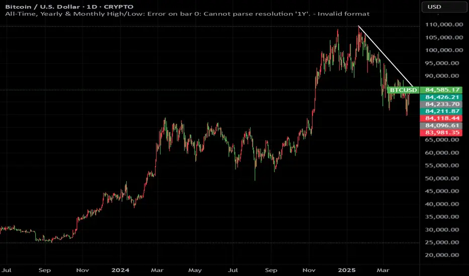
All-Time, Yearly & Monthly High/LowThis indicator visually tracks and displays:
• All-Time High (ATH) – The highest price the asset has ever reached
• All-Time Low (ATL) – The lowest price the asset has ever reached
• Yearly High/Low – The highest and lowest prices recorded in the current calendar year
• Monthly High/Low – The highest and lowest prices in the current calendar month
It helps traders quickly identify major support/resistance levels and historical price extremes across different timeframes. Level
Color
Updates When
All-Time High
Red
A new highest price ever is reached
All-Time Low
Green
A new lowest price ever is reached
Yearly High
Orange
New yearly high occurs or changes with new year
Yearly Low
Teal
New yearly low occurs or changes with new year
Monthly High
Fuchsia
New monthly high or at the start of each new month
Monthly Low
Navy Blue
New monthly low or at the start of each new month This indicator is especially useful for:
• Swing traders watching monthly or yearly trend zones
• Breakout traders looking to spot price levels where breakouts might occur
• Reversal traders using all-time levels for high-risk reward zones
• Long-term investors gauging historical extremes for entries/exits
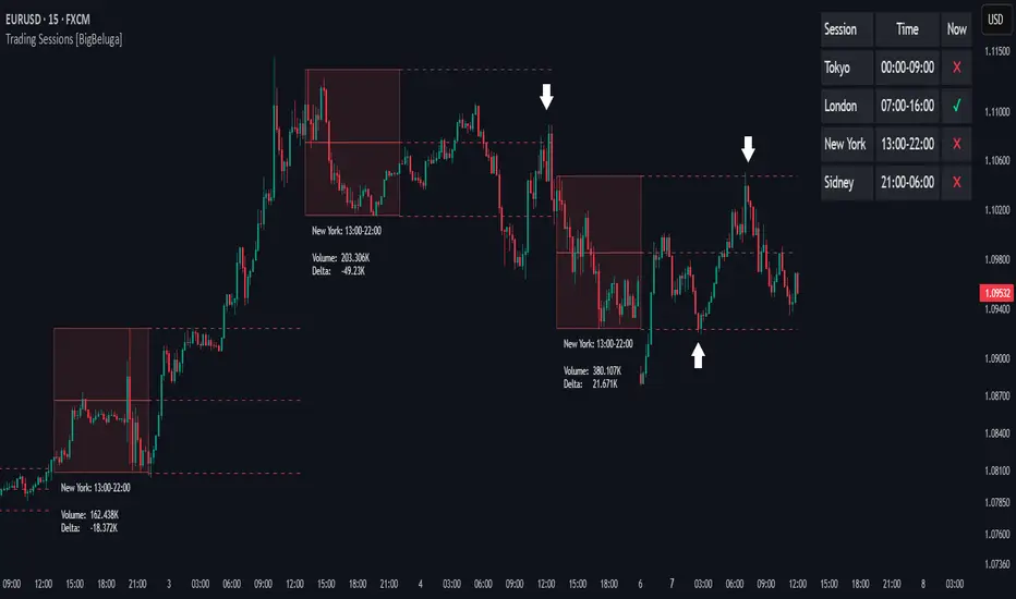
Trading Sessions [BigBeluga]
This indicator brings Smart Money Concept (ICT) session logic to life by plotting key global trading sessions with volume and delta analytics. It not only highlights session ranges but also tracks their midpoints — which often act as intraday support/resistance levels.
🔵 KEY FEATURES
Visual session boxes: Plots boxes for Tokyo, London, New York, and Sydney sessions based on user-defined UTC+0 time ranges.
Volume & delta metrics: Displays total volume and delta volume (buy–sell difference) within each session.
Mid, High & Low Range Extension: Once a session ends, the high, low, and midpoint levels automatically extend — ideal for detecting SR zones.
Session labels: Each box includes a label with session name, time, volume, and delta for quick reference.
Custom session control: Enable or disable sessions individually and configure start/end times.
Clean aesthetics: Transparent shaded boxes with subtle borders make it easy to overlay without clutter.
Sessions Dashboard: Shows the time range of each session and tells you whether the session is currently active.
🔵 USAGE
Enable the sessions you want to monitor (e.g., New York or Tokyo) from the settings.
Use session volume and delta values to gauge the strength and direction of institutional activity.
Watch for price interaction with the extended range — it often acts as dynamic support/resistance after the session ends.
Overlay it with liquidity tools or breaker blocks for intraday strategy alignment.
🔵 EXAMPLES
Extended Future Range acted as resistance/support.
Delta value helped confirm bullish pressure during New York open.
Multiple sessions helped identify kill zone overlaps and high-volume turns.
Trading Sessions is more than just a visual scheduler — it's a precision tool for traders who align with session-based volume dynamics and ICT methodology. Use it to define high-probability zones, confirm volume shifts, and read deeper into the true intent behind market structure.
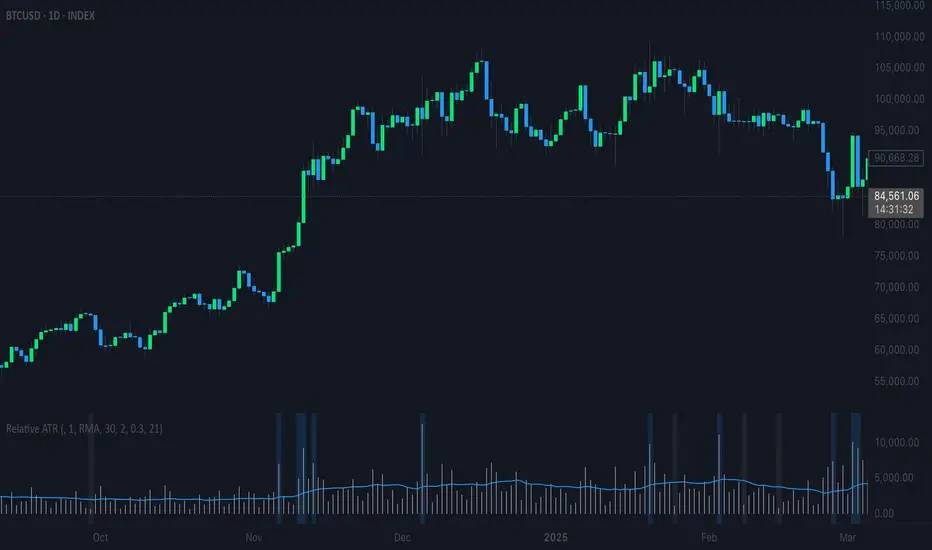
Relative ATRThis indicator enhances the standard Average True Range (ATR) by providing context about current volatility relative to its recent historical average. It highlights periods where ATR is significantly higher or lower than its own recent norm.
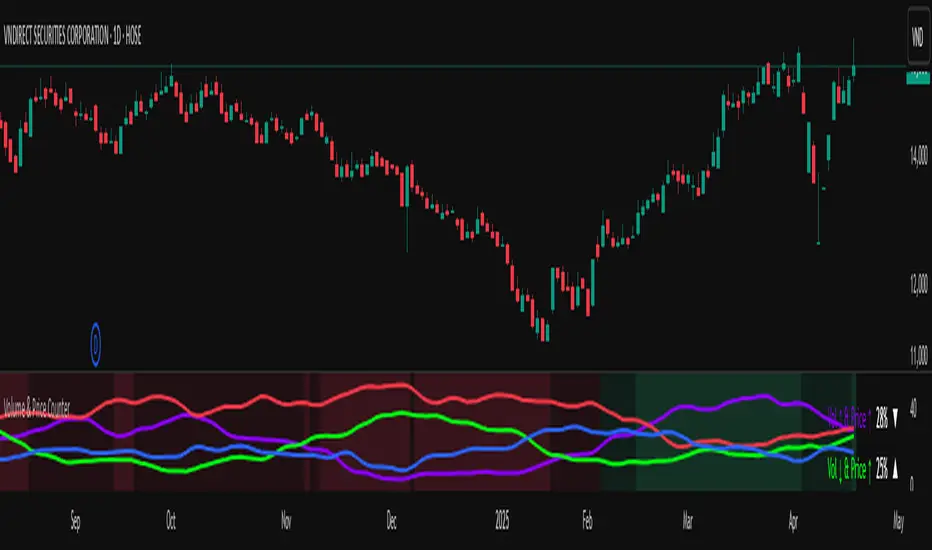
Volume & Price Counter**User Guide for Volume & Price Counter (Candle Structure)**
### 1. Introduction to Volume & Price Counter
The **Volume & Price Counter** (Candle Structure) is a momentum analysis indicator that helps identify which side—buyers or sellers—is dominating the market by counting candles based on the combination of volume and price movement.
The indicator classifies candles into 4 groups:
- **Volume Up, Price Up (Vol ↑ & Price ↑)** – Indicates strong buying pressure.
- **Volume Down, Price Up (Vol ↓ & Price ↑)** – Price is rising but buying momentum is weakening.
- **Volume Up, Price Down (Vol ↑ & Price ↓)** – Indicates strong selling pressure.
- **Volume Down, Price Down (Vol ↓ & Price ↓)** – Price is falling but selling momentum is weakening.
---
### 2. How the Indicator Works
The Volume & Price Counter calculates the number of each candle type over a specific time period to determine which side is currently in control:
- **Green Background**: When the total of (Vol ↑ & Price ↑) + (Vol ↓ & Price ↑) is greater than the total of (Vol ↑ & Price ↓) + (Vol ↓ & Price ↓) → Buyers are in control.
- **Red Background**: When the total of (Vol ↑ & Price ↓) + (Vol ↓ & Price ↓) is greater than the total of (Vol ↑ & Price ↑) + (Vol ↓ & Price ↑) → Sellers are in control.
---
### 3. How to Use the Indicator in Trading
**a) When the background is green**:
- The market is in an uptrend; consider buying during pullbacks to support zones.
- If the green background continues and the number of (Vol ↑ & Price ↑) candles dominates, the price may continue to rise.
- If the green background is present but there are many (Vol ↓ & Price ↑) candles, be cautious as buying strength may be fading.
**b) When the background is red**:
- The downtrend is prevailing; it's better to stay out or look for selling opportunities during pullbacks.
- If the red background continues with a high number of (Vol ↑ & Price ↓) candles, the price may continue to fall.
- If there are many (Vol ↓ & Price ↓) candles during a red background, selling pressure may be weakening—watch for reversal signals.
**c) When the background shifts from red to green**:
- This is a positive signal, indicating buyers are returning to the market.
- Additional volume confirmation is needed to validate a true uptrend.
**d) When the background shifts from green to red**:
- This warns of a potential trend reversal to the downside.
- If volume spikes during the red shift, consider closing long positions.
---
### 4. Combining Volume & Price Counter with Other Indicators
**Combine with support/resistance levels**:
If a green background appears at a strong support zone, it may signal a potential buying opportunity.
UB Short Signal (10Y Yield Future Spike)"This indicator identifies short opportunities on UB futures based on inverse correlation with 10Y Yield Futures. A macro trading tool to be used with additional confirmations."
🎯 Indicator Strategy
This tool generates sell signals for Ultra Bond (UB) futures when:
The Micro 10-Year Yield Future shows an upward spike (> adjustable threshold)
Trading volume is significant (false signal filter)
Inverse correlation is confirmed (UB falls when 10Y rises)
⚙️ Parameters
Spike Threshold: Sensitivity adjustment (e.g., 0.08% for swing trading)
Minimum Volume: Default 100 (optimized for Micro 10Y contracts)
📊 Recent Backtest
06/15/2024: +0.10% spike → UB dropped -0.3% within 15 minutes
06/18/2024: Valid signal post-CPI release
⚠️ Disclaimer
Analytical tool only – not financial advice
Must be combined with proper risk management

RSI HeartHere's an introduction you can use for your RSI Heart indicator:
---
### RSI Heart Indicator
The **RSI Heart Indicator** provides a visually engaging way to monitor and track the **Relative Strength Index (RSI)** across multiple timeframes (10m, 15m, 30m, and 1H). It not only shows the RSI value but also uses heart-shaped symbols to reflect the current market condition based on RSI levels, making it easier to understand the strength and momentum of a given asset at a glance.
### Key Features:
- **Multi-Timeframe Support**: The indicator pulls the RSI values from multiple timeframes (10 minutes, 15 minutes, 30 minutes, and 1 hour) so you can analyze market strength at different intervals in one view.
- **Heart Symbols**: RSI values are displayed alongside heart emojis (❤️, 💛, 💚) that provide a visual cue for the market condition:
- **❤️ (Overbought or Oversold)**: When RSI is below 27 or above 73.
- **💛 (Near Oversold/Overbought)**: When RSI is between 27-30 or 70-73.
- **💚 (Neutral)**: When RSI is between 30 and 70.
- **Customizable Visibility**: Toggle visibility for each timeframe's RSI using simple on/off settings, giving you control over which timeframes are displayed in your chart.
### How it Can Help:
- **Quick Market Sentiment Analysis**: The heart symbols and RSI values allow you to quickly assess whether an asset is in an overbought or oversold condition.
- **Multi-Timeframe RSI**: By viewing RSI across multiple timeframes, you can gain a more comprehensive understanding of market momentum and strength.
- **Personalized to Your Preferences**: Adjust the settings to only show the timeframes that matter most to you, creating a customized and clean chart view.
This indicator helps traders make more informed decisions by providing a clear, easy-to-read representation of market conditions across various timeframes, all within one indicator.
---
This introduction explains what the indicator does, its features, and how it can benefit traders in a concise and easy-to-understand way.

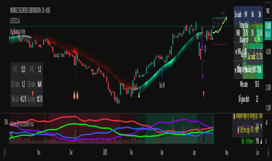
Key Financial index**Basic Indicators** (updates may be delayed by a few weeks after dividend distribution):
1. **P/E Ratio**: *Price-to-Earnings*. This ratio shows the price investors are willing to pay for each unit of profit the company generates.
- A P/E below 8 is considered good, meaning the company yields a 12.5% annual profit, which implies a payback period of 8 years.
2. **P/B Ratio**: *Price-to-Book Ratio*. This is used to compare a company's market value with its book value.
- A low P/B (usually below 1): May indicate that the stock is undervalued compared to the company’s net asset value. This can be a good investment opportunity but may also signal financial trouble.
- A high P/B (usually above 3): May suggest the stock is overvalued relative to the company’s net assets. This could reflect high growth expectations or potential overvaluation.
3. **D/E Ratio**: *Debt-to-Equity Ratio* is a financial metric that measures a company’s financial leverage.
D/E Ratio = Total Liabilities / Shareholders' Equity.
It compares the total liabilities of a company to its equity to indicate how much debt is used to finance its assets compared to shareholder investments.
- D/E Ratio below 1: Generally considered safe.
- D/E Ratio between 1 and 2: May be acceptable depending on the industry.
- D/E Ratio above 2: May indicate high financial risk.
4. **CR Ratio**: *Current Ratio*, an important liquidity metric used to assess a company’s ability to pay off short-term liabilities using its short-term assets.
- CR Ratio > 1: Indicates the company has enough current assets to pay off its short-term debts. The higher the ratio, the better the liquidity position.
- CR Ratio < 1: Suggests the company may face difficulties in meeting short-term obligations. This can be a red flag for financial stability.
5. **Profit Margin**: A key financial indicator that measures a company’s profitability relative to its revenue. It shows what percentage of revenue remains after all related costs are deducted.
**General significance of Profit Margin**:
- **Operational Efficiency**: A high profit margin indicates efficient cost management and the ability to generate strong profits from revenue.
- **Industry Comparison**: Comparing a company’s profit margin with its industry peers helps assess its competitive position and relative performance.
**Note**:
- There is no single “good” margin across all industries. Each industry has different cost structures and competition levels, leading to varying average margins.
- When analyzing profit margins, one must consider the industry context, the company’s business model, and market trends.
6. **Growth Expectation ↑**: This refers to the expected profit growth. The percentage figure reflects how much growth the market expects the company to achieve in the next financial report based on the current stock price.
- The lower the expected growth rate (typically below 15%), the safer the current price is considered.
- A high expected growth rate may indicate that the market anticipates a profit breakthrough or that the stock is trading above its intrinsic value relative to actual earnings.
RSI + SuperTrend Filter Strategy (45m BTCUSDT)🧠 Strategy Breakdown: RSI + SuperTrend Filter (45m BTCUSDT)
This strategy is built on a simple yet powerful principle: don’t fight the trend — and never ignore momentum exhaustion.
At its core, this setup looks for RSI-based reversal entries, but only when price action aligns with the underlying trend structure, defined by a modified SuperTrend. This combo filters out a large chunk of noise you typically get with RSI alone on lower timeframes.
📊 How It Works
Longs trigger when RSI crosses up from oversold and SuperTrend confirms a bullish bias.
Shorts trigger when RSI crosses down from overbought and SuperTrend confirms a bearish structure.
Each entry is paired with a tight SL (1%) and dynamic TP (1.5%), offering favorable risk:reward setups.
The script includes clean chart visuals — background zones, SL/TP lines, and real-time trend bands — built for clarity and decision speed.
⚙️ Why It Works
Too many RSI strategies reverse blindly — this doesn’t. By combining RSI oversold/overbought conditions with a directional SuperTrend filter, you get higher-quality entries, especially during high-volatility phases.
This is not designed for sideways markets — it’s meant to catch clean swings in structured trends. The 45m TF adds breathing room for better signal quality while still allowing for decent trade frequency.
📈 Backtest Snapshot (3m logic on 45m BTCUSDT)
💰 +213,885 USDT total P&L
🧠 239 trades, with solid coverage across sessions
📉 15% max drawdown
⚖️ Profit factor: 1.12
🔁 Dynamic execution-ready — ideal for automation or manual confirmations
🔧 Built For Traders Who:
Want non-repainting structure they can trust
Prefer mechanical entries with visual context
Are experimenting with automation-ready setups
Need something they can tweak and expand on
🔥 If you're serious about combining clean signals with trend confirmation — this is a solid foundation. Drop a comment if you want the multi-timeframe version or ideas on adding volume-based confirmations.

Hull MA with Support/Resistance📊 Combined Hull MA & Support/Resistance Indicator
🌟 Core Features Overview
This indicator integrates two powerful tools:
Hull Moving Average (Hull MA) - An optimized MA variant that reduces lag and closely follows price action.
Dynamic Support/Resistance System - Automatically identifies key price levels based on market structure.
Dual Advantage: Simultaneously identifies trends with Hull MA while pinpointing critical price zones for optimal entries.
⚙️ How It Works
Component Functionality Key Attributes Hull MA
- Trend identification
- Reversal signals via color changes - Low latency
- Color-coded (green/red) momentum
Support/Resistance - Key level detection
- Noise filtering via pivot points - Auto-adjusting
- Extended line visualization
📈 Practical Applications Trend Trading:
Buy when Hull MA turns green + price breaks Resistance
Sell when Hull MA turns red + price breaks Support
Breakout/Pullback Strategies:
Combine S/R breakouts with Hull MA slope for signal confirmation
Risk Management:
Place stop-loss orders beyond nearest S/R levels
⚡ Performance Optimization
Default Settings:
Hull MA: 16 periods (ideal for H1/D1 timeframes)
S/R: 1-bar pivot (short-term swing points)
Advanced Customization:
Increase Hull MA sensitivity by reducing periods
Widen S/R zones with Left/Right Bars >1
📌 Critical Notes
• Most effective in trending markets
• Recommended to combine with volume or RSI for confirmation
• Always backtest across multiple timeframes before live trading
💡 Pro Tip: Use Hull MA as primary trend filter - only trade when price retests S/R levels aligned with the MA's color.

Pivot detector🧠 Pivot Detector – Multi-condition Reversal Signal with Trend & Time Filters
This indicator is specifically optimized for Bitcoin trading, combining classic reversal patterns with volume, trend, and session filters.
🟢 Long signals:
- RSI crossing up from oversold (RSI < 30)
- MACD histogram crossing above zero
- Price touching the lower Bollinger Band with OBV reversal
- Bullish engulfing pattern + volume spike
🔴 Short signals:
- RSI crossing down from overbought (RSI > 70)
- MACD histogram crossing below zero
- Price touching upper Bollinger Band + OBV failure
- Bearish engulfing pattern + volume spike
⚙️ Additional filters:
- ❌ Signals are blocked during low-volatility range zones (ADX < 20 or narrow standard deviation)
- ✅ Longs only allowed during active hours: 00–02, 07–09, 13–15 UTC
- ✅ Shorts only triggered outside strong uptrend (ADX > 25 with DI+ dominance)
📊 Best used on:
- ✅ Bitcoin / BTCUSDT
- ✅ 15m, 30m, 1H, 4H charts
🎯 Strategy focus:
- Captures short-term reversals in volatile but trendable markets
- Filters out traps and low-quality signals during sideways conditions
- Best used with manual confirmation or as part of a composite system
Alerts are built-in for both long and short triggers.
⚠️ This tool is still in its experimental phase and may require further adjustments as it's tested and improved.

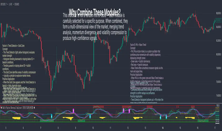
Multi-Factor Reversal AnalyzerMulti-Factor Reversal Analyzer – Quantitative Reversal Signal System
OVERVIEW
Multi-Factor Reversal Analyzer is a comprehensive technical analysis toolkit designed to detect market tops and bottoms with high precision. It combines trend momentum analysis, price action behavior, wave oscillation structure, and volatility breakout potential into one unified indicator.
This indicator is not a random mix of tools — each module is carefully selected for a specific purpose. When combined, they form a multi-dimensional view of the market, merging trend analysis, momentum divergence, and volatility compression to produce high-confidence signals.
Why Combine These Modules?
Module Combination Ideas & How to Use Them
Factor A: Trend Detector + Gold Zone
Concept:
• The Trend Detector (light yellow histogram) evaluates market strength:
• Histogram trending downward or staying below 50 → bearish conditions;
• Trending upward or staying above 50 → bullish conditions.
• The Gold Zone identifies areas of volatility compression — typically a prelude to explosive market moves.
Practical Application:
• When the Gold Zone appears and the Trend Detector is bearish → likely downside move;
• When the Gold Zone appears and the Trend Detector is bullish → likely upside breakout.
• Note: The Gold Zone does not mean the bottom is in. It is not a buy signal on its own — always combine it with other modules for directional bias.
Factor B: PAI + Wave Trend
Concept:
• PAI (Price Action Index) is a custom oscillator that combines price momentum with volatility dispersion, displaying strength zones:
• Green area → bullish dominance;
• Red area → bearish pressure.
• Wave Trend offers smoothed crossover signals via the main and signal lines.
Practical Application:
• When PAI is in the green zone and Wave Trend makes a bullish crossover → potential reversal to the upside;
• When PAI is in the red zone and Wave Trend shows a bearish crossover → potential start of a downtrend.
Factor C: Trend Detector + PAI
Concept:
• Combines directional trend strength with price action strength to confirm setups via confluence.
Practical Application:
• Trend Detector histogram bottoms out + PAI enters the green zone → high chance of upward reversal;
• Histogram tops out + PAI in the red zone → increased likelihood of downside continuation.
Multi-Factor Confluence (Advanced Use)
• When Trend Detector, PAI, and Wave Trend all align in the same direction (bullish or bearish), the directional signal becomes significantly more reliable.
• This setup is especially useful for trend-following or swing trade entries.
KEY FEATURES
1. Multi-Layer Reversal Logic
• Combines trend scoring, oscillator divergence, and volatility squeezes for triangulated reversal detection.
• Helps traders distinguish between trend pullbacks and true reversals.
2. Advanced Divergence Detection
• Detects both regular and hidden divergences using pivot-based confirmation logic.
• Customizable lookback ranges and pivot sensitivity provide flexible tuning for different market styles.
3. Gold Zone Volatility Compression
• Highlights pre-breakout zones using custom oscillation models (RSI, harmonic, Karobein, etc.).
• Improves anticipation of breakout opportunities following low-volatility compressions.
4. Trend Direction Context
• PAI and Trend Score components provide top-down insight into prevailing bias.
• Built-in “Straddle Area” highlights consolidation zones; breakouts from this area often signal new trend phases.
5. Flexible Visualization
• Color-coded trend bars, reversal markers, normalized oscillator plots, and trend strength labels.
• Designed for both visual discretionary traders and data-driven system developers.
USAGE GUIDELINES
1. Applicable Markets
• Suitable for stocks, crypto, futures, and forex
• Supports reversal, mean-reversion, and breakout trading styles
2. Recommended Timeframes
• Short-term traders: 5m / 15m / 1H — use Wave Trend divergence + Gold Zone
• Swing traders: 4H / Daily — rely on Price Action Index and Trend Detector
• Macro trend context: use PAI HTF mode for higher timeframe overlays
3. Reversal Strategy Flow
• Watch for divergence (WT/PAI) + Gold Zone compression
• Confirm with Trend Score weakening or flipping
• Use Straddle Area breakout for final trigger
• Optional: enable bar coloring or labels for visual reinforcement
• The indicator performs optimally when used in conjunction with a harmonic pattern recognition tool
4. Additional Note on the Gold Zone
The “Gold Zone” does not directly indicate a market bottom. Since it is displayed at the bottom of the chart, it may be misunderstood as a bullish signal. In reality, the Gold Zone represents a compression of price momentum and volatility, suggesting that a significant directional move is about to occur. The direction of that move—upward or downward—should be determined by analyzing the histogram:
• If histogram momentum is weakening, the Gold Zone may precede a downward move.
• If histogram momentum is strengthening, it may signal an upcoming rebound or rally.
Treat the Gold Zone as a warning of impending volatility, and always combine it with trend indicators for accurate directional judgment.
RISK DISCLAIMER
• This indicator calculates trend direction based on historical data and cannot guarantee future market performance. When using this indicator for trading, always combine it with other technical analysis tools, fundamental analysis, and personal trading experience for comprehensive decision-making.
• Market conditions are uncertain, and trend signals may result in false positives or lag. Traders should avoid over-reliance on indicator signals and implement stop-loss strategies and risk management techniques to reduce potential losses.
• Leverage trading carries high risks and may result in rapid capital loss. If using this indicator in leveraged markets (such as futures, forex, or cryptocurrency derivatives), exercise caution, manage risks properly, and set reasonable stop-loss/take-profit levels to protect funds.
• All trading decisions are the sole responsibility of the trader. The developer is not liable for any trading losses. This indicator is for technical analysis reference only and does not constitute investment advice.
• Before live trading, it is recommended to use a demo account for testing to fully understand how to use the indicator and apply proper risk management strategies.
CHANGELOG
v1.0: Initial release featuring integrated Price Action Index, Trend Strength Scoring, Wave Trend Oscillator, Gold Zone Compression Detection, and dual-type divergence recognition. Supports higher timeframe (HTF) synchronization, visual signal markers, and diversified parameter configurations.
Lunar Cycle Tracker - (Moon + 3 Mercury Retrogrades)This script overlays the lunar and Mercury retrograde cycles directly onto your chart, helping traders visualize natural timing intervals that may influence market behavior.
Key Features:
🌑 New Moon & Full Moon Markers:
Vertical lines and labels indicate new and full moon events each month. You can fully customize their colors.
🌗 Last Quarter Moon Fill:
A soft pink background highlights the last quarter moon phase (from 7.4 days after the full moon to the next new moon).
🪐 Three Mercury Retrograde Zones:
Highlight up to three retrograde periods per year with customizable date inputs and background color. Great for spotting potential reversal or volatility windows.
Customization:
Moon event dates and colors
Manual input for Mercury retrograde periods (year, month, day)
Full compatibility with all timeframes (1H, 4H, daily, etc.)
Great for astro-cycle traders, Gann-based analysts, or anyone who respects time symmetry in the markets.
Fully customizable & works across all timeframes.
This tool was created by AngelArt as part of a larger astro-market model using lunar timing and planetary retrogrades for cycle-based market analysis.

No Trading ZoneNo trading zone
This indicator highlights the time range between 03:00 and 11:00 UTC as a "danger zone" for trading.
Based on data-driven backtesting, this period consistently showed:
- High frequency of moving average (MA) crossovers without meaningful trend
- A high concentration of sideways market conditions
- Increased likelihood of false breakouts and stop-loss hunting
On average, strong directional trends tend to emerge after 12:00 UTC, especially between 12:00–15:00 UTC.
Avoiding trades during this time zone can help reduce exposure to low-probability setups and enhance strategy reliability.

Cumulative Delta Volume DivergenceCDV Divergence Indicator. Trading is about probabilities and no one indicator is going to give you a definite Buy/Sell signal. There are false positives. It can't tell you how high or low the price will go before it turns around. This is not financial advice. This is just a helpful addition to your toolbox :)

Rolling Beta against SPY📈 Pine Script Showcase: Rolling Beta Against SPY
Understanding how your favorite stock or ETF moves in relation to a benchmark like the S&P 500 can offer powerful insights into risk and exposure. This script calculates and visualizes the rolling beta of any asset versus the SPY ETF (which tracks the S&P 500).
🧠 What Is Beta?
Beta measures the sensitivity of an asset's returns to movements in the broader market. A beta of:
- 1.0 means the asset moves in lockstep with SPY,
- >1.0 indicates higher volatility than the market,
- <1.0 implies lower volatility or possible defensive behavior,
- <0 suggests inverse correlation (e.g., hedging instruments).
🧮 How It Works
This script computes rolling beta over a user-defined window (default = 60 periods) using classic linear regression math:
- Calculates daily returns for both the asset and SPY.
- Computes covariance between the two return streams.
- Divides by the variance of SPY returns to get beta.
⚙️ Customization
You can adjust the window size to control the smoothing:
- Shorter windows capture recent volatility changes,
- Longer windows give more stable, long-term estimates.
📊 Visual Output
The script plots the beta series dynamically, allowing you to observe how your asset’s correlation to SPY evolves over time. This is especially useful in regime-change environments or during major macroeconomic shifts.
💡 Use Cases
- Portfolio construction: Understand how your assets co-move with the market.
- Risk management: Detect when beta spikes—potentially signaling higher market sensitivity.
- Market timing: Use beta shifts to infer changing investor sentiment or market structure.
📌 Pro Tip: Combine this rolling beta with volatility, Sharpe ratio, or correlation tracking for a more robust factor-based analysis.
Ready to add a layer of quantitative insight to your chart? Add the script to your watchlist and start analyzing your favorite tickers against SPY today!
