Impulse Volume Oscillator [Alpha Extract]Impulse Volume Oscillator
A sophisticated indicator designed to identify market impulse moves and volume-based momentum shifts, helping traders capture significant price movements with precision.
Combining price deviations with volume analysis, this oscillator dynamically measures market strength and weakness, providing clear signals for potential trend continuations and reversals.
🔶 Volume-Adjusted Normalization
Utilizes a unique normalization technique that incorporates volume impact to enhance signal quality. This approach ensures the indicator responds more strongly to high-volume price movements while filtering out low-volume noise.
vol_ratio = ta.rsi(volume, 14) / 50
vol_factor = vol_impact > 0 ? 1 + (vol_ratio - 1) * vol_impact : 1
raw_normalized = dev / (ta.stdev(source, bars) * mult)
vol_adjusted = raw_normalized * vol_factor
normalized = ta.sma(vol_adjusted, smooth)
🔶 Adaptive Regime Detection
Incorporates threshold-based regime identification that clearly distinguishes between trending and mean-reverting market conditions. The customizable threshold system allows traders to adapt to different market volatilities and timeframes.
🔶 Customizable Parameters
Fine-tune detection sensitivity with adjustable inputs for lookback period, standard deviation multiplier, volume impact, and signal smoothing. These parameters enable traders to optimize the indicator for various trading styles and market conditions.
❓How It Works
🔶 Impulse Calculation
The oscillator measures price deviation from a moving average baseline, normalized by standard deviation, and then adjusts the signal based on relative volume strength. This creates a responsive yet stable indicator that accurately reflects market momentum.
// Calculate the basis using the selected MA
basis = get_ma(source, bars)
// Calculate the normalized value with volume impact
dev = source - basis
🔶 Dynamic Visualization
The histogram changes color based on signal strength, providing instant visual cues about market conditions. Green bars indicate positive momentum while red bars represent negative momentum, with color intensity reflecting signal strength.
🔶 Trend Confirmation
Built-in trend direction analysis provides confluence with the primary signal, helping traders distinguish between counter-trend bounces and genuine trend reversals. This dual-confirmation approach significantly reduces false signals.
🔶 Visual Alerts & Boundary Tracking
Monitors signal extremes and dynamically adjusts visualization transparency based on signal strength. The indicator highlights particularly strong impulse moves with background shading, making potential trading opportunities immediately apparent.
🔶 Custom Candle Coloring
Optional candle coloring applies the same color logic as the histogram directly to price candles, providing a unified visual framework that helps traders correlate indicator signals with price action.
🔶 Momentum Shift Detection
Automatically identifies important zero-line crossovers that often signify the beginning of new impulse moves. These transition points frequently offer favorable risk/reward entry opportunities.
🔶 Snapshot samples
1 Week
1 Day
15 Min
🔶 Why Choose AE - Impulse Volume Oscillator?
This indicator provides a comprehensive approach to identifying significant market moves by combining volume analysis with price momentum. By offering clear visual signals for both trend continuation and reversal scenarios, it empowers traders to make more informed decisions across various market conditions and timeframes.
Multitimeframe

The Mayan CalendarThis indicator displays the current date in the Mayan Calendar, based on real-time UTC time. It calculates and presents:
🌀 Long Count (Baktun.Katun.Tun.Uinal.Kin) – A linear count of days since the Mayan epoch (August 11, 3114 BCE).
🔮 Tzolk'in Date – A 260-day sacred cycle combining a number (1–13) and one of 20 day names (e.g., 4 Ajaw).
🌾 Haab' Date – A 365-day civil cycle divided into 18 months of 20 days + 5 "nameless" days (Wayeb').
The calculations follow Smithsonian standards and align with the Maya Calendar Converter from the National Museum of the American Indian:
👉 maya.nmai.si.edu
The results are shown in a table overlay on your chart's top-right corner. This indicator is great for symbolic traders, astro enthusiasts, or anyone interested in ancient timekeeping systems woven into financial timeframes. Enjoy, time travelers! ⌛

Trend Matrix Multi-Timeframe Dashboard(TechnoBlooms)Trend Matrix Multi-Timeframe Dashboard is a Minimalist Multi-Timeframe Trend Analyzer with Smart Indicator Integration. Trend Matrix MTF Dashboard is a clean, efficient, and visually intuitive trend analyzer built for traders who value simplicity without compromising on technical depth.
This dashboard empowers you to track trend direction across multiple timeframes using a curated set of powerful technical indicators—all from one compact visual panel. The design philosophy is simple: eliminate clutter, highlight trend clarity, and accelerate your decision-making process.
Key Features
✅ Minimalist Design with Maximum Insight
A compact dashboard view designed for clean charts and focused trading
Optimized layout shows everything you need—nothing you don’t
✅ Multi-Timeframe Access at a Glance
Instantly read the trend direction of selected indicators on multiple timeframes (e.g., 15m, 1h, 4h, 1D)
Customize the timeframe stack to fit scalping, intraday, swing, or positional strategies
✅ Robust Technical Indicators Built In
Each one is hand-picked for trend reliability:
MACD – Momentum and crossover confirmation
RSI – Overbought/oversold and directional shift
EMA – Dynamic support/resistance and trend bias
Bollinger Bands – Volatility structure and trend containment
PVT – Volume-Weighted Trend Confirmation
Supertrend – Price-following trend tracker
✅ Live Updates & Lightweight Performance
Built to update efficiently on every bar close
Minimal performance impact even with multiple timeframes active
By offering multi-timeframe (MTF) access to proven trend-following indicators, Trend Matrix helps you confidently align with the market’s dominant direction—without jumping between charts or analyzing indicators one by one.
This indicator offers customizable settings. The trader can choose the input parameters timeframes as per the choice.
Trend Matrix Multi-Timeframe Dashboard helps traders to identify trend based on technical indications. Trader can refer this while taking trading decisions.
🧠 Ideal For
Scalpers who need higher timeframe confirmation
Swing traders identifying clean entries aligned with the macro trend
Trend followers seeking clarity before committing capital
Price action & SMC traders validating market structure setups
Beginners who want a high-level trend guide without messy indicators

Anilk_3X_Trend_Pulse🧠 What is it trying to do?
It shows whether the price of a stock (or crypto, etc.) is bullish, bearish, or neutral based on how prices are moving over different time periods.
Based on this, it gives a strength score:
+100 means strong bullish momentum (upward)
-100 means strong bearish momentum (downward)
0 means no clear direction (Neutral)
🎨 What does it show on the chart?
It draws 3 colored lines (Blue, Green, Red) below your price chart (in a separate panel):
Blue = Short-term strength
Green = Medium-term strength
Red = Long-term strength
You also see 3 reference lines:
+100 = Bullish line
0 = Neutral line
-100 = Bearish line
🧰 Why is this useful for a trader?
It helps you visually judge momentum across different timeframes.
You can see if all timeframes are pointing in the same direction, which can signal a strong trend.
Great for deciding:
Whether to enter a trade
Whether to stay in or exit
Whether the market is confused or trending clearly
📌 In simple terms:
"This script acts like a trend strength meter across short, medium, and long periods — helping traders see if the market is going up, down, or just stuck."
Would you like a visual example or want this added to your TradingView chart?
// Disclaimer: Please backtest this indicator across different timeframes before using it for live trading to ensure it performs as expected.

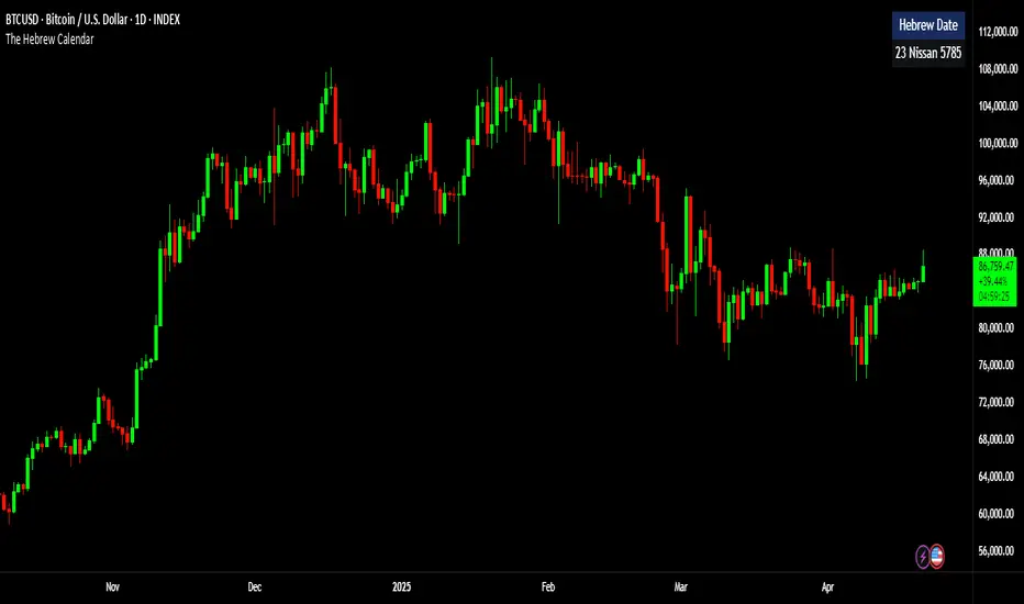
The Hebrew CalendarThis indicator displays the current Hebrew (Jewish) calendar date based on the real-time Gregorian calendar. Features included:
Calculates and displays the current Hebrew day, month, and year.
Recognizes leap years and adjusts month counts accordingly.
Aligns with traditional Hebrew month names (Tishrei, Cheshvan, Kislev, etc.).
The calculations align with the Hebrew Calendar Converter from:
👉 www.chabad.org
The results are shown in a table overlay on your chart's top-right corner. This indicator is great for symbolic traders, astro enthusiasts, or anyone interested in ancient timekeeping systems woven into financial timeframes. Enjoy, time travelers! ⌛
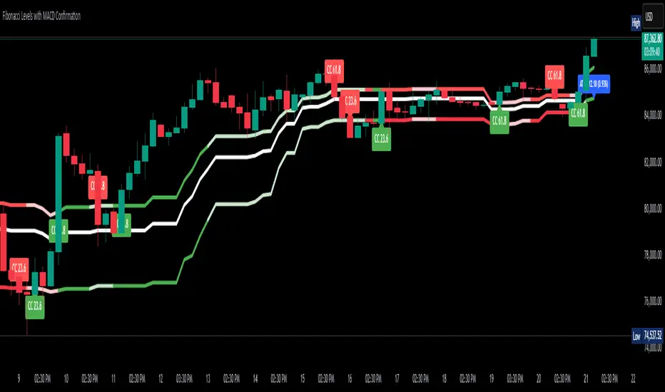
Fibonacci Levels with MACD ConfirmationHow to Understand and Use the Fibonacci Levels with MACD Confirmation Script
This custom Pine Script is designed to give traders a clear visual framework by combining dynamic Fibonacci retracement levels, MACD histogram confirmation, and volatility-based swing zones. It aims to simplify trend analysis, improve entry timing, and adapt to various market conditions.
How to Interpret the 23.6% & 61.8% Labels
These Fibonacci levels represent key retracement zones where price often reacts during trend pullbacks or reversals.
The 23.6% level indicates a shallow retracement, useful in strong trends where price resumes early.
The 61.8% level is a deeper retracement, often a "last line of defense" before trend invalidation.
The script labels these zones with "CC 23.6" and "CC 61.8" when the price crosses them with MACD histogram confirmation:
Green label (CC) = bullish confirmation
Red label (CC) = bearish confirmation
How to Modify Inputs (Manual Adjustments)
Input Purpose Default How to Use
ATR Period Measures volatility 14 Increase for smoother, slower reactions; reduce for faster swings
Min Lookback Minimum bars for swing zone 20 Avoids short-term noise
Max Lookback Cap for swing zone scan 100 Avoids excessively wide retracement levels
Inverse Candle Chart Flips high/low logic false Enable for inverted analysis or backtesting "opposite logic"
How to Use the Inverse Candle Chart Option
Activating inverse mode flips candle logic:
Highs become negative lows, and vice versa.
Useful for:
Contrarian analysis
Inverse ETFs or short-biased views
Backtesting reverse-pattern behavior
How to Adjust the Style
You can manually personalize the script’s visual appearance:
Change line width in plot(..., linewidth=2) for bolder or thinner Fib levels.
Change colors from color.green, color.red, etc., to suit your theme.
Modify label.size, label.style, and label.color for different labeling visuals.
Customize MACD histogram style from plot.style_columns to other styles like style_histogram.
How the MACD is Set and Displayed
The MACD uses non-standard values:
Fast Length = 24
Slow Length = 52
Signal Smoothing = 18
These values slow down the indicator, reducing noise and aligning better with medium- to long-term trends.
MACD histogram is plotted directly on the main chart for faster, on-screen decision making.
Color-coded histogram:
Green/Lime = Bullish momentum increasing or steady
Red/Maroon = Bearish momentum increasing or steady
How to Use the Indicator in Real-World Trading
This indicator is most effective when used to:
✅ 1. Spot High-Probability Trend Continuation Zones
In a strong trend, price will often retrace to 23.6% or 61.8%, then resume.
Wait for:
Price to cross 23.6 or 61.8
MACD histogram rising (bullish) or falling (bearish)
"CC 23.6" or "CC 61.8" label to appear
🟢 Entry Example: Price retraces to Fib 61.8%, crosses up with green MACD histogram → take long position
✅ 2. Validate Reversal or Breakout Zones
These Fib levels also act as support/resistance.
If price crosses a Fib level but MACD fails to confirm, it may be a fake breakout.
Use confirmation labels only when MACD aligns.
✅ 3. Add Volatility Context (ATR) for Risk Management
The ATR label shows both value and %.
Use ATR to:
Set dynamic stop-losses (e.g., 1.5x ATR below entry)
Decide trade size based on volatility
How to Combine the Indicator With Other Tools
You can combine this script with other technical tools for a powerful trading framework:
🔁 With Moving Averages
Use 50/200 MA for overall trend direction
Take signals only in the direction of MA slope
🔄 With Price Action Patterns
Use the Fib/MACD signals at confluence points:
Support/resistance zones
Breakout retests
Candlestick patterns (pin bars, engulfing)
🔺 With Volume or Order Flow
Combine with volume spikes or order book signals
Confirm that Fib/MACD signals align with strong volume for conviction
✅ Trade Setup Summary
Criteria Long Setup Short Setup
Price at Fib Level At or crossing Fib 23.6 / 61.8 Same
MACD Histogram Rising and above previous bar Falling and below previous bar
Label Appears Green "CC 23.6" or "CC 61.8" Red "CC 23.6" or "CC 61.8"
Optional Filters Trend direction, ATR range, volume, price pattern Same
Jack's ADX Entry V5This is Jack’s ADX Entry v5 (latest build) that gives added confirmation on entries that follows these conditions:
For a long - a green up arrow will appear when the ADX trend strength has increased from the previous value + the Long EMA is at the bottom, the medium EMA is in the middle and the short EMA is on top. This provides added confirmation that price is trending upwards.
For a short it’s the opposite - a red arrow will appear when the ADX trend strength has increased from the prvious value + the Long EMA is on top, the medium EMA is in the middle and the short EMA is on the bottom. This is added confirmation that price is trending downwards.

Dskyz (DAFE) AI Adaptive Regime - Pro Dskyz (DAFE) AI Adaptive Regime - Pro: Redefining Trading Excellence
Introduction
welcome to a new era of trading! the Dskyz (DAFE) Ai Adaptive Regime - Pro is a strategy on TradingVew that combines ai-driven adaptability with practical trading tools. it’s built for traders of all levels—whether you’re just starting out or you’ve been in the game for years. this strategy dynamically adjusts to any market condition (trending, ranging, volatile, or quiet) using a unique blend of indicators and ai logic. it’s available on TradingView scripts and has been backtested on the nasdaq 100 micro futures (MNQ1!) to show real results. this is an updated version of my previous script , now with refined settings like a faster 3-period fast MA, a 2-minute HTF for RSI/MACD, and an exaggerated commission of $10 per side to demonstrate the strategy’s robustness.
What It Does and Why It’s Unique
this strategy isn’t just another tradingview script—it’s a system that thinks on its feet. most strategies struggle when market conditions change, but this one uses regime detection to identify the market’s state and adjust its approach. here’s the core idea: it analyzes the market using multiple indicators, assigns a “regime” (trending, ranging, volatile, or quiet), and then tailors its signals to match. this adaptability comes from combining several concepts:
regime detection: uses the average directional index (ADX) to spot trends (ADX > 15), bollinger bands (BB) width to measure volatility, and ATR to gauge price movement. this ensures the strategy knows when to trade aggressively (trending markets) or sit tight (ranging markets).
multi-timeframe confirmation: pulls RSI and MACD from a higher timeframe (default: 2 minutes) to filter out noise on the 1-minute chart. for example, if the 2-minute RSI is overbought (>75), it’ll avoid long trades even if the 1-minute chart looks bullish.
candlestick patterns: spots setups like bullish engulfing, hammers, and double bottoms, but only acts when volume confirms the move (volume > 1.5x the 20-period average). this cuts down on false signals.
dynamic risk management: sets stops and targets using ATR (default period: 3, multiplier: 4.6), so your risk adjusts to volatility. trailing stops kick in to lock in profits as the trade moves your way.
what makes this script stand out is how these pieces work together. the ADX and BBs define the market’s state, the HTF RSI/MACD confirms the trend, candlestick patterns pinpoint entries, and ATR keeps your risk in check. most TradingView scripts focus on one or two of these—like just following a moving average crossover—but this strategy’s multi-layered approach ensures it’s ready for any market. plus, it learns from recent trades (using a 5-trade window) to tweak its risk settings, making it smarter over time.
How It Works: Key Components
let’s break down the main indicators and how they fit into the strategy:
adaptive moving averages: uses a fast EMA (3-period) and slow EMA (36-period) to determine trend direction. if the fast MA is above the slow MA by more than 100x ATR, it’s a bullish trend. this helps avoid choppy markets where MAs often give false signals.
average true range (ATR): calculates dynamic stops and targets. for example, a long entry might set a stop at the recent swing low minus 4.6x ATR, ensuring the stop isn’t too tight in volatile markets.
multi-timeframe RSI & MACD: checks the 2-minute chart for RSI (overbought/oversold) and MACD (trend direction). this adds a layer of confirmation, so you’re not trading against the bigger trend.
bollinger bands: measures volatility to classify regimes. a wide BB (above the 50-period average) signals a volatile market, while a narrow BB suggests a quiet market. the bands also help spot overextended moves for potential reversals.
candlestick patterns: looks for patterns like hammers or double bottoms near support/resistance, but only if volume spikes to confirm. this ensures the pattern isn’t just noise.
these components feed into a scoring system. for a buy signal, the strategy checks the regime, trend direction, HTF indicators, and candlestick patterns, assigning points for each (e.g., a bullish engulfing pattern adds 0.5, a bullish HTF MACD adds 0.3). if the total score hits 1.0 or higher, it triggers a trade. this layered approach makes signals more reliable than a single-indicator strategy.
Default Properties and Backtest Settings
To keep things realistic and transparent, here are the default settings used in the script and
Backtest:
symbol: MNQ1! (nasdaq 100 micro futures)
timeframe: 1 minute
initial capital: $50,000 (realistic for the average trader)
commission: $10 per side ($20 round trip per trade), intentionally exaggerated to demonstrate the strategy’s effectiveness under high fees. typical micro futures commissions are $1.00-$3.00 round trip per contract, so this is ~10x higher to stress-test the system
slippage: 4 ticks (1 point, since MNQ has 4 ticks per point)
risk per trade: $200 (0.4% of capital, well below the 5-10% max risk guideline)
max contracts: 2 (but backtest shows max held is 1 contract per trade)
ATR period: 3
ATR multiplier: 4.6
fast MA: 3-period EMA
slow MA: 36-period EMA
HTF: 2 minutes for RSI/MACD
backtest period: march 23, 2025, 17:00 to april 17, 2025, 15:59 (25 days, 73 trades)
the backtest results showed a net profit of $10,573 with a 46.58% win rate and a 2.657 win/loss ratio over 73 trades. this averages 2.9 trades per day on a 1-minute chart. while this is below the recommended 100+ trades for a sample size, the strategy’s settings (e.g., fast MA of 3, slow MA of 36, 2-minute HTF) are tuned for fewer, higher-quality trades, and the stable win rate and strong profit factor (2.316) suggest reliability. the max drawdown was $1,394.50 (2.35% of initial capital), within the 5-10% guideline. total commission paid was $1,470 (73 trades * $20), which is high due to the exaggerated $10 per side fee. if using a more typical $1.00 per trade commission, total fees would be $73, increasing net profit to $11,050. this shows the strategy performs even better under realistic conditions.
How to Use It
this script is designed to be user-friendly, even if you don’t know pine script. here’s how to get started:
add to chart: load the script on tradingview and apply it to a 1-minute MNQ1! chart (or your preferred instrument/timeframe after testing).
check presets: the script offers three modes—aggressive, conservative, and optimized. start with “optimized” (default) for a balanced approach. you can switch modes in the inputs tab.
read the dashboard: a table at the bottom-left shows key metrics like trend direction, ATR, RSI, and the current regime (trending, ranging, etc.). use this to understand the market’s state.
watch for signals: green triangles below bars signal a buy, red triangles above bars signal a sell. the script also plots stop-loss and take-profit levels (red/green lines) for each trade.
monitor visuals: the chart background changes color based on the regime (green for trending, orange for ranging, etc.), and bollinger bands (upper green, lower red, center white) help you see volatility.
backtest first: before live trading, run a backtest with your settings to see how it performs on your instrument and timeframe. adjust risk per trade or max contracts in the inputs if needed.
for pros, you can dive into the inputs to tweak things like the ATR multiplier, MA lengths, or HTF timeframe. the script also includes a debug table (top-left) to show regime counts and indicator values, which is great for fine-tuning.
Key Features and Benefits
market adaptability: switches between four regimes to trade smarter in any condition.
precision signals: combines HTF RSI/MACD, candlestick patterns, and volume for reliable entries/exits.
smart risk management: ATR-based stops and trailing stops keep your capital safe.
self-optimizing ai: adjusts risk based on recent trades to improve over time.
user-friendly design: presets and a sleek dashboard make it easy for beginners.
visual appeal: color-coded backgrounds, glow-effect bands, and clear signal markers.
Limitations and Considerations
no strategy is perfect, so here’s what to keep in mind:
market dependency: works best on futures like MNQ or ES due to consistent tick values. stocks or forex may need adjustments to ATR or risk settings.
l earning curve: presets make it easy, but understanding regimes and indicators unlocks its full potential. check the dashboard to learn as you go.
no guarantees: success depends on market conditions and discipline. backtest thoroughly before live trading.
exaggerated commission: the backtest uses a high $10 per side commission to stress-test the strategy. real-world fees are typically lower, which would improve performance.
Conclusion
The Dskyz (DAFE) Ai adaptive regime - Pro is here to help you trade smarter, not harder. its ai-driven adaptability, multi-timeframe precision, and user-friendly design make it a powerful tool for any trader. despite a high $10 per side commission in the backtest, it still delivered a $10,573 profit, proving its robustness. under typical fees, performance would be even stronger. whether you’re chasing trends on MNQ or testing it on another instrument, this strategy gives you an edge with its dynamic signals and risk management. add it to your chart, backtest it, and see why it’s redefining trading excellence. let’s trade with discipline, vision, and pro-level precision! 🚀
—Dskyz

4 EMA + MTF Trend TableCreates a table on top right of chart that shows if the 4ma is bullish or bearish on different timeframes

Multi-Timeframe EMA Signal - StyledTrend reminder, what is based on the 39 MA. Looking after 14 CLOSED candles. The minute TF is calculated from the 1m chart, the 1H, 4h, 1D is calculated from the 1h TF.
If you go higher on the minute TF you see that the calculation goes bad, so you dont see the minute TF-s trend if you are on the 5m or on the 15M or higher TF. It's ok for my needs i usualy trade on the 1m chart so i see everything.
It's simple.
I was looking for a srcipt like this, and did not find anything.
It's not my work, its Veronika's script from chatGPT based on my needs. :)

🔸 Channel Zones + VWAP [Multi-Timeframe]Channel Zones + VWAP for intraday trading, scalping, or swing setups.
🔸 1. Trend + Zone Confluence
If price is near the lower red channel and VWAP is green, look for long entries.
If price hits the upper green channel and VWAP turns red, look for short setups.
🔸 2. HTF Confirmation
Use the HTF zones (lime/orange) as bigger picture support/resistance.
For example:
If on 15m chart, set HTF to 1h or 4h.
If price hits HTF Support + VWAP is green, look for reversal entries.
If price is stuck between HTF zones, consider range-bound plays.
🔸 3. Avoid False Breakouts
If price breaks a channel but VWAP doesn't confirm (e.g., VWAP still red while price breaks above), consider it a fakeout.
This keeps you aligned with volume and mean-reversion logic.
🔸 4. Scalping Plays
Look for price touching current channel levels while diverging from VWAP.
Enter when:
Price is far from VWAP → Expect pullback.
Price is at red/green line → Potential bounce zone.
Like this indicator ? Boost it ♥️

HTF Countdown by Silver Mountain Trading)Stay sharp and time your trades with precision.
This simple but effective tool shows a real-time countdown to the next Higher Time Frame (HTF) candle — such as 4H, 1H, or whatever timeframe you choose.
The countdown is always placed just below the current day’s low, with clean design and no clutter.
🔹 Displays remaining time in H:M:S
🔹 Anchored visually to current day’s LOD
🔹 Works in replay mode
🔹 Open-source and free to use
🔹 From Silver Mountain Trading
🙌 If you found this helpful, a like and subscribe to the Silver Mountain Trading YouTube channel would be much appreciated as a thank-you. www.youtube.com

[Kpt-Ahab] Moving Average Alarm OutputVarious Moving Average with Signal Outputs
Compatible with various backtesting-systems or risk management-systems for generating alarms and trading signals.
Also compatible with the djmad Multibit ecosystem, allowing for signal filtering or combining indicators.
Standard signal output Long/Short +1/-1
Filter, for suppressing signals
Various color variations.
Intraday Long Stoploss DistanceWhile working on intraday 1-minute charts i found it distracting to calculate the stoploss distance from the current price so i created an overlay indicator that plots the values of the last 15 minute and 30 minutes low for safe SL placement so you can get a rough idea of Risk management and lot size to use.
Still in early phases. Few more updates coming soon .stay updated.
*Not a financial advice.

Jack's ADX Entry V5Updated Jack's ADX Entry Indicator to show entry for long/short positions based on:
1. Order of the short, medium and long EMAs.
2. ADX Trend strength momentum value increasing from previous value.

Super Indicator Enhanced by TradeGlobal PROSuper Indicator Enhanced by TradeGlobal PRO
This indicator is designed to help traders identify high-probability trading opportunities across various markets, particularly on intraday timeframes like 1H and 4H. It combines multiple technical indicators—RSI, MACD, Bollinger Bands, and volume analysis—to generate reliable BUY and SELL signals while filtering out noise during sideways markets.
Features
RSI with Divergence Detection: Uses the Relative Strength Index (RSI) to identify overbought/oversold conditions and bullish/bearish divergences for potential reversals.
MACD for Trend Confirmation: Employs the Moving Average Convergence Divergence (MACD) to confirm bullish or bearish momentum, ensuring signals align with the market trend.
Bollinger Bands for Sideways Detection: Filters out false signals during low-volatility (sideways) periods by analyzing the Bollinger Bands width.
Volume Breakout & Whale Detection: Detects significant volume spikes to identify potential whale activity, indicating strong buying or selling pressure.
Support/Resistance with Retest Logic: Identifies key support and resistance levels, enhanced with retest confirmation for higher accuracy.
Double Bottom/Top Patterns: Detects classic reversal patterns (double bottom/top) with volume confirmation to validate breakouts.
Dynamic Stop-Loss and Take-Profit: Automatically calculates stop-loss and take-profit levels using ATR (Average True Range) with a customizable risk-to-reward ratio.
Signal Types
BUY/SELL: Standard signals for entering trades based on RSI, MACD, and whale activity.
BUY EL/SELL EL: Enhanced signals with higher confidence, incorporating support/resistance, double bottom/top patterns, and retest logic.
OUT: Signals to exit a trade when the price hits the stop-loss, take-profit, or breaks key levels.
How to Use
Timeframe: Best used on 1H or 4H charts for intraday trading. Adjust the RSI overbought/oversold levels for higher timeframes if needed.
Signals:
BUY/BUY EL: Enter a long position when these signals appear. Place a stop-loss below the calculated level and aim for the take-profit level.
SELL/SELL EL: Enter a short position when these signals appear. Place a stop-loss above the calculated level and aim for the take-profit level.
OUT: Exit the trade when this signal appears to secure profits or minimize losses.
Customization:
Adjust the RSI Length, MACD settings, and Bollinger Bands Length to suit your trading style.
Modify the ATR Multiplier for stop-loss and the Risk:Reward ratio for take-profit based on your risk tolerance.
Alerts: Set up alerts for BUY, SELL, BUY EL, SELL EL, and OUT signals to stay informed of trading opportunities.
Notes
The indicator works best in trending markets. Avoid using signals during prolonged sideways periods (check Bollinger Bands width).
Always combine the indicator with your own market analysis and risk management strategy.
Try it out and share your feedback in the comments! Let’s master the markets together.

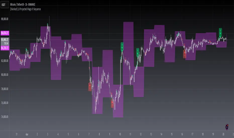
[blackcat] L3 Projected Magic-9 SequenceOVERVIEW
The L3 Projected Magic-9 Sequence indicator is a sophisticated tool designed to help traders identify potential trend reversals through a unique sequence of price movements. By calculating projected highs and lows based on previous bar conditions, this script provides valuable insights into possible future market directions. It plots these key levels on the chart and highlights specific sequential patterns that often precede significant reversals, offering traders a visual advantage in their decision-making process 📈💡.
FEATURES
Projections: Calculates and plots projected highs and lows based on intricate conditions derived from previous bars' open, close, high, and low prices. These projections serve as dynamic support and resistance levels, helping traders anticipate potential turning points in the market 📊.
Sequential Patterns:
Identifies various sequential patterns known as "Magic" sequences, such as Magic-9 and Magic-13.
Labels these sequences directly on the chart for easy identification: 5, 6, 7, 8, 9, 12, 13 for both bullish and bearish trends.
Provides additional labels when these sequences align with projected highs or lows, enhancing the reliability of the signal 🏷️.
Differentiates between trend and sideways phases using the Magic-9 Project Range. Traditional sequences generating buy and sell signals of 9 and 13 during sideways swings are displayed indistinguishably from other numbers. However, the 9 and 13 generated by breakouts are highlighted with red and green labels for better visibility 🚦.
Project Range Adjustment:
The Project Range is automatically adjusted by Multiple Time Frame (MTF).
A higher cycle is selected as the baseline of the Project Range based on the current operating cycle, ensuring adaptability to varying market conditions ⏳.
Customization:
Offers customizable colors for plotted lines and labels, allowing users to tailor the appearance to their preferences 🎨.
Adjustable settings for lookback periods and other parameters to fine-tune the indicator according to individual trading styles.
Automatic Timeframe Selection:
Automatically selects the most suitable timeframe for data fetching, ensuring optimal performance across different chart intervals ⏳.
Ensures compatibility with various trading strategies, whether short-term intraday or long-term positional trading.
HOW TO USE
Adding the Indicator:
Open your TradingView platform and navigate to the chart where you want to apply the indicator.
Click on the "Indicators" button at the top of the screen and search for L3 Projected Magic-9 Sequence.
Select the indicator from the list and add it to your chart.
Understanding Projections:
Once added, observe the plotted projected highs and lows on your chart.
These lines represent anticipated support and resistance levels based on complex calculations involving previous bar data.
Identifying Sequential Patterns:
Look for labels such as 5, 6, 7, 8, 9, 12, and 13 appearing on the chart.
These labels signify specific sequential patterns that often precede market reversals.
Pay special attention to labels that include arrows (e.g., 9▼, 13▲), indicating alignment with projected highs or lows.
Note the differentiation between trend and sideways phases:
During sideways swings, traditional sequences generating buy and sell signals of 9 and 13 are displayed indistinguishably from other numbers.
Breakout-generated 9 and 13 are highlighted with red and green labels for clear identification.
Combining with Other Tools:
While the L3 Projected Magic-9 Sequence offers powerful insights, it is essential to combine its signals with other technical analysis tools.
Use moving averages, volume indicators, or candlestick patterns to confirm the validity of the identified sequences before executing trades.
LIMITATIONS
Market Conditions: The indicator performs best in trending markets but may generate false signals during periods of consolidation or range-bound movement 🌐.
Complexity: Due to its reliance on specific sequential patterns, some traders might find the concept challenging to grasp initially. Thorough testing and understanding are crucial before deploying it in live trading environments.
Data Dependency: Accurate projections depend on having sufficient historical data. Insufficient data may lead to less reliable results.
NOTES
Backtesting: Before implementing the indicator in real-time trading, conduct extensive backtesting to evaluate its effectiveness under various market conditions.
Risk Management: Always adhere to proper risk management principles, even when relying on robust indicators like this one. Set stop-loss orders and position sizes accordingly to protect your capital 🛡️.
Continuous Learning: Stay updated with the latest developments and adjustments made to the indicator by following community discussions and official updates from the author.
Aesthetic RSI [AlchimistOfCrypto]🌌 Aesthetic RSI – Unveiling the Fractal Forces of Markets 🌌
Category: Momentum Indicators 📈
"The RSI oscillator, formalized through an advanced mathematical prism, reveals the underlying fractal structures of price movements. This indicator draws inspiration from quantum principles of divergence-convergence where the probability of a return to equilibrium increases proportionally to the distance from the median point. Our implementation employs sophisticated algorithmic smoothing to filter out the stochastic noise inherent in financial markets, allowing visualization of the true momentum forces according to thermodynamic entropy principles applied to trading systems."
📊 Professional Trading Application
The Aesthetic RSI is a visually stunning and mathematically refined take on the classic Relative Strength Index. With customizable settings, advanced smoothing, and eight unique visual palettes, it empowers traders to detect momentum shifts and divergences with unparalleled clarity.
⚙️ Indicator Configuration
- Length 📏
The core parameter (default: 20) that determines the calculation period.
- Lower values (8-14): Increase sensitivity for short-term trading.
- Higher values (21-34): Provide stronger signals for position trading.
- OverBought/OverSold Thresholds 🎯
Customizable boundaries (default: 75/25) to identify extreme market conditions.
- Calibrate based on asset volatility: Higher volatility assets may need wider thresholds (80/20) to reduce false signals.
- Style 🎨
Eight meticulously crafted visual palettes optimized for pattern recognition:
- Miami Vice (default): High-contrast cyan/magenta scheme for spotting divergences.
- Cyberpunk: Yellow/purple combo to highlight momentum shifts.
- Classic: Traditional green/red for conventional analysis.
- High Contrast: Maximum visual separation for traders with visual impairments.
- Specialized palettes (Forest, Ocean, Fire, Monochrome): Tailored for diverse market conditions.
- Mode Selection 🔄
- Full: Displays a complete gradient spectrum across the RSI range, emphasizing momentum transitions between 35-65.
- OverZone: Focuses on actionable extreme zones, reducing noise in ranging markets.
🚀 How to Use
1. Adjust Length ⏰: Set the period based on your trading style (short-term or long-term).
2. Fine-Tune Thresholds 🎚️: Customize overbought/oversold levels to match the asset’s volatility.
3. Select a Palette 🌈: Choose a visual style that enhances your pattern recognition.
4. Choose Mode 🔍: Use "Full" for detailed momentum analysis or "OverZone" for extreme zone focus.
5. Spot Divergences ✅: Look for price-RSI divergences to anticipate reversals.
6. Trade with Precision 🛡️: Combine with other indicators for high-probability setups.
📅 Release Notes (April 2025)
Aesthetic RSI blends quantum-inspired mathematics with artistic visualization, redefining momentum analysis. Stay tuned for future enhancements! ✨
🏷️ Tags
#Trading #TechnicalAnalysis #RSI #Momentum #Divergence #MultiTimeframe #TradingStrategy #RiskManagement #Forex #Stocks #Crypto #Bitcoin #AlgoTrading #DayTrading #SwingTrading #TheAlchimist #QuantumTrading #VisualTrading #PatternRecognition

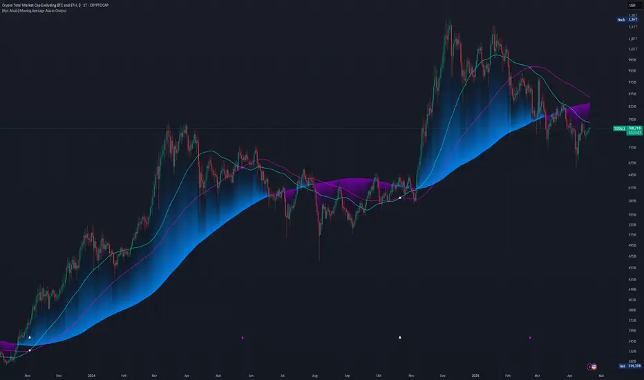
Global M2 Liquidity [TheAlchimist]🌍 Global M2 Liquidity – Navigating the Quantum Field of Markets 🌍
Category: Macroeconomic Indicators 📊
"In quantum physics, the observer effect states that the mere act of observation changes the system being observed. Similarly, in financial markets, global liquidity acts as a quantum field that permeates all market states simultaneously. Just as Heisenberg’s uncertainty principle suggests we cannot precisely measure both position and momentum, the M2 money supply’s influence on market dynamics creates a complex web of cause and effect across multiple timeframes."
📈 Overview
The Global M2 Liquidity indicator is a powerful tool that tracks the combined M2 money supply from five major economies (US, EU, China, Japan, UK), converted to USD 💵, offering a panoramic view of global liquidity conditions. With multi-timeframe analysis and a customizable forward-shift feature, it empowers traders to anticipate market movements driven by liquidity trends.
✨ Features
- Global Coverage 🌎: Monitors M2 money supply from 5 major economic regions (US, EU, China, Japan, UK).
- Real-Time Conversion 💱: Converts all data to USD for consistent analysis.
- Multi-Timeframe Analysis ⏰: Tracks liquidity from 15-minute to weekly charts.
- Forward-Shift Capability 🔮: Aligns M2 data with future price action for predictive insights.
- Color-Coded Trends 🎨: Visualizes liquidity trends (🟢 Expansion, 🔴 Contraction).
🚀 How to Use
1. Main Line 📉: Displays total global M2 liquidity in trillions of USD.
2. Golden Moving Average ⭐: Identifies the overall trend direction.
3. Trend Colors 🟢🔴:
- Green: Liquidity expanding above the moving average (bullish for risk assets).
- Red: Liquidity contracting below the moving average (bearish signal).
4. Forward Shift ⏩: Use the shift parameter to align M2 data with price action for predictive analysis.
5. Combine with Price Action 🔍: Correlate liquidity trends with assets like Bitcoin, stocks, or forex for strategic entries/exits.
⚙️ Settings
- MA Period 📏: Length of the moving average (default: 50).
- Shift ⏳: Number of days to shift data forward (default: 60).
🏷️ Tags
#Trading #Macroeconomic #M2Liquidity #GlobalLiquidity #MoneySupply #MultiTimeframe #TrendAnalysis #PredictiveAnalysis #Forex #Stocks #Crypto #Bitcoin #RiskAssets #CentralBanks #USD #TheAlchimist #QuantumTrading #AlgoTrading #DayTrading #SwingTrading

MACD [AlchimistOfCrypto]🌠 MACD Optimized with Python – Decoding the Chaos of Markets 🌠
Category: Trend Analysis 📈
"Like the dynamic systems studied in chaos theory, financial markets appear unpredictable at first glance. Yet, as Edward Lorenz demonstrated, even in apparent chaos reside harmonious mathematical structures. The MACD (Moving Average Convergence Divergence) represents this quest for order within disorder—a mathematical formulation that extracts coherent signals from price noise. By combining moving averages of different periods, this indicator reveals hidden cycles and precise moments when market energy shifts, like a pendulum obeying the immutable laws of physics."
📊 Technical Overview
The MACD Optimized with Python is a revolutionary take on the classic Moving Average Convergence Divergence indicator. Powered by Python-driven optimizations 🐍, it adapts to specific timeframes, delivering razor-sharp signals for traders seeking to navigate the market’s chaos with precision.
⚙️ How It Works
- Python-Optimized Parameters 🔧: Unlike the standard MACD (12,26,9), our version uses mathematically tailored parameters for each timeframe:
- 1H: 11/38/27
- 4H: 9/98/27
- 1D: 45/90/29
- 1W: 9/16/3
- 2W: 5/20/5
- Intuitive Visuals 🎨:
- Crossovers marked by colored dots 🟢🔴 for clear entry/exit signals.
- Histogram with a color gradient 🌈 to show direction and momentum intensity.
- Customizable Signals 🎯: Choose to display long, short, or both signals to match your trading style.
🚀 How to Use This Indicator
1. Select Your Timeframe ⏰: Choose the timeframe aligned with your trading horizon (1H, 4H, 1D, 1W, or 2W).
2. Spot Crossovers 🔍: Watch for the MACD line (green) crossing the signal line (red) to identify potential trend changes.
3. Confirm with Divergence ✅: Combine crossovers with price-MACD divergence for high-probability trend reversal signals.
📅 Release Notes
Unlock the hidden order of markets with this Python-optimized MACD. Stay tuned for future enhancements! ✨
🏷️ Tags
#Trading #TechnicalAnalysis #MACD #TrendAnalysis #Python #MultiTimeframe #Divergence #Momentum #TradingStrategy #RiskManagement #Forex #Stocks #Crypto #ChaosTheory #OptimizedTrading

MarketTrend [AlchimistOfCrypto]🌌 MarketTrend – Unveil the Cosmic Harmony of Markets 🌌
"What we call 'trend' is merely an illusion of our limited perception of the space-time continuum of markets. Pivots are points of singularity where potential energy ⚡️ transforms into kinetic energy 🚀. The fourth dimension isn’t just time—it’s the simultaneous awareness of all temporal states. By observing mathematical laws across time scales, we unlock the secrets of the cosmic harmony of markets."
📊 Technical Overview
MarketTrend is a multi-timeframe trend analysis powerhouse 🔥 that tracks market direction across six timeframes simultaneously. It pinpoints pivot points 📍 to classify trends as bullish 🐂, bearish 🐻, or neutral ⚖️, presenting results in a sleek, easy-to-read table.
⚙️ How It Works
- The algorithm scans for pivot highs and pivot lows using a 20-bar lookback period 🔍.
- Bullish Trend 🟢: Price breaks above a previous pivot high.
- Bearish Trend 🔴: Price drops below a previous pivot low.
- Neutral Zone 🟡: Price consolidates until a breakout sparks a new trend.
🚀 How to Use This Indicator
1. Master Multi-Timeframe Analysis 🌍: Spot trend alignment across timeframes for a holistic view.
2. Seek Confluence ✅: Stronger signals emerge when multiple timeframes align.
3. Time Your Entries ⏰: Enter trades when shorter timeframes sync with larger ones for maximum precision.
4. Manage Risk 🛡️: Avoid countertrend trades when timeframes show unified direction.

Multi-Timeframe Bollinger Bands OverlayThis indicator lets you view the Bollinger Bands from both the current chart and a higher timeframe (like 1H, 4H, etc.)
U can customize the BB length and multiplier.
Clean overlay design with distinct colors.
Like this indicator? Boost it ♡

Tinchy- MTF Extreme RSI Flowershow extreme RSI flowers on K-line when RSI value > 70 or <30
RSI 60 == 1h
RSI 240 == 4h
RSI 1440 == 1d
