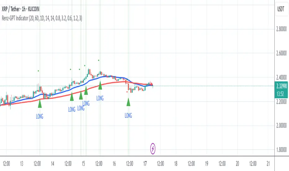
Renz-GPT IndicatorThe Renz-GPT Indicator is a powerful, all-in-one trading tool designed to simplify decision-making and improve trade accuracy using a combination of trend, momentum, and volume analysis.
🔍 How It Works
Trend Detection:
Uses two EMAs (Exponential Moving Averages) to identify the current market trend.
A higher timeframe EMA acts as a trend filter to align trades with the larger market trend.
Momentum Confirmation:
RSI (Relative Strength Index) confirms the momentum strength.
Only takes trades when the momentum aligns with the trend.
Volume Confirmation:
Uses On-Balance Volume (OBV) to verify if volume supports the trend direction.
Signal Calculation:
Combines trend, momentum, and volume signals to create a high-probability trade setup.
Filters out weak signals to avoid false trades.
Entry, Stop Loss & Take Profit:
Displays clear LONG and SHORT markers on the chart.
Automatically calculates and displays Stop Loss and Take Profit levels based on ATR (Average True Range).
Alerts:
Sends real-time alerts when a valid buy or sell signal occurs.
Alerts include entry price, stop loss, and take profit levels.
Forecasting
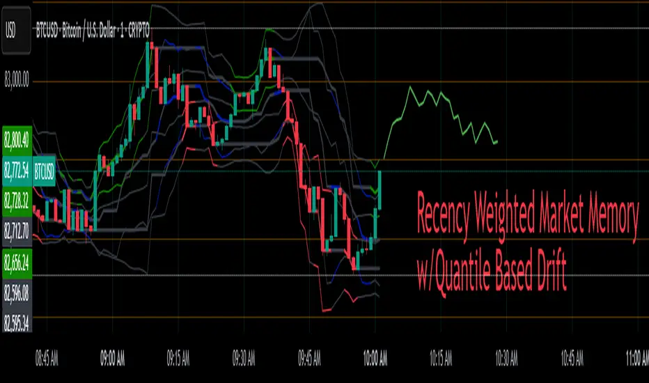
Recency-Weighted Market Memory w/ Quantile-Based DriftRecency-Weighted Market Memory w/ Quantile-Based Drift
This indicator combines market memory, recency-weighted drift, quantile-based volatility analysis, momentum (RoC) filtering, and historical correlation checks to generate dynamic forecasts of possible future price levels. It calculates bullish and bearish forecast lines at each horizon, reflecting how the price might behave based on historical similarities.
Trading Concepts & Mathematical Foundations Explained
1) Market Memory
Concept:
Markets tend to repeat past behaviors under similar conditions. By identifying historical market states that closely match current conditions, we predict future price movements based on what happened historically.
Calculation Steps:
We select a historical lookback window (for example, 210 bars).
Each historical bar within this window is evaluated to see if its conditions match the current market. Conditions include:
Correlation between price change and bullish/bearish volume changes (over a user-defined correlation lookback period).
Momentum (Rate of Change, RoC) measured over a separate lookback period.
Only bars closely matching current conditions (within user-defined tolerance percentages) are included.
2) Recency-Weighted Drift
Concept:
Recent market movements often influence future direction. We assign more importance to recent bars to capture the current market bias effectively.
Calculation Steps:
Consider recent price changes between opens and closes for a user-defined drift lookback (for example, last 20 bars).
Give higher weight to recent bars (the most recent bar gets the highest weight, and weights decrease progressively for older bars).
Average these weighted changes separately for upward and downward movements, then combine these averages to calculate a final drift percentage relative to the current price.
3) Correlation Filtering
Concept:
Price changes often correlate strongly with bullish or bearish volume activity. By using historical correlation comparisons, we focus only on past market states with similar volume-price dynamics.
Calculation Steps:
Compute current correlations between price changes and bullish/bearish volume over the user-defined correlation lookback.
Evaluate each historical bar to see if its correlation closely matches the current correlation (within a user-specified percentage tolerance).
Only historical bars meeting this correlation criterion are selected.
4) Momentum (RoC) Filtering
Concept:
Two market periods may exhibit similar correlation structures but differ in how fast prices move (momentum). To ensure true similarity, momentum is checked as an additional filter.
Calculation Steps:
Compute the current Rate of Change (RoC) over the specified RoC lookback.
For each candidate historical bar, calculate its historical RoC.
Only include historical bars whose RoC closely matches the current RoC (within the RoC percentage tolerance).
5) Quantile-Based Volatility and Drift Amplification
Concept:
Quantiles (such as the 95th, 50th, and 5th percentiles) help gauge if current prices are near historical extremes or the median. Quantile bands measure volatility expansions and contractions.
Calculation Steps:
Calculate the 95%, 50%, and 5% quantiles of price over the quantile lookback period.
Add and subtract multiples of the standard deviation to these quantiles, creating upper and lower bands.
Measure the bands' widths relative to the current price as volatility indicators.
Determine the active quantile (95%, 50%, or 5%) based on proximity to the current price (within a percentage tolerance).
Compute the rate of change (RoC) of the active quantile to detect directional bias.
Combine volatility and quantile RoC into a scaling factor that amplifies or dampens expected price moves.
6) Expected Value (EV) Computation & Forecast Lines
Concept:
We forecast future prices based on how similarly-conditioned historical periods performed. We average historical moves to estimate the expected future price.
Calculation Steps:
For each forecast horizon (e.g., 1 to 27 bars ahead), collect all historical price moves that passed correlation and RoC filters.
Calculate average historical moves for bullish and bearish cases separately.
Adjust these averages by applying recency-weighted drift and quantile-based scaling.
Translate adjusted percentages into absolute future price forecasts.
Draw bullish and bearish forecast lines accordingly.
Indicator Inputs & Their Roles
Correlation Tolerance (%)
Adjusts how strictly the indicator matches historical correlation. Higher tolerance includes more matches, lower tolerance selects fewer but closer matches.
Price RoC Lookback and Price RoC Tolerance (%)
Controls how momentum (speed of price moves) is matched historically. Increasing tolerance broadens historical matches.
Drift Lookback (bars)
Determines the number of recent bars influencing current drift estimation.
Quantile Lookback Period and Std Dev Multipliers
Defines quantile calculation and the size of the volatility bands.
Quantile Contact Tolerance (%)
Sets how close the current price must be to a quantile for it to be considered "active."
Forecast Horizons
Specifies how many future bars to forecast.
Continuous Forecast Lines
Toggles between drawing continuous lines or separate horizontal segments for each forecast horizon.
Practical Trading Applications
Bullish & Bearish EV Lines
These forecast lines indicate expected price levels based on historical similarity. Green indicates positive expectations; red indicates negative.
Momentum vs. Mean Reversion
Wide quantile bands and high drift suggest momentum, while extremes may signal possible reversals.
Volatility Sensitivity
Forecasts adapt dynamically to market volatility. Broader bands increase forecasted price movements.
Filtering Non-Relevant Historical Data
By using both correlation and RoC filtering, irrelevant past periods are excluded, enhancing forecast reliability.
Multi-Timeframe Suitability
Adaptable parameters make this indicator suitable for different trading styles and timeframes.
Complementary Tool
This indicator provides probabilistic projections rather than direct buy or sell signals. Combine it with other trading signals and analyses for optimal results.
Important Considerations
While historically-informed forecasts are valuable, market behavior can evolve unpredictably. Always manage risks and use supplementary analysis.
Experiment extensively with input settings for your specific market and timeframe to optimize forecasting performance.
Summary
The Recency-Weighted Market Memory w/ Quantile-Based Drift indicator uniquely merges multiple sophisticated concepts, delivering dynamic, historically-informed price forecasts. By combining historical similarity, adaptive drift, momentum filtering, and quantile-driven volatility scaling, traders gain an insightful perspective on future price possibilities.
Feel free to experiment, explore, and enjoy this powerful addition to your trading toolkit!
V Pattern TrendDESCRIPTION:
The V Pattern Trend Indicator is designed to identify and highlight V-shaped reversal patterns in price action. It detects both bullish and bearish V formations using a five-candle structure, helping traders recognize potential trend reversal points. The indicator filters out insignificant patterns by using customizable settings based on ATR, percentage, or points, ensuring that only meaningful V patterns are displayed.
CALCULATION METHOD
The user can choose how the minimum length of a V pattern is determined. The available options are:
- ATR (Average True Range) – Filters V patterns based on ATR, making the detection adaptive to market volatility.
- Percentage (%) – Considers V patterns where the absolute price difference between the V low and V high is greater than a user-defined percentage of the V high.
- Points – Uses a fixed number of points to filter valid V patterns, making it useful for assets with consistent price ranges.
ATR SETTINGS
- ATR Length – Defines the number of periods for ATR calculation.
- ATR Multiplier – Determines the minimum V length as a multiple of ATR.
PERCENTAGE THRESHOLD
- Sets a minimum percentage difference between the V high and V low for a pattern to be considered valid.
POINTS THRESHOLD
- Defines the minimum price movement (in points) required for a V pattern to be considered significant.
PATTERN VISUALIZATION
- A bullish V pattern is plotted using two upward-sloping lines, with a filled green region to highlight the formation.
- A bearish V pattern is plotted using two downward-sloping lines, with a filled red region to indicate the reversal.
- The indicator dynamically updates and marks only the most recent valid patterns.
UNDERSTANDING V PATTERNS
A V pattern is a sharp reversal formation where price moves strongly in one direction and then rapidly reverses in the opposite direction, forming a "V" shape on the chart.
BULLISH V PATTERN
- A bullish V pattern is formed when the price makes three consecutive lower lows, followed by two consecutive higher lows.
- The pattern is confirmed when the highest high of the formation is greater than the previous highs within the structure.
- This pattern suggests a potential trend reversal from bearish to bullish.
- The lowest point of the pattern represents the V low, which acts as a support level.
bull_five_candle_v = low > low and low > low and low > low and low > low
and high > math.max(high , high , high ) and high > math.max(high , high , high )
BEARISH V PATTERN
- A bearish V pattern is detected when the price makes three consecutive higher highs, followed by two consecutive lower highs.
- The pattern is confirmed when the lowest low of the formation is lower than the previous lows within the structure.
- This pattern signals a possible trend reversal from bullish to bearish.
- The highest point of the pattern represents the V high, which acts as a resistance level.
bear_five_candle_v = high < high and high < high and high < high and high < high
and low < math.min(low , low , low ) and low < math.min(low , low , low )
HOW THIS IS UNIQUE
- Advanced Filtering Mechanism – Unlike basic reversal indicators, this tool provides customizable filtering based on ATR, percentage, or points, ensuring that only significant V patterns are displayed.
- Enhanced Visual Clarity – The indicator uses color-coded fills and structured plotting to make reversal patterns easy to recognize.
- Works Across Market Conditions – Adaptable to different market environments, filtering out weak or insignificant price fluctuations.
- Multi-Timeframe Usability – Can be applied across different timeframes and asset classes, making it useful for both intraday and swing trading.
HOW TRADERS CAN USE THIS INDICATOR
- Identify potential trend reversals early based on structured price action.
- Filter out weak or insignificant reversals to focus only on strong V formations.
- Use the V pattern’s highs and lows as key support and resistance zones for trade entries and exits.
- Combine with other indicators like moving averages, trendlines, or momentum oscillators for confirmation.

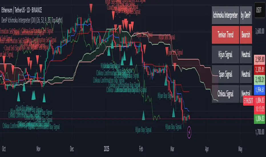
DenP Ichimoku Interpreter (DII)A simple indicator using Ishimoku as a basis, giving entry and exit signals.
Components of the Ichimoku Cloud
The Ichimoku system consists of multiple lines that help traders understand market trends, momentum, and potential reversals.
1. Tenkan-Sen (Conversion Line) - Blue
Formula: (Highest High + Lowest Low) / 2 over the last 9 periods (default).
Purpose: Measures short-term trend direction.
Interpretation:
Upward movement: Indicates bullish momentum.
Downward movement: Indicates bearish momentum.
Flat line: Indicates consolidation.
2. Kijun-Sen (Base Line) - Red
Formula: (Highest High + Lowest Low) / 2 over the last 26 periods (default).
Purpose: Represents medium-term trend.
Interpretation:
Price above Kijun-Sen: Bullish signal.
Price below Kijun-Sen: Bearish signal.
Flat Kijun-Sen: Market in consolidation.
3. Senkou Span A (Leading Span A) - Light Green
Formula: (Tenkan-Sen + Kijun-Sen) / 2, plotted 26 periods ahead.
Purpose: Forms one of the Ichimoku Cloud boundaries.
Interpretation:
If Senkou Span A is rising, the market is bullish.
If Senkou Span A is falling, the market is bearish.
4. Senkou Span B (Leading Span B) - Light Red
Formula: (Highest High + Lowest Low) / 2 over the last 52 periods, plotted 26 periods ahead.
Purpose: Forms the second boundary of the Ichimoku Cloud.
Interpretation:
If price is above the cloud, the market is in a strong uptrend.
If price is below the cloud, the market is in a strong downtrend.
If price is inside the cloud, the market is consolidating.
5. Kumo (Cloud)
The area between Senkou Span A and Senkou Span B is shaded.
Green Cloud (Span A above Span B): Bullish trend.
Red Cloud (Span B above Span A): Bearish trend.
The thickness of the cloud represents market volatility.
6. Chikou Span (Lagging Line) - Green
Formula: Current closing price plotted 26 periods back.
Purpose: Confirms trend direction.
Interpretation:
Chikou Span above price 26 periods ago: Bullish.
Chikou Span below price 26 periods ago: Bearish.
Buy and Sell Conditions
The indicator generates buy and sell signals based on Ichimoku components.
1. Kijun Cross (Medium-Term Trend)
Buy Signal: When the closing price crosses above the Kijun-Sen (red line).
Sell Signal: When the closing price crosses below the Kijun-Sen.
2. Cloud Breakout (Senkou Span Cross)
Buy Signal:
When Senkou Span A is above Senkou Span B, and the price crosses above the cloud.
Indicates a strong uptrend.
Sell Signal:
When Senkou Span B is above Senkou Span A, and the price crosses below the cloud.
Indicates a strong downtrend.
3. Chikou Span Confirmation (Momentum Confirmation)
Buy Signal:
If Chikou Span (green) crosses above past price action, it confirms a bullish trend.
Used to validate Kijun and Cloud Buy signals.
Sell Signal:
If Chikou Span crosses below past price action, it confirms a bearish trend.
Visual Signals
The indicator plots triangles on the chart to indicate buy and sell signals:
Kijun Buy Signal: Upward triangle (green).
Kijun Sell Signal: Downward triangle (red).
Cloud Buy Signal: Upward triangle (green) near the cloud.
Cloud Sell Signal: Downward triangle (red) near the cloud.
Chikou Confirmation Buy: Upward triangle (green, confirming previous signals).
Chikou Confirmation Sell: Downward triangle (red, confirming previous signals).
Additional Features
Customizable Colors & Settings: Users can adjust colors, time periods, and display settings.
On-Chart Table: Displays current trend interpretations for easy reference.
How to Use the Indicator?
Check the Cloud Position:
Price above the cloud = bullish.
Price below the cloud = bearish.
Price inside the cloud = consolidation.
Look for Kijun Crosses:
Buy when price crosses above Kijun-Sen.
Sell when price crosses below Kijun-Sen.
Confirm with Chikou Span:
If Chikou Span supports the buy/sell signal, it's more reliable.
Use Cloud Breakouts for Trend Reversals:
If price moves from below to above the cloud = strong buy.
If price moves from above to below the cloud = strong sell.
Pipsttocra Technical Patterns: EV HV FVG & OBPipstocrat Technical Patterns , identifies and visualizes key technical analysis patterns and structures on a TradingView chart. Here's a simple breakdown of what it does:
Fair Value Gaps (FVG):
Detects and highlights bullish and bearish Fair Value Gaps as colored boxes.
Adds centerline markers to indicate potential price levels.
Order Blocks (OB):
Identifies bullish and bearish order blocks (areas of significant buying or selling).
Displays them as colored rectangles extending to the right of the chart.
Candlestick Patterns:
Detects Engulfing Patterns (bullish and bearish) with volume confirmation.
Highlights Hammer and Inverted Hammer patterns with customizable shapes and colors.
Customization Options:
Allows users to adjust colors, sizes, and styles for all patterns and structures.
Provides options to show/hide specific patterns like FVGs, engulfing candles, hammers, etc.
Alerts:
Generates alerts for detected patterns, such as FVGs, order blocks, engulfing candles, and confluence zones (combination of FVGs and order blocks).
Management Features:
Automatically removes older or "filled" patterns (optional).
Tracks and updates patterns dynamically as new bars form.
Purpose:
This tool helps traders spot high-probability trading opportunities by identifying key market structures (like FVGs and order blocks) and candlestick patterns. It combines multiple technical analysis concepts into one comprehensive indicator for better decision-making.

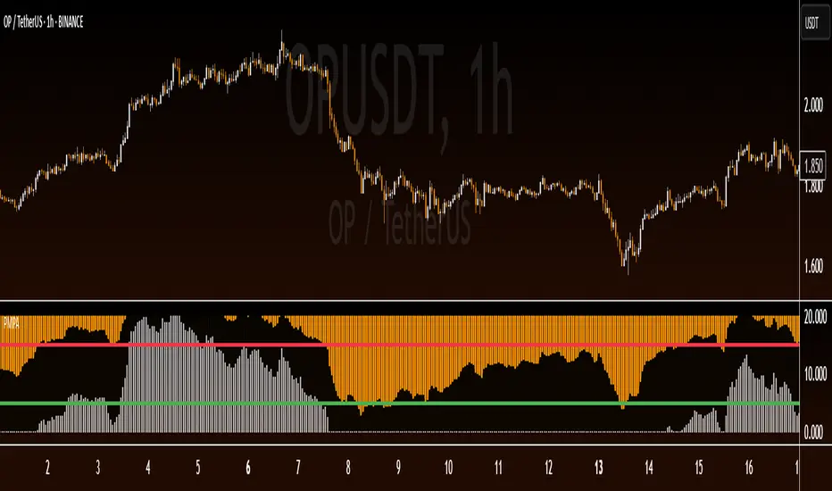
Pipstocrat Market Participant AnalysisPipstocrat Market Participant Analysis (PMPA) , analyzes the behavior of different types of traders in the market: Hot Money (short-term traders), Smart Money (institutional or professional traders), and Retail Traders . It uses RSI-based calculations to measure their activity and displays the results as colored bars on a chart.
Customizable Colors: Users can change the colors for each type of trader and other visual elements like reference lines.
Reference Lines: Horizontal lines at levels 5 (Support), 10 (Neutral), and 15 (Resistance) help interpret the data.
Focus on RSI: The script simplifies analysis by focusing solely on RSI-based signals.
This tool helps traders quickly identify trends and sentiment in the market, making it easier to spot potential opportunities.
Bias TableOverview
The Bias Table Indicator is a multi-timeframe analysis tool designed to provide a quick sentiment overview across multiple timeframes. It combines signals from Moving Averages (MAs) and Oscillators to determine market bias, helping traders make more informed decisions.
Key Features
✔ Multi-Timeframe Analysis (MTF) – Displays market bias across up to five timeframes.
✔ Customizable Signals – Choose whether bias is based on Moving Averages (MAs), Oscillators, or a combination of both.
✔ Visual Table Format – The indicator presents the bias as a color-coded table in the bottom-right corner of the chart for quick reference.
✔ Adjustable Colors & Display Settings – Users can customize colors for different sentiment states (Strong Buy, Buy, Neutral, Sell, Strong Sell).
How It Works
Bias Calculation: The indicator evaluates market conditions using preset values (which can be replaced with actual logic) to determine sentiment for each timeframe.
Multi-Timeframe Support: The table can display bias from hourly to monthly timeframes, giving traders a broader view of market conditions.
Customizable Signals: Users can filter the table to show bias based only on MAs, Oscillators, or a combination of both.
Interpreting the Table
📊 Timeframes: The leftmost column shows selected timeframes (e.g., 1H, 4H, 1D, 1W, 1M).
📈 Signal Columns:
MAs – Bias based on Moving Averages.
Oscillators – Bias based on momentum indicators like RSI, Stochastics, etc.
All – A combined bias based on both MAs & Oscillators.
🚦 Color-Coded Ratings:
🔵 Strong Buy – High bullish strength.
🔹 Buy – Moderate bullish sentiment.
⚪ Neutral – No clear trend.
🔸 Sell – Moderate bearish sentiment.
🔴 Strong Sell – High bearish strength.
Best Used For:
📈 Trend Confirmation: Validate signals from your primary strategy.
⏳ Multi-Timeframe Analysis: See whether short-term and long-term trends align.
⚡ Quick Sentiment Check: Get a high-level view of market conditions without analyzing multiple indicators separately.
Customization Options:
Select which timeframes to include in the table.
Choose whether to base bias on MAs, Oscillators, or both.
Adjust colors for each signal type.

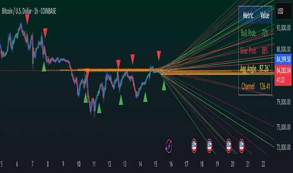
Geometric Momentum Breakout with Monte CarloOverview
This experimental indicator uses geometric trendline analysis combined with momentum and Monte Carlo simulation techniques to help visualize potential breakout areas. It calculates support, resistance, and an aggregated trendline using a custom Geo library (by kaigouthro). The indicator also tracks breakout signals in a way that a new buy signal is triggered only after a sell signal (and vice versa), ensuring no repeated signals in the same direction.
Important:
This script is provided for educational purposes only. It is experimental and should not be used for live trading without proper testing and validation.
Key Features
Trendline Calculation:
Uses the Geo library to compute support and resistance trendlines based on historical high and low prices. The midpoint of these trendlines forms an aggregated trendline.
Momentum Analysis:
Computes the Rate of Change (ROC) to determine momentum. Breakout conditions are met only if the price and momentum exceed a user-defined threshold.
Monte Carlo Simulation:
Simulates future price movements to estimate the probability of bullish or bearish breakouts over a specified horizon.
Signal Tracking:
A persistent variable ensures that once a buy (or sell) signal is triggered, it won’t repeat until the opposite signal occurs.
Geometric Enhancements:
Calculates an aggregated trend angle and channel width (distance between support and resistance), and draws a perpendicular “breakout zone” line.
Table Display:
A built-in table displays key metrics including:
Bullish probability
Bearish probability
Aggregated trend angle (in degrees)
Channel width
Alerts:
Configurable alerts notify when a new buy or sell breakout signal occurs.
Inputs
Resistance Lookback & Support Lookback:
Number of bars to look back for determining resistance and support points.
Momentum Length & Threshold:
Period for ROC calculation and the minimum percentage change required for a breakout confirmation.
Monte Carlo Simulation Parameters:
Simulation Horizon: Number of future bars to simulate.
Simulation Iterations: Number of simulation runs.
Table Position & Text Size:
Customize where the table is displayed on the chart and the size of the text.
How to Use
Add the Script to Your Chart:
Copy the code into the Pine Script editor on TradingView and add it to your chart.
Adjust Settings:
Customize the inputs (e.g., lookback periods, momentum threshold, simulation parameters) to fit your analysis or educational requirements.
Interpret Signals:
A buy signal is plotted as a green triangle below the bar when conditions are met and the state transitions from neutral or sell.
A sell signal is plotted as a red triangle above the bar when conditions are met and the state transitions from neutral or buy.
Alerts are triggered only on the bar where a new signal is generated.
Examine the Table:
The table displays key metrics (breakout probabilities, aggregated trend angle, and channel width) to help evaluate current market conditions.
Disclaimer
This indicator is experimental and provided for educational purposes only. It is not intended as a trading signal or financial advice. Use this script at your own risk, and always perform your own research and testing before using any experimental tools in live trading.
Credit
This indicator uses the Geo library by kaigouthro. Special thanks to Cryptonerds and @Hazzantazzan for their contributions and insights.
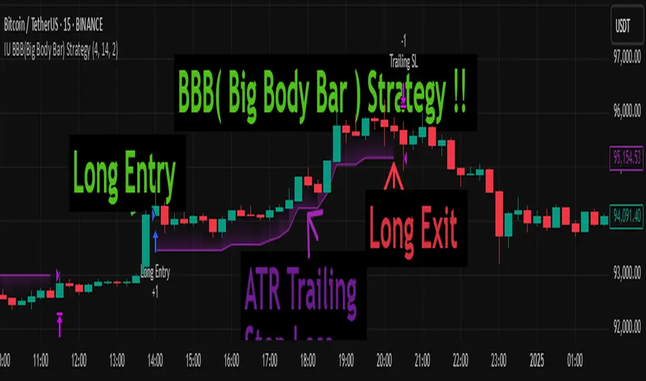
IU BBB(Big Body Bar) StrategyDESCRIPTION
The IU BBB (Big Body Bar) Strategy is a price action-based trading strategy that identifies high-momentum candles with significantly larger body sizes compared to the average. It enters trades when a strong bullish or bearish move occurs and manages risk using an ATR-based trailing stop-loss system.
USER INPUTS:
- Big Body Threshold – Defines how many times larger the candle body should be compared to the average body ( default is 4 ).
- ATR Length – The period for the Average True Range (ATR) used in the trailing stop-loss calculation ( default is 14 ).
- ATR Factor – Multiplier for ATR to determine the trailing stop distance ( default is 2 ).
LONG CONDITION:
- The current candle’s body is greater than the average body size multiplied by the Big Body Threshold.
- The closing price is higher than the opening price (bullish candle).
SHORT CONDITION:
- The current candle’s body is greater than the average body size multiplied by the Big Body Threshold.
- The closing price is lower than the opening price (bearish candle).
LONG EXIT:
- ATR-based trailing stop-loss dynamically adjusts, locking in profits as the price moves higher.
SHORT EXIT:
- ATR-based trailing stop-loss dynamically adjusts, securing profits as the price moves lower.
WHY IT IS UNIQUE:
- Unlike traditional momentum strategies, this system adapts to volatility by filtering trades based on relative candle size.
- It incorporates an ATR-based trailing stop-loss, ensuring risk management and profit protection.
- The strategy avoids choppy market conditions by only trading when significant momentum is present.
HOW USERS CAN BENEFIT FROM IT:
- Catch Strong Price Moves – The strategy helps traders enter trades when the market shows decisive momentum.
- Effective Risk Management – The ATR-based trailing stop ensures that winning trades remain profitable.
- Works Across Markets – Can be applied to stocks, forex, crypto, and indices with proper optimization.
- Fully Customizable – Users can adjust sensitivity settings to match their trading style and time frame.
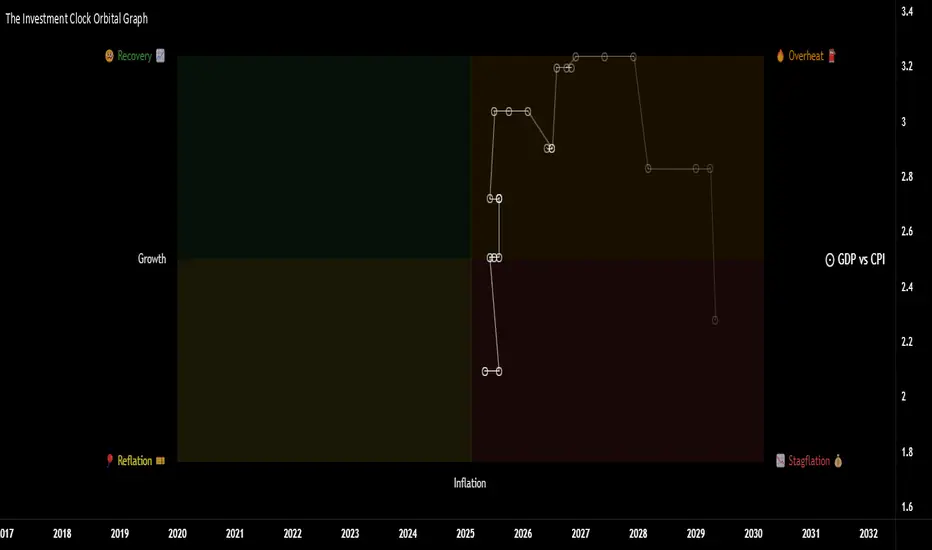
The Investment Clock Orbital GraphThe Investment Clock Orbital Graph is an advanced visualization tool designed to help traders and investors track economic cycles using a dynamic scatter plot of GDP growth vs. CPI inflation rates.
This indicator is a fusion of two powerful TradingView indicators:
LuxAlgo ’s Relative Strength Scatter Plot – A robust scatter plot for tracking relative strength.
The Investment Clock Indicator – A cycle-based approach to market rotation. This indicator contains more information regarding The Investment Clock.
By combining these approaches, the Investment Clock Orbital Graph enables traders to visualize economic momentum and inflationary trends in a unique, orbital-style scatter plot.
Key Features & Improvements
Orbital Graph Representation – Displays GDP growth and CPI inflation as a dynamic, evolving scatter plot, showing how the economy moves through different phases.
Quadrant-Based Market Regimes – Identifies four key economic phases:
1)🔥 Overheating (High Growth, High Inflation)
2)📉 Stagflation (Low Growth, High Inflation)
3)🤒 Recovery (High Growth, Low Inflation)
4)🎈 Reflation (Low Growth, Low Inflation)
Data-Driven Analysis – Utilizes FRED (Federal Reserve Economic Data) for accurate real-world GDP & CPI data.
Trailing Path of Economic Evolution – Tracks historical economic cycles over time to show momentum and cyclical movements.
Customizable Parameters – Set sustainable GDP growth and inflation thresholds, adjust trail length, and fine-tune scatter plot resolution.
Auto-Labeled Quadrants & Revised Accurate Market Guidance – Each quadrant includes newly updated tooltips and annotations (like ETF suggestions) to help traders make informed decisions.
Live Macro Forecasting Tool – Helps traders anticipate future market conditions, rate hikes/cuts, and sector rotations.
How to Use for Trading Decisions
The Investment Clock Orbital Graph helps traders and macro investors by identifying market phases and providing insights into asset class performance during different economic conditions.
📌 Step 1: Identify the Current Quadrant
Locate the most recent point on the orbital graph to see if the economy is in Overheating, Stagflation, Recovery, or Reflation.
📌 Step 2: Forecast Market Trends
The trajectory of the points can predict upcoming economic shifts:
Overheating → Stagflation ➡️ Expect economic slowdowns, bearish stock markets.
Stagflation → Reflation ➡️ Interest rate cuts likely, bonds and defensive stocks perform well.
Reflation → Recovery ➡️ Risk-on rally, technology and cyclicals perform best.
Recovery → Overheating ➡️ Commodities surge, inflation rises, and central banks intervene.
📌 Step 3: Align Trading & Investing Strategies
🔥 Overheating – Favor commodities & energy (Oil, Industrial Stocks, Materials).
📉 Stagflation – Favor defensive assets (Cash, Utilities, Healthcare).
🤒 Recovery – Favor growth stocks (Technology, Consumer Discretionary).
🎈 Reflation – Favor bonds, value stocks, and financials.
📌 Step 4: Monitor Trends Over Time
The indicator visualizes economic movement over multiple months, allowing traders to confirm long-term trends vs. short-term noise.
The Investment Clock Orbital Graph is an essential macro trading tool, providing a real-time visualization of economic conditions. By tracking GDP growth vs. CPI inflation, traders and investors can align their portfolios with major macroeconomic shifts, predict sector rotations, and anticipate central bank policy changes.
SemiCircle Cycle Notation PivotsFor decades, traders have sought to decode the rhythm of the markets through cycle theory. From the groundbreaking work of HM Gartley in the 1930s to modern-day cycle trading tools on TradingView, the concept remains the same: markets move in repeating waves with larger cycles influencing smaller ones in a fractal-like structure, and understanding their timing gives traders an edge to better anticipate future price movements🔮.
Traditional cycle analysis has always been manual, requiring traders to painstakingly plot semicircles, diamonds, or sine waves to estimate pivot points and time reversals. Drawing tools like semicircle & sine wave projections exist on TradingView, but they lack automation—forcing traders to adjust cycle lengths by eye, often leading to inconsistencies.
This is where SemiCircle Cycle Notation Pivots indicator comes in. Semicircle cycle chart notation appears to have evolved as a practical visualization tool among cycle theorists rather than being pioneered by a single individual; some key influences include HM Gartley, WD Gann, JM Hurst, Walter Bressert, and RayTomes. Built upon LonesomeTheBlue's foundational ZigZag Waves indicator , this indicator takes cycle visualization to the next level by dynamically detecting price pivots and then automatically plotting semicircles based on real-time cycle length calculations & expected rhythm of price action over time.
Key Features:
Automated Cycle Detection: The indicator identifies pivot points based on your preference—highs, lows, or both—and plots semicircle waves that correspond to Hurst's cycle notation.
Customizable Cycle Lengths: Tailor the analysis to your trading strategy with adjustable cycle lengths, defaulting to 10, 20, and 40 bars, allowing for flexibility across various timeframes and assets.
Dynamic Wave Scaling: The semicircle waves adapt to different price structures, ensuring that the visualization remains proportional to the detected cycle lengths and aiding in the identification of potential reversal points.
Automated Cycle Detection: Dynamically identifies price pivot points and automatically adjusts offsets based on real-time cycle length calculations, ensuring precise semicircle wave alignment with market structure.
Color-Coded Cycle Tiers: Each cycle tier is distinctly color-coded, enabling quick differentiation and a clearer understanding of nested market cycles.

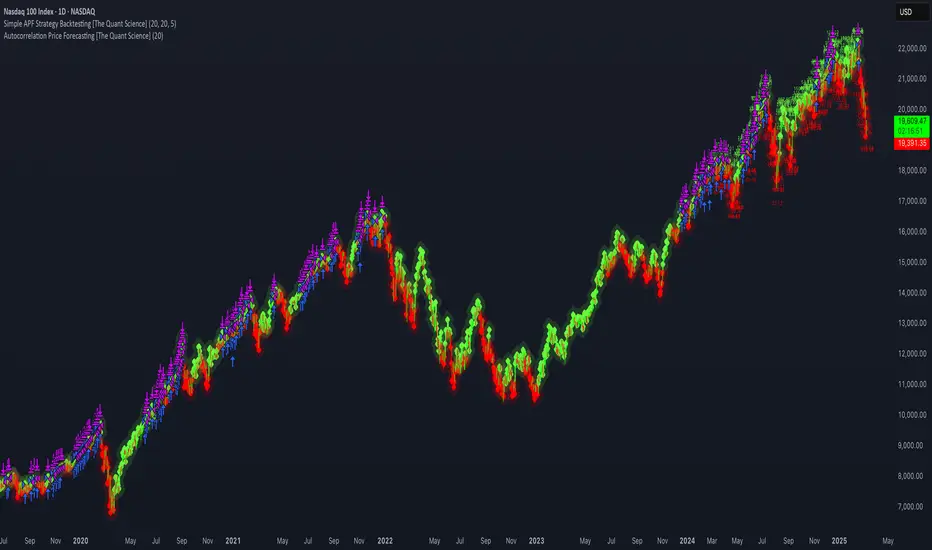
Simple APF Strategy Backtesting [The Quant Science]Simple backtesting strategy for the quantitative indicator Autocorrelation Price Forecasting. This is a Buy & Sell strategy that operates exclusively with long orders. It opens long positions and generates profit based on the future price forecast provided by the indicator. It's particularly suitable for trend-following trading strategies or directional markets with an established trend.
Main functions
1. Cycle Detection: Utilize autocorrelation to identify repetitive market behaviors and cycles.
2. Forecasting for Backtesting: Simulate trades and assess the profitability of various strategies based on future price predictions.
Logic
The strategy works as follow:
Entry Condition: Go long if the hypothetical gain exceeds the threshold gain (configurable by user interface).
Position Management: Sets a take-profit level based on the future price.
Position Sizing: Automatically calculates the order size as a percentage of the equity.
No Stop-Loss: this strategy doesn't includes any stop loss.
Example Use Case
A trader analyzes a dayli period using 7 historical bars for autocorrelation.
Sets a threshold gain of 20 points using a 5% of the equity for each trade.
Evaluates the effectiveness of a long-only strategy in this period to assess its profitability and risk-adjusted performance.
User Interface
Length: Set the length of the data used in the autocorrelation price forecasting model.
Thresold Gain: Minimum value to be considered for opening trades based on future price forecast.
Order Size: percentage size of the equity used for each single trade.
Strategy Limit
This strategy does not use a stop loss. If the price continues to drop and the future price forecast is incorrect, the trader may incur a loss or have their capital locked in the losing trade.
Disclaimer!
This is a simple template. Use the code as a starting point rather than a finished solution. The script does not include important parameters, so use it solely for educational purposes or as a boilerplate.
Ethereum Logarithmic Regression Bands (Fine-Tuned)This indicator, "Ethereum Logarithmic Regression Bands (Fine-Tuned)," is my attempt to create a tool for estimating long-term trends in Ethereum (ETH/USD) price action using logarithmic regression bands. Please note that I am not an expert in financial modeling or coding—I developed this as a personal project to serve as a rough estimation rather than a precise or professional trading tool. The data was fitted to non-bubble periods of Ethereum's history to provide a general trendline, but it’s far from perfect.
I’m sharing this because I couldn’t find a similar indicator available, and I thought it might be useful for others who are also exploring ETH’s long-term behavior. The bands start from Ethereum’s launch price and are adjustable via input parameters, but they are based on my best effort to align with historical data. With some decent coding experience, I’m sure someone could refine this further—perhaps by optimizing the coefficients or incorporating more advanced fitting techniques. Feel free to tweak the code, suggest improvements, or use it as a starting point for your own projects!
How to Use:
** THIS CHART IS SPECIFICALLY CODED FOR ETH/USD (KRAKEN) ON THE WEEKLY TIMEFRAME IN LOG VIEW**
The main band (blue) represents the logarithmic regression line.
The upper (red) and lower (green) bands provide a range around the main trend, adjustable with multipliers.
Adjust the "Launch Price," "Base Coefficient," "Growth Coefficient," and other inputs to experiment with different fits.
Disclaimer:
This is not financial advice. Use at your own risk, and always conduct your own research before making trading decisions.

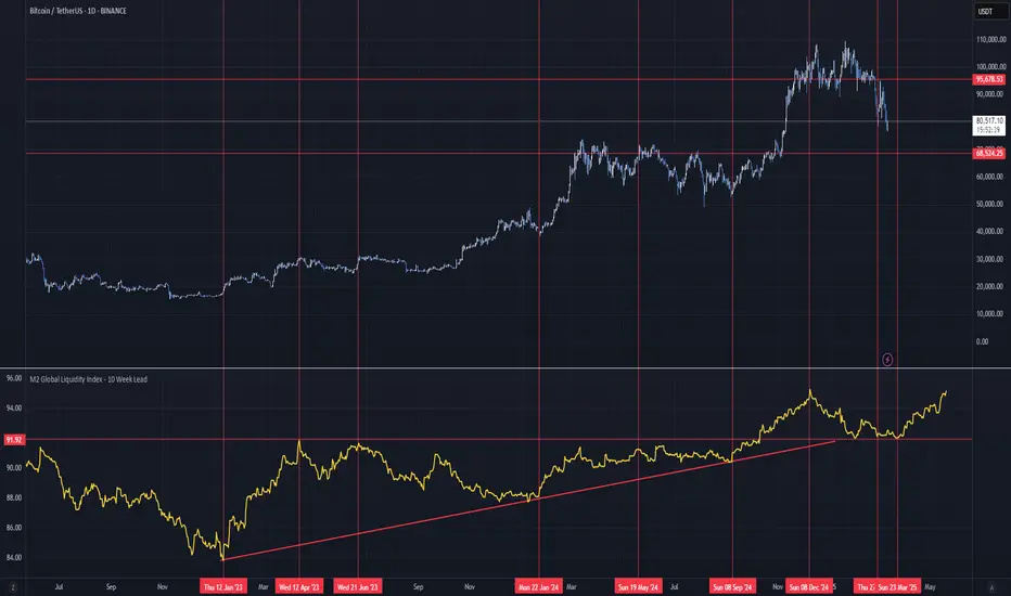
M2 Global Liquidity Index - 10 Week Lead
M2 Global Liquidity Index - Forward Projection (10 Weeks)
This indicator provides a 10-week forward projection of the M2 Global Liquidity Index, offering traders insight into potential future market conditions based on global money supply trends.
What This Indicator Shows
The M2 Global Liquidity Index aggregates M2 money stock data from five major economies:
- China (CNY)
- United States (USD)
- European Union (EUR)
- Japan (JPY)
- Great Britain (GBP)
All values are converted to USD and presented as a unified global liquidity metric, providing a comprehensive view of worldwide monetary conditions.
Forward Projection Feature
This adaptation displays the indicator 10 weeks ahead of the current price, allowing you to visualize potential future liquidity conditions that might influence market behavior. The projection maintains data integrity while providing an advanced view of the liquidity landscape.
Trading Applications
- Anticipate potential market reactions to changing global liquidity conditions
- Identify divergences between projected liquidity and current price action
- Develop longer-term strategic positions based on forward liquidity projections
- Enhance your macro-economic analysis toolkit
Credit
This indicator is an adaptation of the original "M2 Global Liquidity Index" created by Mik3Christ3ns3n. Full credit for the original concept and implementation goes to the original author. This version simply adds a 10-week forward projection to the existing calculations.
Disclaimer
This indicator is for informational purposes only and should be used as one of many tools in your analysis. Past performance and projections are not guarantees of future results.
MTF ATR BandsA simple but effective MTF ATR bands indicator.
The script calculate and display ATR bands low and high of the current timeframe using high, low inputs and an RMA moving average, adding to it ATR of the period multiplied with the user multiplier, default is set to 1.5.
Than is calculated a smoothed average of the range and the color of it based on its slope, same color is used to fill the atr bands.
Than the higher timeframe bands are calculated and displayed on the chart.
How can be used ?
The higher timeframe average and bands can give you long term direction of the trend and the current timeframes moving average and filling short term trend, for example using the 15 min chart with a 4h HTF bands, or an 1h with a daily, or a daily with an weekly or weekly with bi-monthly atr bands.
Also can be used as a stop loss indicator.
Hope you will like it, any question send me a PM.

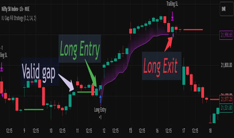
IU Gap Fill StrategyThe IU Gap Fill Strategy is designed to capitalize on price gaps that occur between trading sessions. It identifies gaps based on a user-defined percentage threshold and executes trades when the price fills the gap within a day. This strategy is ideal for traders looking to take advantage of market inefficiencies that arise due to overnight or session-based price movements. An ATR-based trailing stop-loss is incorporated to dynamically manage risk and lock in profits.
USER INPUTS
Percentage Difference for Valid Gap - Defines the minimum gap size in percentage terms for a valid trade setup. ( Default is 0.2 )
ATR Length - Sets the lookback period for the Average True Range (ATR) calculation. (default is 14 )
ATR Factor - Determines the multiplier for the trailing stop-loss, helping in risk management. ( Default is 2.00 )
LONG CONDITION
A gap-up occurs, meaning the current session opens above the previous session’s close.
The price initially dips below the previous session's close but then recovers and closes above it.
The gap meets the valid percentage threshold set by the user.
The bar is not the first or last bar of the session to avoid false signals.
SHORT CONDITION
A gap-down occurs, meaning the current session opens below the previous session’s close.
The price initially moves above the previous session’s close but then closes below it.
The gap meets the valid percentage threshold set by the user.
The bar is not the first or last bar of the session to avoid false signals.
LONG EXIT
An ATR-based trailing stop-loss is set below the entry price and dynamically adjusts upwards as the price moves in favor of the trade.
The position is closed when the trailing stop-loss is hit.
SHORT EXIT
An ATR-based trailing stop-loss is set above the entry price and dynamically adjusts downwards as the price moves in favor of the trade.
The position is closed when the trailing stop-loss is hit.
WHY IT IS UNIQUE
Precision in Identifying Gaps - The strategy focuses on real price gaps rather than minor fluctuations.
Dynamic Risk Management - Uses ATR-based trailing stop-loss to secure profits while allowing the trade to run.
Versatility - Works on stocks, indices, forex, and any market that experiences session-based gaps.
Optimized Entry Conditions - Ensures entries are taken only when the price attempts to fill the gap, reducing false signals.
HOW USERS CAN BENEFIT FROM IT
Enhance Trade Timing - Captures high-probability trade setups based on market inefficiencies caused by gaps.
Minimize Risk - The ATR trailing stop-loss helps protect gains and limit losses.
Works in Different Market Conditions - Whether markets are trending or consolidating, the strategy adapts to potential gap fill opportunities.
Fully Customizable - Users can fine-tune gap percentage, ATR settings, and stop-loss parameters to match their trading style.
Round NumbersTries to only show major round numbers regardless of whether you're looking at something priced in the thousands or under a dollar.

ReadyFor401ks Pivot / Support / ResistOverview
The ReadyFor401ks Pivot / Support / Resist indicator is a versatile tool designed to help traders identify key price levels—pivots, supports, and resistances—derived from a higher timeframe. This indicator recalculates levels based on a user-defined timeframe, providing you with a broader context for potential market reversals and continuations.
Key Features and Benefits
• Customizable Higher Timeframe:
You can select the frequency at which the levels are recalculated. For example, on a Daily chart, you might choose a 3-month timeframe to determine the pivot levels. This allows you to capture longer-term support and resistance zones that can be crucial for identifying major price reactions.
• Visual Clarity:
With toggles to show or hide the pivot, support, and resistance lines on the price chart, you have full control over the visual clutter on your chart. Additionally, you can choose to display the exact price values directly on the price scale, giving you an immediate reference as you trade.
• Enhanced Data Display:
In addition to price scale labels, the indicator offers an option to show the level values on the status line (data window). This feature is especially beneficial for traders who want to keep a close eye on these key levels without compromising chart space.
Practical Example
Imagine you’re analyzing a Daily chart while the indicator is set to recalculate levels on a 3-month frequency . Over a three-month period, the indicator determines a pivot point (P) along with three levels of resistance (R1, R2, R3) and support (S1, S2, S3). As price action unfolds, you may observe that:
• Price approaches the pivot level (P): This could indicate a potential reversal or a consolidation zone.
• Price bounces off a resistance level (e.g., R1): Signaling that the market is struggling to break higher.
• Price finds support at S1: Providing an opportunity to look for a bullish reversal.
By combining these insights with your own technical analysis, you can make more informed trading decisions based on significant levels that have been validated over a longer timeframe.
Conclusion
The ReadyFor401ks Pivot / Support / Resist indicator is ideal for traders who want to add an extra layer of confirmation to their trading strategies by identifying key price levels derived from higher timeframe data. Whether you’re a swing trader or a long-term investor, this tool helps you visualize crucial support and resistance areas, improving your market timing and risk management. Enjoy the enhanced clarity and flexibility this indicator offers on your TradingView charts!

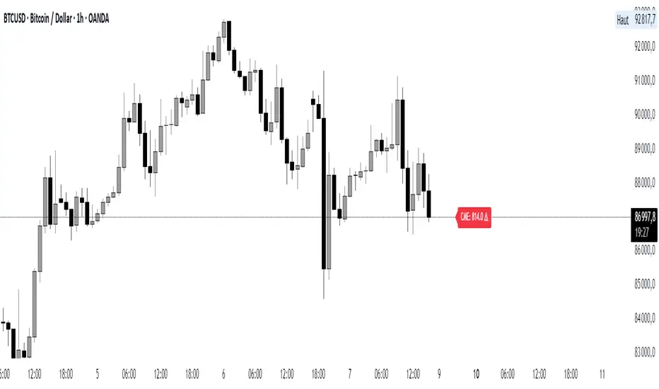
Real-Time Price Comparator→ La version française se trouve plus bas ←
Real-Time Price Spread Comparator
This indicator allows you to compare the real-time price difference (spread) between two assets. It is particularly useful for spotting arbitrage opportunities or price discrepancies between different markets.
💡 Why is this useful?
This tool is especially practical for monitoring the gap between CME futures and the spot market. If the spread becomes too large, we can expect the market to rebalance, which can help anticipate potential price movements.
📌 Features:
✅ Compare two assets of your choice (default: BTC CME vs. BTC OANDA).
✅ Displays the spread as a real-time value on the chart.
✅ Customizable threshold for alerts when the spread exceeds a certain value.
✅ Visual alert: The label changes color and an alert icon appears when the threshold is exceeded.
✅ Adjustable label position to avoid obstructing candlestick wicks.
🛠️ How to Use:
1️⃣ Choose the asset to compare (for example, BTC CME).
2️⃣ Select the main chart (the one you are currently viewing, such as BTC OANDA).
3️⃣ Set the alert threshold (the spread value that will trigger an alert).
4️⃣ Adjust the label position using the offset settings if needed.
5️⃣ When the spread exceeds the threshold, an alert will be displayed!
-------------------------------------------------
Comparateur de Spread en Temps Réel
Cet indicateur permet de comparer en temps réel la différence de prix (spread) entre deux actifs. Il est particulièrement utile pour détecter des opportunités d’arbitrage ou des écarts de prix entre différents marchés.
💡 Pourquoi c'est utile ?
Cet outil est pratique pour surveiller l’écart entre les contrats à terme CME et le marché spot. Si l’écart devient trop important, on peut s’attendre à ce que le marché s’équilibre, ce qui peut nous orienter sur les futurs mouvements du prix.
📌 Fonctionnalités :
✅ Comparez deux actifs de votre choix (par défaut : BTC CME vs. BTC OANDA).
✅ Affiche le spread en temps réel directement sur le graphique.
✅ Définissez un seuil d’alerte pour être notifié visuellement sur le graphique si le spread dépasse une certaine valeur.
✅ Alerte visuelle : le label change de couleur et une icône d’alerte apparaît en cas de dépassement.
✅ Ajustez la position du label pour éviter qu’il ne cache les mèches des bougies.
🛠️ Comment l’utiliser :
1️⃣ Choisissez l’actif à comparer (exemple : BTC CME).
2️⃣ Sélectionnez ensuite l’actif affiché sur votre graphique principal (exemple : BTC OANDA).
3️⃣ Définissez le seuil d’alerte (valeur du spread qui déclenchera une alerte).
4️⃣ Ajustez la position du label grâce aux options d’offset si nécessaire.
5️⃣ Si le spread dépasse le seuil, une alerte visuelle apparaîtra !
FinFluential Global M2 Money Supply // Days Offset =The "Global M2 Money Supply" indicator calculates and visualizes the combined M2 money supply from multiple countries and regions worldwide, expressed in trillions of USD.
M2 is a measure of the money supply that includes cash, checking deposits, and easily convertible near-money assets. This indicator aggregates daily M2 data from various economies, converts them into a common USD base using forex exchange rates, and plots the total as a single line on the chart.
It is designed as an overlay indicator aligned to the right scale, making it ideal for comparing global money supply trends with price action or other market data.
Key Features
Customizable Time Offset: Users can adjust the number of days to shift the M2 data forward or backward (from -1000 to +1000 days) via the indicator settings. This allows for alignment with historical events or forward-looking analysis.
Global Coverage Includes:
Eurozone: Eurozone M2 (converted via EUR/USD)
North America: United States, Canada
Non-EU Europe: Switzerland, United Kingdom, Finland, Russia
Pacific: New Zealand
Asia: China, Taiwan, Hong Kong, India, Japan, Philippines, Singapore
Latin America: Brazil, Colombia, Mexico
Middle East: United Arab Emirates, Turkey
Africa: South Africa

VIX:VIX3M RatioThe VIX/VIX3M Ratio indicator compares the short-term (1-month) volatility index (VIX) to the medium-term (3-month) volatility index (VIX3M). This ratio provides insights into the market's volatility expectations across different time horizons.
Key Interpretations:
Ratio > 1: Short-term volatility expectations are higher than 3-month expectations
Ratio = 1: Short-term and medium-term volatility expectations are aligned
Ratio < 1: Medium-term volatility expectations are higher than short-term expectations
Potential Trading Insights:
A rising ratio may indicate increasing near-term market uncertainty
Significant deviations from 1.0 can signal potential market stress or changing risk perceptions
Traders use this to gauge the term structure of market volatility

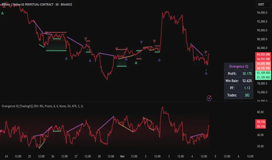
Divergence IQ [TradingIQ]Hello Traders!
Introducing "Divergence IQ"
Divergence IQ lets traders identify divergences between price action and almost ANY TradingView technical indicator. This tool is designed to help you spot potential trend reversals and continuation patterns with a range of configurable features.
Features
Divergence Detection
Detects both regular and hidden divergences for bullish and bearish setups by comparing price movements with changes in the indicator.
Offers two detection methods: one based on classic pivot point analysis and another that provides immediate divergence signals.
Option to use closing prices for divergence detection, allowing you to choose the data that best fits your strategy.
Normalization Options:
Includes multiple normalization techniques such as robust scaling, rolling Z-score, rolling min-max, or no normalization at all.
Adjustable normalization window lets you customize the indicator to suit various market conditions.
Option to display the normalized indicator on the chart for clearer visual comparison.
Allows traders to take indicators that aren't oscillators, and convert them into an oscillator - allowing for better divergence detection.
Simulated Trade Management:
Integrates simulated trade entries and exits based on divergence signals to demonstrate potential trading outcomes.
Customizable exit strategies with options for ATR-based or percentage-based stop loss and profit target settings.
Automatically calculates key trade metrics such as profit percentage, win rate, profit factor, and total trade count.
Visual Enhancements and On-Chart Displays:
Color-coded signals differentiate between bullish, bearish, hidden bullish, and hidden bearish divergence setups.
On-chart labels, lines, and gradient flow visualizations clearly mark divergence signals, entry points, and exit levels.
Configurable settings let you choose whether to display divergence signals on the price chart or in a separate pane.
Performance Metrics Table:
A performance table dynamically displays important statistics like profit, win rate, profit factor, and number of trades.
This feature offers an at-a-glance assessment of how the divergence-based strategy is performing.
The image above shows Divergence IQ successfully identifying and trading a bullish divergence between an indicator and price action!
The image above shows Divergence IQ successfully identifying and trading a bearish divergence between an indicator and price action!
The image above shows Divergence IQ successfully identifying and trading a hidden bullish divergence between an indicator and price action!
The image above shows Divergence IQ successfully identifying and trading a hidden bearish divergence between an indicator and price action!
The performance table is designed to provide a clear summary of simulated trade results based on divergence setups. You can easily review key metrics to assess the strategy’s effectiveness over different time periods.
Customization and Adaptability
Divergence IQ offers a wide range of configurable settings to tailor the indicator to your personal trading approach. You can adjust the lookback and lookahead periods for pivot detection, select your preferred method for normalization, and modify trade exit parameters to manage risk according to your strategy. The tool’s clear visual elements and comprehensive performance metrics make it a useful addition to your technical analysis toolbox.
The image above shows Divergence IQ identifying divergences between price action and OBV with no normalization technique applied.
While traders can look for divergences between OBV and price, OBV doesn't naturally behave like an oscillator, with no definable upper and lower threshold, OBV can infinitely increase or decrease.
With Divergence IQ's ability to normalize any indicator, traders can normalize non-oscillator technical indicators such as OBV, CVD, MACD, or even a moving average.
In the image above, the "Robust Scaling" normalization technique is selected. Consequently, the output of OBV has changed and is now behaving similar to an oscillator-like technical indicator. This makes spotting divergences between the indicator and price easier and more appropriate.
The three normalization techniques included will change the indicator's final output to be more compatible with divergence detection.
This feature can be used with almost any technical indicator.
Stop Type
Traders can select between ATR based profit targets and stop losses, or percentage based profit targets and stop losses.
The image above shows options for the feature.
Divergence Detection Method
A natural pitfall of divergence trading is that it generally takes several bars to "confirm" a divergence. This makes trading the divergence complicated, because the entry at time of the divergence might look great; however, the divergence wasn't actually signaled until several bars later.
To circumvent this issue, Divergence IQ offers two divergence detection mechanisms.
Pivot Detection
Pivot detection mode is the same as almost every divergence indicator on TradingView. The Pivots High Low indicator is used to detect market/indicator highs and lows and, consequently, divergences.
This method generally finds the "best looking" divergences, but will always take additional time to confirm the divergence.
Immediate Detection
Immediate detection mode attempts to reduce lag between the divergence and its confirmation to as little as possible while avoiding repainting.
Immediate detection mode still uses the Pivots Detection model to find the first high/low of a divergence. However, the most recent high/low does not utilize the Pivot Detection model, and instead immediately looks for a divergence between price and an indicator.
Immediate Detection Mode will always signal a divergence one bar after it's occurred, and traders can set alerts in this mode to be alerted as soon as the divergence occurs.
TradingView Backtester Integration
Divergence IQ is fully compatible with the TradingView backtester!
Divergence IQ isn’t designed to be a “profitable strategy” for users to trade. Instead, the intention of including the backtester is to let users backtest divergence-based trading strategies between the asset on their chart and almost any technical indicator, and to see if divergences have any predictive utility in that market.
So while the backtester is available in Divergence IQ, it’s for users to personally figure out if they should consider a divergence an actionable insight, and not a solicitation that Divergence IQ is a profitable trading strategy. Divergence IQ should be thought of as a Divergence backtesting toolkit, not a full-feature trading strategy.
Strategy Properties Used For Backtest
Initial Capital: $1000 - a realistic amount of starting capital that will resonate with many traders
Amount Per Trade: 5% of equity - a realistic amount of capital to invest relative to portfolio size
Commission: 0.02% - a conservative amount of commission to pay for trade that is standard in crypto trading, and very high for other markets.
Slippage: 1 tick - appropriate for liquid markets, but must be increased in markets with low activity.
Once more, the backtester is meant for traders to personally figure out if divergences are actionable trading signals on the market they wish to trade with the indicator they wish to use.
And that's all!
If you have any cool features you think can benefit Divergence IQ - please feel free to share them!
Thank you so much TradingView community!
Machine Learning + IchimokuIchimoku Cloud + Machine Learning Levels is an advanced indicator that merges a classic trend tool with machine-learned supply & demand zones. Combining the two can help traders identify trends and key price zones with greater confidence when both signals align!
How it Works
The Ichimoku Cloud component identifies the trend direction and momentum at a glance – it shows support/resistance areas via its cloud (Kumo) and signals potential trend changes when the Tenkan-sen and Kijun-sen lines cross. Meanwhile, the Machine Learning module analyzes historical price data to project potential support and resistance levels (displayed as horizontal lines) that the algorithm deems significant. By combining these, the script offers a two-layer confirmation: Ichimoku outlines the broader trend and equilibrium, while the ML levels pinpoint specific price levels where the price may react. For example, if price is above the Ichimoku Cloud (uptrend) and also near an ML-predicted support, the confluence of these signals strengthens the case for a bounce.
How to Use
Apply the indicator to a chart like any other TradingView script. It works on multiple asset classes (see supported list below). Once added:
Ichimoku Lines
Tenkan-sen (Blue): Short-term average reflecting recent highs/lows.
Kijun-sen (Red): Medium-term baseline for support/resistance.
Senkou Span A (Green) & Senkou Span B (Orange) form the “Cloud” (Kumo). Price above the Cloud often signals a bullish environment; price below it can signal a bearish environment.
Chikou Span (Purple): Plots current closing price shifted back, helping gauge momentum vs. past price.
ML-Predicted Support/Resistance Lines (Green/Red Horizontal Lines)
Green Horizontal Lines – Potential support zones.
Red Horizontal Lines – Potential resistance zones.
These dynamically adjust based on the specific asset and are updated as new historical data becomes available.
Password (for Advanced Features)
In the indicator’s Settings, there is an input field labeled “Password.” The password corresponds to the ticker(s) listed below.
Stocks
TSLA, NVDA, AAPL, AMZN, PLTR, AMD, META, MSFT, MSTR, GOOG, GME, COIN, NFLX, BABA, UBER, HOOD, NKE
Cryptocurrencies
ETH, BTC, SOL, BNB, XRP, ADA, DOT, DOGE, LTC, JUP, LINK, INJ, FET, SAND, HBAR, TRX, SHIB, UNI
(If you attach the indicator to any unlisted ticker, you will only see the Ichimoku Cloud.)
Why It’s Unique
This script is a fresh take on market analysis – it’s original in fusing Ichimoku’s visual trend mapping with machine learning. The Ichimoku framework provides time-proven trend insight, and the ML levels add forward-looking context specific to each asset. By uniting them, the indicator aims to filter out false signals and highlight high-probability zones. No repainting occurs: Ichimoku values are based on closed data, and ML levels are computed from historical patterns (they do not retroactively change).
Ichimoku Cloud + Machine Learning Levels offers an informative blend of old and new analysis techniques. It clearly shows where price is relative to trend (via Ichimoku) and where it might react in the future (via ML levels). Use it to gain a richer view of the market’s behavior. I hope this indicator provides valuable insights for your trading decisions. Happy trading!
