ALTIN.S1 mi 🤔 BİST mi 🤔
// © kadriyamacli
//@version=5
indicator("ALTIN.S1 mi 🤔 BİST mi 🤔 ", overlay=true)
Educational

CISD [TakingProphets]🧠 Indicator Purpose:
The "CISD - Change in State of Delivery" is a precision tool designed for traders utilizing ICT (Inner Circle Trader) conecpets. It detects critical shifts in delivery conditions after liquidity sweeps — helping you spot true smart money activity and optimal trade opportunities. This script is especially valuable for traders applying liquidity concepts, displacement recognition, and market structure shifts at both intraday and swing levels.
🌟 What Makes This Indicator Unique:
Unlike basic trend-following or scalping tools, CISD operates through a two-phase smart money logic:
Liquidity Sweep Detection (sweeping Buyside or Sellside Liquidity).
State of Delivery Change Identification (through bearish or bullish displacement after the sweep).
It intelligently tracks candle sequences and only signals a CISD event after true displacement — offering a much deeper context than ordinary indicators.
⚙️ How the Indicator Works:
Swing Point Detection: Identifies recent pivot highs/lows to map Buyside Liquidity (BSL) and Sellside Liquidity (SSL) zones.
Liquidity Sweeps: Watches for price breaches of these liquidity points to detect institutional stop hunts.
Sequence Recognition: Finds series of same-direction candles before sweeps to mark institutional accumulation/distribution.
Change of Delivery Confirmation: Confirms CISD only after significant displacement moves price against the initial candle sequence.
Visual Markings: Automatically plots CISD lines and optional labels, customizable in color, style, and size.
🎯 How to Use It:
Identify Liquidity Sweeps: Watch for CISD levels plotted after a liquidity sweep event.
Plan Entries: Look for retracements into CISD lines for high-probability entries.
Manage Risk: Use CISD levels to refine your stop-loss and profit-taking zones.
Best Application:
After stop hunts during Killzones (London Open, New York AM).
As part of the Flow State Model: identify higher timeframe PD Arrays ➔ wait for lower timeframe CISD confirmation.
🔎 Underlying Concepts:
Liquidity Pools: Highs and lows cluster stop orders, attracting institutional sweeps.
Displacement: Powerful price moves post-sweep confirm smart money involvement.
Market Structure: CISD frequently precedes major Change of Character (CHoCH) or Break of Structure (BOS) shifts.
🎨 Customization Options:
Adjustable line color, width, and style (solid, dashed, dotted).
Optional label display with customizable color and sizing.
Line extension settings to keep CISD zones visible for future reference.
✅ Recommended for:
Traders studying ICT Smart Money Concepts.
Intraday scalpers and higher timeframe swing traders.
Traders who want to improve entries around liquidity sweeps and institutional displacement moves.
🚀 Bonus Tip:
For maximum confluence, pair this with the HTF POI, ICT Liquidity Levels, and HTF Market Structure indicators available at TakingProphets.com! 🔥

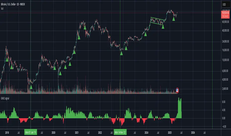
Bitcoin as % Global M2 signalThis script provides signal system:
Buy signal: each time the YoY of the Global M2 rises more than 2.5% while the distance between the bitcoin price as a percentage of the Global M2 is below its yearly SMA.
Sell signal: the distance between the bitcoin price as a percentage of the Global M2 and its yearly SMA is > 0.7
This is a very simple system, but it seems to work pretty well to ride the bitcoin price cycle wave.
The parameters are hard coded but they can be easily changed to test different levels for both the buy and sell signals.

True Daily Open (ICT 7:30AM until Market Close)Horizontal line marking 7:30am "True Daily Open" every day

Advance Trading StrategyStrategy Description: Advance Trading Strategy uses:
Fast (12) & Slow (21) EMAs for trend determination via crossovers.
ADX (14) with manual smoothing to confirm trend strength; threshold settable (default 20).
ATR-based stop-loss and take-profit levels (multipliers configurable).
Visual signals: BUY/SELL labels on crossover when ADX

Short Below 20 EMA with Exit Above Prior High - 15 Minshort trade strategy when price comes below 20 ema

Global M2 YoY % Increase signalThe script produces a signal each time the global M2 increases more than 2.5%. This usually coincides with bitcoin prices pumps, except when it is late in the business cycle or the bitcoin price / halving cycle.
It leverages dylanleclair Global M2 YoY % change, with several modifications:
adding a 10 week lead at the YoY Change plot for better visibility, so that the bitcoin pump moreless coincides with the YoY change.
signal increases > 2.5 in Global M2 at the point at which they occur with a green triangle up.
TP/SL calcJust draw lines on top and bottom of entry price line.
-1% and +1%
-2% and +2%
-10% and +10%

Nifty 3-min Options Pro Strategy (Fixed Version)This strategy is designed specifically for high-probability intraday options trading on the Nifty 3-5 minute chart.
It intelligently combines CPR (Central Pivot Range) and VWAP to define the market's bias (bullish or bearish) and detects Inside Bar Breakouts to pinpoint low-risk, high-reward entries.
The strategy automatically:
Identifies Buy Signals for CE (Call Options) when conditions are bullish.
Identifies Buy Signals for PE (Put Options) when conditions are bearish.
Plots dynamic CPR and VWAP levels on the chart.
Applies ATR-based Stop Loss and trailing stop loss for risk management.
Generates real-time alerts for quick trading actions.
The trading logic is time-filtered to operate only during optimal intraday hours (9:00 AM to 2:30 PM), avoiding low-volume traps and volatile close sessions.
Designed to help traders capture strong directional moves early, this strategy is perfect for Nifty scalpers and intraday options traders aiming for consistent profitability.

Sharpe & Sortino Ratio PROSharpe & Sortino Ratio PRO offers an advanced and more precise way to calculate and visualize the Sharpe and Sortino Ratios for financial assets on TradingView. Its main goal is to provide a scientifically accurate method for assessing the risk-adjusted performance of assets, both in the short and long term. Unlike TradingView’s built-in metrics, this script correctly handles periodic returns, uses optional logarithmic returns, properly annualizes both returns and volatility, and adjusts for the risk-free rate — all critical factors for truly meaningful Sharpe and Sortino calculations.
Users can customize the rolling analysis window (e.g., 252 periods for one year on daily data) and the long-term smoothing period (e.g., 1260 periods for five years). There’s also an option to select between linear and logarithmic returns and to manually input a risk-free rate if real-time data from FRED (the 3-Month T-Bill Rate via FRED:DGS3MO) is unavailable. Based on the chart’s timeframe (daily, weekly, or monthly), the script automatically adjusts the risk-free rate to a per-period basis.
The Sharpe Ratio is calculated by first determining the asset’s excess returns (returns after subtracting the risk-free return per period), then computing the average and standard deviation of those excess returns over the specified window, and finally annualizing these figures separately — in line with best scientific practices (Sharpe, 1994). The Sortino Ratio follows a similar approach but only considers negative returns, focusing specifically on downside risk (Sortino & Van der Meer, 1991).
To enhance readability, the script visualizes the ratios using a color gradient: strong negative values are shown in red, neutral values in yellow, and strong positive values in green. Additionally, the long-term averages for both Sharpe and Sortino are plotted with steady colors (teal and orange, respectively), making it easier to spot enduring performance trends.
Why calculating Sharpe and Sortino Ratios manually on TradingView is necessary?
While TradingView provides basic Sharpe and Sortino Ratios, they come with significant methodological flaws that can lead to misleading conclusions about an asset’s true risk-adjusted performance.
First, TradingView often computes volatility based on the standard deviation of price levels rather than returns (TradingView, 2023). This method is problematic because it causes the volatility measure to be directly dependent on the asset’s absolute price. For instance, a stock priced at $1,000 will naturally show larger absolute daily price moves than a $10 stock, even if their percentage changes are similar. This artificially inflates the measured standard deviation and, as a result, depresses the calculated Sharpe Ratio.
Second, TradingView frequently neglects to adjust for the risk-free rate. By treating all returns as risky returns, the computed Sharpe Ratio may significantly underestimate risk-adjusted performance, especially when interest rates are high (Sharpe, 1994).
Third, and perhaps most critically, TradingView doesn’t properly annualize the mean excess return and the standard deviation separately. In correct financial math, the mean excess return should be multiplied by the number of periods per year, while the standard deviation should be multiplied by the square root of the number of periods per year (Cont, 2001; Fabozzi et al., 2007). Incorrect annualization skews the Sharpe and Sortino Ratios and can lead to under- or overestimating investment risk.
These flaws lead to three major issues:
• Overstated volatility for high-priced assets.
• Incorrect scaling between returns and risk.
• Sharpe Ratios that are systematically biased downward, especially in high-price or high-interest environments.
How to properly calculate Sharpe and Sortino Ratios in Pine Script?
To get accurate results, the Sharpe and Sortino Ratios must be calculated using the correct methodology:
1. Use returns, not price levels, to calculate volatility. Ideally, use logarithmic returns for better mathematical properties like time additivity (Cont, 2001).
2. Adjust returns by subtracting the risk-free rate on a per-period basis to obtain true excess returns.
3. Annualize separately:
• Multiply the mean excess return by the number of periods per year (e.g., 252 for daily data).
• Multiply the standard deviation by the square root of the number of periods per year.
4. Finally, divide the annualized mean excess return by the annualized standard deviation to calculate the Sharpe Ratio.
The Sortino Ratio follows the same structure but uses downside deviations instead of standard deviations.
By following this scientifically sound method, you ensure that your Sharpe and Sortino Ratios truly reflect the asset’s real-world risk and return characteristics.
References
• Cont, R. (2001). Empirical properties of asset returns: stylized facts and statistical issues. Quantitative Finance, 1(2), pp. 223–236.
• Fabozzi, F.J., Gupta, F. and Markowitz, H.M. (2007). The Legacy of Modern Portfolio Theory. Journal of Investing, 16(3), pp. 7–22.
• Sharpe, W.F. (1994). The Sharpe Ratio. Journal of Portfolio Management, 21(1), pp. 49–58.
• Sortino, F.A. and Van der Meer, R. (1991). Downside Risk: Capturing What’s at Stake in Investment Situations. Journal of Portfolio Management, 17(4), pp. 27–31.
• TradingView (2023). Help Center - Understanding Sharpe and Sortino Ratios. Available at: www.tradingview.com (Accessed: 25 April 2025).

Sharpe Ratio Forced Selling StrategyThis study introduces the “Sharpe Ratio Forced Selling Strategy”, a quantitative trading model that dynamically manages positions based on the rolling Sharpe Ratio of an asset’s excess returns relative to the risk-free rate. The Sharpe Ratio, first introduced by Sharpe (1966), remains a cornerstone in risk-adjusted performance measurement, capturing the trade-off between return and volatility. In this strategy, entries are triggered when the Sharpe Ratio falls below a specified low threshold (indicating excessive pessimism), and exits occur either when the Sharpe Ratio surpasses a high threshold (indicating optimism or mean reversion) or when a maximum holding period is reached.
The underlying economic intuition stems from institutional behavior. Institutional investors, such as pension funds and mutual funds, are often subject to risk management mandates and performance benchmarking, requiring them to reduce exposure to assets that exhibit deteriorating risk-adjusted returns over rolling periods (Greenwood and Scharfstein, 2013). When risk-adjusted performance improves, institutions may rebalance or liquidate positions to meet regulatory requirements or internal mandates, a behavior that can be proxied effectively through a rising Sharpe Ratio.
By systematically monitoring the Sharpe Ratio, the strategy anticipates when “forced selling” pressure is likely to abate, allowing for opportunistic entries into assets priced below fundamental value. Exits are equally mechanized, either triggered by Sharpe Ratio improvements or by a strict time-based constraint, acknowledging that institutional rebalancing and window-dressing activities are often time-bound (Coval and Stafford, 2007).
The Sharpe Ratio is particularly suitable for this framework due to its ability to standardize excess returns per unit of risk, ensuring comparability across timeframes and asset classes (Sharpe, 1994). Furthermore, adjusting returns by a dynamically updating short-term risk-free rate (e.g., US 3-Month T-Bills from FRED) ensures that macroeconomic conditions, such as shifting interest rates, are accurately incorporated into the risk assessment.
While the Sharpe Ratio is an efficient and widely recognized measure, the strategy could be enhanced by incorporating alternative or complementary risk metrics:
• Sortino Ratio: Unlike the Sharpe Ratio, the Sortino Ratio penalizes only downside volatility (Sortino and van der Meer, 1991). This would refine entries and exits to distinguish between “good” and “bad” volatility.
• Maximum Drawdown Constraints: Integrating a moving window maximum drawdown filter could prevent entries during persistent downtrends not captured by volatility alone.
• Conditional Value at Risk (CVaR): A measure of expected shortfall beyond the Value at Risk, CVaR could further constrain entry conditions by accounting for tail risk in extreme environments (Rockafellar and Uryasev, 2000).
• Dynamic Thresholds: Instead of static Sharpe thresholds, one could implement dynamic bands based on the historical distribution of the Sharpe Ratio, adjusting for volatility clustering effects (Cont, 2001).
Each of these risk parameters could be incorporated into the current script as additional input controls, further tailoring the model to different market regimes or investor risk appetites.
References
• Cont, R. (2001) ‘Empirical properties of asset returns: stylized facts and statistical issues’, Quantitative Finance, 1(2), pp. 223-236.
• Coval, J.D. and Stafford, E. (2007) ‘Asset Fire Sales (and Purchases) in Equity Markets’, Journal of Financial Economics, 86(2), pp. 479-512.
• Greenwood, R. and Scharfstein, D. (2013) ‘The Growth of Finance’, Journal of Economic Perspectives, 27(2), pp. 3-28.
• Rockafellar, R.T. and Uryasev, S. (2000) ‘Optimization of Conditional Value-at-Risk’, Journal of Risk, 2(3), pp. 21-41.
• Sharpe, W.F. (1966) ‘Mutual Fund Performance’, Journal of Business, 39(1), pp. 119-138.
• Sharpe, W.F. (1994) ‘The Sharpe Ratio’, Journal of Portfolio Management, 21(1), pp. 49-58.
• Sortino, F.A. and van der Meer, R. (1991) ‘Downside Risk’, Journal of Portfolio Management, 17(4), pp. 27-31.


Relative Volume CandlesVisualizes candlesticks with transparency based on volume relative to a moving average. Higher-than-average volume makes candles more opaque, while lower volume increases transparency—helping you spot significant price movements at a glance!
Features:
Customizable up/down candle colors (default: green/red)
Adjustable lookback period for volume averaging (default: 21)
Fine-tune transparency with base transparency (default: 80) and scale (default: 2.0)
Overlay directly on your chart for seamless analysis

Kalman Filtered RSI | [DeV]The Kalman Filtered RSI indicator is an advanced tool designed for traders who want precise, noise-free market insights. By enhancing the classic Relative Strength Index (RSI) with a Kalman filter, this indicator delivers a smoother, more reliable view of market momentum, helping you identify trends, reversals, and overbought/oversold conditions with greater accuracy. It’s an ideal choice for traders seeking clear signals amidst market volatility, giving you a competitive edge across any trading environment.
The RSI measures momentum by analyzing price movements over a set period, typically 14 bars. It calculates the average of price gains on up days and the average of price losses on down days, then compares these to produce a value between 0 and 100. An RSI above 70 often indicates an overbought market that may reverse downward, while below 30 suggests an oversold market that could reverse upward. RSI is great for spotting momentum shifts, potential reversals, and trend strength, but it can be noisy in choppy markets, leading to misleading signals.
That's where the Kalman filter comes in; it enhances the RSI by applying a sophisticated smoothing process that predicts the RSI’s next value based on its historical trend, then updates this prediction with the actual RSI reading. It operates in two phases: prediction and correction. In the prediction phase, it uses the previous filtered RSI and adds uncertainty from process noise (Q), which is derived from the historical variance of RSI changes, reflecting how much the RSI might unexpectedly shift. In the correction phase, it calculates a Kalman gain based on the ratio of prediction uncertainty to measurement noise (R), which is determined from the variance between raw RSI and a smoothed version, indicating the raw data’s noisiness. This gain weights how much the filter trusts the new RSI versus the prediction, blending them to produce a smoothed RSI that reduces noise while staying responsive to real trends, outperforming simpler methods like moving averages that often lag or oversmooth.
With the Kalman Filtered RSI, you get a refined view of momentum, making it easier to spot trends and reversals with clarity. This indicator’s ability to dynamically adapt to market changes delivers timely, reliable signals, making it a powerful addition to your trading strategy for any market or timeframe.

🌎 Modern Economic Eras - Visual Backgrounds & LabelsModern Economic Eras - Visual Backgrounds & Labels
This indicator highlights key modern economic eras with distinct background shading and floating labels, based on the structural macroeconomic periods identified by Deutsche Bank in their Long-Term Asset Return Study (2020).
🌎 First Era of Globalization (1860–1914)
A period of strong global growth, trade expansion, and low inflation, ending with World War I.
⚔️ Great Wars and the Depression (1914–1945)
The most turbulent period in modern history, marked by conflict, economic hardship, and volatile inflation.
🪙 Bretton Woods & Gold System (1945–1971)
Post-war stability driven by gold-backed currencies, strong growth, and the creation of modern welfare states.
💸 Fiat Money & High Inflation Era (1971–1980)
After the collapse of Bretton Woods, fiat currencies led to global inflation surges and economic instability.
🌍 Second Era of Globalization (1980–2020?)
A golden age of asset returns, global trade boom, China's reintegration, and falling inflation supported by demographic trends.
⚡ Age of Disorder (2020–????)
Characterized by rising geopolitical tensions (especially US-China), high debt levels, political fragmentation, demographic reversals, inequality challenges, and environmental pressures.
Each era is visually segmented and labeled above the chart for intuitive historical context.
This tool helps traders and investors understand the broader macro context behind asset price movements across different long-term regimes.
Useful for:
✅ Macro analysis
✅ Historical financial studies
✅ Long-term strategic planning
Compatible with any asset and timeframe, although it is intended primarily for use on indices like the S&P 500 (SPX).

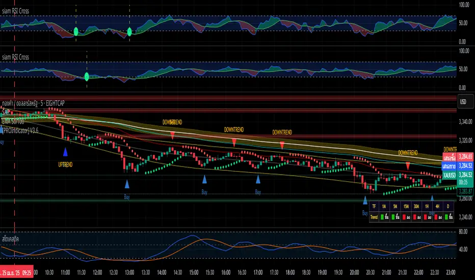
siam RSI Crossอินดิเคเตอร์ "Siam RSI Cross" ช่วยระบุจุดตัดระหว่าง RSI และ SMA ในโซน overbought (เหนือ 70) และ oversold (ใต้ 30)
- เส้นปะสีเหลืองและจุดสีแดง: RSI ตัดขึ้นใต้ระดับ 30 (โซน oversold)
- เส้นปะสีขาวและจุดสีเขียว: RSI ตัดลงเหนือระดับ 70 (โซน overbought)
- ปรับแต่งได้: ความยาว RSI (MA 1) และ SMA (MA 2)
- รองรับการแจ้งเตือนสำหรับสัญญาณซื้อ/ขาย
สรุปการทำงานของสคริปต์:
1. วัตถุประสงค์หลัก:
อินดิเคเตอร์นี้ใช้ RSI (Relative Strength Index) และ SMA (Simple Moving Average) ของ RSI เพื่อระบุจุดตัด (crossover และ crossunder) ในโซน overbought (เหนือ 70) และ oversold (ใต้ 30)
แสดงสัญญาณด้วย:
เส้นปะแนวตั้ง: เพื่อระบุจุดตัดในโซนที่กำหนด
จุดสี: เพื่อเน้นจุดตัดให้ชัดเจนยิ่งขึ้น
การแจ้งเตือน: เพื่อให้ผู้ใช้ตั้งค่าแจ้งเตือนใน TradingView ได้
2. องค์ประกอบของอินดิเคเตอร์:
เส้น RSI: คำนวณจาก ta.rsi(close, len1) โดย len1 (ค่าเริ่มต้น 34) เป็นความยาวที่ผู้ใช้กำหนดได้ แสดงเป็นเส้นสีน้ำเงิน
เส้น SMA ของ RSI: คำนวณจาก ta.sma(sh, len2) โดย len2 (ค่าเริ่มต้น 68) เป็นความยาวที่ผู้ใช้กำหนดได้ แสดงเป็นเส้นสีเขียว
เส้นแนวนอน: ที่ระดับ 30 (Oversold) และ 70 (Overbought) เป็นเส้นสีเทาแบบปะ
การเติมสีระหว่างเส้น 30 และ 70: ใช้สีน้ำเงินโปร่งใส (opacity 80)
การเติมสีระหว่าง RSI และ SMA:
สีเขียวอ่อน (lime) เมื่อ RSI > SMA
สีแดงเมื่อ RSI < SMA
3. เงื่อนไขและการแสดงสัญญาณ:
RSI ตัดขึ้น (Crossover) ใต้เส้น 30:
เงื่อนไข: RSI ตัดขึ้นผ่าน SMA (ta.crossover(sh, ln)) และ RSI < 30 (sh < 30)
เส้นปะแนวตั้งสีเหลือง: วาดจากระดับ 0 ถึง 100 ในหน้าต่าง RSI ด้วย line.new
จุดสีแดง: วาดที่ระดับ RSI (sh) ตรงจุดตัด ด้วย plotshape (รูปวงกลม, ขนาดเล็ก)
RSI ตัดลง (Crossunder) เหนือเส้น 70:
เงื่อนไข: RSI ตัดลงผ่าน SMA (ta.crossunder(sh, ln)) และ RSI > 70 (sh > 70 and sh > 70)
เส้นปะแนวตั้งสีขาว: วาดจากระดับ 0 ถึง 100 ในหน้าต่าง RSI ด้วย line.new
จุดสีเขียว: วาดที่ระดับ RSI (sh) ตรงจุดตัด ด้วย plotshape (รูปวงกลม, ขนาดเล็ก)
หมายเหตุ: เงื่อนไข sh > 70 and sh > 70 ช่วยให้แน่ใจว่าการตัดลงเกิดในโซน overbought และป้องกันการตรวจจับที่ผิดพลาด
4. การแจ้งเตือน (Alert Conditions):
สัญญาณซื้อทั่วไป: เมื่อ RSI ตัดขึ้นผ่าน SMA (ta.crossover(sh, ln)) ชื่อ: "Buy", ข้อความ: "RSI Cross. Buy Signal"
สัญญาณขายทั่วไป: เมื่อ RSI ตัดลงผ่าน SMA (ta.crossunder(sh, ln)) ชื่อ: "Sell", ข้อความ: "RSI Cross. Sell Signal"
สัญญาณตัดขึ้นใต้ 30: ชื่อ: "Buy Cross Below 30", ข้อความ: "RSI Cross Up Below 30"
สัญญาณตัดลงเหนือ 70: ชื่อ: "Sell Cross Above 70", ข้อความ: "RSI Cross Down Above 70"
ผู้ใช้สามารถตั้งค่าการแจ้งเตือนใน TradingView โดยเลือกเงื่อนไขเหล่านี้
5. การตั้งค่าที่ผู้ใช้ปรับได้:
len1: ความยาวของ RSI (ค่าเริ่มต้น: 34) ปรับได้ผ่านอินพุต "MA 1"
len2: ความยาวของ SMA (ค่าเริ่มต้น: 68) ปรับได้ผ่านอินพุต "MA 2"
6. การแสดงผล:
อินดิเคเตอร์แสดงในหน้าต่างแยก (ไม่ทับบนชาร์ตราคา) เนื่องจาก overlay=false
เส้นแนวตั้งและจุดสีทั้งหมดปรากฏในหน้าต่าง RSI โดย:
เส้นปะแนวตั้งครอบคลุมช่วง 0 ถึง 100
จุดสีแดงและสีเขียวอยู่ที่ระดับ RSI ตรงจุดตัด
Summary of the Script's Functionality:
1. Main Objective:
The indicator uses the Relative Strength Index (RSI) and a Simple Moving Average (SMA) of the RSI to identify crossover and crossunder points in the overbought (above 70) and oversold (below 30) zones.
It displays signals using:
Dashed vertical lines: To mark crossover/crossunder points in the specified zones.
Colored dots: To highlight the crossover/crossunder points more clearly.
Alerts: To allow users to set up notifications in TradingView.
2. Components of the Indicator:
RSI Line: Calculated using ta.rsi(close, len1), where len1 (default: 34) is a user-defined length, displayed as a blue line.
SMA of RSI: Calculated using ta.sma(sh, len2), where len2 (default: 68) is a user-defined length, displayed as a green line.
Horizontal Lines: At levels 30 (Oversold) and 70 (Overbought), shown as dashed gray lines.
Fill Between 30 and 70: Filled with a translucent blue color (opacity 80).
Fill Between RSI and SMA:
Light green (lime) when RSI > SMA.
Red when RSI < SMA.
3. Conditions and Signal Display:
RSI Crossover Below 30:
Condition: RSI crosses above SMA (ta.crossover(sh, ln)) and RSI < 30 (sh < 30).
Yellow Dashed Vertical Line: Drawn from level 0 to 100 in the RSI window using line.new.
Red Dot: Plotted at the RSI level (sh) at the crossover point using plotshape (circle shape, small size).
RSI Crossunder Above 70:
Condition: RSI crosses below SMA (ta.crossunder(sh, ln)) and RSI > 70 (sh > 70 and sh > 70).
White Dashed Vertical Line: Drawn from level 0 to 100 in the RSI window using line.new.
Green Dot: Plotted at the RSI level (sh) at the crossunder point using plotshape (circle shape, small size).
Note: The condition sh > 70 and sh > 70 ensures that the crossunder occurs in the overbought zone and prevents false detections.
4. Alert Conditions:
General Buy Signal: When RSI crosses above SMA (ta.crossover(sh, ln)), Name: "Buy", Message: "RSI Cross. Buy Signal".
General Sell Signal: When RSI crosses below SMA (ta.crossunder(sh, ln)), Name: "Sell", Message: "RSI Cross. Sell Signal".
Crossover Below 30 Signal: Name: "Buy Cross Below 30", Message: "RSI Cross Up Below 30".
Crossunder Above 70 Signal: Name: "Sell Cross Above 70", Message: "RSI Cross Down Above 70".
Users can set up alerts in TradingView by selecting these conditions.
5. User-Adjustable Settings:
len1: RSI length (default: 34), adjustable via the "MA 1" input.
len2: SMA length (default: 68), adjustable via the "MA 2" input.
6. Display:
The indicator is displayed in a separate window (not overlaid on the price chart) due to overlay=false.
All vertical lines and colored dots appear in the RSI window:
Dashed vertical lines span from 0 to 100.
Red and green dots are placed at the RSI level at the crossover/crossunder points.
MyBoxMyBox - Display Text with Customizable Position and Size
This indicator allows you to display a customizable message on your chart, with adjustable font size, position, and background color. You can input your desired message, choose the font size (small, normal, large, huge), and place it in various positions on the chart (top-left, top-center, top-right, etc.). Additionally, you can customize the background color of the box where the text is displayed.
Features:
Display a custom message on your chart (e.g., "FOMO Incoming!!").
Adjustable font size (small, normal, large, huge).
Choose from multiple position options for text placement (e.g., top-left, middle-center, bottom-right).
Customize the box background color for better visibility.
Perfect for displaying personal notes, reminders, or trading signals while analyzing the market!

🌎 Modern Economic Eras Dashboard🌍 Overview
The Modern Economic Eras Dashboard is a upgrade over the earlier "Modern Economic Eras - Visual Background & Labels" script.
Inspired by the 2020 Deutsche Bank Long-Term Asset Return Study ("The Age of Disorder"), this dashboard contextualizes market behavior through the major structural macroeconomic eras of modern history.
🔥 What's New?
Macroeconomic eras are colored clearly across the timeline.
Major financial crashes (e.g., Great Depression, Oil Crisis 1973, Dot-Com Bubble, GFC 2008, COVID Crash) are shaded distinctly.
Key macroeconomic indicators are overlaid and properly rescaled to align visually on a unified panel.
🎯 How to Use It
This tool is ideal for:
Long-term investors seeking to understand where current markets sit within historical macroeconomic regimes.
Macro researchers analyzing how asset classes performed across different structural periods.
Strategic traders identifying points of inflection tied to historical crises or regime shifts.
Educators and students visualizing economic history in a financial context.
📊 Scaled Data (for improved visualization)
Real GDP: divided by 100B
Inflation Index: divided by 2
US Debt to GDP: raw
Labor Force Participation Rate: raw
Oil Price: raw
US 10Y Real Yield: multiplied by 10
Active Symbol Price: user-adjustable scaling factor
⚡ Features
Background shading for eras and crises.
Adjustable symbol scaling via input field.
Clean, non-overlay pane for better visual separation.
Labels placed on the chart for easier historical reference.
🛠️ Usage
Best applied to major indices (SPX, DJI, MSCI World) on monthly timeframes for clearer historical visualization.
📖 Credits
Original structural macroeconomic eras based on Deutsche Bank's Long-Term Asset Return Study (2020), further adapted and expanded.
📝 Author’s Note
This script was created for investors, traders, and researchers who want to understand long-term market cycles through a clearer macro lens.
If you find this useful, a like or a comment is always appreciated! 🚀

OpeningRange (Trading_Tix)Purpose:
The indicator highlights the high, low, and middle (50%) price levels of a specified session's opening range. These levels can serve as key support and resistance zones for trading strategies. The indicator also offers options to extend these levels beyond the session into later timeframes, making it useful for tracking breakout or trend continuation setups.
Key Features:
1. Session Detection:
The indicator identifies a specific session period using the user-defined Session Time. It calculates the start time, high, and low prices during this period:
rangeTime: Defines the session time range (default: 5:00 PM to 2:59 AM).
extendTime: Defines the extended time range where lines/backgrounds can be prolonged.
2. Opening Range Calculation:
High (high_val) and Low (low_val)**:
Tracks the highest and lowest prices during the session.
Middle Line:
A midpoint is calculated by averaging high_val and low_val.
3. Visual Elements:
Horizontal Lines:
Drawn at the high, low, and middle levels.
Customizable in width and color.
Shaded Background Box:
Covers the range between high and low prices.
The box’s color and transparency can be adjusted.
Line and Box Extension:
Optionally extends these elements into the extended time range.
4. Customization:
Users have the flexibility to:
Toggle visibility of lines, middle line, and background box.
Adjust colors, line thickness, and style.
Enable or disable the extension of lines and backgrounds into the extended period.
How It Works:
Initialization:
The script initializes variables to store range data (startTime, high_val, low_val) and drawing objects (lines, boxes).
It detects whether the current bar falls within the session (inSession) or extended timeframe (inExtend).
Plotting:
During the session:
Deletes previous lines and boxes from prior sessions.
Draws new lines at the high, low, and middle levels.
Creates a background box covering the range, if enabled.
During the extended period:
Extends the session lines and box, if the user has opted for extensions.
Updates:
Continuously adjusts the high/low values and updates the lines as new price data arrives.
Use Cases:
This indicator can be valuable for traders who:
Use the opening range to identify potential breakout zones.
Trade based on price consolidation within the range.
Want a visual representation of key price levels to plan entries and exits.
Would you like help refining this script further or adjusting its settings to match your trading style?

AI-EngulfingCandle+Alert+thanks-2-ahmedirshad419!WE MUST APPRECIATE ahmedirshad419 and his great work.
I added some tips and sources instead of the shout for MIT XD.
plotshape(tradeSignal and bullishCandle, title = 'bullish', location = location.belowbar, color = color.new(color.green, 0), style = shape.triangleup, text = 'BUY @ next higher bottom @ upper trend')
plotshape(tradeSignal and bearishCandle, title = 'bearish', location = location.abovebar, color = color.new(color.red, 0), style = shape.triangledown, text = 'SELL @ next lower top @ downer trend')
alertcondition(bullishCandle, title = 'Double Bottom Upcoming', message = 'BUY @ next higher bottom @ upper trend !')
alertcondition(bearishCandle, title = 'Doublle Top Upcoming', message = 'SELL @ next lower top @ downer trend !')
You should see the MIRACLE of your LIFE.

Triple Confirmation Buy/Sell Engine VWAP + MACD + RSIDescription:
This custom-built indicator generates high-confidence Buy/Sell signals using a powerful combination of MACD momentum, RSI strength, and VWAP trend confirmation — designed for cleaner entries and fewer false signals.
Unlike traditional scripts that rely on only one indicator (and produce noisy or early signals), this system requires triple confirmation, greatly increasing signal quality and reducing false trades.
✅ Buy Signal Conditions:
MACD histogram turns green (momentum shift positive)
RSI crosses above 50 (bullish strength confirmation)
Price closes above VWAP (trend confirmation)
🔻 Sell Signal Conditions:
MACD histogram turns red (momentum shift negative)
RSI crosses below 50 (weakening trend)
Price closes below VWAP (bearish confirmation)
🛠 Best For:
Trend traders seeking higher probability entries
Swing traders who want to catch bigger moves
Crypto, stocks, forex traders looking for simple, effective signals

Setup Score Check Final AlertTotal Score
Significance
0–6 points
No trade – "Instinct instead of system"
7–12 points
C-Setup – only small test size
13–17 points
B-Setup – entry with caution
18–21 points
A-Setup – fully feasible

Godfather of Support & Resistance Godfather of Support & Resistance
Overview
The Godfather of Support & Resistance script is a powerful tool designed to help traders identify critical support and resistance levels on their charts. These price levels are vital for understanding market behavior, as they often act as turning points where prices reverse, consolidate, or break through. By automating the detection of these levels, this script simplifies your trading decisions and enhances your technical analysis.
How It Works
Pivot Points for Level Detection:
The script uses pivot points to identify potential support (lows) and resistance (highs) levels:
A pivot high is a local peak (a high surrounded by lower highs).
A pivot low is a local trough (a low surrounded by higher lows).
You can adjust the Pivot Length (pivotLen) input to control the sensitivity of detection. Smaller values detect more levels, while larger values focus on major levels.
Dynamic Grouping with Tolerance:
The script dynamically groups nearby price levels using a tolerance percentage. This tolerance is based on the level's price, making it adaptive to all types of assets (low- and high-priced).
For example, if the tolerance is set to 1% and a level is at $100, levels within $1 are grouped together.
Touch Count for Significance:
The script tracks how many times the price interacts with each level (touch count). Only levels that meet or exceed the Minimum Touches (minTouches) input are displayed on the chart. This ensures only meaningful levels are highlighted.
Clear Visual Representation:
Resistance Levels (Red Lines): Represent areas where the price tends to reverse downward.
Support Levels (Green Lines): Represent areas where the price tends to reverse upward.
Labels are added to each level (optional) to display the price and the number of touches for better decision-making.
Inputs You Can Customize
Minimum Touches to Show Level:
Set the minimum number of price interactions required for a level to be displayed.
Maximum Lines to Keep:
Limit the number of support and resistance lines displayed to keep your chart clean and focused.
Pivot Length:
Customize the sensitivity of pivot point detection. Smaller values detect more levels, while larger values focus on key levels.
Tolerance for Touch Detection (%):
Adjust the grouping tolerance as a percentage of the price. For example, 1% groups levels that are within 1% of each other.
How to Use
Apply the Script:
Add the script to your TradingView chart, and it will automatically detect and plot support and resistance levels.
Analyze the Levels:
Use Resistance Levels (red lines) as potential sell zones or areas to place stop-loss orders above.
Use Support Levels (green lines) as potential buy zones or areas to place stop-loss orders below.
Customize for Your Trading Style:
Adjust the inputs to match your preferred strategy and the timeframe or asset you're analyzing.
Example Use Case
Imagine you're analyzing a stock:
Resistance Level: The script identifies resistance at $150 with 3 touches. This might be a potential sell zone if the price struggles to break through.
Support Level: The script identifies support at $130 with 4 touches. This might be a potential buy zone if the price shows signs of bouncing upward.
Key Features
Automatically detects and plots support and resistance levels.
Tracks the number of price touches to filter out weak levels.
Adapts dynamically to price ranges using a percentage-based tolerance.
Fully customizable to suit different trading styles and assets.
Clean and professional chart display with a limit on the number of lines.
Notes
This script is for educational purposes only and should not be considered financial advice.
Always perform your own analysis and manage risk before making trading decisions.
Why Use This Script?
The Godfather of Support & Resistance script simplifies your trading decisions by automating the detection of critical price levels. Whether you're a beginner or an experienced trader, this script is designed to save you time and help you focus on making informed trades.
Start using it today to master the art of support and resistance trading!
Let me know if you need further refinements for this description!
