⚡ High-Frequency Pro Strategy | Enhanced Filtersfind the supply ondemand for Gold and the best areat to import
Циклический анализ

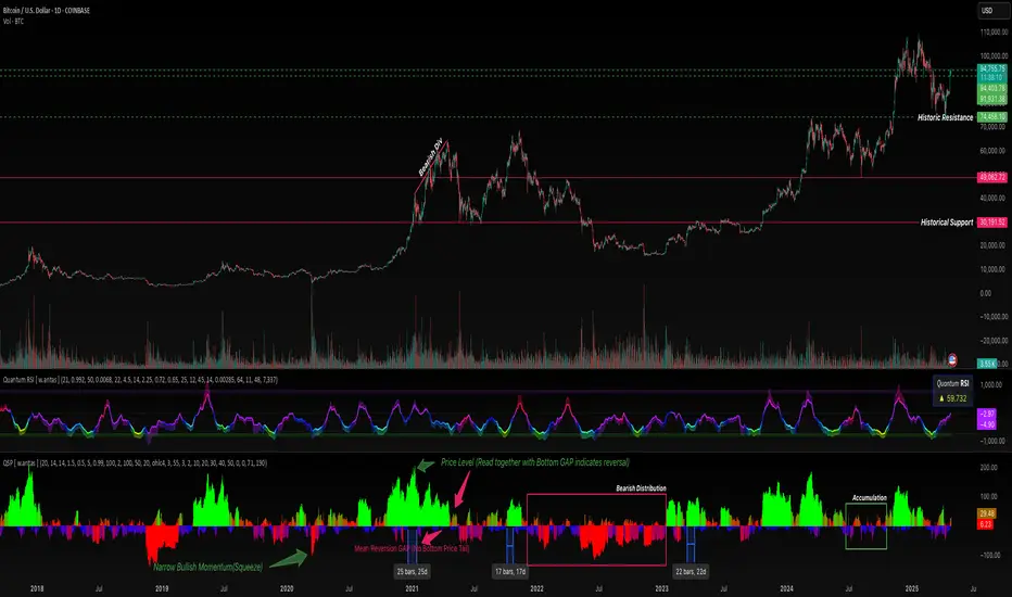
QuantumSync Pulse [ w.aritas ]QuantumSync Pulse (QSP) is an advanced technical indicator crafted for traders seeking a dynamic and adaptable tool to analyze diverse market conditions. By integrating momentum, mean reversion, and regime detection with quantum-inspired calculations and entropy analysis, QSP offers a powerful histogram that reflects trend strength and market uncertainty. With multi-timeframe synchronization, adaptive filtering, and customizable visualization, it’s a versatile addition to any trading strategy.
Key Features
Hybrid Signals: Combines momentum and mean reversion, dynamically weighted by market regime.
Quantum Tunneling: Enhances responsiveness in volatile markets using volatility-adjusted calculations.
3-State Entropy: Assesses market uncertainty across up, down, and neutral states.
Regime Detection: Adapts signal weights with Hurst exponent and volatility ROC.
Multi-Timeframe Alignment: Syncs with higher timeframe trends for context.
Customizable Histogram: Displays trend strength with ADX-based visuals and flexible styling.
How to Use and Interpret
Histogram Interpretation
Positive (Above Zero): Bullish momentum; color intensity shows trend strength.
Negative (Below Zero): Bearish momentum; gradients indicate weakness.
Overlaps: Alignment of final_z (signal) and ohlc4 (price) histograms highlights key price levels or turning points.
Regime Visualization
Green Background: Trending market; prioritize momentum signals.
Red Background: Mean-reverting market; focus on reversion signals.
Blue Background: Neutral state; balance both signal types.
Trading Signals
Buy: Histogram crosses above zero or shows positive divergence between histograms.
Sell: Histogram crosses below zero or exhibits negative divergence.
Confirmation: Match signals with regime background—green for trends, red for ranges.
Customization
Tweak Momentum Length, Entropy Lookback, and Hurst Exponent Lookback for sensitivity.
Adjust color themes and transparency to suit your charts.
Tips for Optimal Use
Timeframes: Use higher timeframes (1h, 4h) for trend context and lower (5m, 15m) for entries.
Pairing: Combine with RSI, MACD, or volume indicators for confirmation.
Backtesting: Test settings on historical data for asset-specific optimization.
Overlaps: Watch for histogram overlaps to identify support, resistance, or reversals.
Simulated Performance
Trending Markets: Histogram stays above/below zero, with overlaps at retracements for entries.
Range-Bound Markets: Oscillates around zero; overlaps signal reversals in red regimes.
Volatile Markets: Quantum tunneling ensures quick reactions, with filters reducing noise.
Elevate your trading with QuantumSync Pulse—a sophisticated tool that adapts to the market’s rhythm and your unique style.
Multi Scanner Plot & Table V1Here's how to interpret each column in the table:
Price vs MAs:
What it shows: Where the current price is relative to the short-term (e.g., 20-period) and long-term (e.g., 50-period) Simple Moving Averages (SMAs) calculated on your current chart's timeframe.
Interpretation:
Above Both (Green background): Price is above both the short and long MAs. Generally considered a bullish sign for the current trend.
Below Both (Red background): Price is below both MAs. Generally considered a bearish sign.
Mixed (Gray background): Price is between the two MAs (e.g., above the short but below the long, or vice-versa). Indicates indecision or a potential trend change.
RSI Value:
What it shows: The actual numerical value of the Relative Strength Index (RSI) calculated on your current chart's timeframe.
Interpretation: Just the raw RSI number (e.g., 65.32). The background is always gray. You compare this value to standard overbought/oversold levels (like 70/30) or the levels defined in the script's inputs.
RSI Status:
What it shows: Interprets the RSI Value based on the Overbought/Oversold levels set in the script's inputs (default 70/30). Calculated on your current chart's timeframe.
Interpretation:
Overbought (Red background): RSI is above the overbought level (e.g., > 70). Suggests the asset might be due for a pullback or reversal downwards. Red indicates a potentially bearish condition.
Oversold (Green background): RSI is below the oversold level (e.g., < 30). Suggests the asset might be due for a bounce or reversal upwards. Green indicates a potentially bullish condition.
Neutral (Gray background): RSI is between the oversold and overbought levels.
Last Sig Price:
What it shows: The price level where the last "SIG NOW" Buy or Sell signal occurred on your current chart's timeframe.
Interpretation: Helps you see the entry price of the most recent short-term signal generated by this script. The background color matches the signal type: Green for the last Buy signal, Red for the last Sell signal. N/A if no signal has occurred yet.
SIG NOW:
What it shows: This is the main short-term signal generated by the script based on conditions on your current chart's timeframe. It combines the "Price vs MAs" status and specific RSI conditions (price must be above/below both MAs and RSI must be within a certain range defined in the inputs).
Interpretation:
BUY (Green background): The specific buy conditions are met right now. (Price above both MAs AND RSI is strong but not necessarily overbought).
SELL (Red background): The specific sell conditions are met right now. (Price below both MAs AND RSI is weak but not necessarily oversold).
NEUTRAL (Gray background): Neither the Buy nor the Sell conditions are currently met.
ALERT:
What it shows: Flags unusual volume activity on the current bar compared to the recent average volume (calculated on your current chart's timeframe).
Interpretation:
SPIKE (Yellow background, black text): Current volume is significantly higher than the recent average (defined by the Volume Spike Multiplier). Can indicate strong interest or a potential climax.
DUMP (Purple background): Current volume is significantly lower than the recent average (defined by the Volume Dump Multiplier). Can indicate fading interest.
NONE (Gray background): Volume is within the normal range for the lookback period.
SD$:
What it shows: The price level where the last Volume Spike or Dump occurred on your current chart's timeframe.
Interpretation: Shows the price associated with the most recent significant volume event. The background color indicates the type of the last event: Green if the last event was a Spike, Red if the last event was a Dump. N/A if no Spike/Dump has occurred yet.
BB Value (%B):
What it shows: This relates to Bollinger Bands, but specifically calculated on a Higher Timeframe (HTF) that you can set in the inputs (e.g., Daily BBs while viewing an Hourly chart). It shows the Bollinger Band Percent B (%B) value for that HTF. %B measures where the HTF closing price is relative to the HTF upper and lower bands.
Interpretation:
Value > 1: HTF price closed above the HTF upper Bollinger Band.
Value < 0: HTF price closed below the HTF lower Bollinger Band.
Value between 0 and 1: HTF price closed within the HTF Bollinger Bands (e.g., 0.5 is exactly on the middle band).
The background is always gray.
LTS (Long Term Signal):
What it shows: A signal derived only from the Higher Timeframe (HTF) Bollinger Bands.
Interpretation:
BUY (Green background): The HTF price closed above the HTF upper Bollinger Band (see BB Value > 1). Considered a strong bullish signal from the higher timeframe perspective.
SELL (Red background): The HTF price closed below the HTF lower Bollinger Band (see BB Value < 0). Considered a strong bearish signal from the higher timeframe perspective.
NEUTRAL (Gray background): The HTF price closed within the HTF Bollinger Bands.
How to Understand Bollinger Bands and Signals in this Context:
Bollinger Bands are primarily used for the Long Term Signal (LTS) column. This script calculates BBs on a higher timeframe (you choose which one, or it defaults to the chart's timeframe if left blank).
The "LTS" signal triggers:
A BUY when the price on that higher timeframe closes above its upper Bollinger Band. This often indicates strong momentum or a potential breakout.
A SELL when the price on that higher timeframe closes below its lower Bollinger Band. This often indicates strong negative momentum or a potential breakdown.
The "BB Value" column gives you the raw %B number from that same higher timeframe, showing you exactly where the price is relative to the bands (is it just barely above/below, or way outside?).
The script does not directly use Bollinger Bands from the current chart timeframe for the "SIG NOW" or other table signals. The main short-term signals ("SIG NOW") rely on Moving Averages and RSI on the current timeframe. The LTS provides a longer-term perspective using HTF Bollinger Bands.
In summary: Look at the table to quickly gauge:
Short-term trend (Price vs MAs).
Short-term momentum (RSI Status, SIG NOW).
Recent short-term entry points (Last Sig Price).
Current volume anomalies (ALERT).
Long-term strength/weakness based on HTF Bollinger Bands (LTS, BB Value).
Combine these pieces of information to get a more rounded view of the current market conditions according to this specific script's logic.

Dow Trend clean MTF - Anticipated SignalsThis is MTF Dow theory arrows... you have the chart timeframe plus 4 other timeframe options. The issue is if you are on a low time frame for example on 1min then you can not see into the future.... a problem we all can relate to ;) I'm working on it. So there will be a delay in a 1 hr dow signal until all the 1hr criteria are met. I have added 2 "sets" of arrows. The 2nd set attempts to anticipate what the longer timeframe signal will be based on aggregate bars. So they may not always be correct. It's an experiment. Enjoy. Screenshot is not using the aggregate arrows just the regular ones. Showing arrows for 15s, 30s, 1m, 2m, and 4 min. progressively larger arrows. transparency is in the code rather than user interface...but should be fine.

cktraderpro session high lowCK Session Tracker – Global Market Session Levels
The CK Session Tracker is a precision-built TradingView indicator designed to map out the most critical times in the market — the Asia, EU, and US sessions. This tool automatically plots the open, close, high, and low of each major session, giving traders a crystal-clear view of market structure, key liquidity zones, and session-based momentum shifts.
🔍 Features:
🕒 Automatic Session Markers – Visualize the exact open and close times of Asia, Europe, and US sessions directly on your chart.
📈 Session Highs & Lows – Instantly spot where price reacted during each session, helping identify breakouts, reversals, or liquidity grabs.
🌐 Global Market Awareness – Designed to adapt to futures, forex, and crypto across all time zones.
🎯 Smart Trading Zones – Use session data to pinpoint high-probability setups during overlaps or session handoffs.
Perfect for intraday traders, ICT strategy followers, and anyone focused on session-based movement. The CK Session Tracker gives you the edge of institutional timing — all on one chart.

ONE RING SlimJust 3 nested envelopes tied together with a factor to size them together. You can have them based on various MAs and the envelopes based on % or on a volatility setup I came up with. You can highlight crosses of outside bands and/or midpoints. Mid lines can be colored based on slope. You can shade in various ways. You can highlight freak volume bars, and ranges also. Have basic options for highlight of session and lunch. Have fun.

Rally Sweep Volume RSVChecks for 3-6 consecutive candle rally, sweep of the low/high of the rally, and closes with more volume then prior candle.

Dow Trend with MA FilterThis is a modification of a very clever Dow Theory script by Mohit_Kakkar08. I found the logic to be great but the visual to be distracting due to lack of user control. The original uses dow theory to define every single bar as an up, down, or outside bar. Fantastic. This mod plots only when the status changes and allows full control over arrows, stop loss plots, etc. Also added a filter by 2 MAs if you want to lessen the signals. The filter will only show up arrows if they are below the MA and only show down arrows if they are above the MA (none, one MA, or both as a filter). Also extended the MTF table to 8 spots...

Impulse FinderPine Script v6, Copyright © 2025, Einhornhunter
The Impulse Finder uses the Elder Impulse System to color candles based on EMA and MACD, identifying bullish (green), bearish (red), or neutral (blue) market conditions. It overlays candles without transparency and offers an option to display only the candle body. Detects cross points for trend changes.
Inputs: MA Period (13), MACD Fast (12), Slow (26), Signal (9), Display Body Only (false).

Session-Based +/-% LinesSimple Script Just to Draw Lines Above 0.09 and Below 0.09 % based on Close Price

Prev Day High/Low + First 5-Min Candle RangeThis will draw a a line for previous day high and low and will also draw out the high and the low of the first five minute candle of the daytime session.

Price Flip StrategyPrice Flip Strategy with User-Defined Ticker Max/Max
This strategy leverages an inverted price calculation based on user-defined maximum and minimum price levels over customizable lookback periods. It generates buy and sell signals by comparing the previous bar's original price to the inverted price, within a specified date range. The script plots key metrics, including ticker max/min, original and inverted prices, moving averages, and HLCC4 averages, with customizable visibility toggles and labels for easy analysis.
Key Features:
Customizable Inputs: Set lookback periods for ticker max/min, moving average length, and date range for signal generation.
Inverted Price Logic: Calculates an inverted price using ticker max/min to identify trading opportunities.
Flexible Visualization: Toggle visibility for plots (e.g., ticker max/min, prices, moving averages, HLCC4 averages) and last-bar labels with user-defined colors and sizes.
Trading Signals: Generates buy signals when the previous original price exceeds the inverted price, and sell signals when it falls below, with alerts for real-time notifications.
Labeling: Displays values on the last bar for all plotted metrics, aiding in quick reference.
How to Use:
Add to Chart: Apply the script to a TradingView chart via the Pine Editor.
Configure Settings:
Date Range: Set the start and end dates to define the active trading period.
Ticker Levels: Adjust the lookback periods for calculating ticker max and min (e.g., 100 bars for max, 100 for min).
Moving Averages: Set the length for exponential moving averages (default: 20 bars).
Plots and Labels: Enable/disable specific plots (e.g., Inverted Price, Original HLCC4) and customize label colors/sizes for clarity.
Interpret Signals:
Buy Signal: Triggered when the previous close price is above the inverted price; marked with an upward label.
Sell Signal: Triggered when the previous close price is below the inverted price; marked with a downward label.
Set Alerts: Use the built-in alert conditions to receive notifications for buy/sell signals.
Analyze Plots: Review plotted lines (e.g., ticker max/min, HLCC4 averages) and last-bar labels to assess price behavior.
Tips:
Use in trending markets by enabling ticker max for uptrends or ticker min for downtrends, as indicated in tooltips.
Adjust the label offset to prevent overlapping text on the last bar.
Test the strategy on a demo account to optimize lookback periods and moving average settings for your asset.
Disclaimer: This script is for educational purposes and should be tested thoroughly before use in live trading. Past performance is not indicative of future results.

Pi Cycle Top IndicatorThe Pi Cycle Top Indicator plots the 111DMA and 350DMAx2. This is a well know indicator that has predicted Bitcoin cycle tops within a few days in previous cycles.

CATS Freak Volume MA % Bands with ShiftThis is a riff on Freak Volume by UniqueCharts. You should probably start there to understand what is happening here. Basically you look for a high volume "freak" volume bar using a set lookback period and a certain standard deviation thresehold. Pretty cool. You can then highlight that bar and show it's range… What has been added here is allowing multiples of the range of that freak bar to be shown. (Sometimes when volume comes into the market there will be a measured move of 2x or 3x of the volume bar.) Also have turned the midpoints of the freak volume bars into a moving average of sorts by connecting those levels with various MA choices and a smothing factor. This MA by itself is very interesting since it can plateau and flatten like a kaufmann ma. Also added the abilty for there to be an envelope around this volume MA. The envelope choices can be a fixed percentage, or a multiple of the freak bar (the before mentioned 2x or other multiples), or a volatility based envelope which you may find interesting. The volatility envelope works in a unique way but you can choose smoothing, steps, % capture, etc. Also added an atr stop loss and the indicator is multi timeframe. There is a lot to play with here...

Reversal Based Buy Sell SignalsThis indicator will provide buy/sell signals based on reversal strategy. Thitakes care of multiple basic indicators like Bollinger band, RSI, MA etc. and based on that provides the signals.

BB SqueezeBB Squeeze
This indicator detects volatility contraction ("squeeze") by checking when Bollinger Bands are entirely inside the Keltner Channels — a condition that often precedes significant price movement.
🟦 Visual Highlight
Unlike traditional squeeze indicators, this version highlights the squeeze only between the upper and lower Bollinger Bands, creating a clean and focused visual cue.
How it works:
When the Bollinger Bands fall inside the Keltner Channels:
A semi-transparent aqua background fills the BB area
No full-screen background is used — minimal and precise
Useful for identifying potential breakout setups and volatility cycles
Parameters include:
BB and Keltner lengths & multipliers
Toggle between “Both bands inside” vs “At least one inside” logic
📈 Ideal for breakout traders, volatility scalpers, and swing strategy setups.

Weekly & Daily Opening Ranges [WOR + DOR]Shows PWC/PWH/WOL/WOH etc.
This indicator was based on YAMAGUCCI framework for price action trading

Umair SuperchartThis indicator combines traditional pivot point analysis with volume surge detection to provide comprehensive trading signals. Here are its key features:
Main Components:
1. Daily Pivot Points (PP, R1-R3, S1-S3)
- Automatically calculates and displays pivot levels
- Color-coded lines (Red for Resistance, Blue for Pivot, Green for Support)
- Movable information box showing all levels
- Works across all timeframes
2. Volume Surge Detection
- Monitors volume increases above 20-period average
- Shows small triangles for immediate volume surges
• Green triangle below bar for bullish volume
• Red triangle above bar for bearish volume
3. Strong Buy/Sell Signals
- Tracks sustained volume surges (default 10 minutes)
- Displays blinking "STRONG BUY!" or "STRONG SELL!" messages
- Provides alerts for sustained momentum
Customizable Features:
- Adjustable volume surge threshold
- Customizable sustained period duration
- Movable pivot level display box
- Adjustable line widths and colors
- Flexible position settings
Alerts:
- Price breaks above R1/below S1
- Immediate volume surges
- Sustained bullish/bearish volume movements
Perfect for:
- Day traders monitoring volume-price relationship
- Swing traders using pivot points for support/resistance
- Technical analysts requiring multiple confirmation signals

RSI Bars cleanan update of the excellent concept of RSI chart bars by Glaz ... modified to add a filter for how many bars would be considered a valid signal, optional arrows on valid signals, coloring separate for bar, wick, and body to make RSI bars more obvious, and multi-timeframe ability. Screenshot is set to 8/70/30 and at least 3 RSI bars for an arrow. Highlights are I believe slightly different from original script as well. The emphasis here is on overheated bars that then cool off. Bars are colored when RSI crosses up through 70 then coloring stops when RSI crosses back down through 70. Same at bottom when RSI crosses down below 30 then back up through 30. These numbers as well as the frequency are user changeable. Helps with identifying tops/bottoms of cycles. Fine Print - Your mileage may vary. All standard exclusions apply. Not liable for account injury of any sort. Do not follow too closely. Not responsible for broken windshields.

Price-Based Strategybasic strategy to help struggling traders improve. Wait for 1 min candle to close above or below line then enter the trade

EMA/VWAP Signal with AlertsEMA + VWAP with alerts to identify entry and exit points. Recommended for stocks.

💵 Federal Funds Rate (US-Leitzins)The Coffee That Stopped Time
It was an ordinary Tuesday morning when Lena ordered a cappuccino at her favorite café, Zeitlos. Nothing about the day hinted that her life was about to take a wildly absurd turn.
The barista — an old man with eyes like melting clock hands — smiled at her and handed over the cup. “A little magic on the house today,” he said with a wink.
Lena chuckled, took a sip — and everything stopped. Literally. The spoon she was dipping into the sugar froze mid-air. The guy by the window paused mid-yawn. Outside, a bird hung in the air like a badly paused video.
Only Lena could move.
Confused, she walked through the streets. Everything was frozen. The world was a still image.
Then she found it: a small note in her jacket pocket that definitely hadn’t been there before. It simply read:
“You have one hour. Do something you’ve never dared to do.”
She thought for a moment. First, she stole a croissant — pure curiosity. Then she climbed to the roof of a hotel she'd always dreamed of photographing the city from. Finally, she sat in an abandoned vintage car, placed her hands on the steering wheel — and imagined herself just driving away from everything.
When the hour was up, the world resumed. The spoon clinked into the cup. The bird flew on. And Lena was back in the café, her cappuccino still half full.
The barista nodded. “How was it?”
“Unforgettable,” she said — and she didn’t mean the coffee.

Cambio de Tendencia EMA 3este inidcador muestra en cambio de tenedencia en l grafica de una ema de 3 periodos muy sencible
