OPEN-SOURCE SCRIPT
Trend Momentum Divergence (TMD)
Обновлено
Shout out to Lazy Bear, Bunghole, and Trading View for script code for this make.
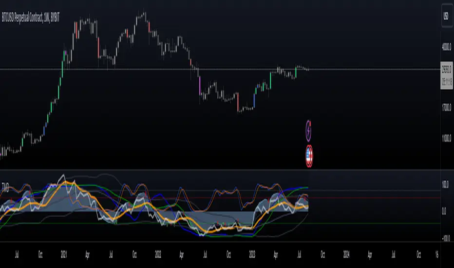
In this study you will have a visual representation of the strength and momentum of a trend and possibilities of where the market is heading. You can use the Blue and White momentum waves to spot divergences in a up oe down trend for potential reversals. When a green dot appears under the lower level with divergence then it is a indication that we should consider looking to buy. If the red dot appears over the upper level with divergence we should be looking to short/sell. The custom MFI indicator determines how much money is flowing into the market. If it is green that means money is flowing into the market and if it shows red it means that money is flowing out of the market. You can spot divergences in the money flow as well as the RSI. The Blue and Green lines from the RCI3line indicator are used for higher timeframe momentum based on current chart timeframe and we can see when they cross over.
In this study you will have a visual representation of the strength and momentum of a trend and possibilities of where the market is heading. You can use the Blue and White momentum waves to spot divergences in a up oe down trend for potential reversals. When a green dot appears under the lower level with divergence then it is a indication that we should consider looking to buy. If the red dot appears over the upper level with divergence we should be looking to short/sell. The custom MFI indicator determines how much money is flowing into the market. If it is green that means money is flowing into the market and if it shows red it means that money is flowing out of the market. You can spot divergences in the money flow as well as the RSI. The Blue and Green lines from the RCI3line indicator are used for higher timeframe momentum based on current chart timeframe and we can see when they cross over.
Информация о релизе
updated a few 'Titles' Информация о релизе
Added Bollinger Bands to RSI.Информация о релизе
adjusted BB Deviation.Информация о релизе
added over bought and over sold area for the TDI. There are many parts to this indicator and dont all need to be used. But use what you need in one place.Информация о релизе
Adjusted value of RCI long line for accuracy. Also adjusted Overbought and Oversold areas on TDI for more accurate reading. Информация о релизе
Added Stochastic RSI. Many ways to set this up. Dont recommend having it all displayed at once. Информация о релизе
Displayed # different ways to set up this indicator. Adjusted RSI length to stock 14 for default.Информация о релизе
added PVSRA volume overlay plus PVSRA candle color option to display Vector candles.Информация о релизе
This script uses some of my favorite moderate indicators for a visual representation of Trend, Momentum, and Divergence in the market. It comprises of Momentum waves and RSI to be used for divergences and momentum. The Bollinger bands can give you a sense of volatility and contraction, while the stochastics try to lay out pivot points of each pivot. For a higher time frame momentum based on your current chart timeframe I use the RCI3line middle and long. There is also a money flow setting for visually seeing money go in and out. Last but not least there are to candle color settings. First is RSI heat map candles. The second is PVSRA candle overlay for candles which have higher volume than the last 10 candles. This displays your Vector candles. There are many settings in this indicator and not all need to be used at once. Скрипт с открытым кодом
В истинном духе TradingView автор этого скрипта опубликовал его с открытым исходным кодом, чтобы трейдеры могли понять, как он работает, и проверить на практике. Вы можете воспользоваться им бесплатно, но повторное использование этого кода в публикации регулируется Правилами поведения. Вы можете добавить этот скрипт в избранное и использовать его на графике.
Отказ от ответственности
Все виды контента, которые вы можете увидеть на TradingView, не являются финансовыми, инвестиционными, торговыми или любыми другими рекомендациями. Мы не предоставляем советы по покупке и продаже активов. Подробнее — в Условиях использования TradingView.